
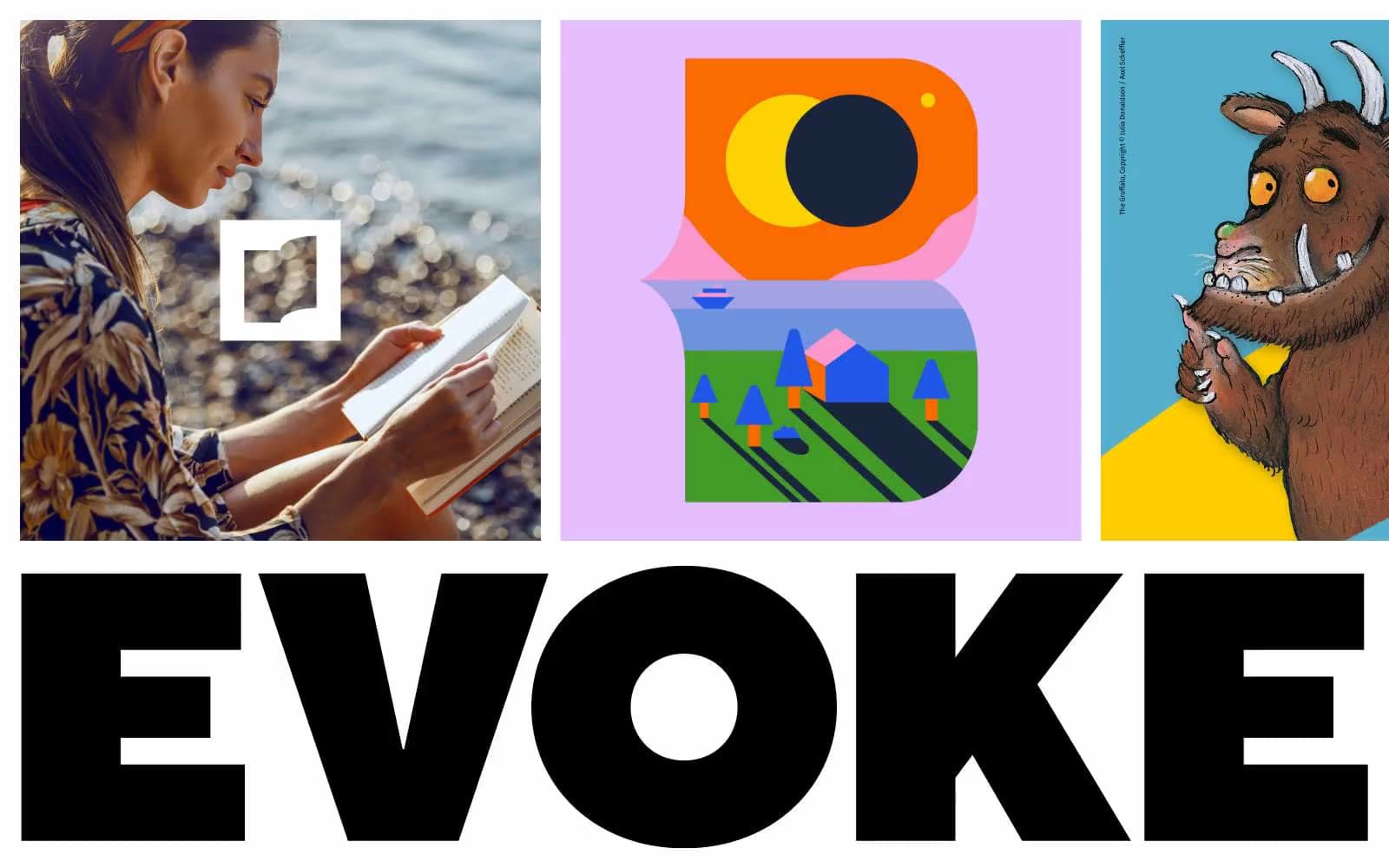
EVOKE. Saturated flat tiles swallowed by a massive black wordmark.
- Brand
- Light theme
- 6 colors
- 2 typefaces
EVOKE is a design studio site that speaks in full-bleed saturated color panels — coral, cyan, yellow, lavender — each one a flat, unmodulated field that doubles as a section anchor. The work lives in a tight 3-column grid of oversized tiles where lifestyle photography, flat vector illustration, and licensed cartoon character art share equal billing at full bleed with no framing or padding. Type is deliberately compressed: TT Norms Pro sets everything, with the Normal weight for content headings and ExtraBlack reserved for the brand wordmark itself, which becomes architecture — a slab of near-black display type at massive scale that anchors the lower half of the page. The system rejects depth entirely: no shadows, no gradients, no rounded softness, no card chrome. Visual hierarchy comes from scale, color contrast, and full-bleed composition rather than z-axis separation. Every surface is a declaration; every wordmark is a wall.
EVOKE design system

Brand4
Full-bleed section panels, project tile backgrounds — warm coral against flat illustration reads as editorial heat
Full-bleed section panels, project tile backgrounds — synthetic cyan reads as digital, screen-native energy
Full-bleed section panels, project tile backgrounds — saturated yellow as high-attention section marker
Full-bleed section panels, soft transitions between louder panels — cool lavender for quieter moments
Neutrals2
Text, display wordmark, hairline borders — compressed near-black carries the entire typographic system and grounds every color panel
Base canvas, text on color panels — the white ground that separates saturated panels and gives the wordmark its field
Try a pairing
Pick any two colors from the palette to check whether text stays readable on top.
Aa
Void Black on Ember Coral
6.80 : 1 contrast
- Body textPasses AA 4.5
- Large textPasses AA 3
- StrictFails AAA 7
More DESIGN.md files. Same web, different personalities.

Airbnb
Brand
Aker
Brand
Alison Roman
Brand
Alpine Bio
Brand
Alveos One
Brand
Amrit Palace
Brand
André Cândido
Brand
Anna Jóna
Brand
Apollo
Brand
Apple
Brand
Arva
Brand
Ashton Bespoke
Brand


