
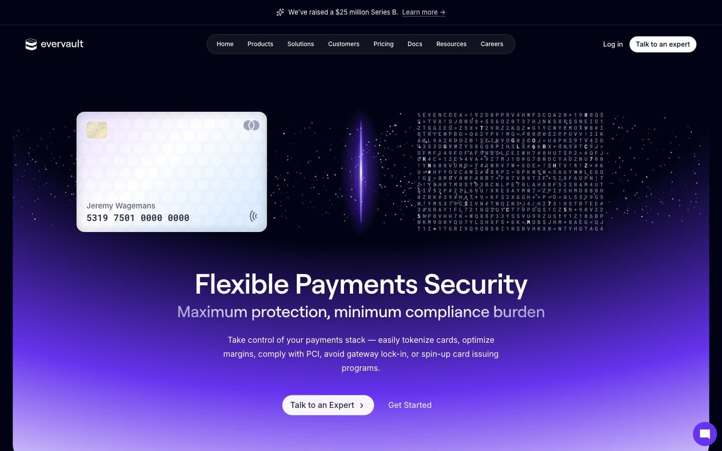
Evervault. A dark crypt where one violet beam reveals everything.
- Developer tools
- Dark theme
- 16 colors
- 3 typefaces
Evervault is a nocturnal crypto-vault interface: an almost-black canvas pierced by ultraviolet light, where every surface feels like brushed obsidian. The palette is 95% achromatic, leaning on cool gray-violet tints (#dfe1f4, #ececfb) rather than pure white, with a single vivid violet (#b88cff) acting as the encryption key — it appears on links, icons, gradient washes, and a glowing portal in the hero. Typography is the brand's quiet flex: Roobert for headlines with aggressive negative tracking that pulls characters into each other, Inter for body/UI at a comfortable density, and Roboto Mono for code that signals developer-first credibility. Components are floating and layered — a pill-shaped nav bar, 12–16px-radius cards with inset shadow stacks, pill CTAs — and the layout alternates between deep canvas and luminous gradient bands to create a sense of moving through encrypted chambers.
Evervault design system

Brand3
Brand accent — links, highlight icons, gradient termini, the signature violet that signals encryption
Brand gradient anchor — hero gradient origin, logo violet, saturated primary brand tone
Mid-gradient violet, hover states on brand elements, secondary accent fills
Accent3
Tinted shadows and border accents — gives depth a violet cast rather than pure black
Deep accent backgrounds, violet-tinted shadow layers, card hover glows
Code syntax highlighting (Monokai-style keywords), inline emphasis in code blocks
Neutrals10
Primary page background, hero canvas — near-black with a blue-violet undertone, not a true neutral
Elevated panels, nav bar, secondary cards — one step up from canvas, reads as a subtle surface tier
Card backgrounds, input fields, inset panels — the main surface level for content containers
Hairline borders, dividers, card edges — barely visible structural lines on dark surfaces
Muted helper text, disabled labels, tertiary metadata
Secondary body text, inactive icons, subdued UI labels
Link resting state, sub-labels, low-emphasis body
Primary body and heading text — a cool off-white, the dominant readable surface in the system
High-contrast text, hover states, icon highlights — the brightest text in the hierarchy
Light supporting surface for subtle backgrounds and section separation. Do not promote it to the primary CTA color
Try a pairing
Pick any two colors from the palette to check whether text stays readable on top.
Aa
Void Canvas on Ultraviolet Key
8.04 : 1 contrast
- Body textPasses AA 4.5
- Large textPasses AA 3
- StrictPasses AAA 7
More DESIGN.md files. Same web, different personalities.

Railway
Developer tools
Nuxt
Developer tools
Astro
Developer tools
Authkit
Developer tools
Axiom
Developer tools
BaseHub
Developer tools
Better Stack
Developer tools
Bun
Developer tools
Checkly
Developer tools
ClickHouse
Developer tools
Depot
Developer tools
dope.security
Developer tools


