
Eventbrite. Pillow-soft discovery wall with a single electric blue pulse.
- Brand
- Light theme
- 13 colors
- 2 typefaces
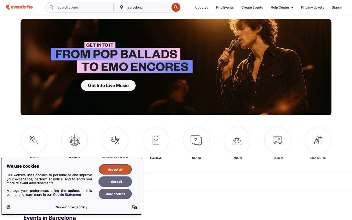
Eventbrite's visual system reads as a warm, welcoming event-discovery surface: a soft off-white canvas (#f8f7fa) with generous 40px-radius cards that feel almost pillow-like, pill-shaped controls (360px), and a single vivid blue (#3659e3) doing all the interactive heavy lifting. The dominant text/border color is a deep muted aubergine (#39364f) rather than pure black — this single tonal choice gives the entire interface a slightly warm, editorial feel without going purple on screen. Orange is reserved exclusively for the brand mark and the cookie consent button, never for product UI, which keeps the accent palette disciplined. Typography is Neue Plak at restrained sizes (14–24px range for most content), and layout is built on a 4-column event grid with circular category icons that hint at the playful, community-first nature of the product.
Eventbrite design system

Brand2
Headlines, event titles, and deep emphasis text — the voice of large type
Violet accent for outlined action borders, linked labels, and lightweight interactive emphasis.
Accent1
Orange wash for highlight backgrounds, decorative bands, and soft emphasis behind content. Do not promote it to the primary CTA color
Neutrals10
Icon fills, certain link text — used sparingly where maximum contrast is needed
Primary text, borders, dividers, icon strokes — the structural backbone of every surface
Nav borders, secondary structural lines, quieter sibling of Aubergine Ink
Muted secondary text, nav borders, low-emphasis icon strokes
Link borders, secondary borders, muted outlines on ghost elements
Hairline borders, list dividers, subtle separators between list items and sections
Soft blue-tinted card borders — the gentler cousin of the accent
Secondary card backgrounds, subtle surface differentiation
Page canvas and page-level background — slightly warm off-white, never sterile
Card surfaces, badge fills, nav background — the elevated layer above the canvas
Try a pairing
Pick any two colors from the palette to check whether text stays readable on top.
Aa
Pure White on Plum Depth
18.04 : 1 contrast
- Body textPasses AA 4.5
- Large textPasses AA 3
- StrictPasses AAA 7
More DESIGN.md files. Same web, different personalities.

Airbnb
Brand
Aker
Brand
Alison Roman
Brand
Alpine Bio
Brand
Alveos One
Brand
Amrit Palace
Brand
André Cândido
Brand
Anna Jóna
Brand
Apollo
Brand
Apple
Brand
Arva
Brand
Ashton Bespoke
Brand


