
Eraser. Neon blueprint on black velvet.
- Developer tools
- Dark theme
- 15 colors
- 3 typefaces
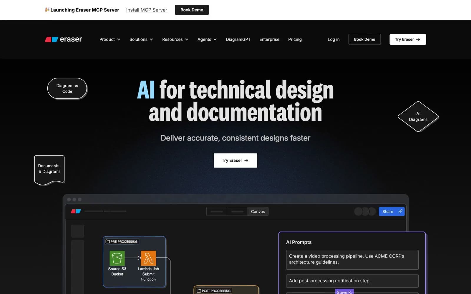
Eraser is a technical-drawing canvas rendered as a neon blueprint on black velvet: near-black canvas (#181818), luminous pastel accents dropped onto individual headline words, and a hard 6px solid-offset shadow that gives every card a sticker-like physicality. The display face is a high-contrast condensed grotesque (National 2 Condensed at line-height 0.85) that lets 90px headlines feel architectural rather than decorative. Color is rationed — almost everything is bone-white on obsidian, with violet, sky, saffron, and rose appearing only as small functional punctuation on borders, heading words, and diagram containers. The signature interaction language treats UI surfaces like diagram nodes themselves: colored group containers, floating pill annotations, and a purple-bordered AI prompt panel that sits beside the canvas like a chat companion.
Eraser design system

Brand3
Primary brand accent — headline words, diagram group borders, and the violet offset shadow that makes hero cards pop off the canvas
Softened brand accent — used where Iris Glow would be too saturated, particularly in headline strokes and lighter decorative borders
Accent shadow tone — paired with the 6px solid-offset shadow recipe to make Iris Glow feel grounded on the dark canvas
Accent3
Cool accent — second headline color and decorative border accent; the blue counterpart to the violet brand system
Warm accent — third headline color, brings the gold/amber note into the multi-word display treatment
Warm accent — fourth headline color, the pink note that completes the four-color headline palette
Neutrals9
Deepest shadow tone — used in the 6px 6px 0 hard-offset shadow under standard cards
Page canvas and card fill background — the dark base everything sits on
Subtle borders — the barely-there divider for low-emphasis separation
Muted borders and dividers, secondary structural lines on dark surfaces
Subtle link borders for de-emphasized text links
Muted text and link borders — body copy de-emphasized, nav text in resting state
Primary text and dominant border color across the interface — the single most-used color in the system
Secondary text color and heading borders where Bone is too cool
Primary action fill — the only CTA button background; also used for high-emphasis text on dark surfaces
Try a pairing
Pick any two colors from the palette to check whether text stays readable on top.
Aa
Ink Black on Iris Glow
6.82 : 1 contrast
- Body textPasses AA 4.5
- Large textPasses AA 3
- StrictFails AAA 7
More DESIGN.md files. Same web, different personalities.

Railway
Developer tools
Nuxt
Developer tools
Astro
Developer tools
Authkit
Developer tools
Axiom
Developer tools
BaseHub
Developer tools
Better Stack
Developer tools
Bun
Developer tools
Checkly
Developer tools
ClickHouse
Developer tools
Depot
Developer tools
dope.security
Developer tools


