
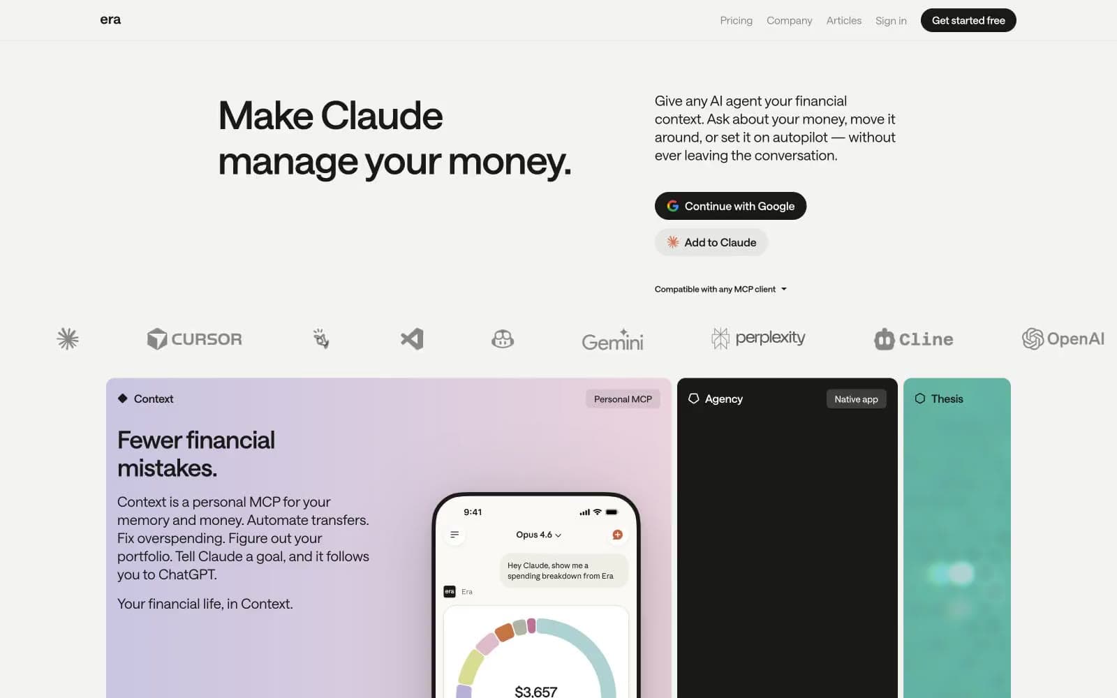
Era. Quiet ledger on warm paper.
- Finance
- Light theme
- 9 colors
- 1 typeface
Era operates in a near-monochrome editorial register: a warm parchment canvas, ink-black typography, and just enough chromatic punctuation — a soft lavender wash, a teal panel, a black card — to make three product surfaces feel like distinct chapters in a printed financial document. The visual system privileges typographic confidence over decoration: a custom variable sans-serif at tight negative tracking carries all the weight, and the interface stays text-first, with components reduced to pill buttons, hairline borders, and flat cards with zero shadow. Every screen should feel like a well-typeset magazine spread — quiet authority, generous whitespace, and color appearing only when a surface needs to announce itself as a distinct product. Density is comfortable, not dense; the rhythm comes from large headlines and 16px padding breathing inside cards, not from packed information rows.
Era design system

Accent3
Product feature card background (Thesis panel) — a desaturated teal that introduces the only sustained chromatic presence in the UI without ever becoming loud
Secondary product card background — a deeper desaturated teal for the Agency-adjacent surface, harmonizing with Sage Wash as a tonal pair
Supporting palette color for small decorative accents when the core palette needs contrast.
Neutrals6
Primary text, filled CTA buttons, nav links, icon strokes, card borders — the near-black that carries the entire typographic and action system. Used as filled pill background for primary actions (white text) and as hairline border on outlined buttons
Dark badge backgrounds where full Ink feels too heavy — used sparingly for tag fills that need to read as dark without the starkness of pure black
Secondary text, link underlines, icon fills, muted helper copy — the mid-gray that recedes so Ink can lead
Hairline borders, divider lines, footer borders, subtle surface elevation — the structural gray that separates content without ever competing with it
Page canvas background — a warm off-white that replaces pure white as the base surface, giving the entire site a paper-like editorial warmth rather than a clinical SaaS feel
Light neutral action fill for buttons on dark surfaces.
Try a pairing
Pick any two colors from the palette to check whether text stays readable on top.
Aa
Ink on Sage Wash
10.75 : 1 contrast
- Body textPasses AA 4.5
- Large textPasses AA 3
- StrictPasses AAA 7
More DESIGN.md files. Same web, different personalities.
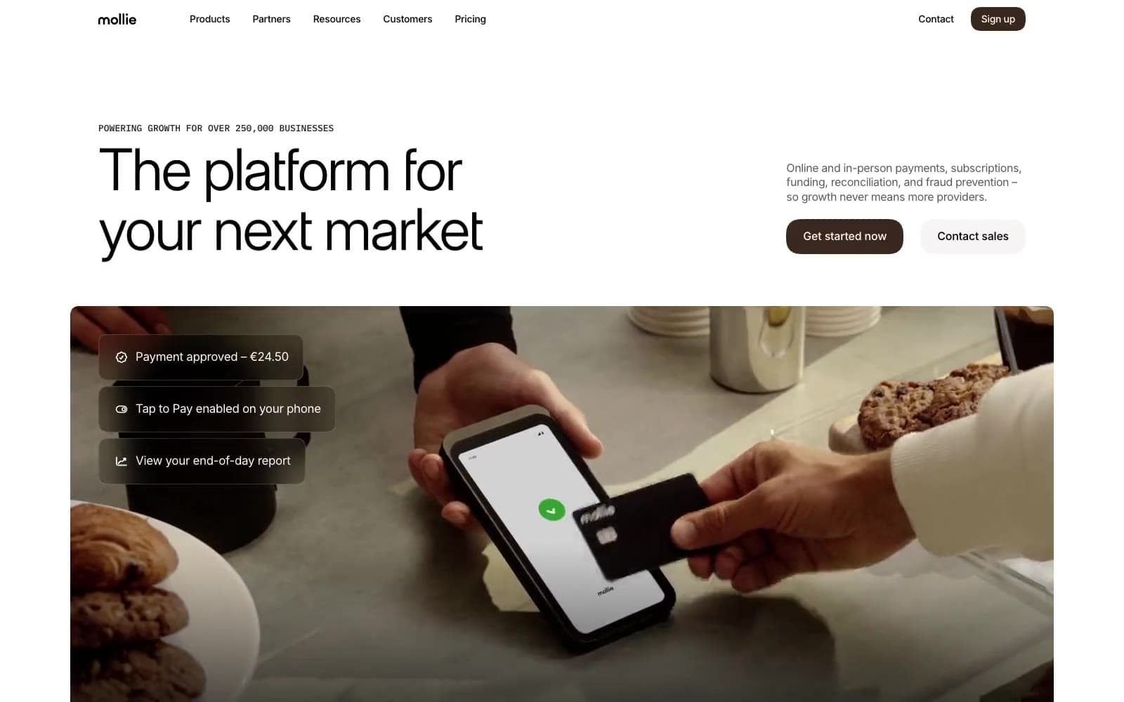
Mollie
Finance
a16z speedrun
Finance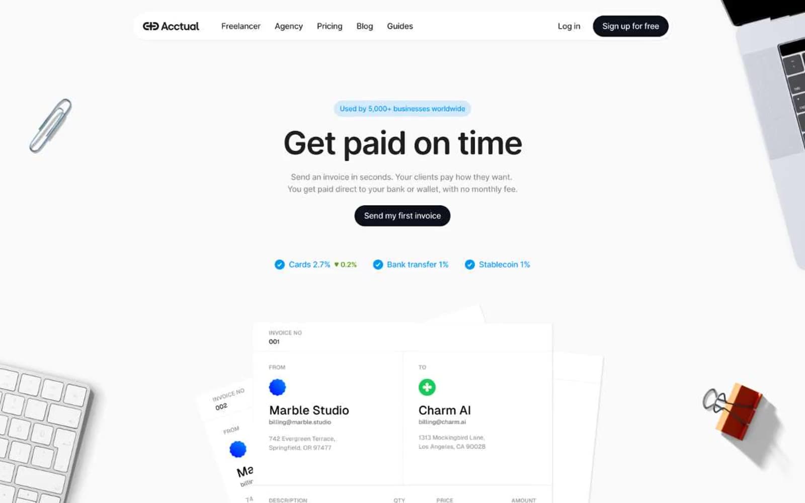
Acctual
Finance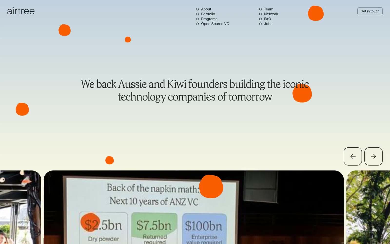
Airtree
Finance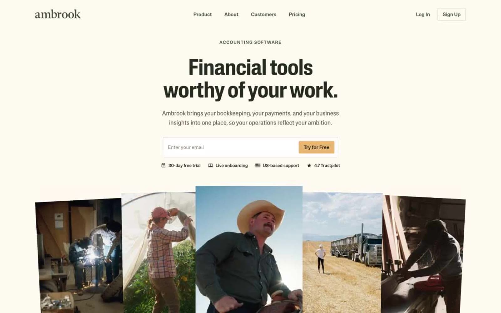
Ambrook
Finance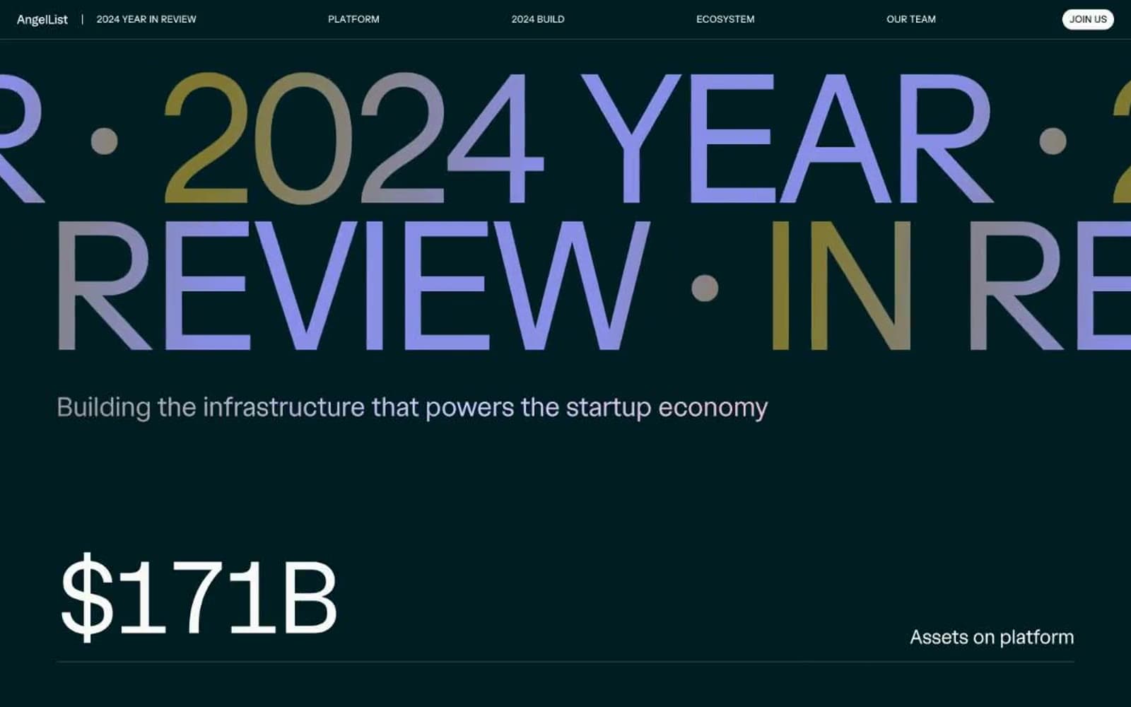
Angellist 2024
Finance
Apron
Finance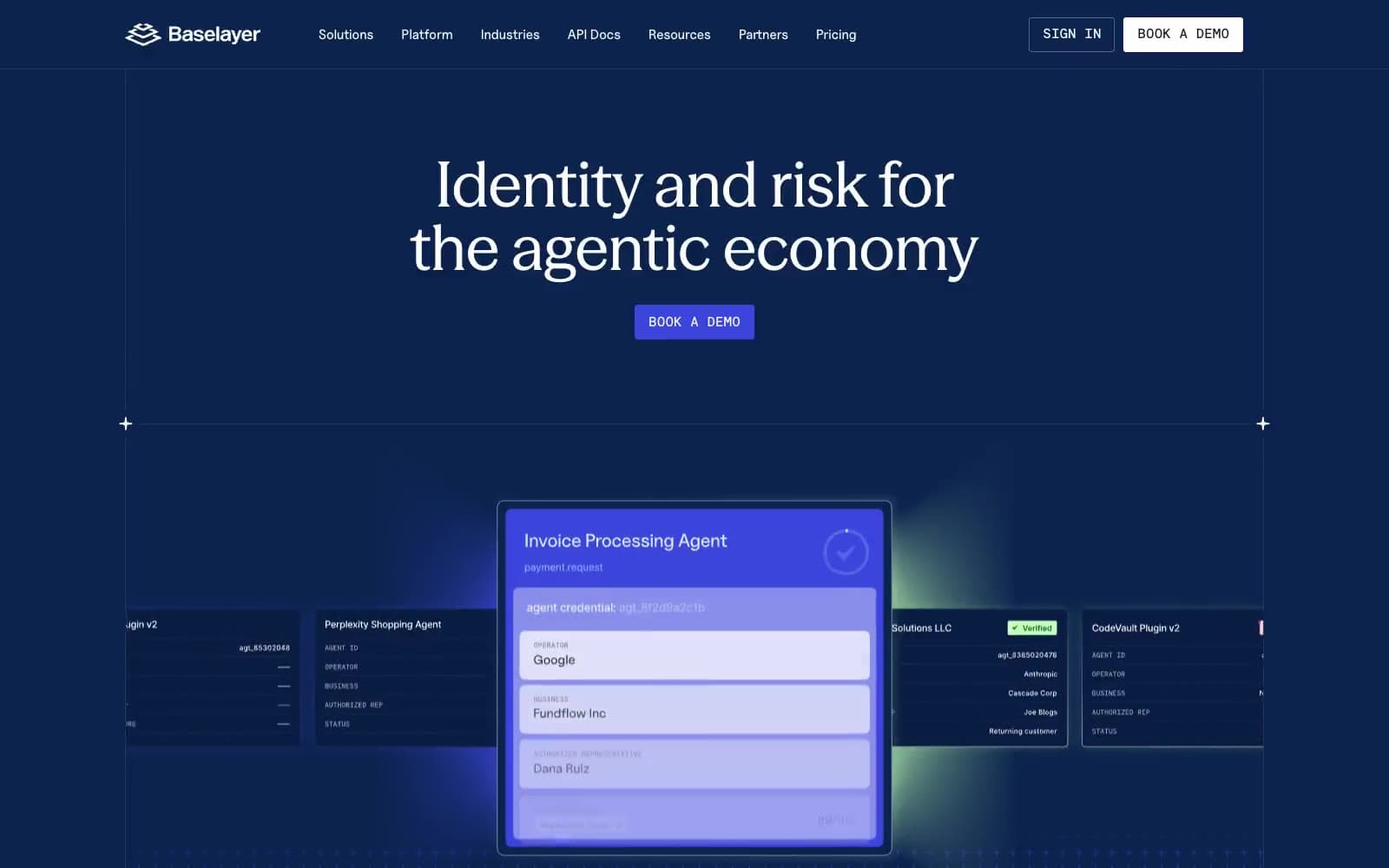
Baselayer
Finance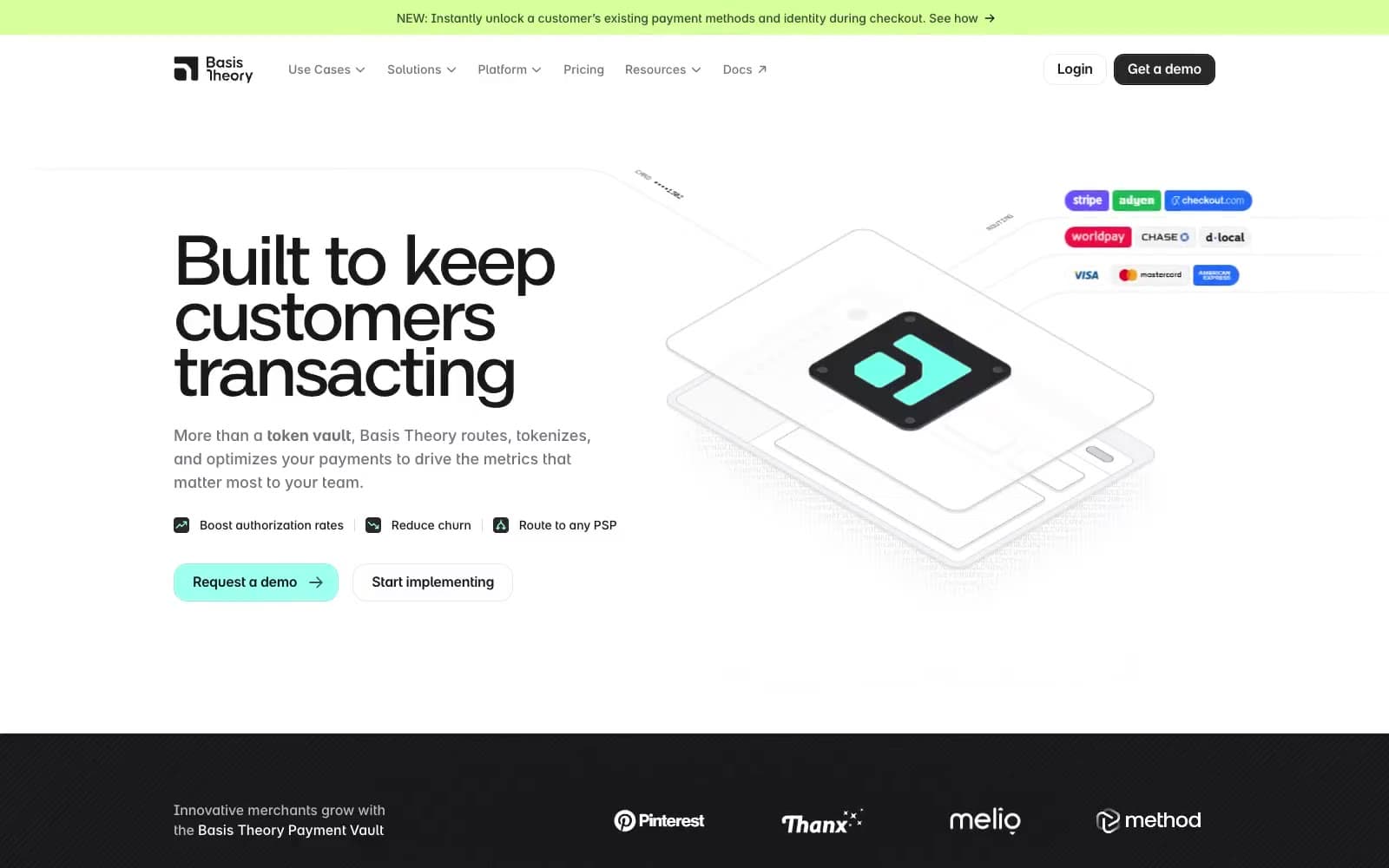
Basis Theory
Finance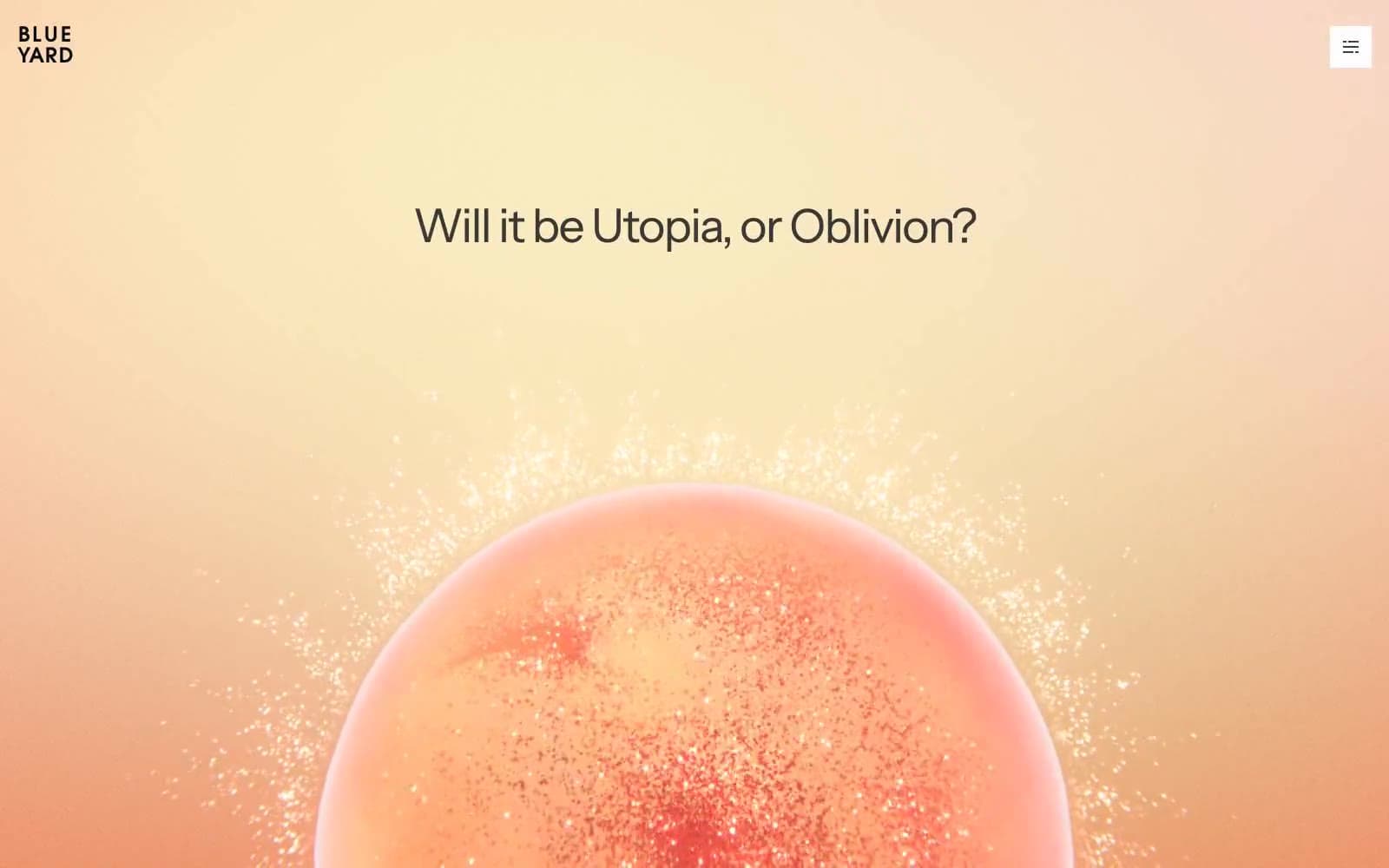
BlueYard Capital
Finance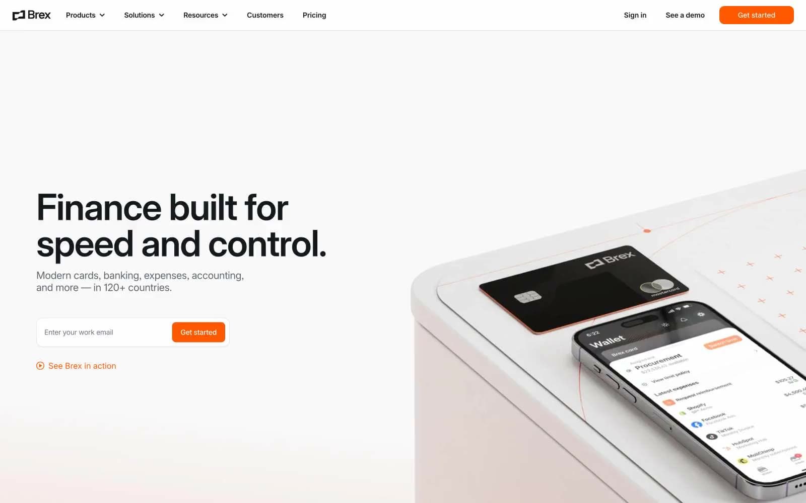
Brex
Finance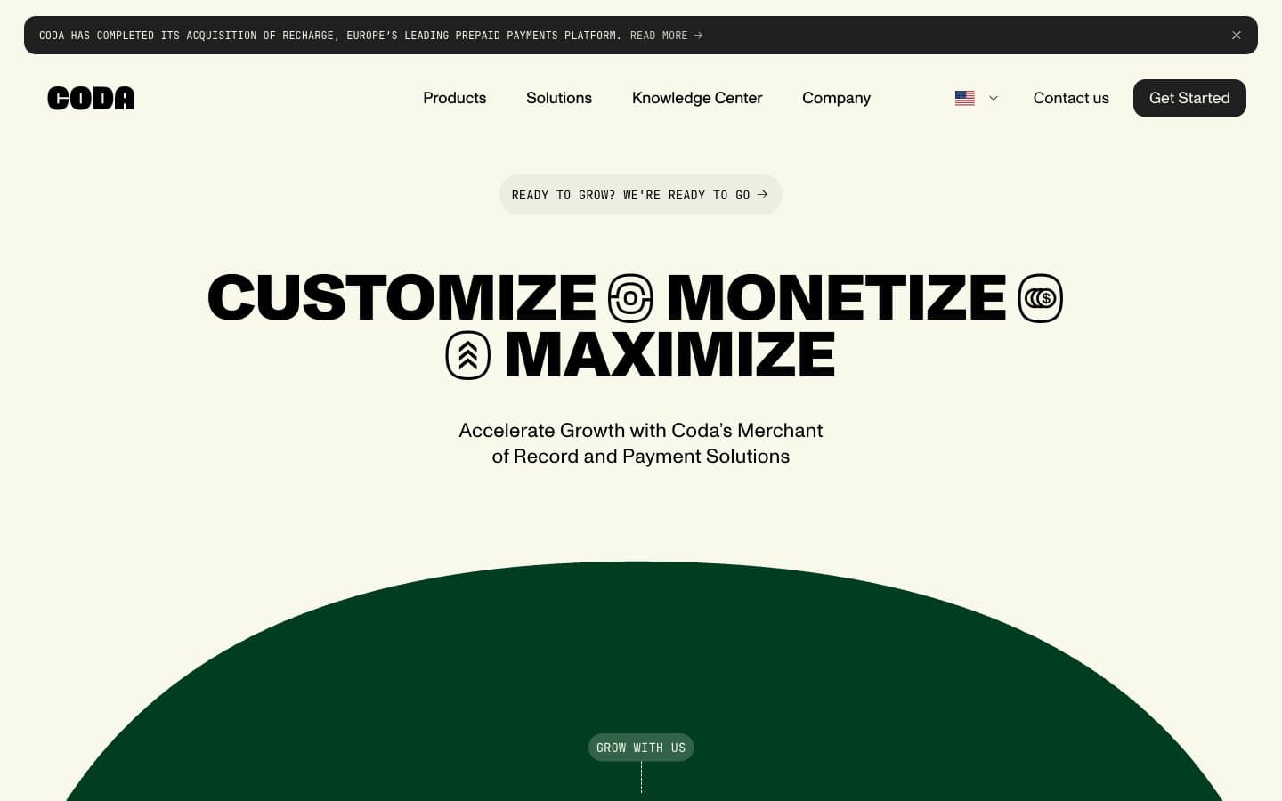
Coda
Finance


