
EPIC agency. A gallery-as-night-sky where pale lavender light and warm gold details float over an infinite aubergine void.
- Studio
- Dark theme
- 4 colors
- 3 typefaces
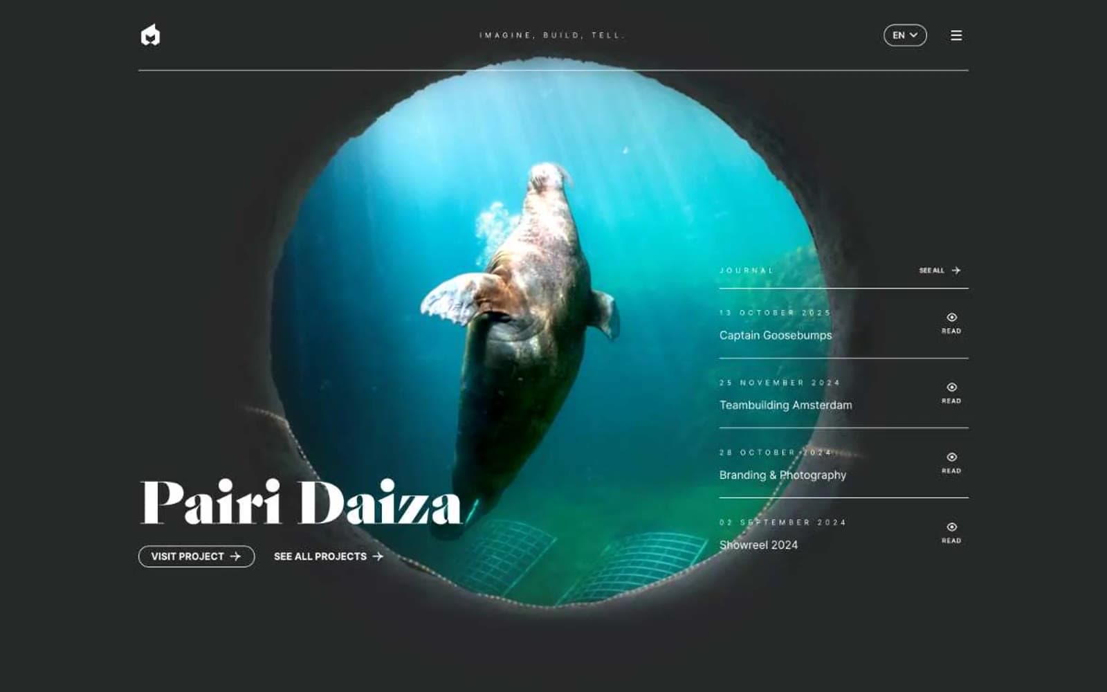
EPIC is a nocturnal creative agency language: a deep violet canvas plays the role of night sky while a pale lavender acts as the primary signal color for type, links, and iconography, with brushed gold as a second accent. The display face (Sang Bleu, a Garamond-class didone) arrives at colossal sizes (80–120px) to carry editorial weight, while Inter handles every working surface at compact sizes (9–18px) with generous tracking on uppercase labels. Layout is dense and magazine-like: a centered 3D hero illustration sits beside a vertical journal column, followed by a full-bleed black showreel block, with whitespace used as a controlled luxury rather than a cushion. Surfaces are flat — no shadows, no gradients — depth comes from color contrast (violet on black, lavender on violet) and from the typographic weight ratio between the display serif and the utilitarian sans.
EPIC agency design system

Brand2
Page background, hero canvas, filled button surface, deep surface elevation — the foundational night-sky tone that everything floats on
Violet supporting accent for decorative details and low-frequency emphasis.
Accent1
Secondary link color, decorative icon accent, highlight strokes — a warm metallic counterpoint to the cool violet, used sparingly as jewelry on the page
Neutrals1
Video/showreel container background, inverse button surface, maximum-contrast surface for media blocks
Try a pairing
Pick any two colors from the palette to check whether text stays readable on top.
Aa
Moonlight Lavender on Aubergine Canvas
10.42 : 1 contrast
- Body textPasses AA 4.5
- Large textPasses AA 3
- StrictPasses AAA 7
More DESIGN.md files. Same web, different personalities.

Basement Studio
Studio
Production Portugal
Studio
Active Theory
Studio
Adnaut
Studio
Agence K72
Studio
Akash Tyagi
Studio
Analogue
Studio
Athletics
Studio
BAM Photographers
Studio
Bareis + Nicolaus
Studio
Becklyn
Studio
Branding
Studio


