
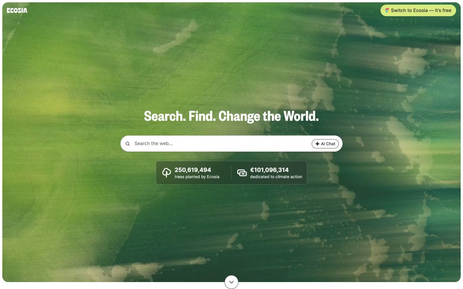
Ecosia. A white-canvas interface with a single lime-green accent and full-bleed leaf photography as the only chromatic noise.
- Brand
- Light theme
- 8 colors
- 2 typefaces
Ecosia positions itself as a verdant search engine: a clean white-canvas interface where one vivid lime-green accent (#d7eb80) acts as the brand's single chromatic punctuation against an otherwise monochrome system. The hero is a full-bleed nature photograph — a leaf-canopied backdrop that reframes the search bar as a clearing — while every other section returns to white space, warm off-white cards, and Founders Grotesk headlines. Components lean soft and rounded: 20px card radii, pill-shaped buttons at 9999px, generous 40-48px section gaps, and a single translucent dark stat overlay floating above the hero photo. The overall rhythm is one confident page, one quiet page, one page with a colorful donut chart — the system uses color sparingly so the lime accent and the nature photography carry the emotional weight.
Ecosia design system

Brand1
Primary action buttons, brand accent border, surface highlight — the single chromatic accent; warm yellow-green reads as young foliage and gives the CTA a nature-coded urgency without alarm
Neutrals7
Primary text, icon strokes, hairlines, structural borders, footer text — carries the entire interface's information hierarchy
Secondary text, link borders, icon strokes, muted descriptions, footer secondary copy
Occasional card surface or muted image treatment — the deepest achromatic before true shadow territory
Medium-contrast borders, control outlines, and structural separators. Do not promote it to the primary CTA color
Tertiary card surfaces, section backgrounds — the warmest neutral, used as gentle banding between content blocks
Secondary card surfaces, subtle elevated panels — a barely-warm off-white that softens the page from clinical white
Page background, card surfaces, button text on lime fills, search bar fill — the dominant canvas
Try a pairing
Pick any two colors from the palette to check whether text stays readable on top.
Aa
Ink Black on Lime Canopy
9.68 : 1 contrast
- Body textPasses AA 4.5
- Large textPasses AA 3
- StrictPasses AAA 7
More DESIGN.md files. Same web, different personalities.

Airbnb
Brand
Aker
Brand
Alison Roman
Brand
Alpine Bio
Brand
Alveos One
Brand
Amrit Palace
Brand
André Cândido
Brand
Anna Jóna
Brand
Apollo
Brand
Apple
Brand
Arva
Brand
Ashton Bespoke
Brand


