
Eat Real Food. Government health brief on cream parchment.
- Brand
- Light theme
- 9 colors
- 4 typefaces
Eat Real Food reads as a government health brief printed on aged parchment: warm cream canvas, near-black ink, and one alarm-red used only when the data needs to stop you in your tracks. The visual system is nearly monochromatic by design — color is treated as editorial punctuation, not decoration. Display type is enormous and tight (170px headlines at 0.84 line-height), making every hero statement feel like a front-page declaration. Components are rounded, pill-shaped, and float on flat surfaces with the faintest layered shadows. The aesthetic borrows from broadsheet newspaper design and government reports: confident, restrained, and data-driven.
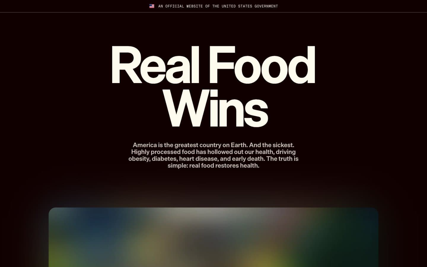
Eat Real Food design system

Accent1
Data emphasis blocks, statistics backgrounds, alarm callouts — the only chromatic color in the system, reserved for moments when numbers must cut through the editorial calm
Neutrals8
Primary text, dark hero surfaces, filled pill buttons, navigation dots — near-black with a warm undertone replaces the cold #000000 to keep the palette feeling printed rather than digital
Muted secondary text, small labels — warm gray-brown that recedes without going cold
Subtle image borders, soft shadow base — warm gray for non-critical structural lines
Card shadow base tone, subtle elevation warmth
Hairline borders, dividers, card edges — the structural neutral that defines component boundaries at 1px weight
Accent surface, secondary button fill, soft highlight wash — a desaturated straw tone that sits between parchment and olive
Page canvas, body text on dark surfaces, filled button backgrounds — the warm off-white that gives the entire site its paper-like quality
Card surfaces, elevated panels, button text on dark fills
Try a pairing
Pick any two colors from the palette to check whether text stays readable on top.
Aa
Newsprint White on Alert Red
5.48 : 1 contrast
- Body textPasses AA 4.5
- Large textPasses AA 3
- StrictFails AAA 7
More DESIGN.md files. Same web, different personalities.

Airbnb
Brand
Aker
Brand
Alison Roman
Brand
Alpine Bio
Brand
Alveos One
Brand
Amrit Palace
Brand
André Cândido
Brand
Anna Jóna
Brand
Apollo
Brand
Apple
Brand
Arva
Brand
Ashton Bespoke
Brand


