
Ease Health. Botanical greenhouse on cream paper.
- Brand
- Light theme
- 9 colors
- 2 typefaces
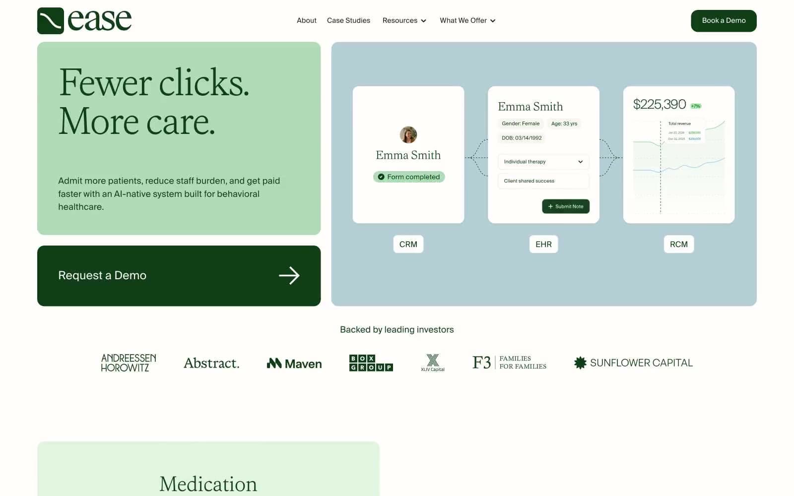
Ease Health uses a clinical-botanical language: a warm cream canvas layered with soft sage, keylime, and slate-blue panels that feel like a greenhouse rendered on paper. Typography carries the entire personality — weight 300 serif headlines (Faire Octave) paired against a humanist sans (Suisse Intl) create a hushed, editorial authority unusual for healthtech. A single deep forest green (#0f3e17) anchors every action and heading, reading like ink on watercolor. Surfaces are flat and shadowless; depth comes from layered tinted panels and generous padding, not elevation. Components are rounded (~14px) and pill-shaped for tags, keeping the whole system soft and approachable without losing clinical seriousness.
Ease Health design system

Brand4
Primary action buttons, headings, links, icon strokes — deep botanical green reads as ink, the only saturated dark in the system
Mid-tone card backgrounds and decorative washes, panel-level surfaces
Hero panel background, light card surfaces — the dominant tinted canvas tone
Accent card surfaces, soft section dividers between sage and keylime layers
Accent1
Cool counter-balance panel for product preview and feature blocks — breaks the green monotony with desaturated blue-gray
Neutrals4
Supporting palette color for small decorative accents when the core palette needs contrast. Do not promote it to the primary CTA color
Navigation text and minor UI strokes — restrained secondary ink
Hairline dividers and subtle borders throughout the layout
Page background, badge backgrounds, button text — warm off-white that softens every green
Try a pairing
Pick any two colors from the palette to check whether text stays readable on top.
Aa
Cream Paper on Forest Ink
12.10 : 1 contrast
- Body textPasses AA 4.5
- Large textPasses AA 3
- StrictPasses AAA 7
More DESIGN.md files. Same web, different personalities.

Airbnb
Brand
Aker
Brand
Alison Roman
Brand
Alpine Bio
Brand
Alveos One
Brand
Amrit Palace
Brand
André Cândido
Brand
Anna Jóna
Brand
Apollo
Brand
Apple
Brand
Arva
Brand
Ashton Bespoke
Brand


