
Duna. A single painted landscape over a quiet, editorial compliance document.
- Finance
- Light theme
- 12 colors
- 5 typefaces
Duna is a monochromatic editorial canvas warmed by a single illustrated sunset landscape — the interface stays nearly 99% achromatic, with a deep aubergine-black as both text and primary action color, replacing the blue/green convention of fintech. Components are soft and pillowy: heavily rounded corners (24px on cards and images, 999px on buttons), generous breathing room, and almost no shadow — elevation is built from hairline borders and contrast alone. The hero watercolor is the only moment of color saturation in the system, a deliberate artistic peak that frames an otherwise quiet, confident, document-like surface. Typography is GT America at restrained weights with aggressive negative tracking on display sizes, giving headlines a compressed, editorial feel rather than the wide, friendly SaaS look.
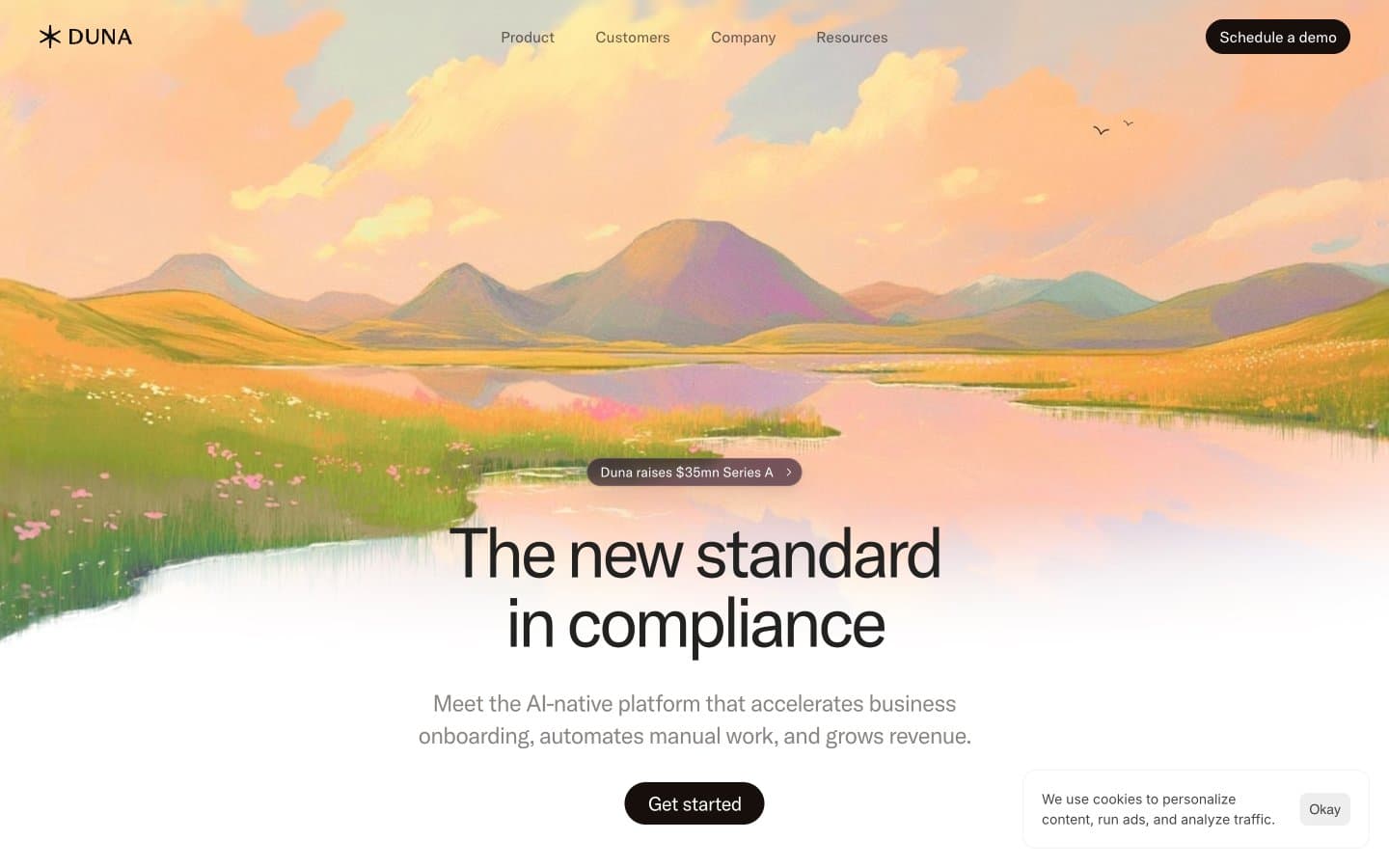
Duna design system

Brand2
Primary text, heading borders, and brand character — the slight warm-purple undertone replaces conventional near-black, giving Duna a distinctive almost-black that is neither pure black nor navy
Primary action fill — filled buttons (Get started, Schedule a demo). Slightly warmer and darker than Aubergine Ink, used exclusively for interactive surfaces that need to feel pressed-into the page
Neutrals10
Icon fills and select text instances — the deepest near-black in the scale, reserved for graphic emphasis
Icon borders, card edge cases, and dark UI elements — a warm-tinted dark for graphical components
Heading borders and dark decorative fills — a warm brown-black for borders on headings and subtle structural elements
Body text variant, icon strokes, input borders — the workhorse neutral for non-heading content
Muted secondary text and subtle borders — a desaturated warm gray that softens long-form copy without competing with the primary text
Tertiary text and dividers — a lighter warm gray for labels, metadata, and less important copy
Card surfaces and subtle elevated panels — a barely-warm cream for cards sitting on the Linen canvas
Input field background — the only functional surface tint that signals a fillable area
Warm canvas background — the off-white page tint that gives the entire system its warm, paper-like atmosphere instead of clinical pure white
Primary surface — cards, buttons, and the dominant page background
Try a pairing
Pick any two colors from the palette to check whether text stays readable on top.
Aa
Paper White on Aubergine Ink
19.12 : 1 contrast
- Body textPasses AA 4.5
- Large textPasses AA 3
- StrictPasses AAA 7
More DESIGN.md files. Same web, different personalities.
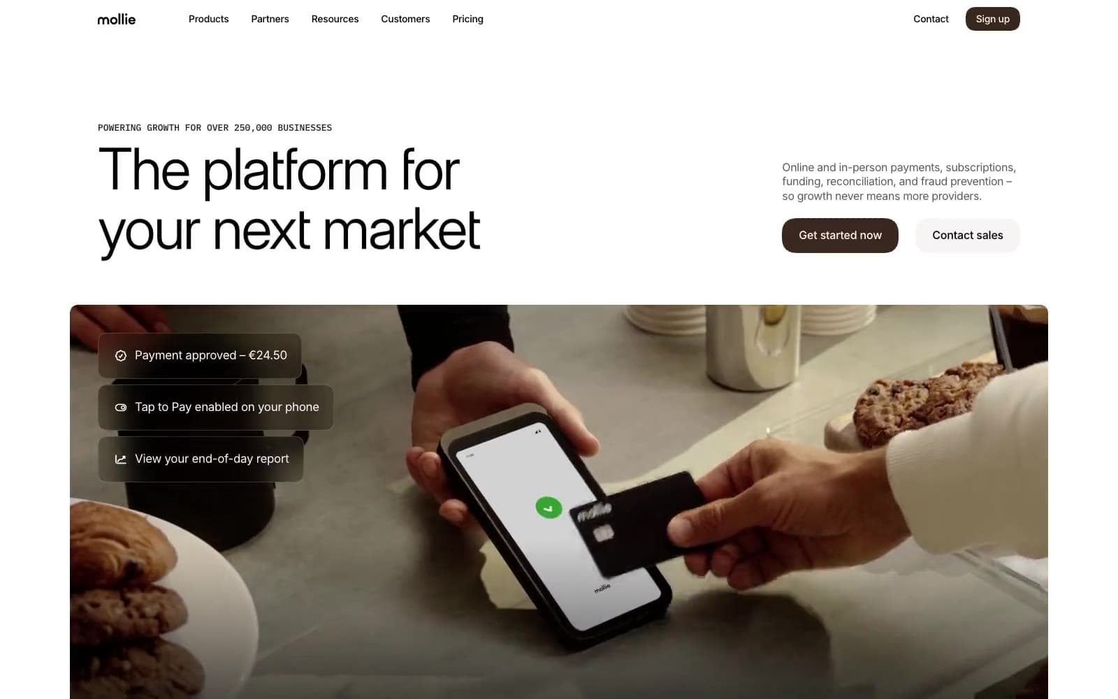
Mollie
Finance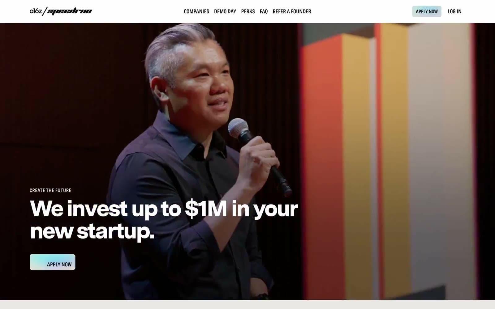
a16z speedrun
Finance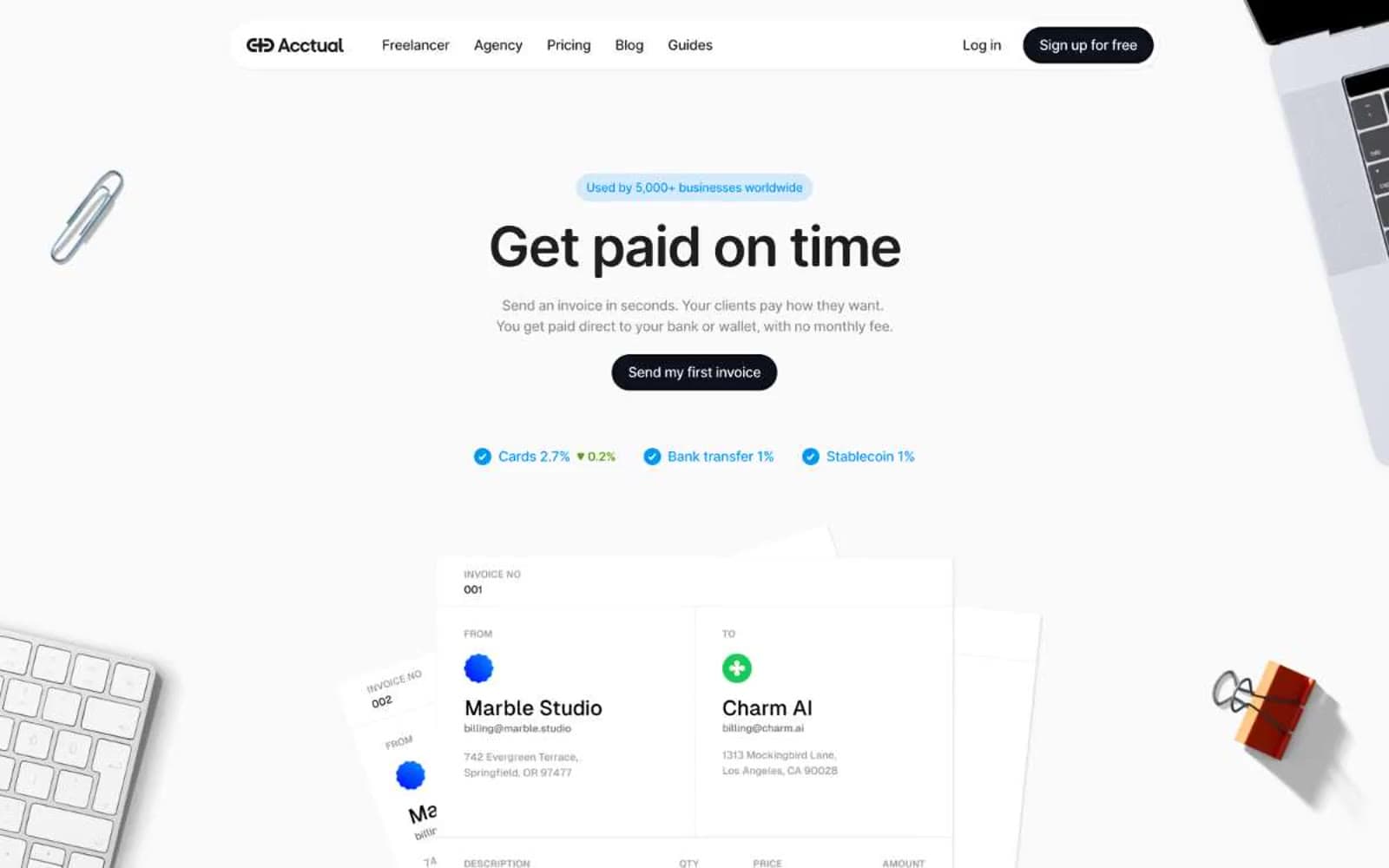
Acctual
Finance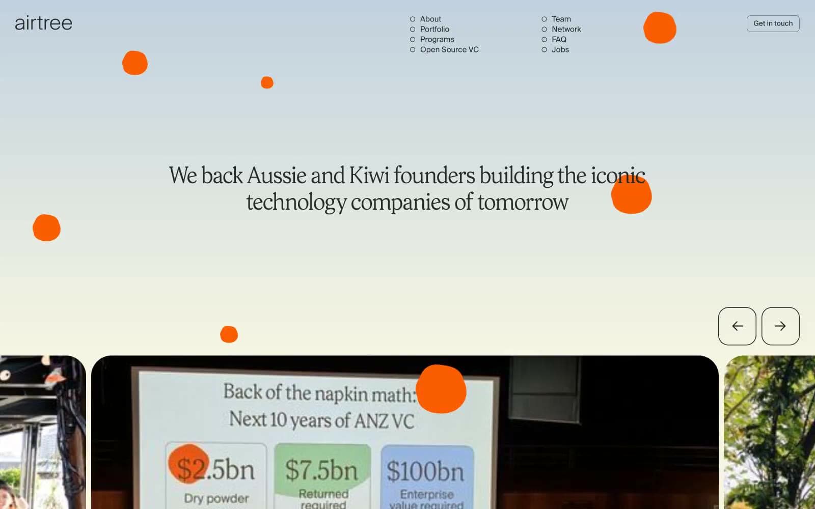
Airtree
Finance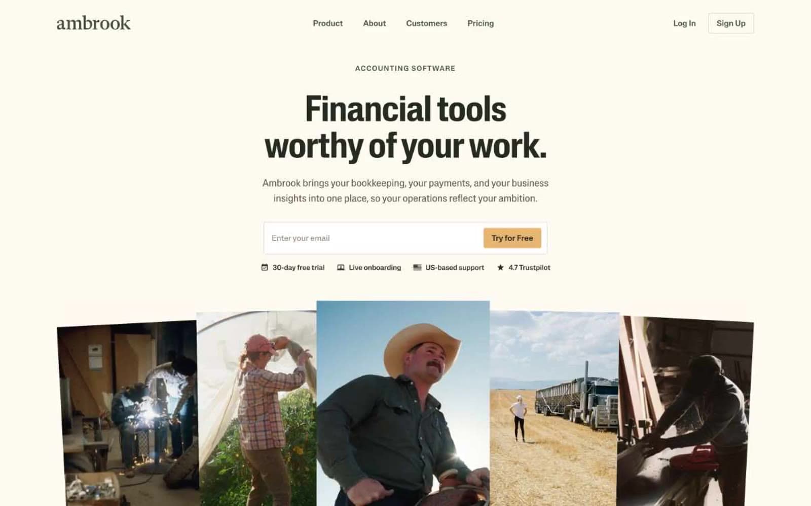
Ambrook
Finance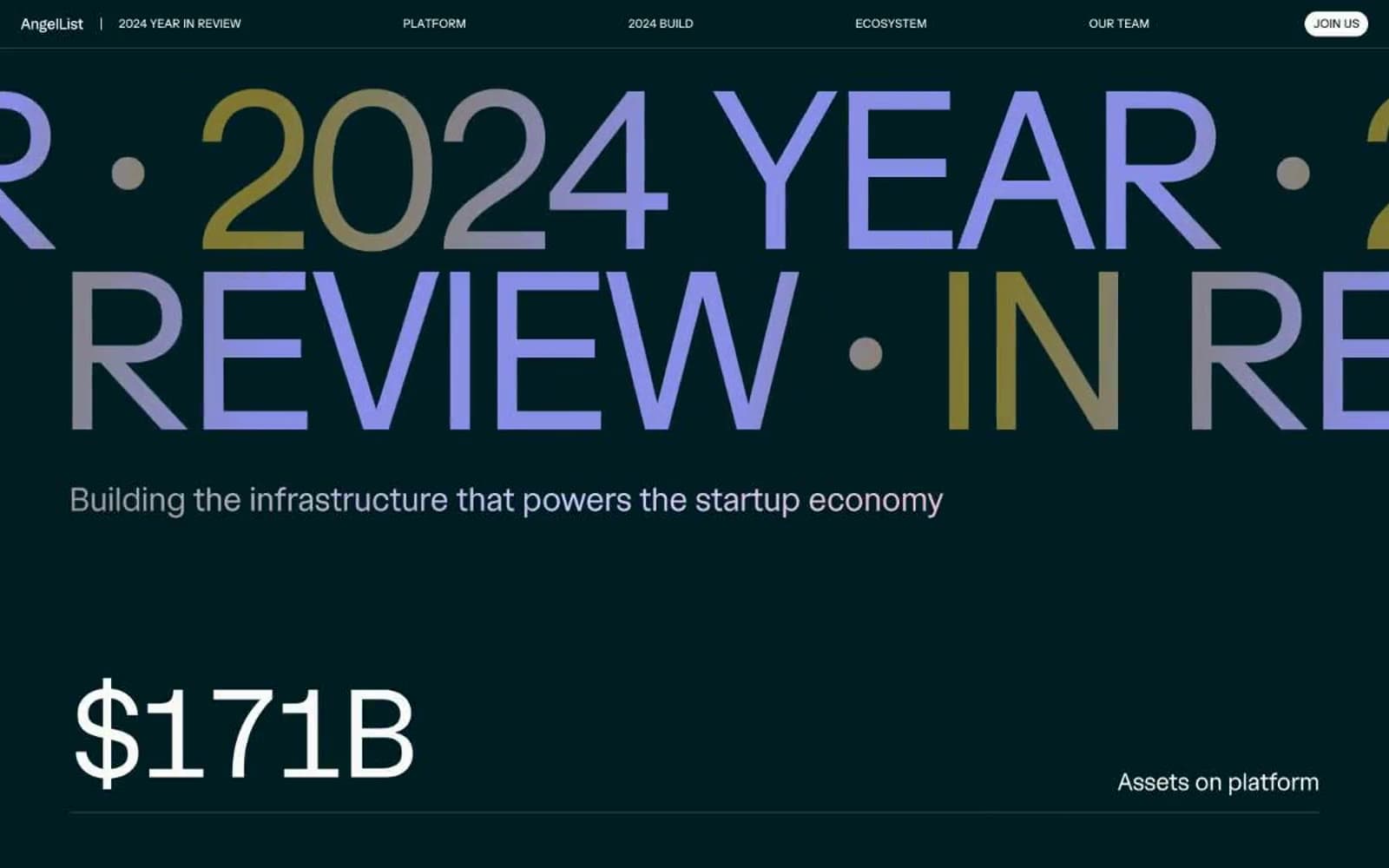
Angellist 2024
Finance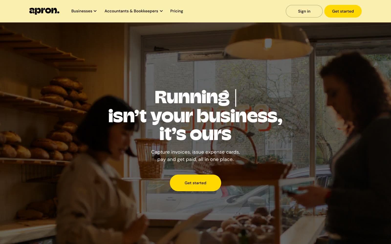
Apron
Finance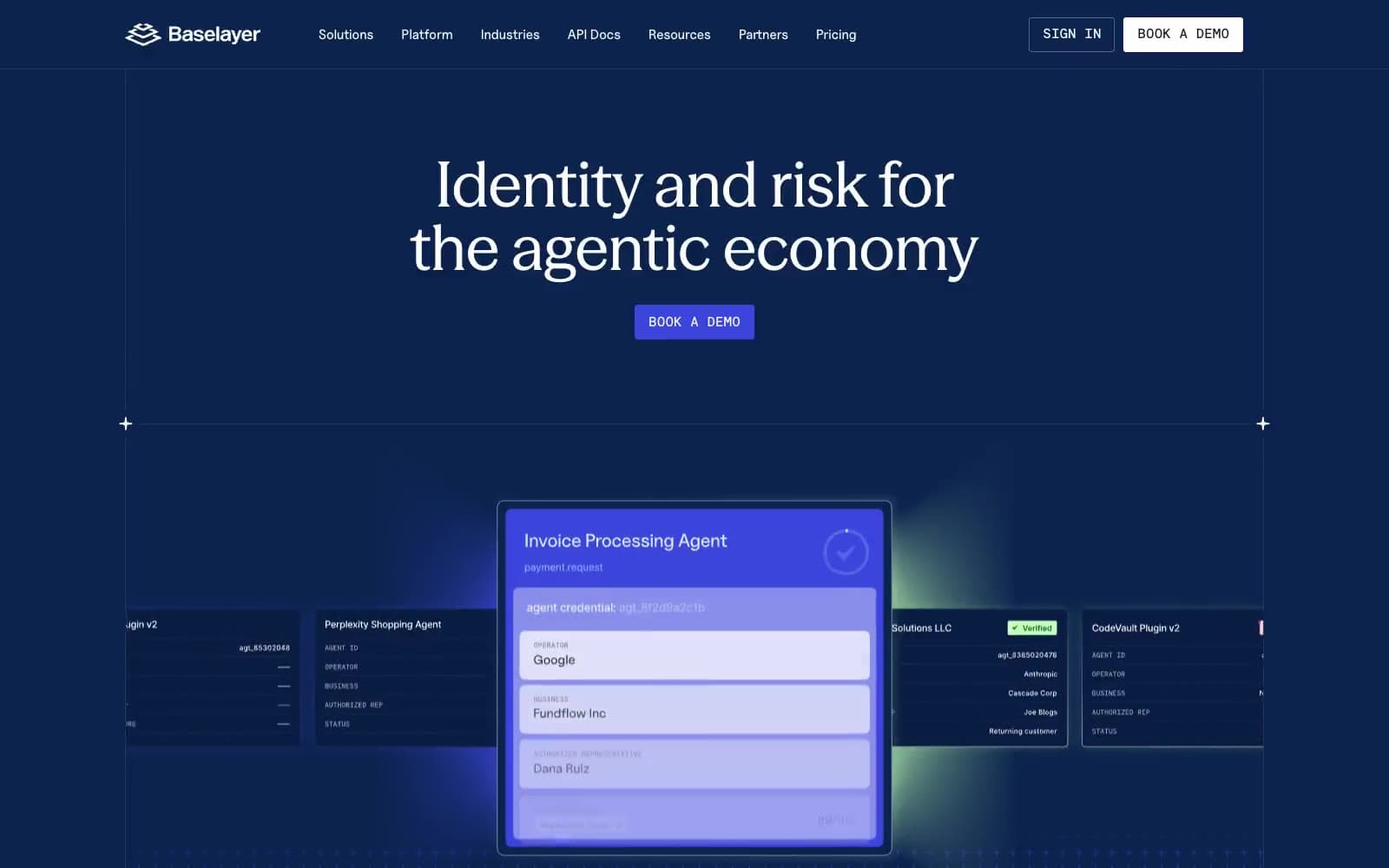
Baselayer
Finance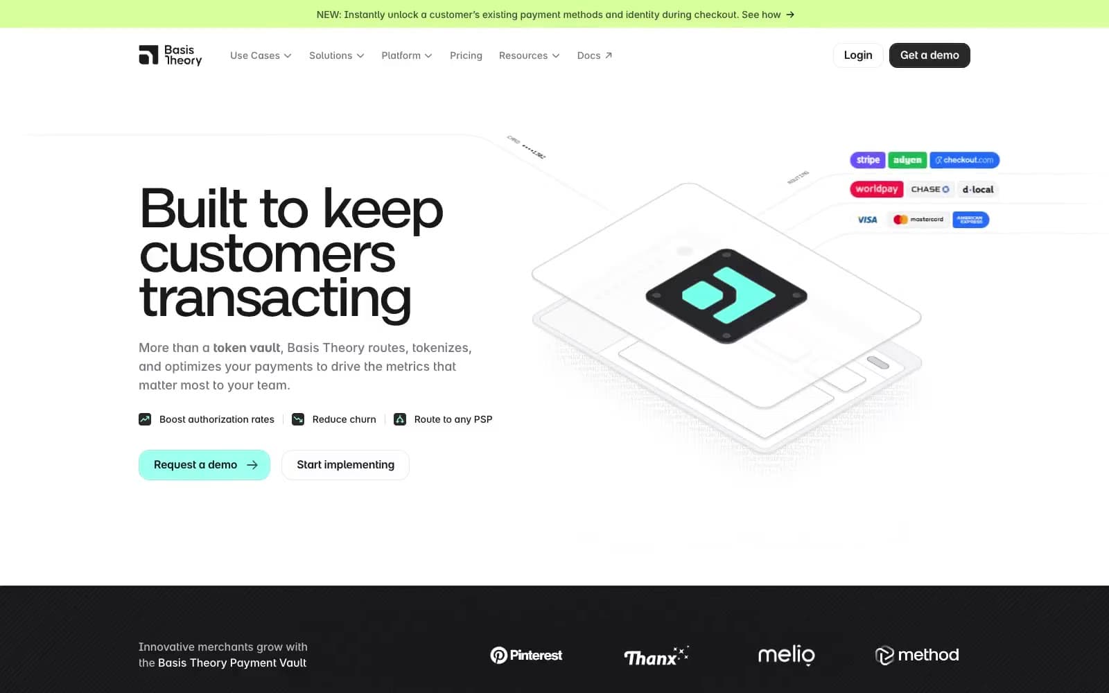
Basis Theory
Finance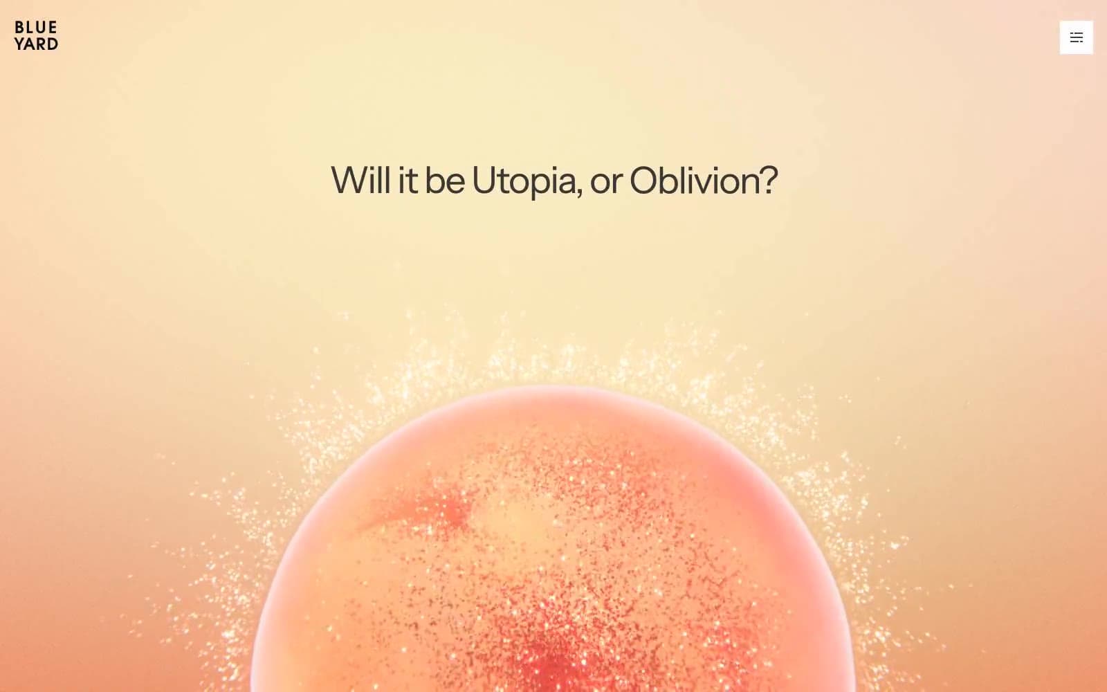
BlueYard Capital
Finance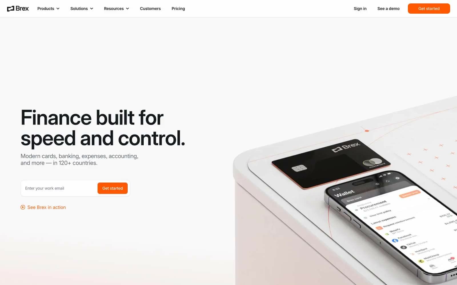
Brex
Finance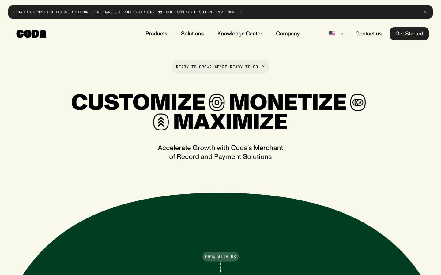
Coda
Finance


