
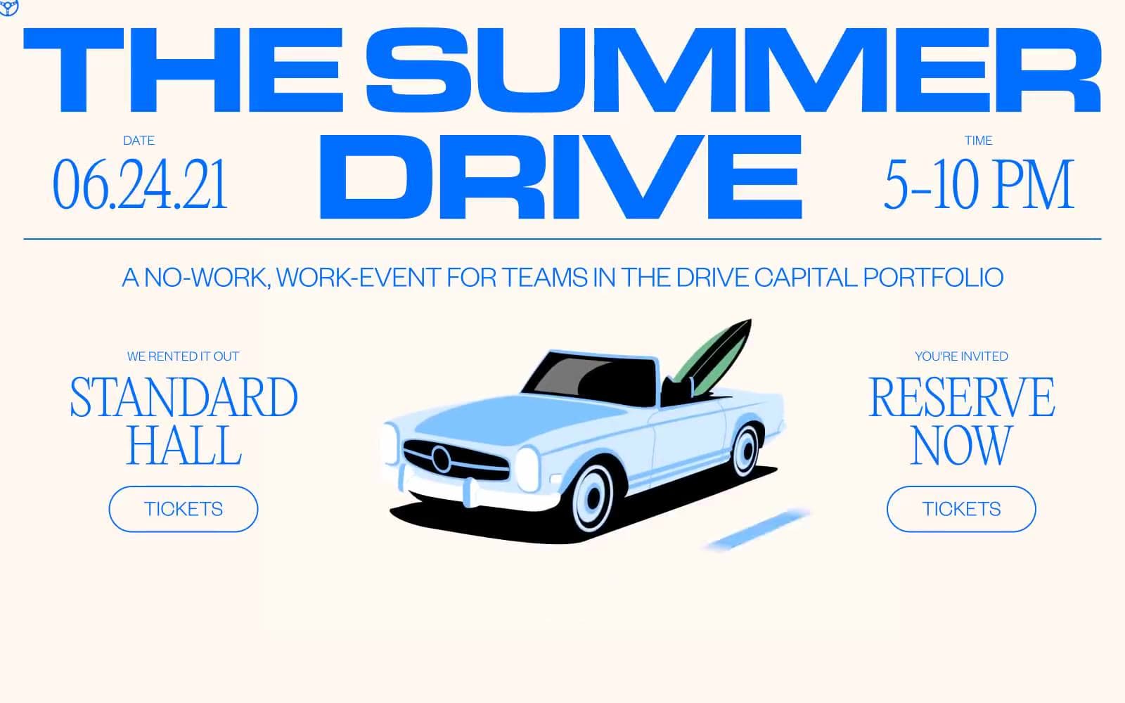
Drive Capital. Retro road-trip poster on warm paper.
- Finance
- Light theme
- 4 colors
- 2 typefaces
Drive Capital's Summer Drive is an editorial event-poster system built on a warm cream canvas and a single electric blue accent. The type pairing is the soul: a hairline didone serif (Editorial New at weight 100) delivers monumental headlines at 77–120px, while a low-weight grotesk (Founders Grotesk 300/400) handles everything else with quiet confidence. Tracking is uniformly tight at -0.02em, giving even body text a compressed, magazine-grade feel. Surfaces are flat — no shadows, no gradients — with hairline gray (#e2e8f0) dividers doing the structural work. Buttons are 60px-radius pills, always outlined in blue, never filled. The overall rhythm is generous: 144px page margins, 150px section padding, with body copy in a narrow column. The result reads like a printed invite dropped into a browser — warm, confident, and deliberately minimal.
Drive Capital design system

Brand1
Blue accent for outlined action borders, linked labels, and lightweight interactive emphasis. Do not promote it to the primary CTA color
Neutrals3
Body text, fine illustration strokes, icon fills
Hairline dividers, card borders, rule lines, neutral button outlines
Page background, card surfaces, button text on filled variants
Try a pairing
Pick any two colors from the palette to check whether text stays readable on top.
Aa
Ink on Voltage Blue
4.67 : 1 contrast
- Body textPasses AA 4.5
- Large textPasses AA 3
- StrictFails AAA 7
More DESIGN.md files. Same web, different personalities.

Mollie
Finance
a16z speedrun
Finance
Acctual
Finance
Airtree
Finance
Ambrook
Finance
Angellist 2024
Finance
Apron
Finance
Baselayer
Finance
Basis Theory
Finance
BlueYard Capital
Finance
Brex
Finance
Coda
Finance


