
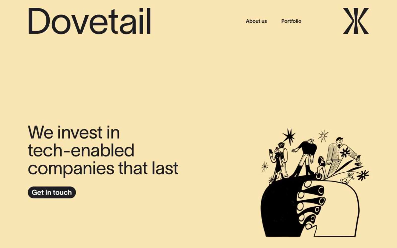
Dovetail. Cream-paper editorial magazine on a sunlit table.
- Finance
- Light theme
- 5 colors
- 1 typeface
Dovetail reads like a printed editorial spread digitized — warm cream canvases, near-black ink, and a single buttery yellow accent that functions as a mood rather than a brand color. Typography is confidently oversized (72px display headlines) yet tightly tracked, giving the site a literary weight without heaviness. The signature visual device is the pill-shaped capability tag (91px radius), used as a stacking motif on the right rail. Components are flat: filled near-black buttons, ghost text links, and 16px-radius photo cards. Imagery alternates between detailed monochrome editorial illustration and full-color photography, with no shadows, gradients, or decorative effects — separation happens through whitespace and hairline borders.
Dovetail design system

Brand1
Hero and section canvas — the warm cream that defines the entire brand atmosphere
Neutrals4
Illustration strokes, icon fills, and SVG detail work — only the darkest graphic elements
Primary text, filled buttons, and the dark surface that anchors contrast — softer than pure black, warm against the cream
Hairline borders, image outlines, subtle dividers, and neutral tag fills — the structural neutral that separates every section
Card surfaces, secondary text on dark, and the lighter off-white that sits above the cream canvas
Try a pairing
Pick any two colors from the palette to check whether text stays readable on top.
Aa
True Black on Butter Cream
16.87 : 1 contrast
- Body textPasses AA 4.5
- Large textPasses AA 3
- StrictPasses AAA 7
More DESIGN.md files. Same web, different personalities.

Mollie
Finance
a16z speedrun
Finance
Acctual
Finance
Airtree
Finance
Ambrook
Finance
Angellist 2024
Finance
Apron
Finance
Baselayer
Finance
Basis Theory
Finance
BlueYard Capital
Finance
Brex
Finance
Coda
Finance


