
(dot)connect. Swiss engineering blueprint with a single ember.
- Brand
- Light theme
- 7 colors
- 2 typefaces
(dot)connect operates as a Swiss-engineering canvas: a warm off-white stage (#fcfbf8) where a single near-black ink (#001011) does almost all the work, and a vivid orange (#fd5321) appears only as deliberate punctuation — never decoration. The typographic signature is extreme: headlines balloon to 72-101px with aggressive negative tracking (-0.025em), creating a display voice that feels architectural rather than marketing-soft. Components are softly rounded (20-24px radii on cards and buttons), never sharp, never heavy — elevation is implied through hairline borders and tonal surface shifts, not shadows. The system reads as 'engineering blueprint with a pulse of fire': monochromatic discipline broken by one warm chromatic gesture per viewport.
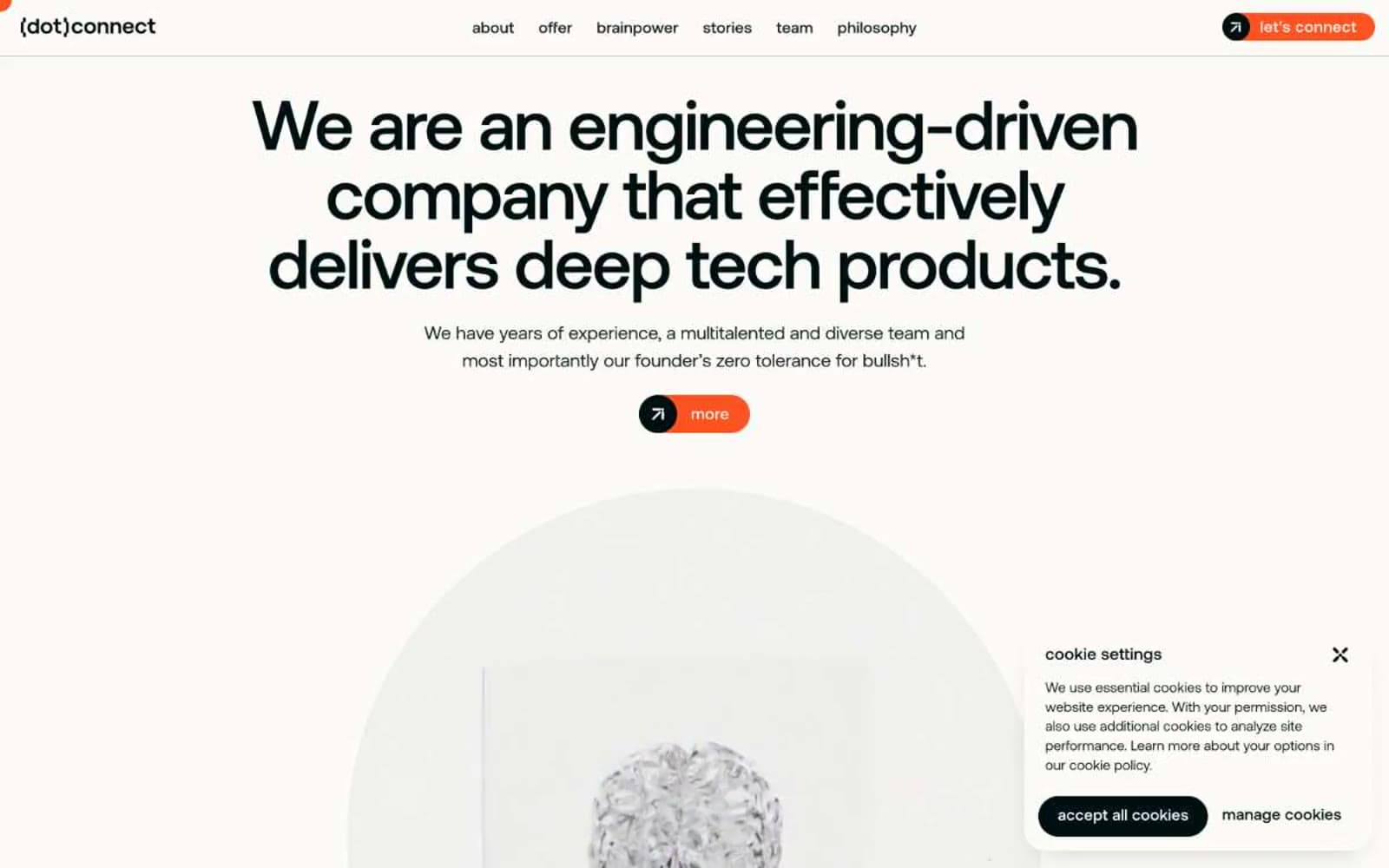
(dot)connect design system

Brand1
Orange wash for highlight backgrounds, decorative bands, and soft emphasis behind content. Do not promote it to the primary CTA color
Accent1
Outlined action border for secondary interactive elements — ghost-button strokes only, never filled
Neutrals5
Primary text, headings, primary action fill, dominant borders — near-black with a barely-perceptible cool tint that distinguishes it from pure #000
Secondary text and borders for body-level elements — a half-step lighter than Charcoal for visual hierarchy without contrast loss
Hairline borders, dividers, section separators — barely visible structural lines
Elevated card backgrounds, subtle surface differentiation, hover states — a warm gray that complements the bone canvas without going cold
Primary page background, card surfaces, light text on dark — warm off-white reads as paper, not screen
Try a pairing
Pick any two colors from the palette to check whether text stays readable on top.
Aa
Charcoal Ink on Ember
5.95 : 1 contrast
- Body textPasses AA 4.5
- Large textPasses AA 3
- StrictFails AAA 7
More DESIGN.md files. Same web, different personalities.

Airbnb
Brand
Aker
Brand
Alison Roman
Brand
Alpine Bio
Brand
Alveos One
Brand
Amrit Palace
Brand
André Cândido
Brand
Anna Jóna
Brand
Apollo
Brand
Apple
Brand
Arva
Brand
Ashton Bespoke
Brand


