
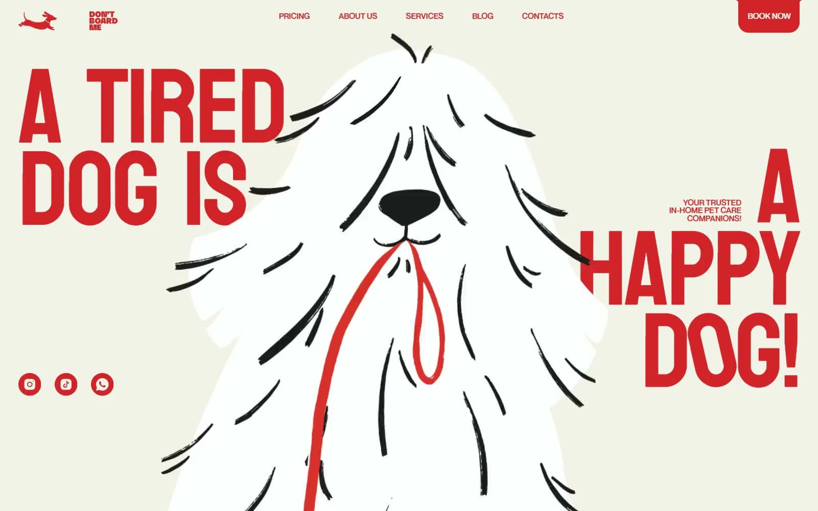
Don't Board Me. Red leash on bubblegum paper.
- Brand
- Light theme
- 15 colors
- 2 typefaces
Don't Board Me is a pet-sitting site styled like a children's picture book shouted through a megaphone. A cream hero hands over to long bubblegum-pink #f4ced3 fields stacked with huge pale circles, then cools into a sky-blue #afd8fb contact and pricing run and ends on a bone-white footer. Almost every word is Leash Red #e33529: Bayon capitals at 206–326px with a 0.78 line-height and roughly -2% tracking jam whole lines edge to edge, while tiny uppercase Neue Montreal 500 labels sit beside them. Pool Blue #2b6786 takes over on the blue sections, tennis-ball yellow #fff500 bounces across as decoration, and controls are fat rotated pills with a trailing dot.
Don't Board Me design system

Brand1
Display capitals, nav links, logo, filled pills, social discs and footer links — one loud tomato red carries nearly all the type
Accent6
Headlines, pills and the pricing link card on the Sky Wash sections — the cool counterpart that replaces red once the page turns blue
Scattered tennis-ball illustrations, the preloader ball and step markers — pure decoration, never text or a button fill
Full-bleed background of the contact, pricing and Instagram-strip sections, where Pool Blue type takes over
Titles, numerals and captions on the four how-it-works process cards — a warm brown that sets the cards apart from the red page
The circular arrow button inside the Pool Blue pricing-page card
Lower illustration panels of the process cards, stepping from #e6dfe7 to this deepest lilac across the four steps
Neutrals8
Hero canvas behind the shaggy-dog illustration and the giant red headline
Pricing cards, the big tennis-ball circles and pill labels — the warm off-white used for everything set on top of colour
Main page background through the services, process and care sections — the pink that defines the site
Oversized background circles and arcs that sit one step deeper than Bubblegum Canvas, plus the preloader screen
The round About Us link disc under the intro copy — the deepest pink in the ramp
Footer, the Instagram photo wall and process-card bodies — a pinkish bone white that closes the page
Fill of the big hand-drawn dog illustrations, the brightest surface on the page
Brushy outline strokes and the nose of the hero dog — the only near-black, kept to illustration
Try a pairing
Pick any two colors from the palette to check whether text stays readable on top.
Aa
#111111 on Leash Red
4.32 : 1 contrast
- Body textFails AA 4.5
- Large textPasses AA 3
- StrictFails AAA 7
More DESIGN.md files. Same web, different personalities.
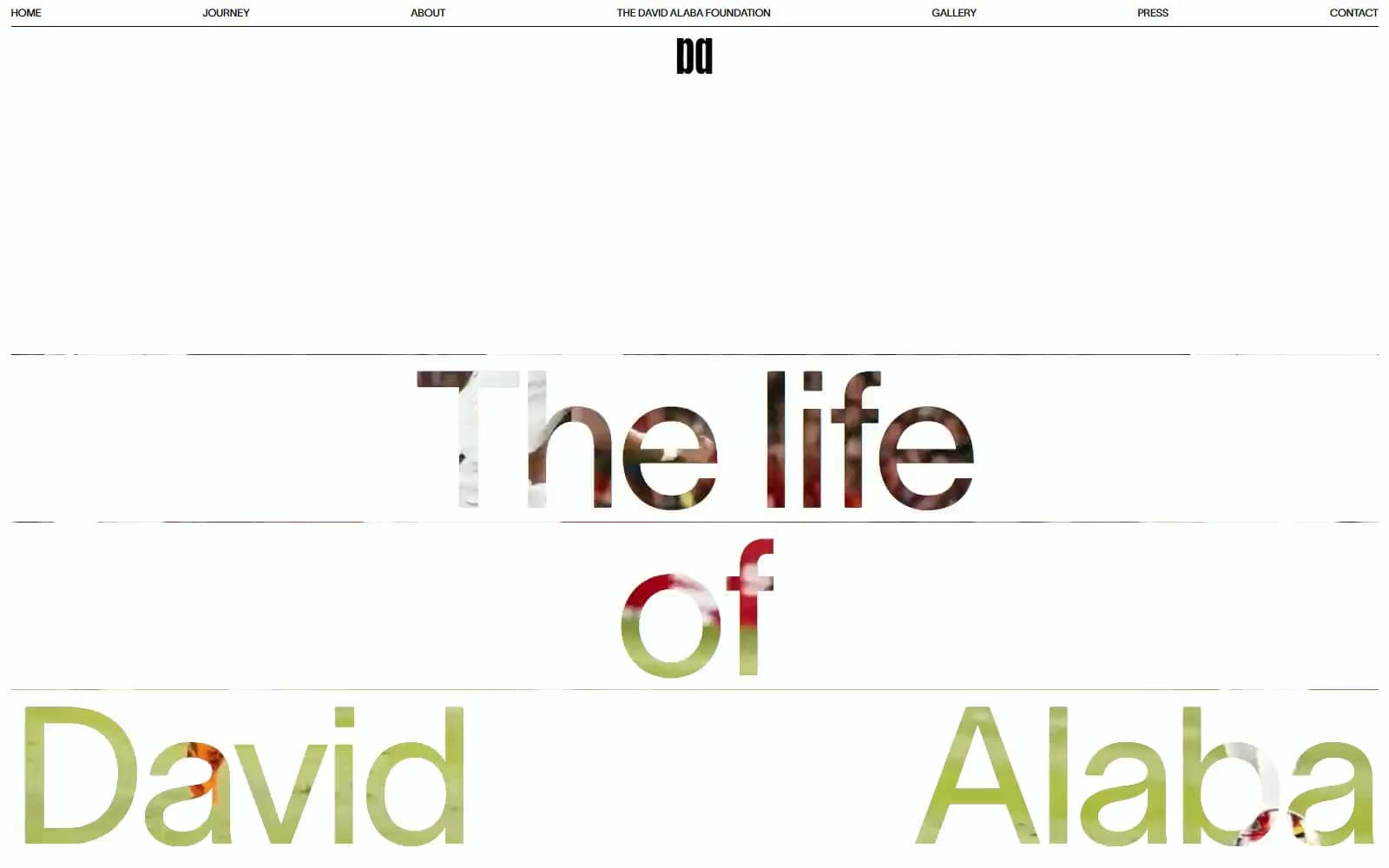
David Alaba
Brand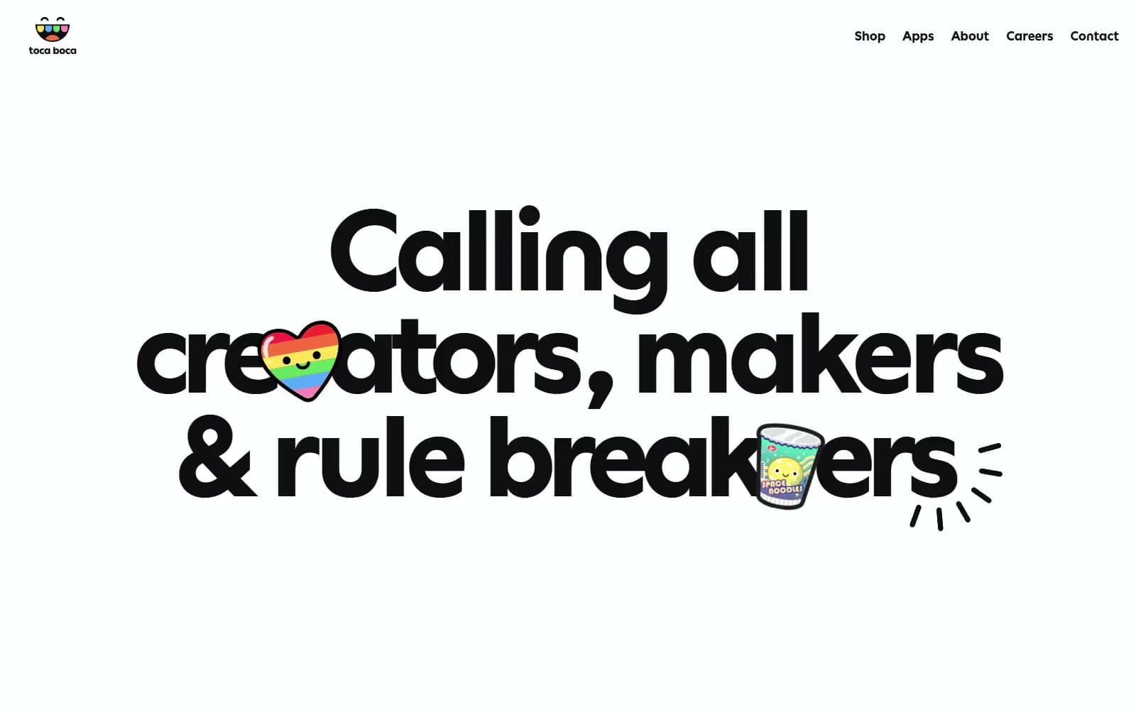
Toca Boca
Brand
Airbnb
Brand
Aker
Brand
Alison Roman
Brand
Alpine Bio
Brand
Alveos One
Brand
Amrit Palace
Brand
André Cândido
Brand
Anna Jóna
Brand
Apollo
Brand


