
Daylit. A modern ledger rewritten for the AI era.
- Finance
- Light theme
- 17 colors
- 3 typefaces
Daylit operates in a warm, candlelit fintech vernacular — a parchment-ivory canvas (#fbf9f6) replaces the cold white norm, and a single deep burgundy (#4d1520) does all the heavy lifting as text, borders, and the primary action fill. Pale lemon (#faffa7) acts as a secondary highlight accent that appears in decorative illustration blocks, testimonial card borders, and badge fills, keeping the palette to roughly two chromatic anchors. Type is large, confident, and tightly tracked — display sizes push to 76–85px with aggressive negative letter-spacing, giving headlines a sculptural, almost editorial quality. Components are flat and low-elevation: hairline warm borders, a 6px default radius, and a single brand-tinted shadow reserved for hero-scale elevation. The overall rhythm is spacious and unhurried, with generous section padding and a centered max-width reading column that feels like a well-typeset annual report rather than a dense SaaS dashboard.
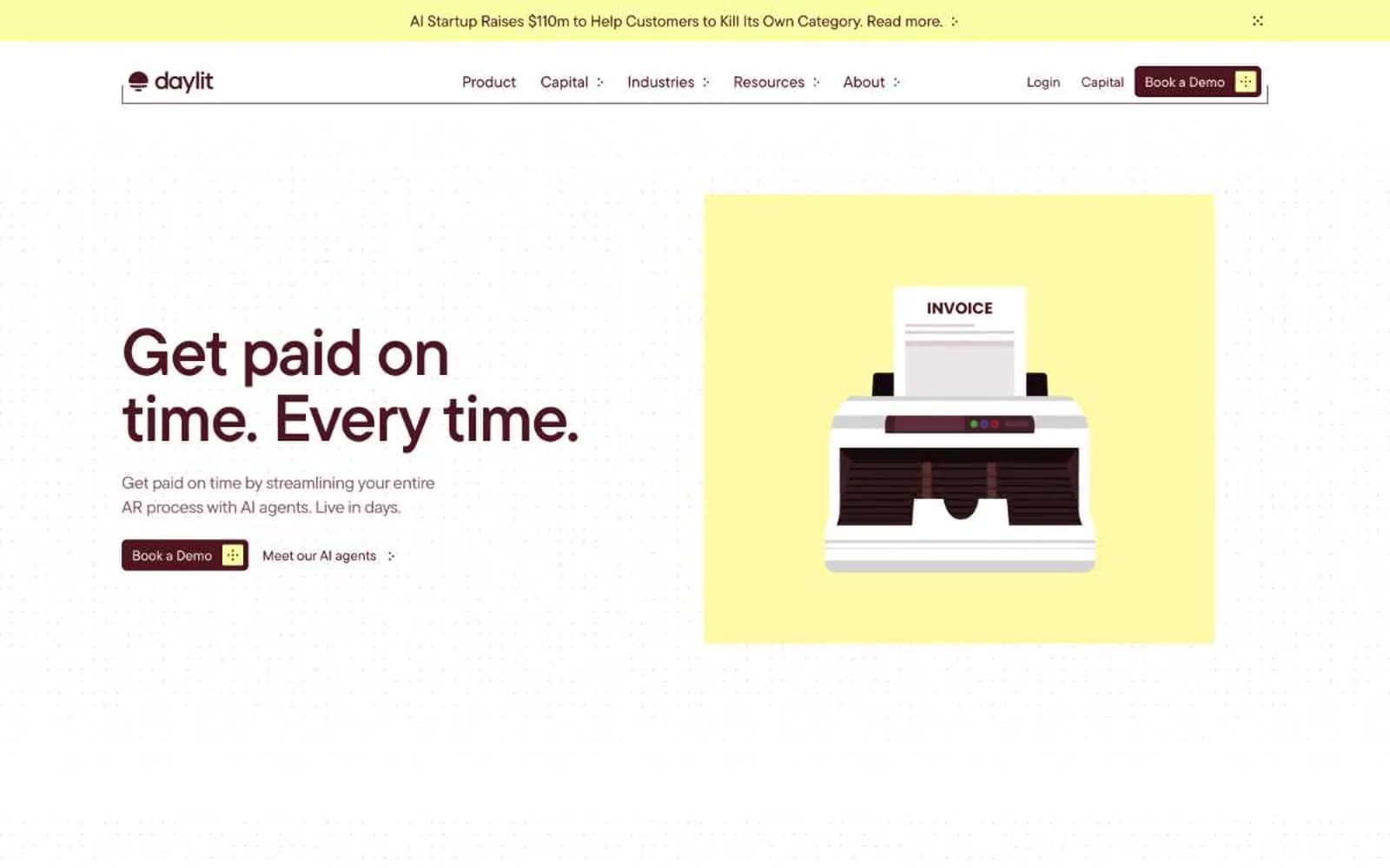
Daylit design system

Brand2
Primary text, primary filled button background, active states, heading color, card borders, and dominant brand stroke — the single chromatic anchor of the entire system
Darkest surface for footer bands and inverted panels
Accent4
Decorative accent fill and border — used in illustration blocks, testimonial card outlines, icon highlights, and soft highlight washes
Softened brand fill for secondary surfaces and SVG illustration shading
Rare saturated accent for micro-detail and decorative strokes
Muted body text and subtle borders when full brand ink would be too loud
Neutrals11
Occasional dark text and info-toned badge borders when Wine Ink would be too warm
Body secondary text, icon strokes, and helper copy — the only cool-leaning neutral
Badge and pill background for muted tag variants
Lowest-contrast neutral for decorative borders and inactive link text
Soft card border accent for warm-toned testimonial and content cards
Muted borders and secondary divider lines on cards and links
Warm card background tint used sparingly for warm-on-warm contrast
Hairline borders, dividers, ghost button outlines, and subtle UI separators
Primary page canvas — the warm ivory that replaces cold white throughout
Ultra-soft warm fill for highlight zones and subtle surface washes
Card surfaces, input fields, elevated panels — the brightest neutral layer above the parchment canvas
Try a pairing
Pick any two colors from the palette to check whether text stays readable on top.
Aa
Pure White on Wine Ink
14.55 : 1 contrast
- Body textPasses AA 4.5
- Large textPasses AA 3
- StrictPasses AAA 7
More DESIGN.md files. Same web, different personalities.
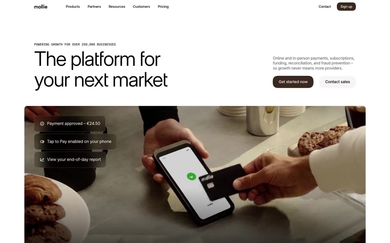
Mollie
Finance
a16z speedrun
Finance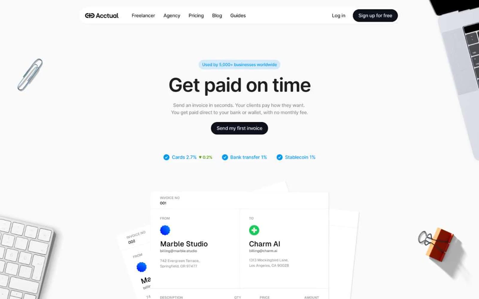
Acctual
Finance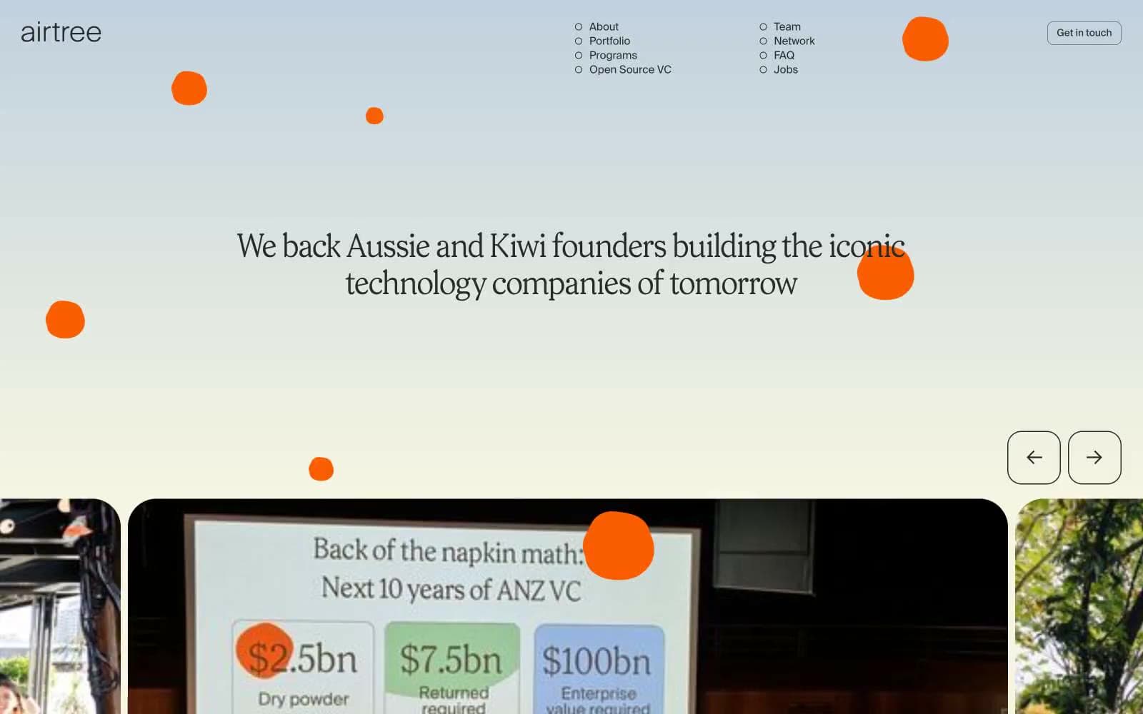
Airtree
Finance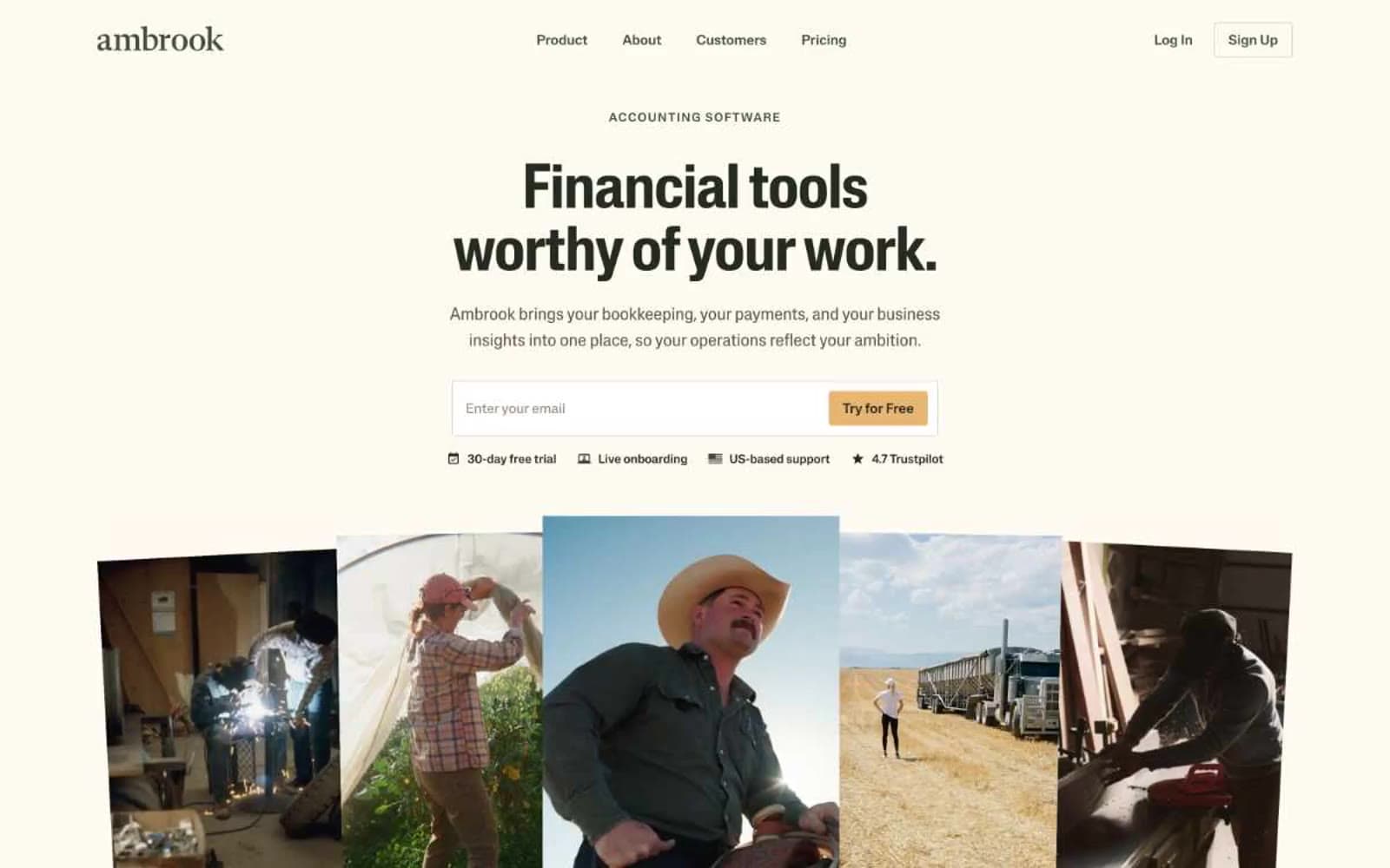
Ambrook
Finance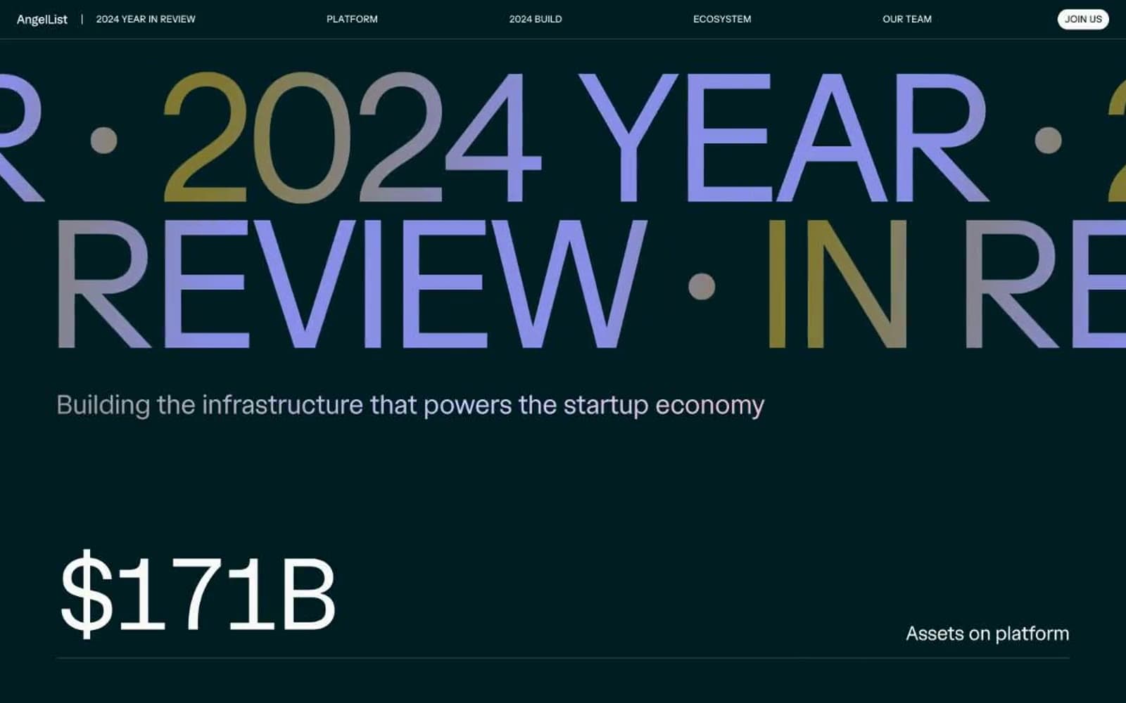
Angellist 2024
Finance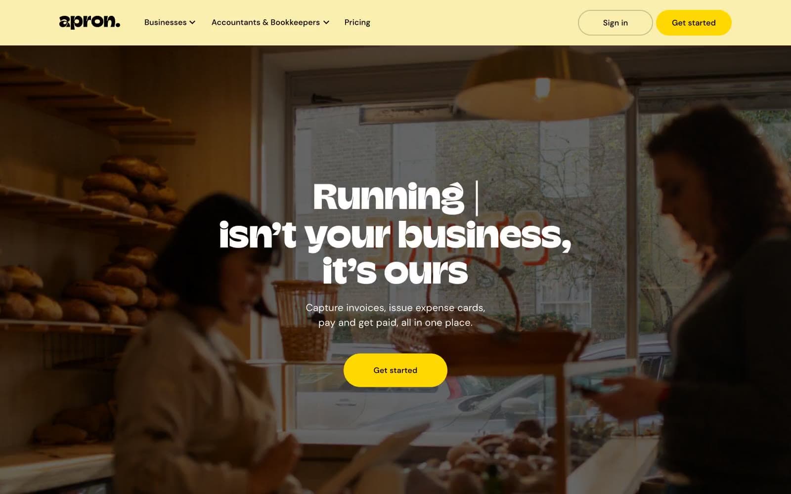
Apron
Finance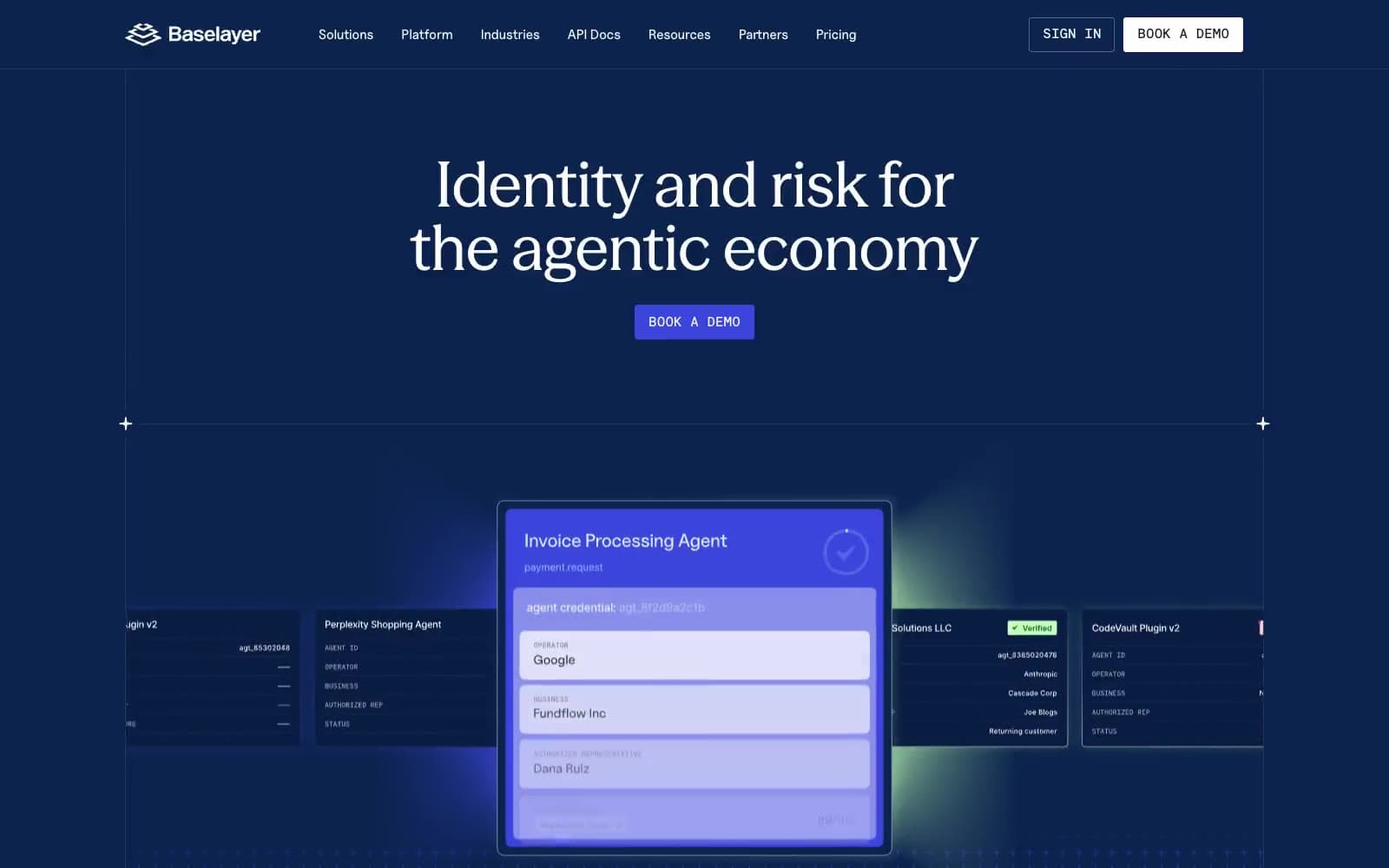
Baselayer
Finance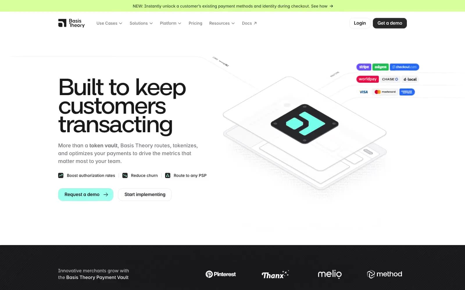
Basis Theory
Finance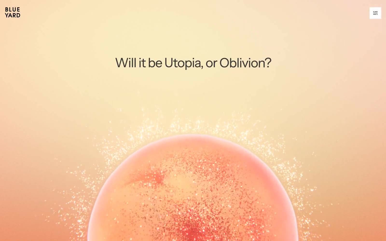
BlueYard Capital
Finance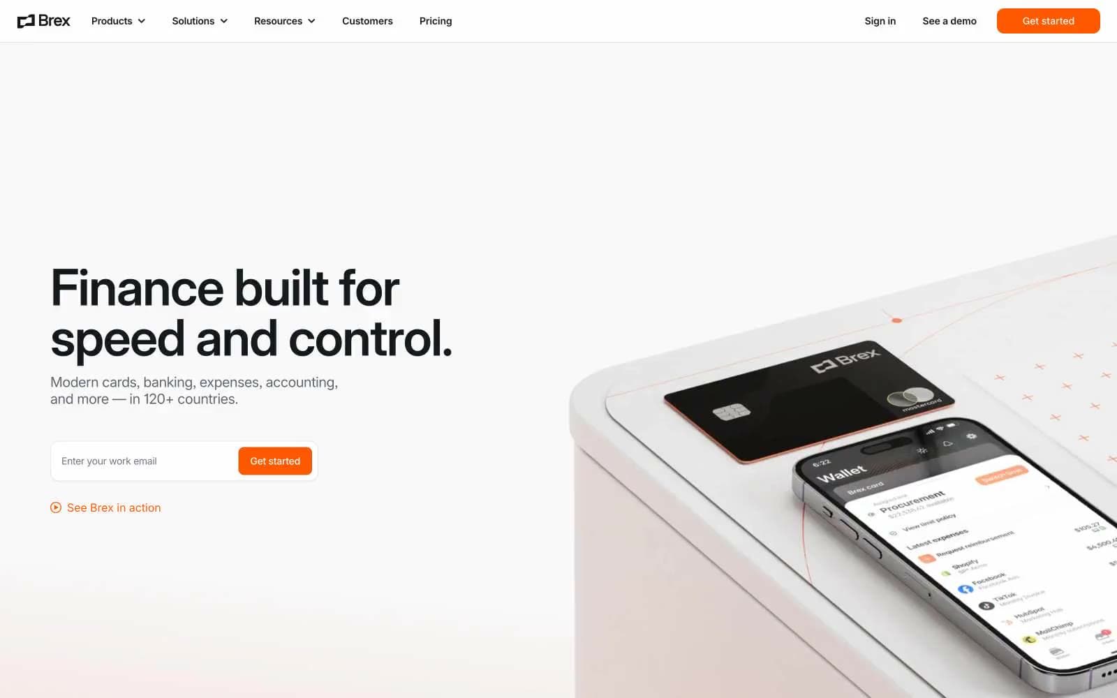
Brex
Finance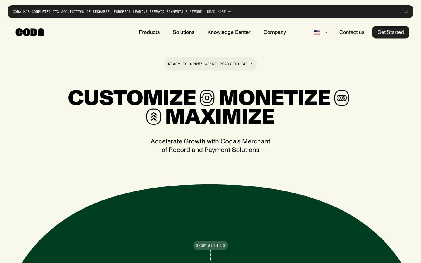
Coda
Finance


