
David Kirschberg. A darkened room where spotlit work is the only color, and the frame around it is intentionally invisible.
- Studio
- Dark theme
- 4 colors
- 2 typefaces
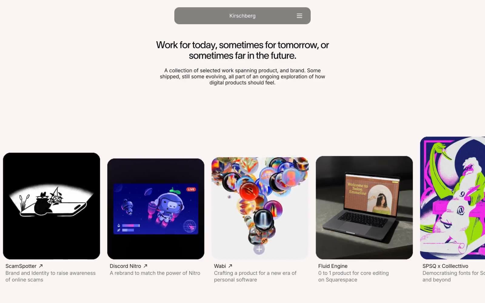
Kirschberg operates as a darkened exhibition space: a near-black canvas (#181818) with a single elevated surface (#262626) hosts colorful project work as the only chromatic event on screen. The interface is deliberately austere — Inter at weight 400 handles all text at 16-17px, while a custom display face (twkLausanne) appears at exactly 32px with aggressive -0.04em tracking for the sole headline. The signature structural shape is the 24px rounded card; there are no shadows, no gradients, and no interface accent color. The portfolio reads as a single horizontal-scroll row where the frame is engineered to disappear so the work is remembered.
David Kirschberg design system

Neutrals4
Page canvas, primary background — the dominant surface that recedes so work thumbnails advance
Elevated surface, card thumbnail backgrounds, and content containers that need to sit one level above the page
Muted secondary text, subtitles, card descriptions — one step quieter than primary text for hierarchy without color
Primary text, hero headlines, card titles — near-white that reads as soft rather than clinical against the dark canvas
Try a pairing
Pick any two colors from the palette to check whether text stays readable on top.
Aa
Bone on Obsidian
17.01 : 1 contrast
- Body textPasses AA 4.5
- Large textPasses AA 3
- StrictPasses AAA 7
More DESIGN.md files. Same web, different personalities.

Basement Studio
Studio
Production Portugal
Studio
Active Theory
Studio
Adnaut
Studio
Agence K72
Studio
Akash Tyagi
Studio
Analogue
Studio
Athletics
Studio
BAM Photographers
Studio
Bareis + Nicolaus
Studio
Becklyn
Studio
Branding
Studio


