
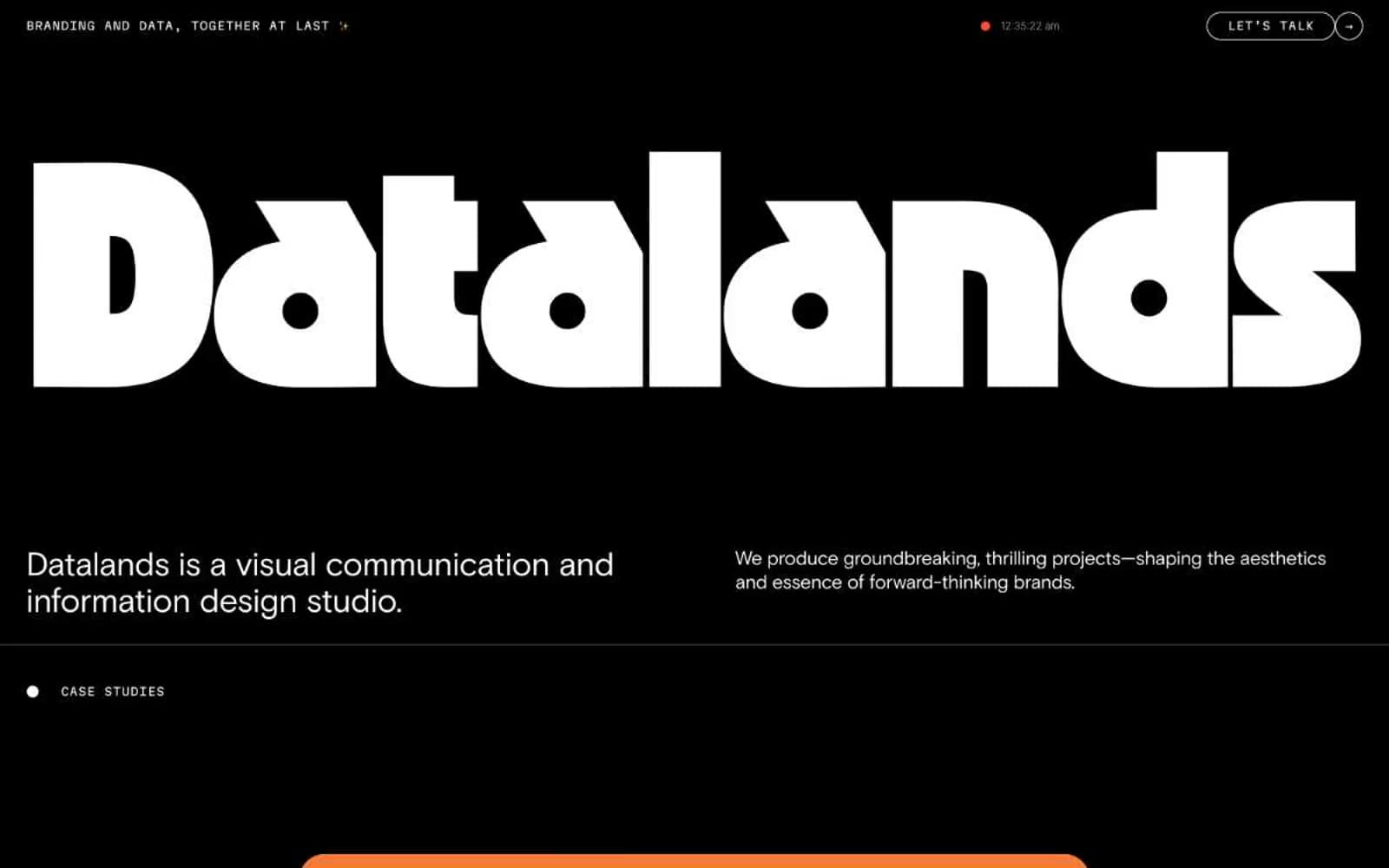
Datalands. Black cathedral with a single neon heartbeat.
- Studio
- Dark theme
- 10 colors
- 8 typefaces
Datalands is a monochrome-black studio portfolio built around a single act of typographic spectacle: an OZIK Black wordmark blown to 358px, reducing the entire brand to a shape you feel before you read. The interface is deliberately austere — pure black canvas, white text, Martian Mono for all UI chrome and labels, Basis Grotesque for body copy with aggressive negative tracking. Chromatic color appears only as punctuation: a vivid magenta #fc74dd for the primary action, a small ember-orange #ff4c33 dot ticking in the nav, and case study visuals that erupt with flat geometric color. Everything rounded — inputs, buttons, tags, and the 'LET'S TALK' CTA all use 96px+ radii, creating a soft, almost capsule-like quality that contrasts the brutalist display type. The grid breathes; sections sit 80px apart, cards carry 48px of internal padding, and the dark mode is treated as a content environment, not a surface to be layered.
Datalands design system

Brand1
Pink action color for filled buttons, selected navigation states, and focused conversion moments.
Accent2
Orange wash for highlight backgrounds, decorative bands, and soft emphasis behind content
Decorative illustration fill used in data-visualization case study artwork. Not an interface token — appears inside graphics
Neutrals7
Universal canvas, page background, default text, hairline borders, monogram fills. Pure black, no warm or cool bias — used at maximum density to let white type and color accents do all the work
Neutral form states, badge text, and quiet UI feedback where color should stay understated.
Elevated card and button-fill surfaces sitting one step above the black canvas. Slightly warm-tinted dark gray
Secondary button borders and button text — a mid-gray frame for outlined/ghost controls on dark
De-emphasized body text and subtle border work when pure white would overstate the hierarchy
Light input field background — a warm near-white that gives the rare form elements a paper-like quality against the black void
Primary headings, body copy on dark, inverse button labels, inverted card surfaces for case studies
Try a pairing
Pick any two colors from the palette to check whether text stays readable on top.
Aa
Void on Neon Magenta
8.68 : 1 contrast
- Body textPasses AA 4.5
- Large textPasses AA 3
- StrictPasses AAA 7
More DESIGN.md files. Same web, different personalities.
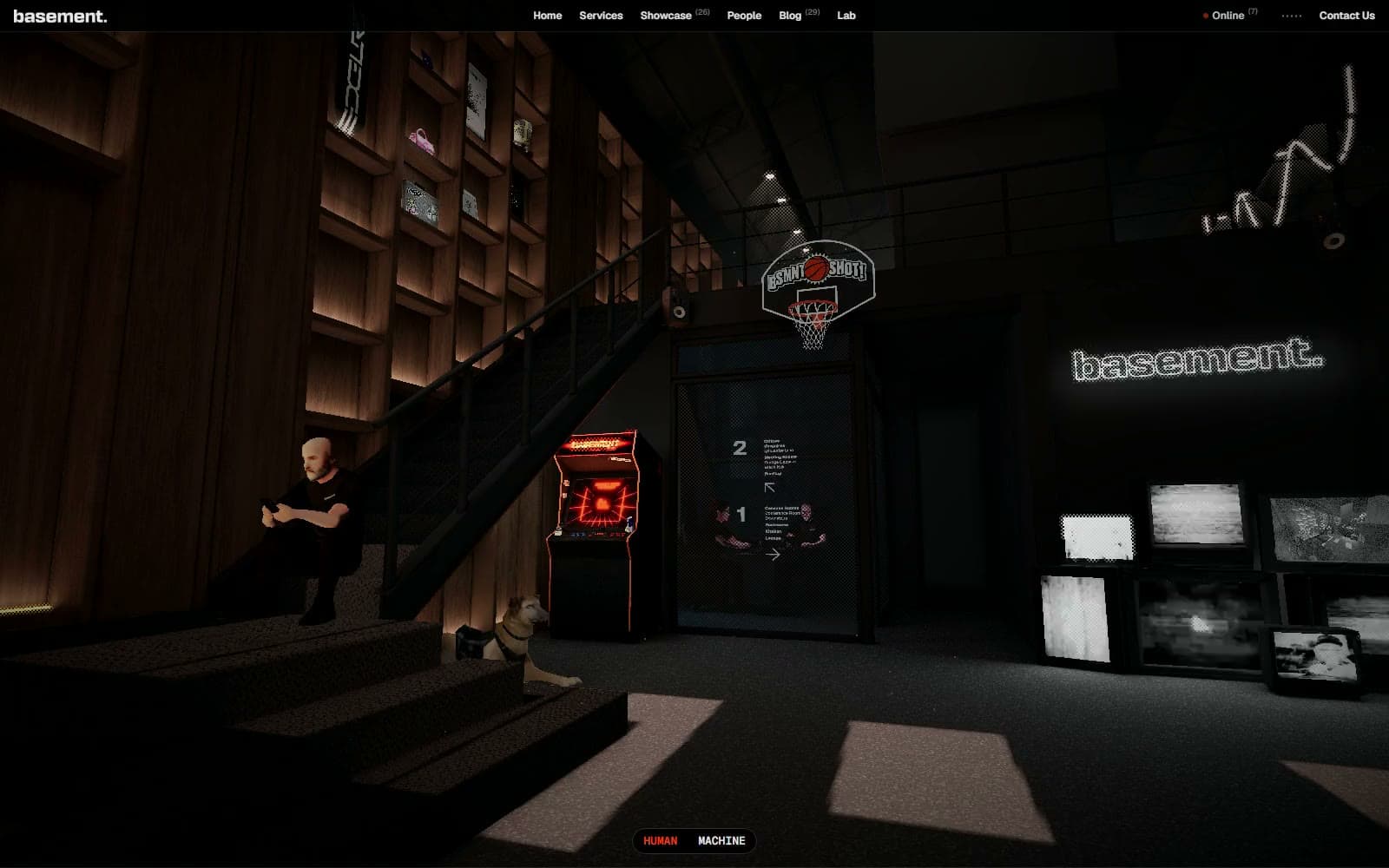
Basement Studio
Studio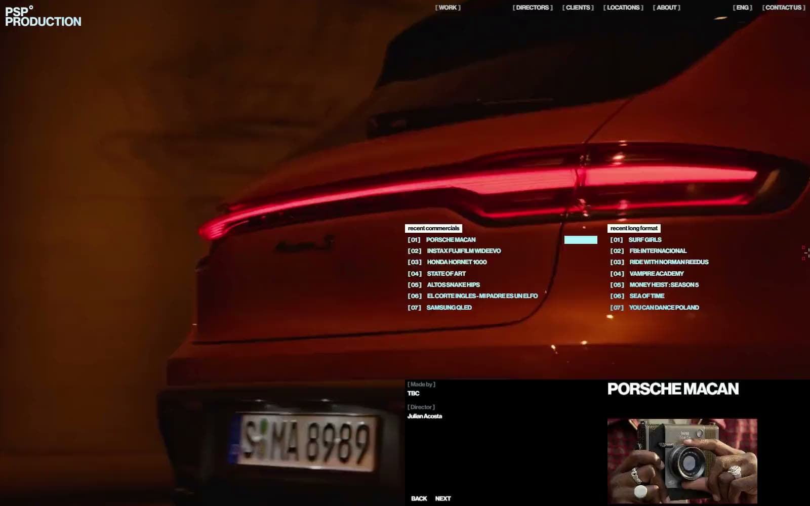
Production Portugal
Studio
Active Theory
Studio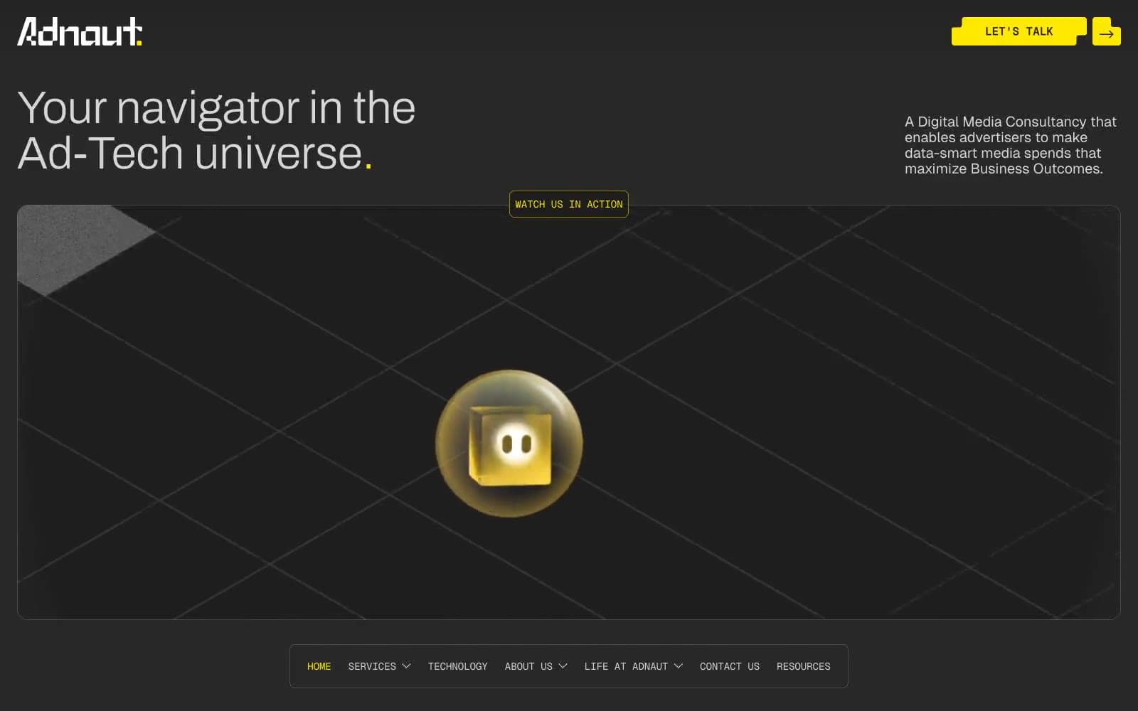
Adnaut
Studio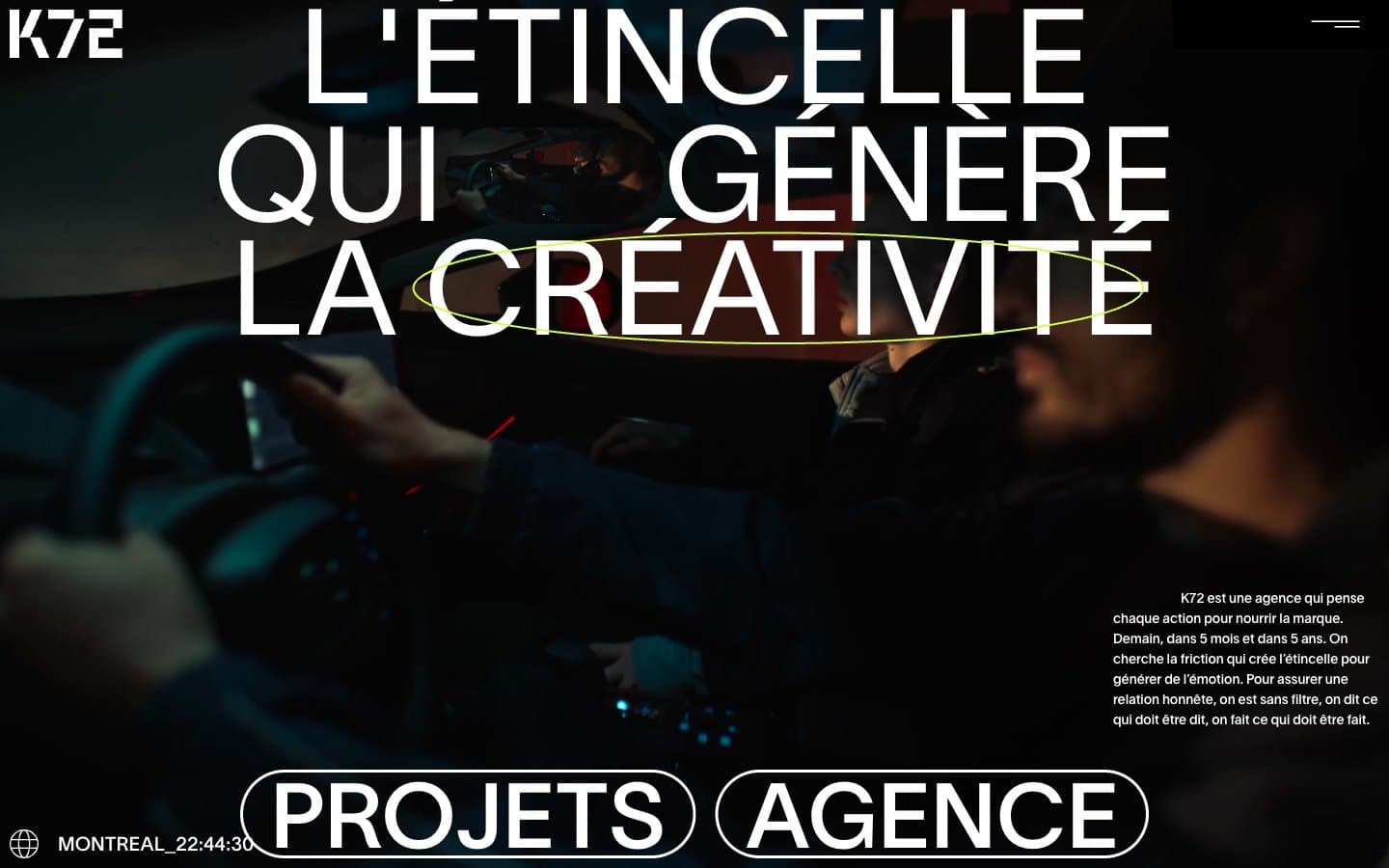
Agence K72
Studio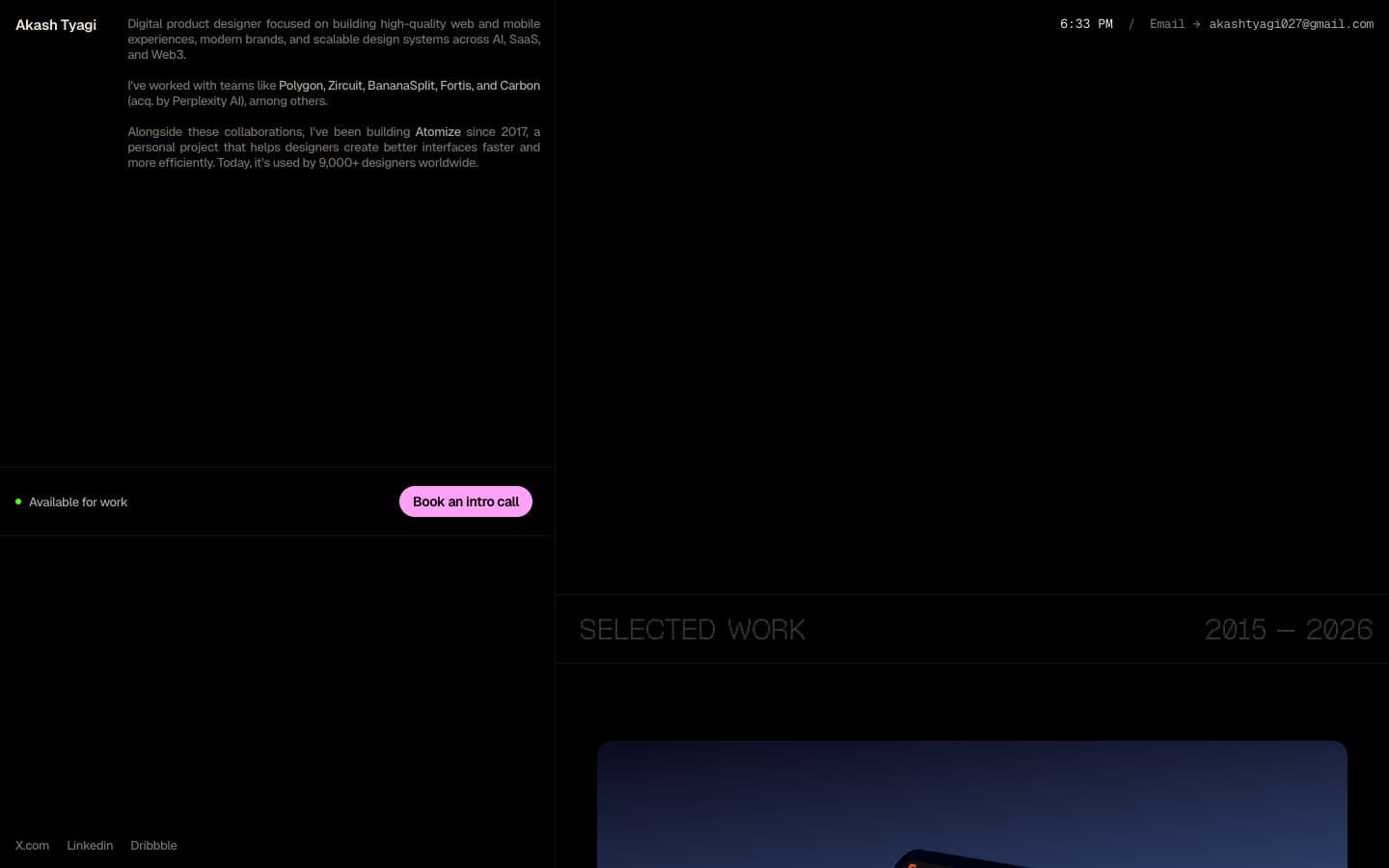
Akash Tyagi
Studio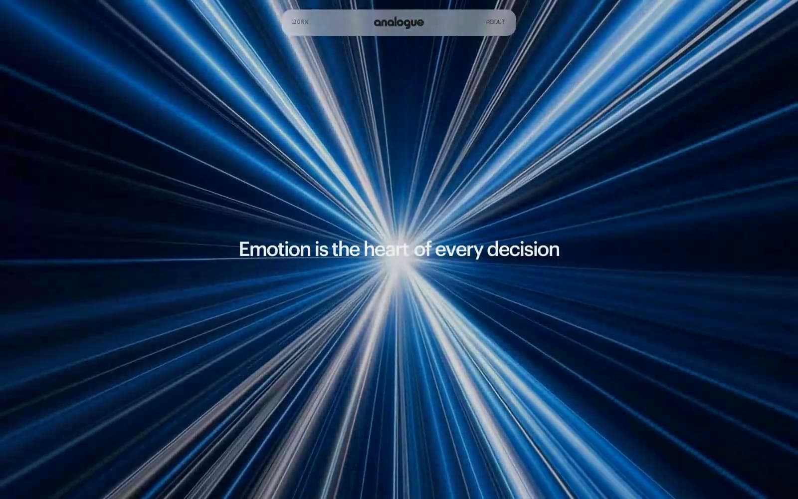
Analogue
Studio
Athletics
Studio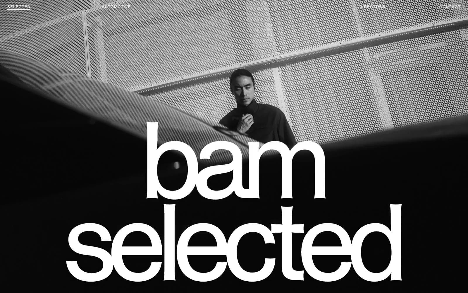
BAM Photographers
Studio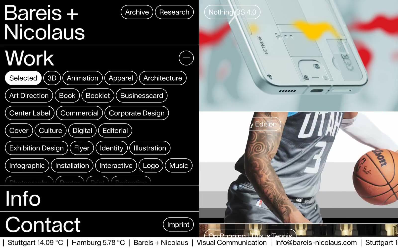
Bareis + Nicolaus
Studio
Becklyn
Studio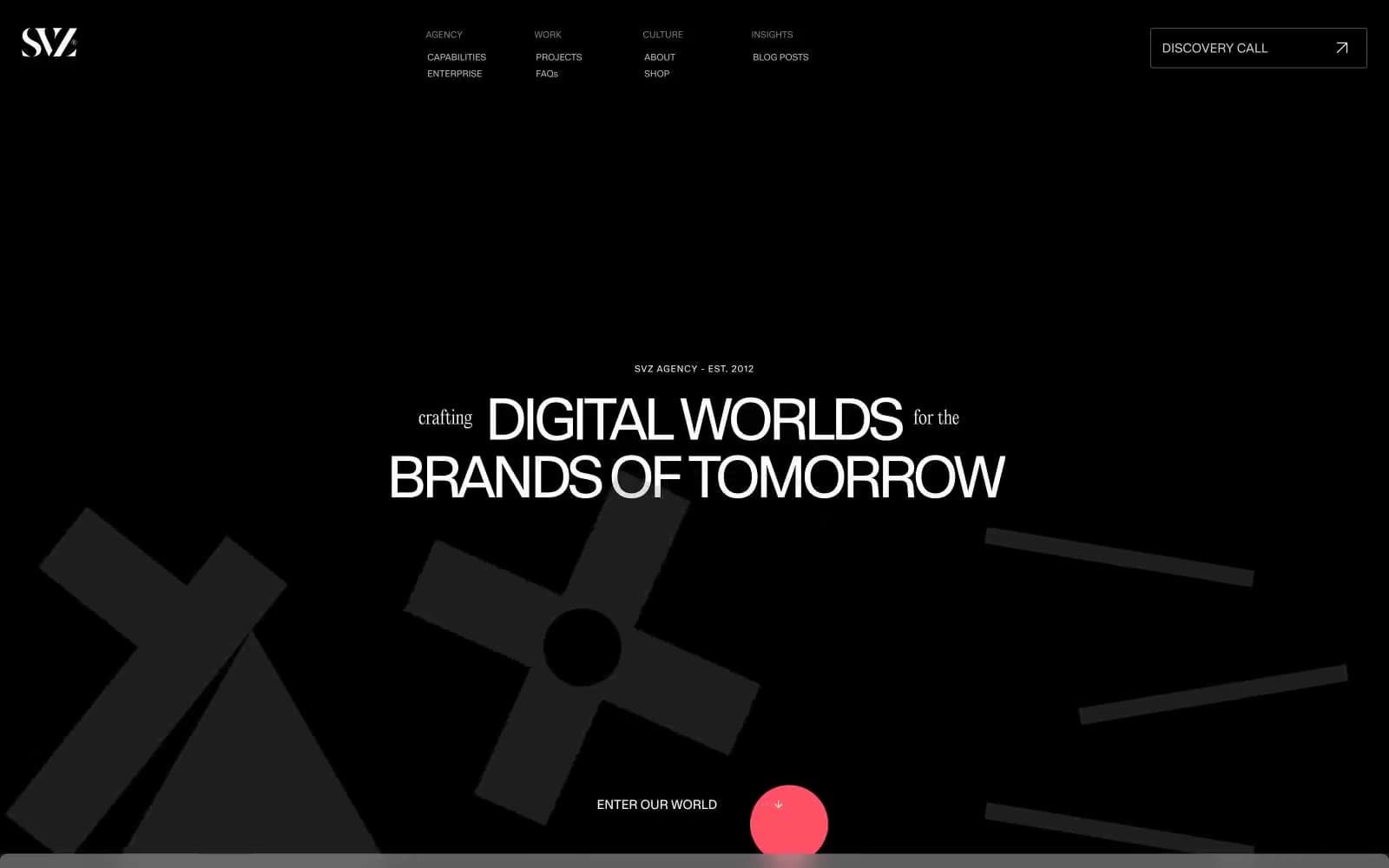
Branding
Studio


