
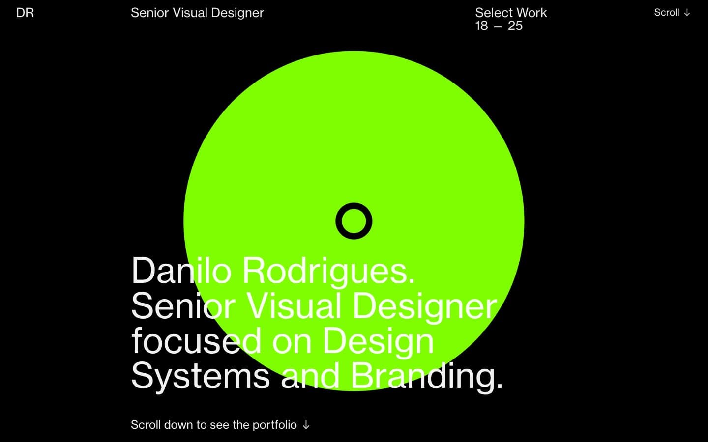
Danilo Rodrigues. A single oversized lime disc burning against a perfectly black page, with white type drifting around it like caption text on a gallery wall.
- Studio
- Dark theme
- 8 colors
- 2 typefaces
Danilo Rodrigues runs on an almost monastic black-and-white system interrupted by two high-voltage color punches: a giant neon-lime disc in the hero and a saturated cobalt header band. Every other choice is editorial restraint — single-weight Neue Haas Grotesk at full volume, pure #000 canvas, and no shadows, no gradients, no borders, no buttons. The visual personality comes from what is removed, not added: there is no chrome, no card system, no component grid. Content sits directly on the void, left-aligned with generous indent, sized in two registers — a 71px display voice and an 18–19px working voice. Treat every screen as a printed editorial spread: monochrome page, one oversized geometric form, and copy that breathes.
Danilo Rodrigues design system

Accent2
Signature accent: the oversized hero disc, focal point punctuation, and any single high-attention graphic — a single neon-lime shape per screen, never decorative repetition
Active header band and focus state for the top navigation — replaces the black header on scroll/hover to mark the system is now engaged
Neutrals6
Page canvas, hero field, all large surface areas — the dominant ground that makes every other element read as signal
Subtle hairline dividers and section separators — barely one step off the canvas, used only when a line needs to exist without announcing itself
Dark borders and separators for elevated surfaces and inverted UI. Do not promote it to the primary CTA color
Secondary heading text, muted labels, supportive metadata — the middle gray that lets a subhead recede behind a headline
Primary body text, paragraph copy, bio blocks, nav labels — slightly off-white so it never feels clinical against the pure black field
Headline text, hero display type, the loudest typographic register — pure white reserved for the largest voices on the page
Try a pairing
Pick any two colors from the palette to check whether text stays readable on top.
Aa
Void Black on Signal Lime
16.32 : 1 contrast
- Body textPasses AA 4.5
- Large textPasses AA 3
- StrictPasses AAA 7
More DESIGN.md files. Same web, different personalities.

Basement Studio
Studio
Production Portugal
Studio
Active Theory
Studio
Adnaut
Studio
Agence K72
Studio
Akash Tyagi
Studio
Analogue
Studio
Athletics
Studio
BAM Photographers
Studio
Bareis + Nicolaus
Studio
Becklyn
Studio
Branding
Studio


