
Daniela and Moe Wedding 2019. Editorial, hand-drawn, sun-warmed.
- Brand
- Light theme
- 11 colors
- 2 typefaces
A warm, editorial wedding invitation language: a blush peach canvas, two-font system (delicate serif display + clean geometric sans), and oversized organic botanical illustrations that bleed off every edge. The palette is earthy and natural — deep navy ink for text, coral-vermillion as the single warm accent for borders and interactive moments, and muted greens, mustards, and dusty pinks living inside the foliage artwork. Layout is centered, generous, and almost magazine-like, with wide tracking on small-caps labels that whisper rather than shout. Every interactive element is a full pill (200px radius), every text block breathes with 32-48px vertical rhythm, and the overall feeling is hand-illustrated, sunlit, and unhurried.
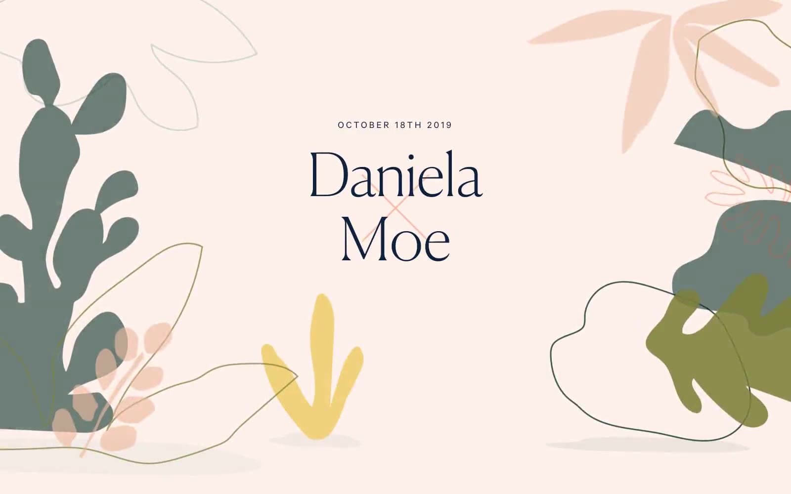
Daniela and Moe Wedding 2019 design system

Brand2
Primary text, headings, nav links, body copy, input borders — the only dark anchor in the system
Outlined link/action borders, active nav underline, button borders — the single warm accent that gives interactive elements their warmth
Accent7
Secondary surface tint, card accents, illustration fills — the softer sibling of the canvas
Botanical illustration dark foliage — the deepest green in the artwork palette
Botanical illustration mid-tone leaves and stems
Botanical illustration flower accents — warm yellow punctuation in the foliage
Botanical illustration bright flower highlights — the vividest warm note in the artwork
Botanical illustration soft greenery, dot patterns — the coolest note in the foliage
Botanical illustration line work, fine stroke details
Neutrals2
Primary page background, section backgrounds, hero canvas — the warm paper tone that carries every screen
Neutral form states, badge text, and quiet UI feedback where color should stay understated. Do not promote it to the primary CTA color
Try a pairing
Pick any two colors from the palette to check whether text stays readable on top.
Aa
Pure White on Ink Navy
15.86 : 1 contrast
- Body textPasses AA 4.5
- Large textPasses AA 3
- StrictPasses AAA 7
More DESIGN.md files. Same web, different personalities.

Airbnb
Brand
Aker
Brand
Alison Roman
Brand
Alpine Bio
Brand
Alveos One
Brand
Amrit Palace
Brand
André Cândido
Brand
Anna Jóna
Brand
Apollo
Brand
Apple
Brand
Arva
Brand
Ashton Bespoke
Brand


