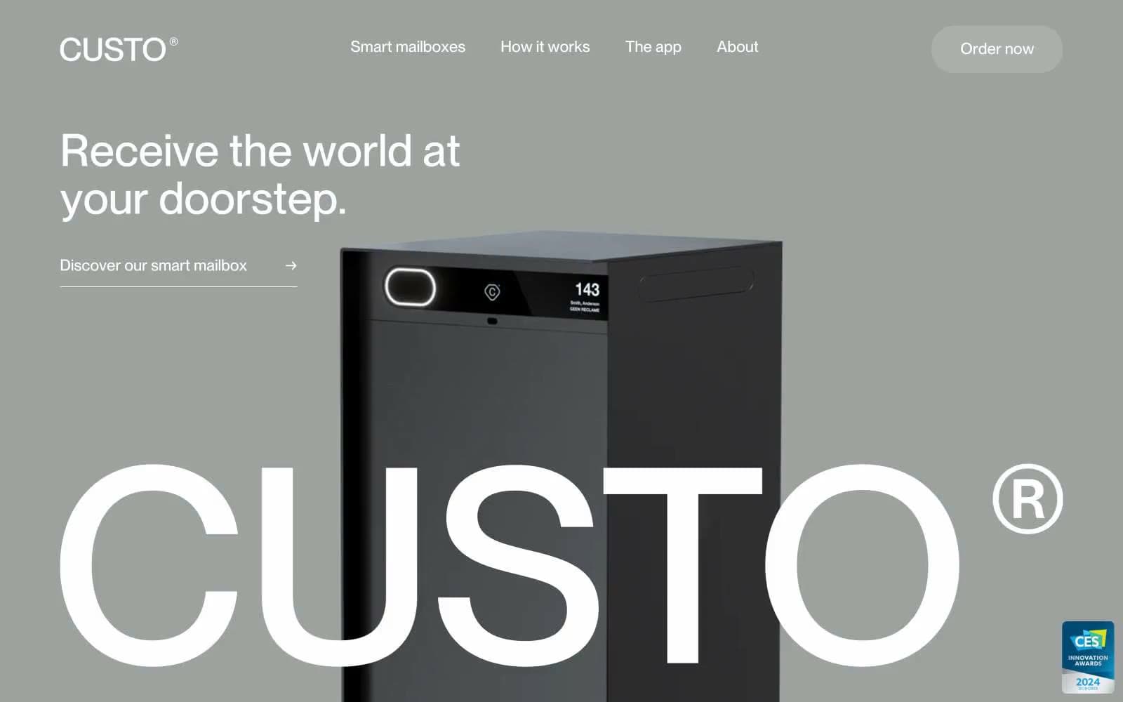
Custo. Gunmetal gallery with monolithic type.
- Brand
- Light theme
- 7 colors
- 1 typeface
Custo operates as an industrial product gallery: a warm gunmetal canvas hosts the physical product while oversized display typography serves as the primary visual ornament. The system is rigorously achromatic — zero chromatic colors — letting the dark anodized mailbox and the geometric weight of a single sans-serif carry all brand personality. Every screen balances generous negative space against one monumental typographic statement, with the brand wordmark recurring as a near-architectural element. Surfaces are flat and matte; depth is implied by the product's own reflectivity rather than drop shadows or gradients.
Custo design system
Neutrals7
Primary text, hairline borders, icon strokes — the highest-contrast ink in the system, used for headings and structural dividers
Dark surface for product photography, secondary headings, and elevated text — echoes the mailbox finish so the UI and product share a material
Muted body text, list dividers, secondary icon strokes — sits between Paper White and Obsidian for inline metadata and subdued links
Hero and feature-section background — the warm gray-green tint distinguishes Custo from generic white SaaS canvases and reads as architectural concrete rather than digital surface
Light border and divider color for headings and section rules — a hairline tone that never competes with Obsidian structural lines
Input field borders, footer separators, the lightest structural line — appears only where a near-invisible boundary is needed
Body section backgrounds, reversed text on gunmetal canvas, text on the dark product photography
Try a pairing
Pick any two colors from the palette to check whether text stays readable on top.
Aa
Paper White on Obsidian
21.00 : 1 contrast
- Body textPasses AA 4.5
- Large textPasses AA 3
- StrictPasses AAA 7
More DESIGN.md files. Same web, different personalities.

Airbnb
Brand
Aker
Brand
Alison Roman
Brand
Alpine Bio
Brand
Alveos One
Brand
Amrit Palace
Brand
André Cândido
Brand
Anna Jóna
Brand
Apollo
Brand
Apple
Brand
Arva
Brand
Ashton Bespoke
Brand


