
Current. Editorial gallery in black and white.
- Finance
- Light theme
- 6 colors
- 2 typefaces
Current uses an editorial monochrome language: stark white canvas, pure black navigation, and whisper-thin soehne headlines that command through restraint rather than weight. The UI itself contains zero chromatic color — every screen is built from black, white, and two shades of slate gray, with a single warm-to-cool gradient reserved for brand expression. Photography brings all the color, and it does so in saturated, slightly surreal editorial frames. Components are pill-shaped and ghost-like: black-filled primary buttons sit beside thin-outlined ghost links, and the only meaningful shadow in the system is a soft ambient glow on the floating app CTA. The aesthetic reads more like a fashion magazine spread than a banking app.
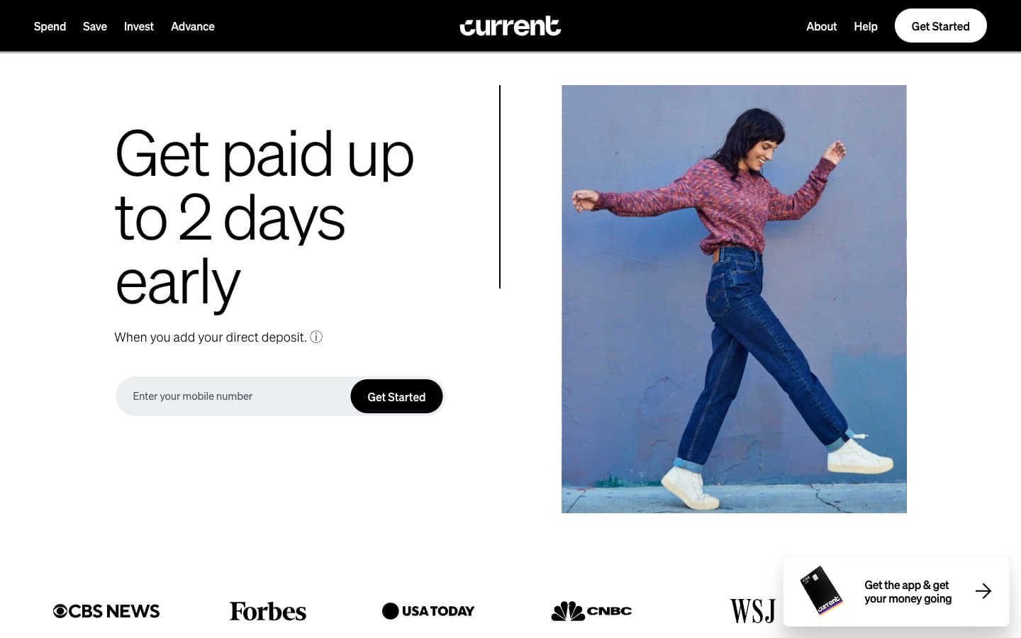
Current design system

Brand1
Brand gradient (yellow → orange → purple → transparent) used on the wordmark and brand-mark expressions — the only chromatic surface in the system
Neutrals5
Navigation bar, filled primary buttons, primary headlines, hairline borders, icon strokes — the structural ink of the entire system
Heavier borders, dividers in dense areas, secondary structural edges
Body copy, secondary text, link text, thin borders — the only mid-tone in the palette carries all helper and supporting information
Input field fills, subtle recessed surfaces, hover wash on form fields
Page canvas, card surfaces, nav text, button text on dark — the negative space that makes the whisper-thin type readable
Try a pairing
Pick any two colors from the palette to check whether text stays readable on top.
Aa
Paper White on Pure Black
21.00 : 1 contrast
- Body textPasses AA 4.5
- Large textPasses AA 3
- StrictPasses AAA 7
More DESIGN.md files. Same web, different personalities.
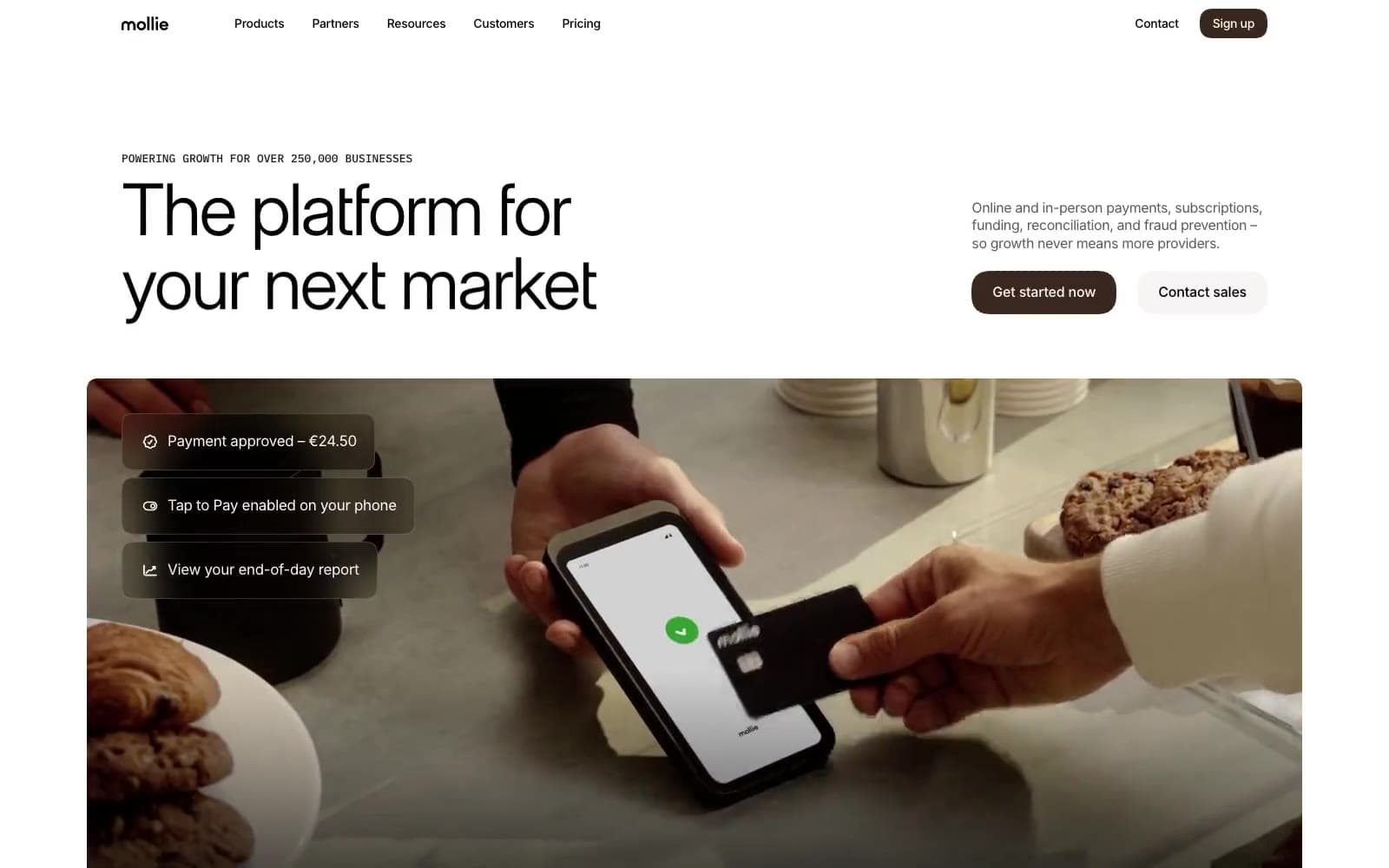
Mollie
Finance
a16z speedrun
Finance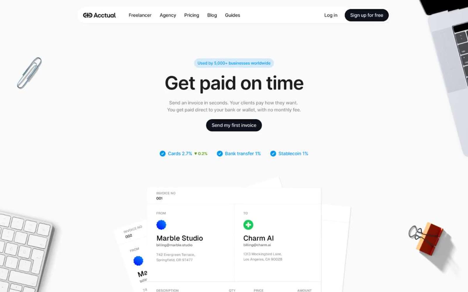
Acctual
Finance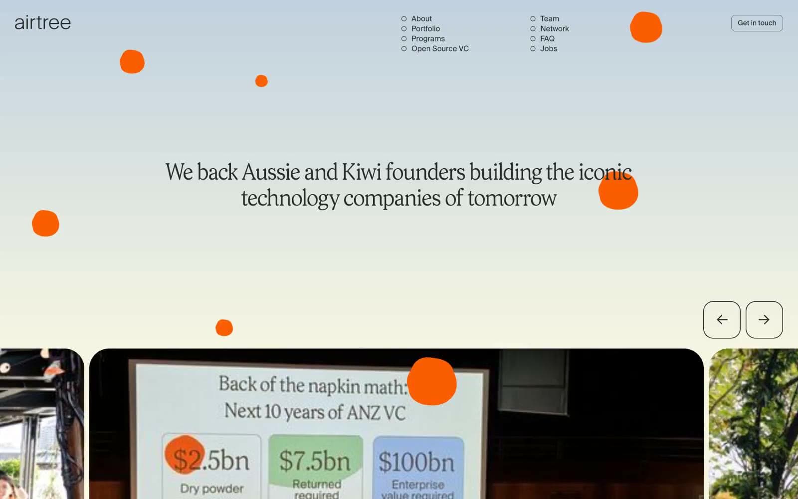
Airtree
Finance
Ambrook
Finance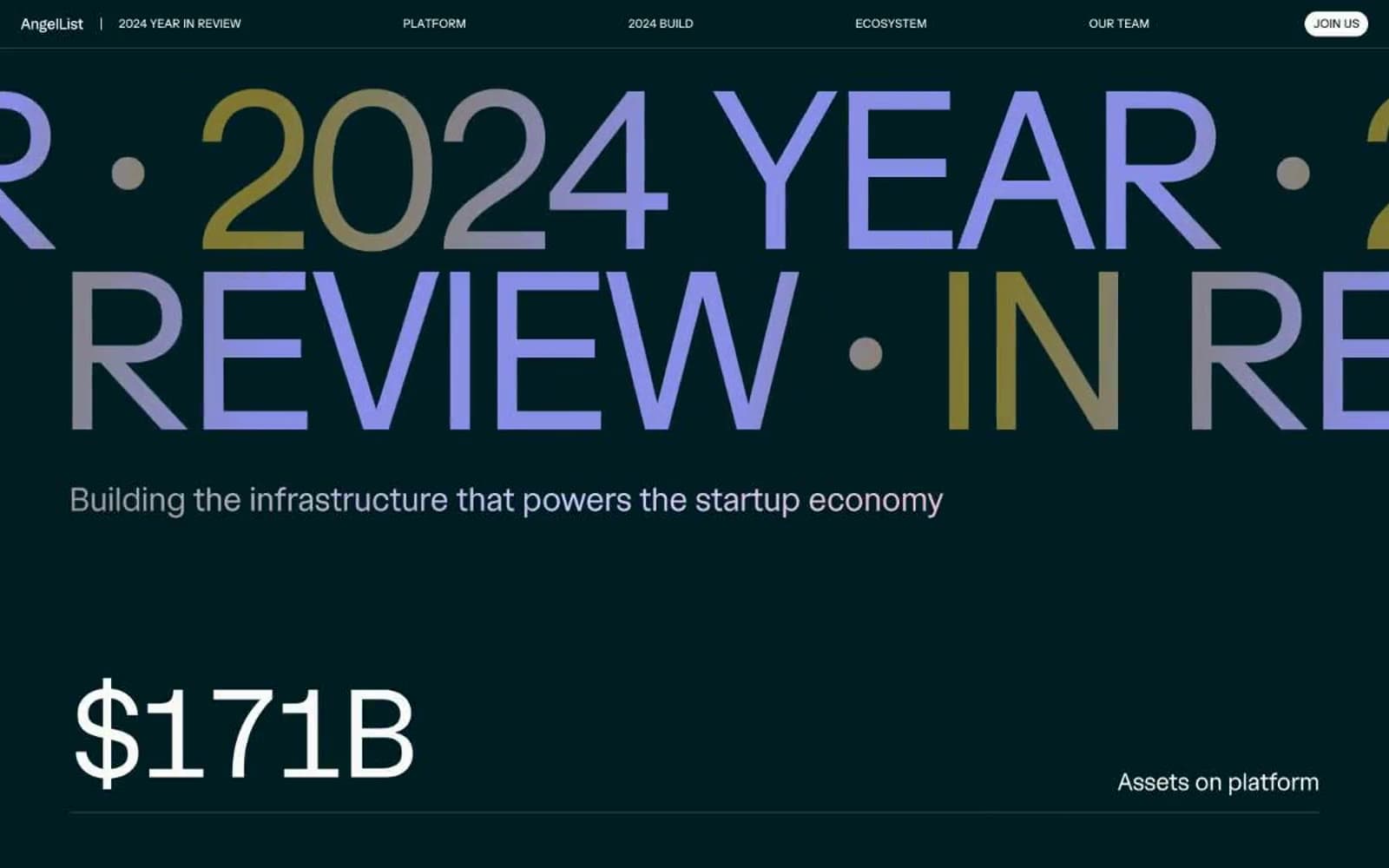
Angellist 2024
Finance
Apron
Finance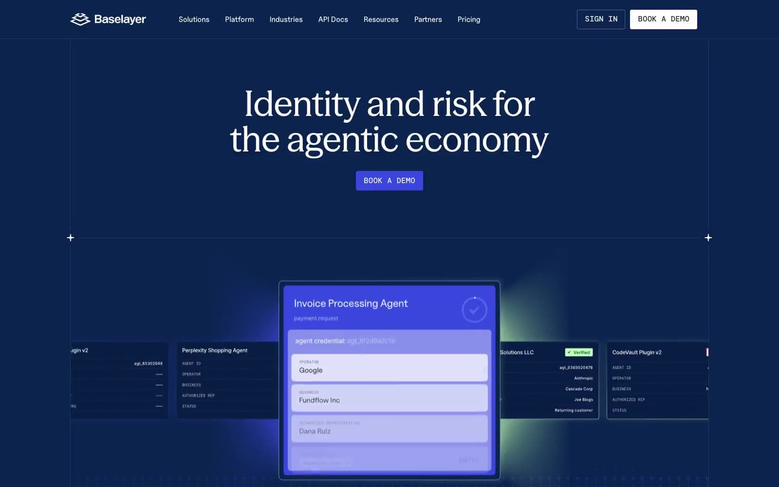
Baselayer
Finance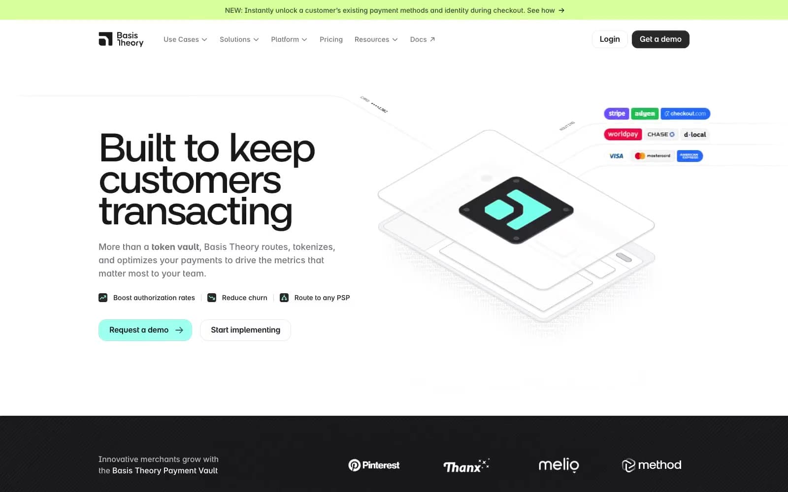
Basis Theory
Finance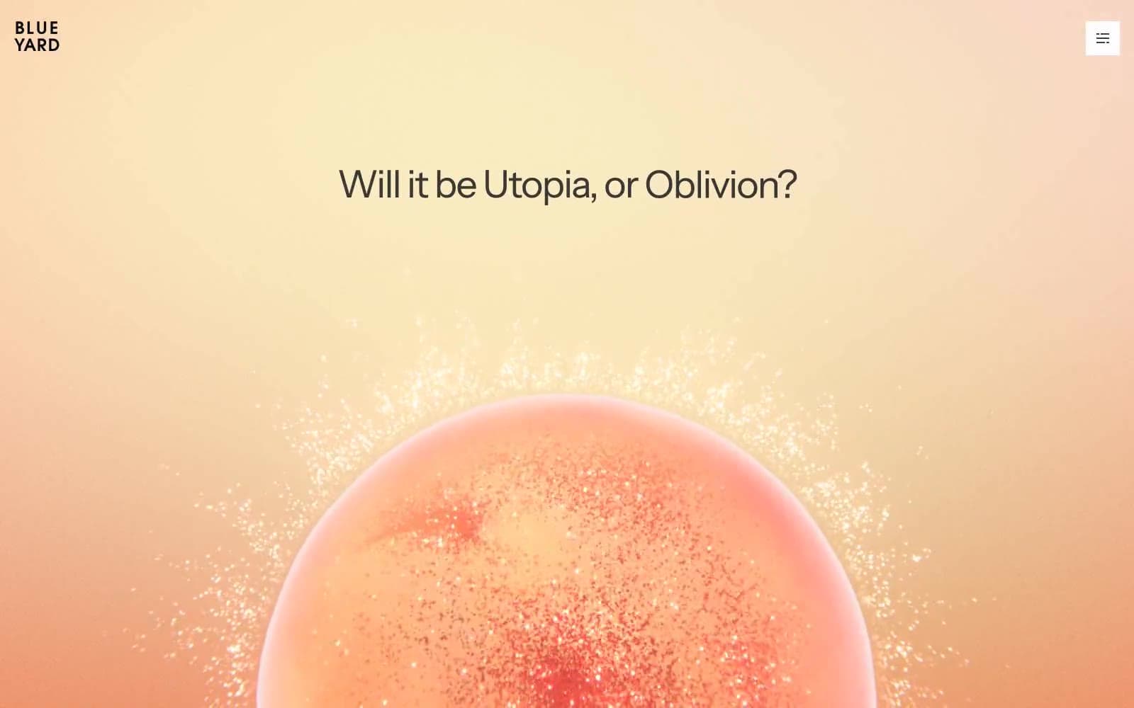
BlueYard Capital
Finance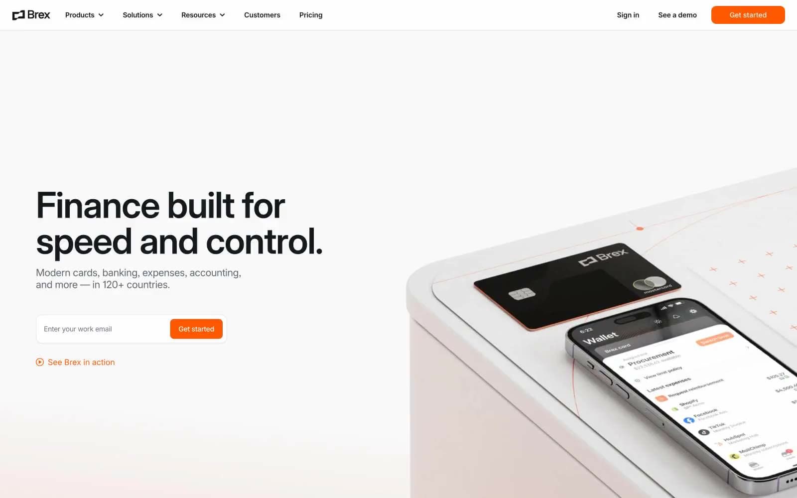
Brex
Finance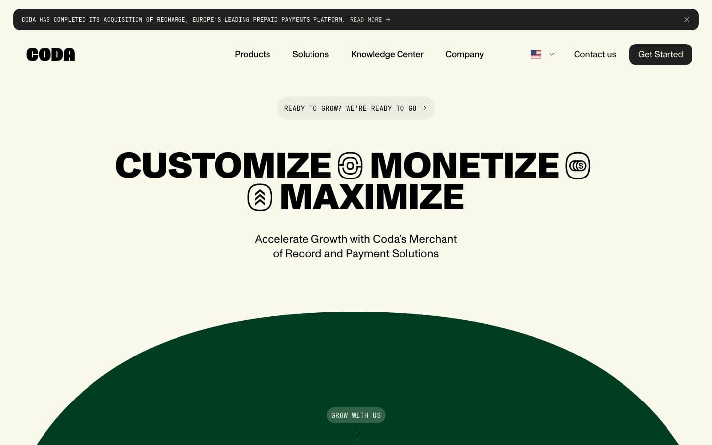
Coda
Finance


