
CQCM. Verdant cooperative megaphone.
- Brand
- Light theme
- 7 colors
- 2 typefaces
CQCM radiates civic confidence through oversized uppercase display type, vivid flat chromatic blocks, and generous white space. A custom wide-tracked display face (Athletics) gives French institutional weight, while Manrope handles reading at human sizes with slightly opened tracking. Black pill buttons are the only filled action element — every other color is a decorative block, not a control. The palette is unapologetically chromatic: a dominant electric green for the hero and key stats, a saturated blue for news surfaces, a coral orange for data emphasis, and a pale mint for quiet card surfaces. Dot patterns and circular image cutouts soften an otherwise orthogonal, grid-heavy layout. The overall feel is a Quebec cooperative movement's visual identity — bold, optimistic, and declarative without ever feeling corporate.
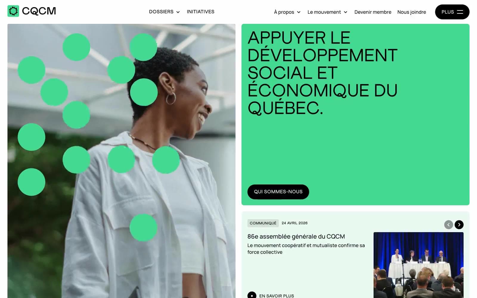
CQCM design system

Brand1
Hero panel fill, primary stat block, decorative dot overlays — the loudest brand voice; the color that makes the page feel activated
Accent2
News card surfaces, secondary stat blocks — chromatic but cooler, reserved for media/content contexts rather than primary brand expression
Accent stat block only — appears once as data emphasis, treated as a single-note punctuation rather than a system color
Neutrals4
Primary text, pill button fill, all borders and dividers — does the structural work of the system, the only color used for controls
Muted helper text, secondary nav borders — the only mid-gray in the system, used sparingly for de-emphasis
Card and nav surface tint — a barely-there green echo of the hero green, softens white space without breaking the light theme
Page canvas, text on filled buttons, image surfaces
Try a pairing
Pick any two colors from the palette to check whether text stays readable on top.
Aa
Ink Black on Cooperative Green
11.58 : 1 contrast
- Body textPasses AA 4.5
- Large textPasses AA 3
- StrictPasses AAA 7
More DESIGN.md files. Same web, different personalities.
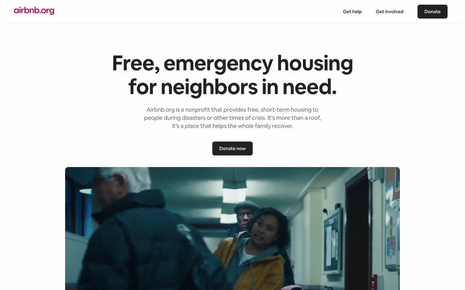
Airbnb
Brand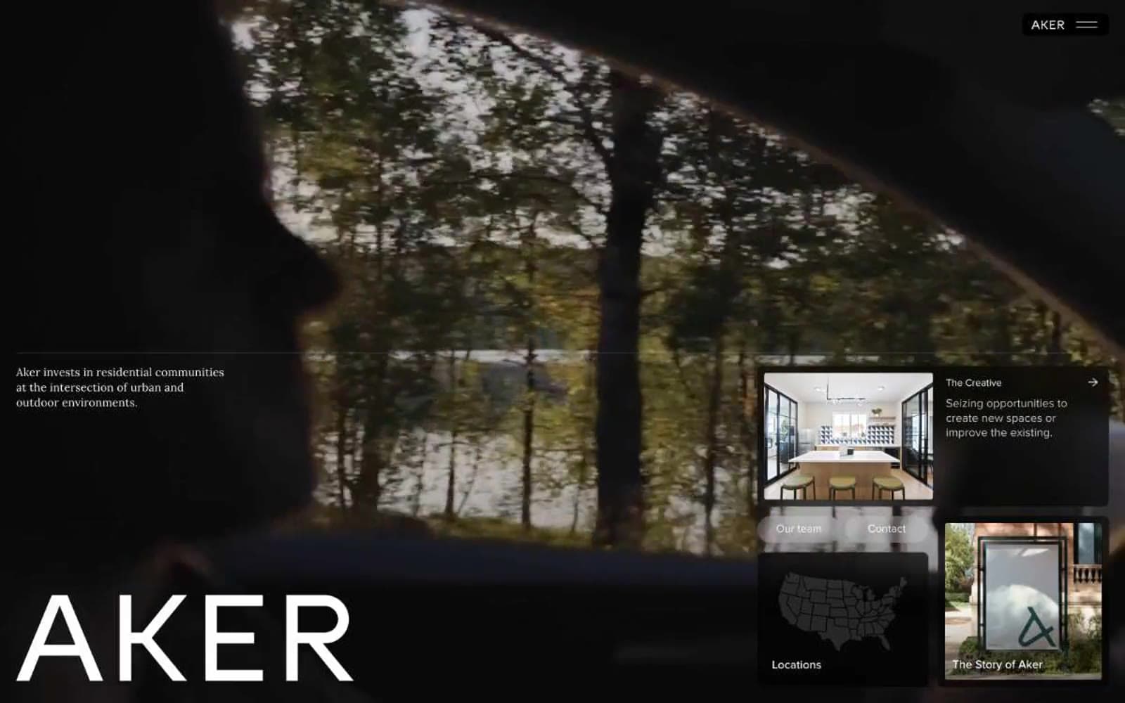
Aker
Brand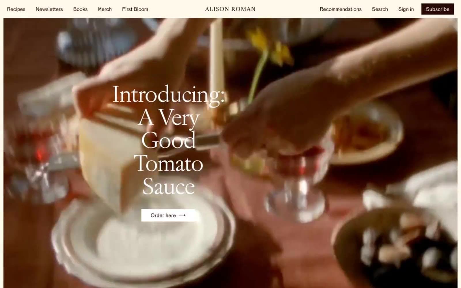
Alison Roman
Brand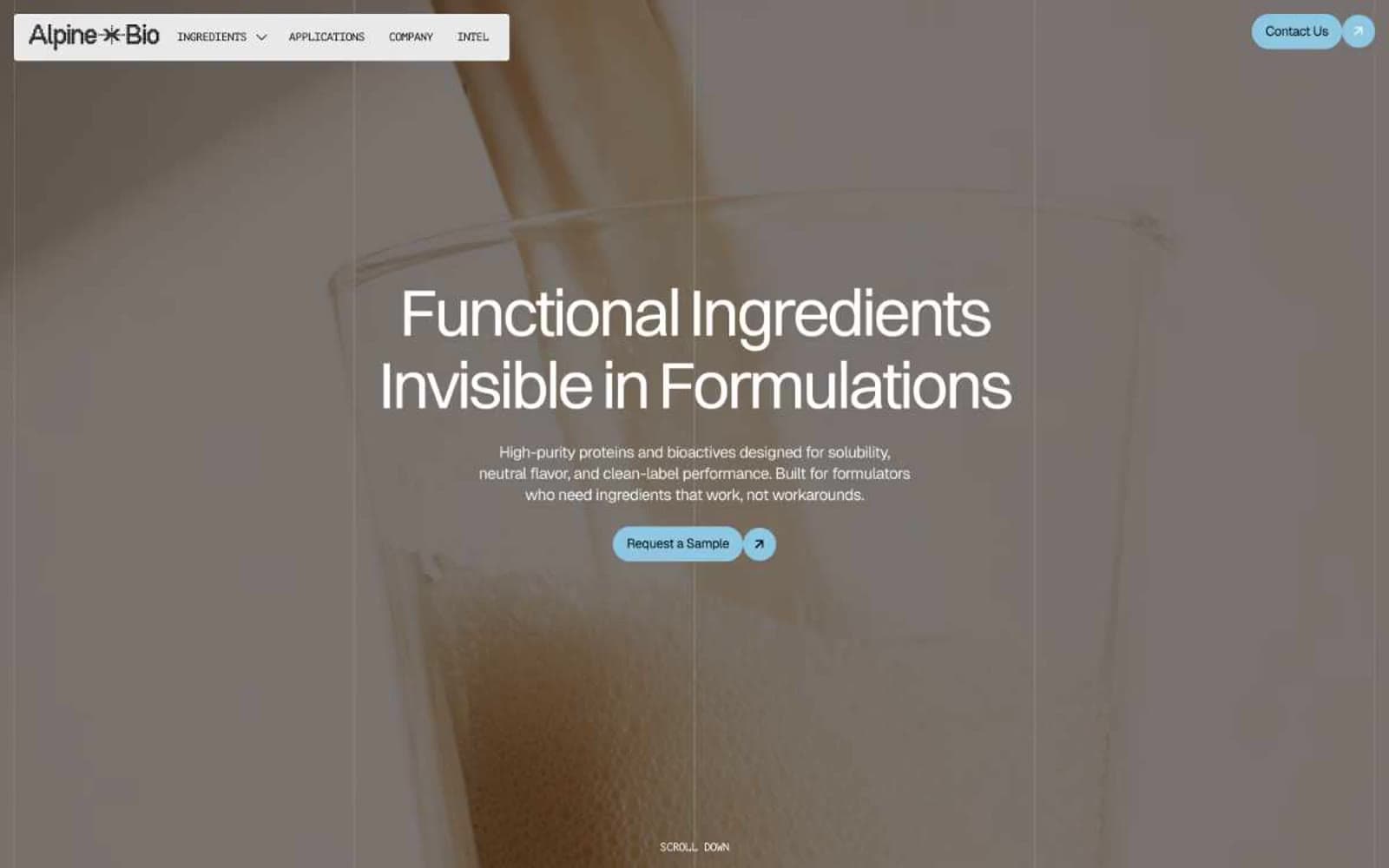
Alpine Bio
Brand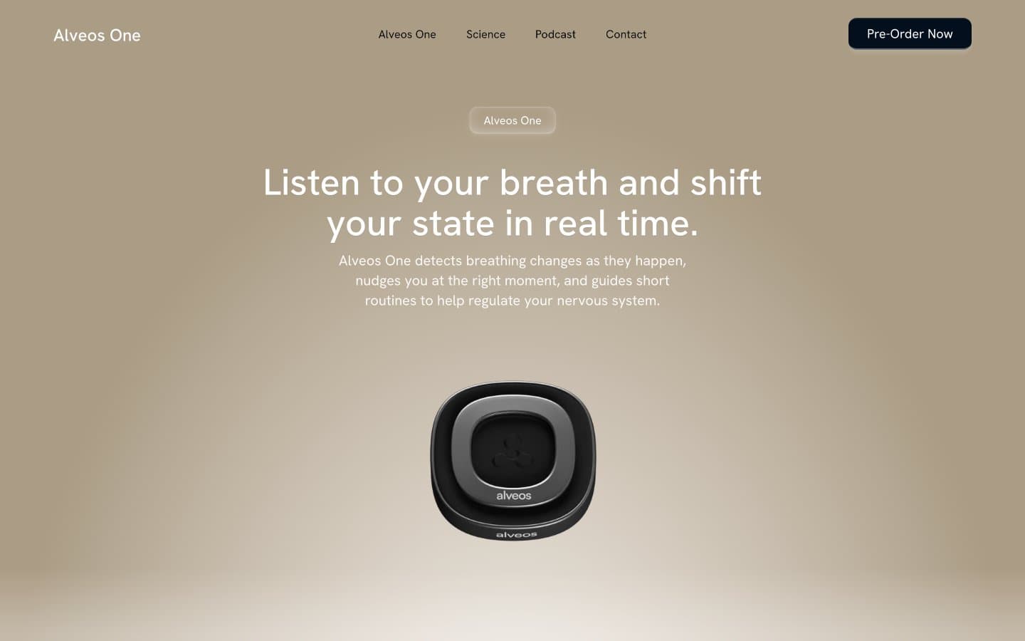
Alveos One
Brand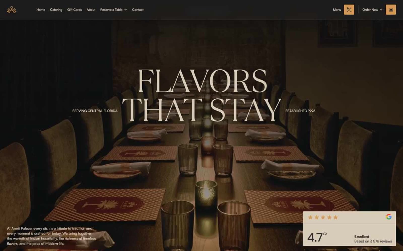
Amrit Palace
Brand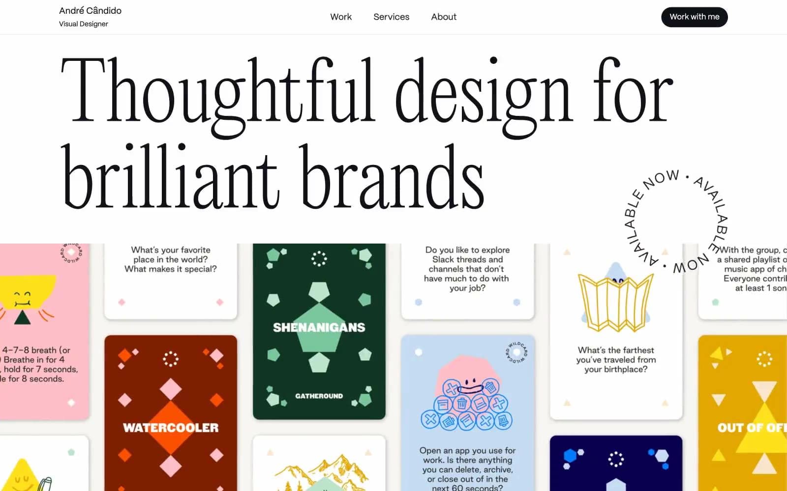
André Cândido
Brand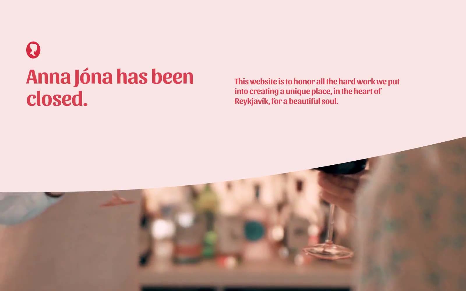
Anna Jóna
Brand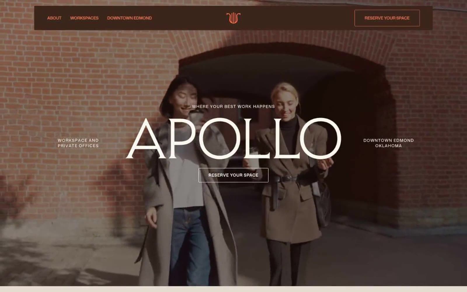
Apollo
Brand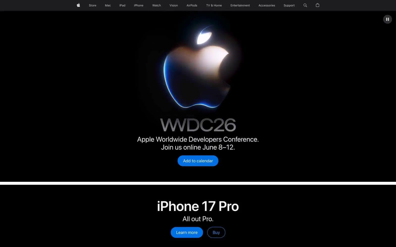
Apple
Brand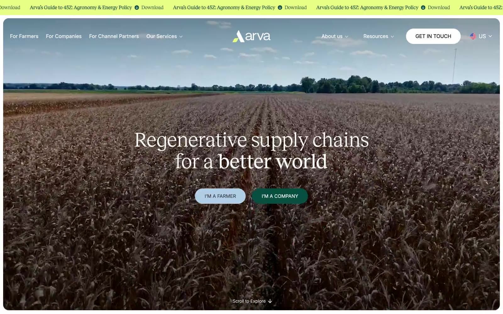
Arva
Brand
Ashton Bespoke
Brand


