
Compound. A quiet editorial system where one font at one weight does all the work, and the only color is the cream ribbon at the top of the page.
- Finance
- Light theme
- 10 colors
- 1 typeface
Compound operates on near-total chromatic silence: one typeface (Monument Grotesk) at a single weight of 400, a fully achromatic palette, and shadows so faint they register as atmosphere rather than depth. Surfaces are nearly invisible — a white canvas, #e5e7eb hairline borders, and 20px rounded cards — so hierarchy is carried entirely by dramatic size jumps (14px body climbing to 60–72px display) and generous whitespace. The only chromatic note in the system is a warm cream announcement bar (#ffe9bf) flush at the very top edge. Interactive elements are deliberately quiet: a single near-black pill button and ghost underlined text links that read as typeset words more than UI chrome. The product preview card — with its subtle four-layer drop shadow and 20px radius — is the one moment of visual thickness in the layout, the only thing the eye can actually grasp as an object.
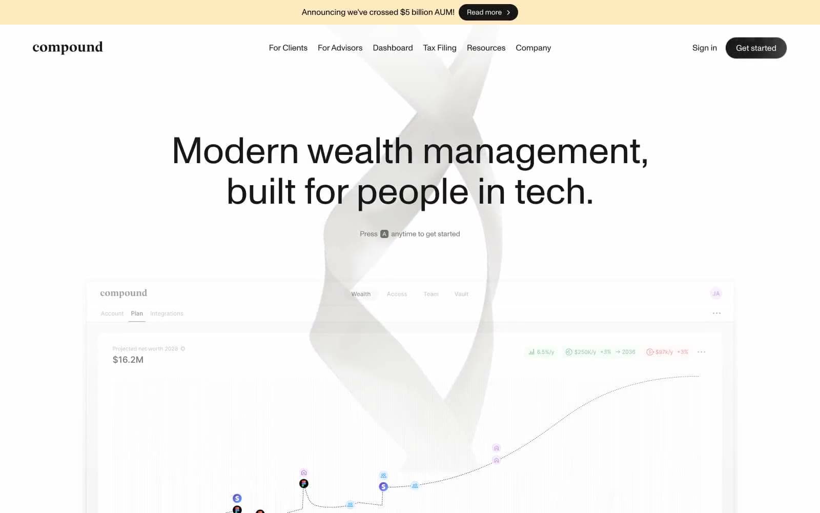
Compound design system

Accent1
Announcement bar background, the single warm accent in the entire system — used only for the top promotional strip
Neutrals9
Primary text, filled pill buttons, navigation emphasis, logo wordmark — the only dark anchor in an otherwise white system
SVG fill and stroke for icons, 3D graphic elements — nearly identical to Ink but reserved for decorative vector work
Helper text, descriptive captions, micro-copy — darker than Slate for emphasized secondary text
Secondary body text, metadata, icon strokes, tab labels — the primary muted text voice
Tertiary text, disabled link color, placeholder text — the quietest readable gray
Decorative fills, gradient endpoints, subtle background washes — never used for text or borders
All structural borders, dividers, card edges, input borders — the most-used color in the system by frequency, defining every container
Secondary surface fills, subtle hover washes, tertiary panel background — the lightest gray still distinct from white
Page canvas, card surfaces, product preview background — the default ground for all content
Try a pairing
Pick any two colors from the palette to check whether text stays readable on top.
Aa
Ink on Cream Notice
15.08 : 1 contrast
- Body textPasses AA 4.5
- Large textPasses AA 3
- StrictPasses AAA 7
More DESIGN.md files. Same web, different personalities.
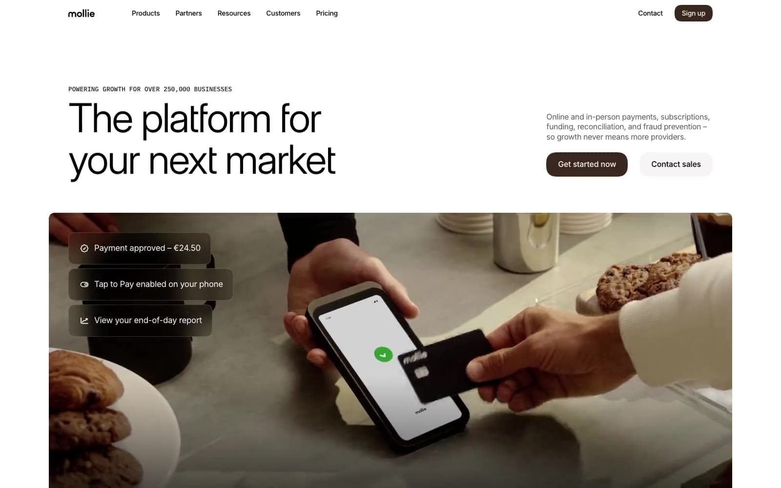
Mollie
Finance
a16z speedrun
Finance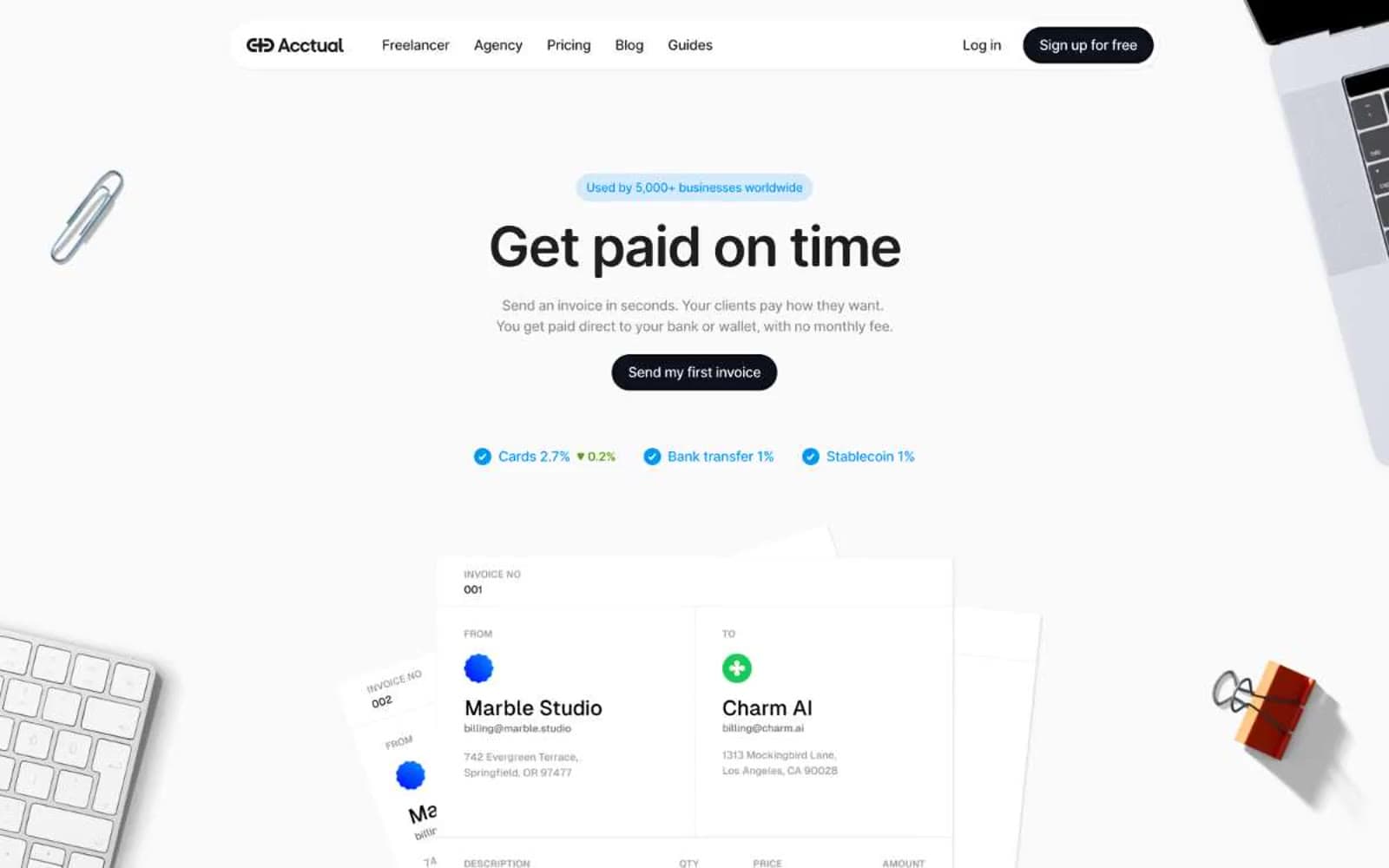
Acctual
Finance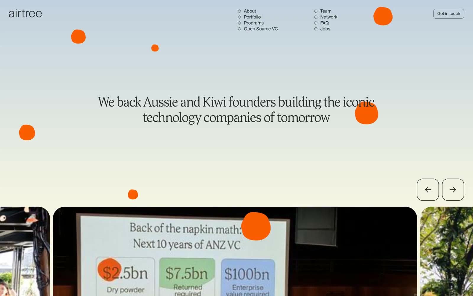
Airtree
Finance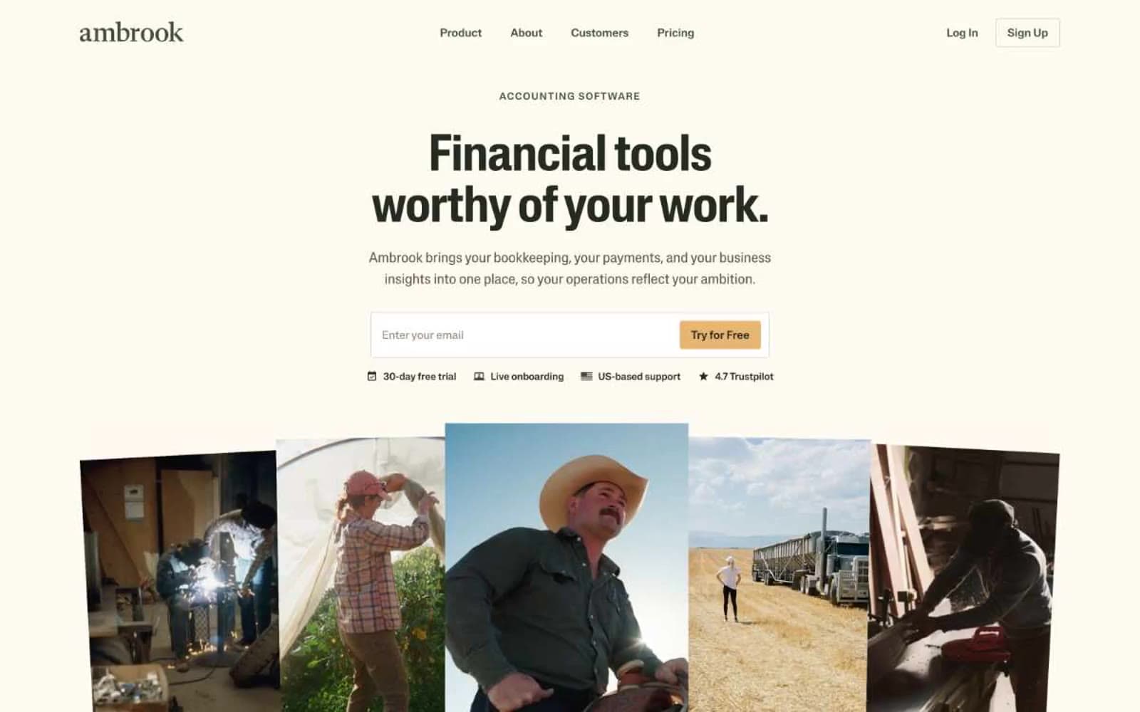
Ambrook
Finance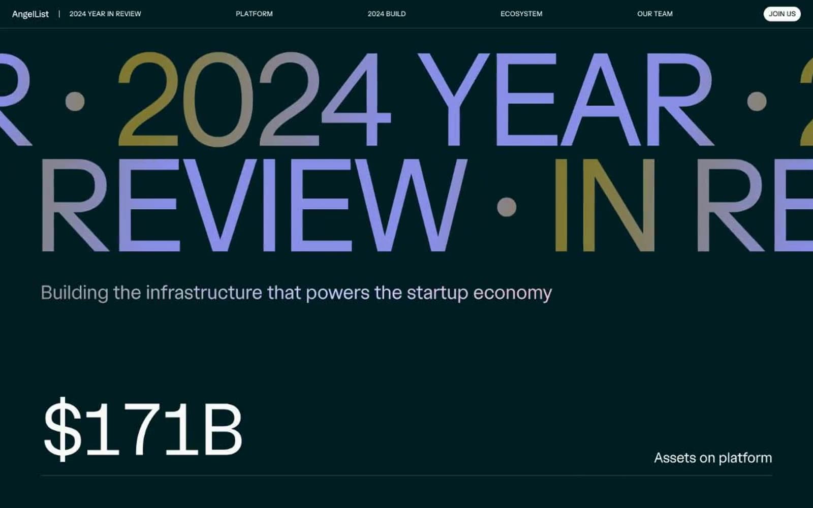
Angellist 2024
Finance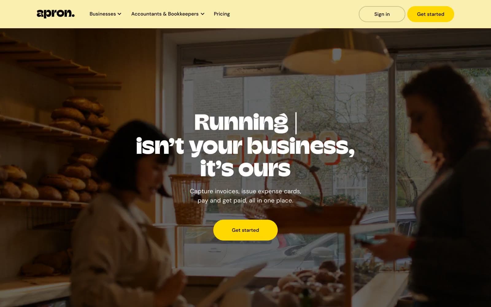
Apron
Finance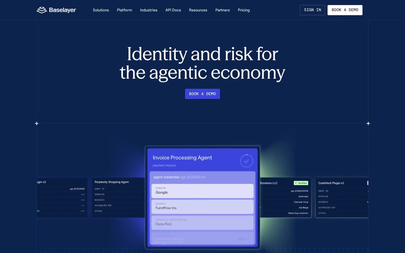
Baselayer
Finance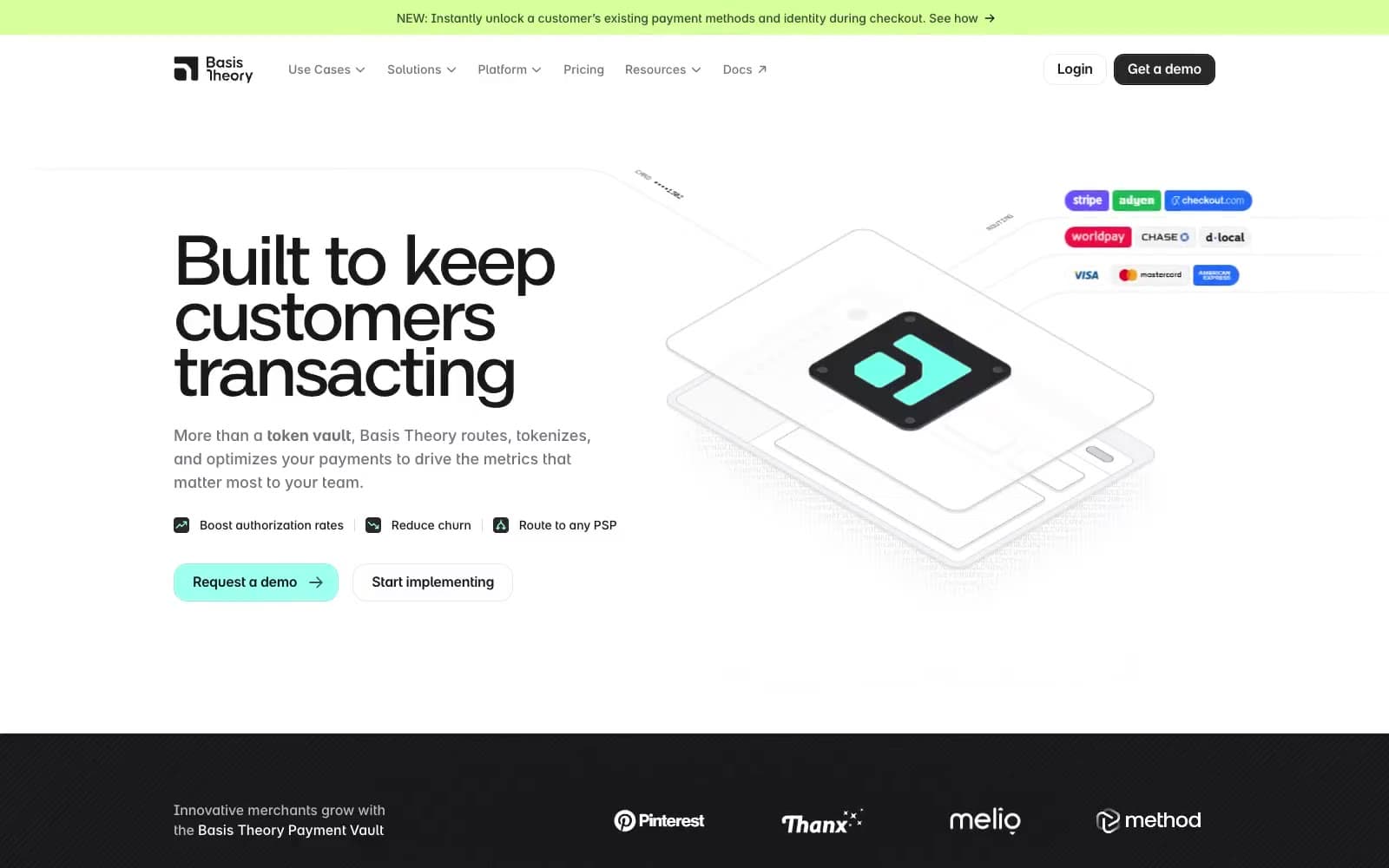
Basis Theory
Finance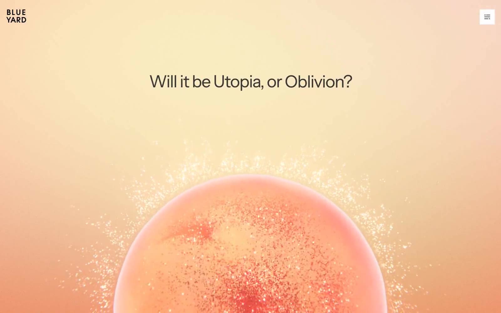
BlueYard Capital
Finance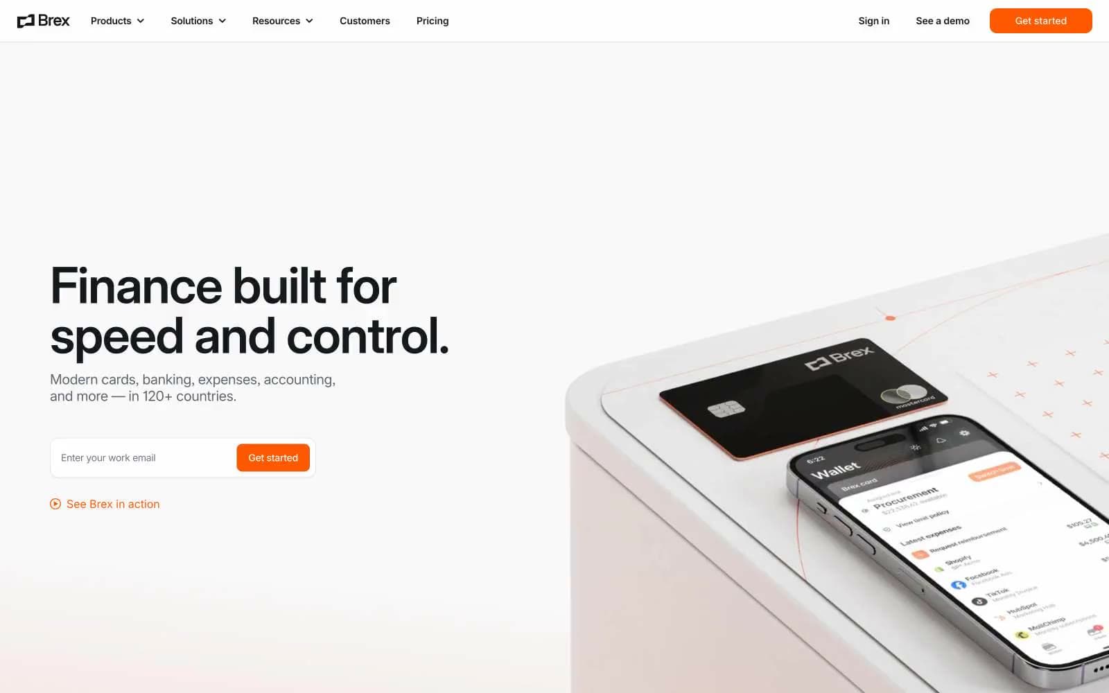
Brex
Finance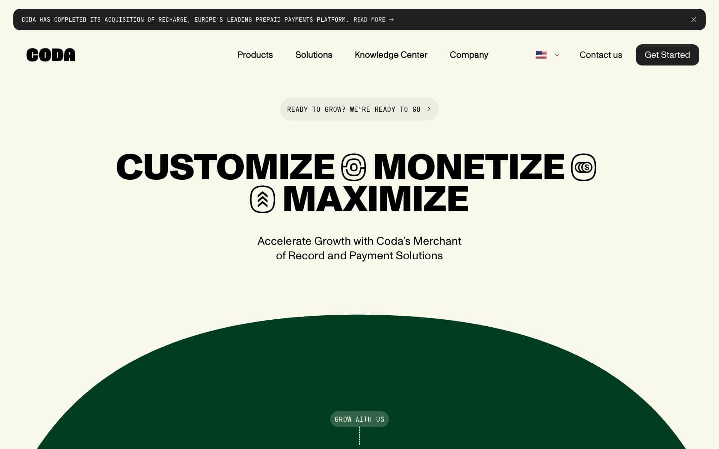
Coda
Finance


