
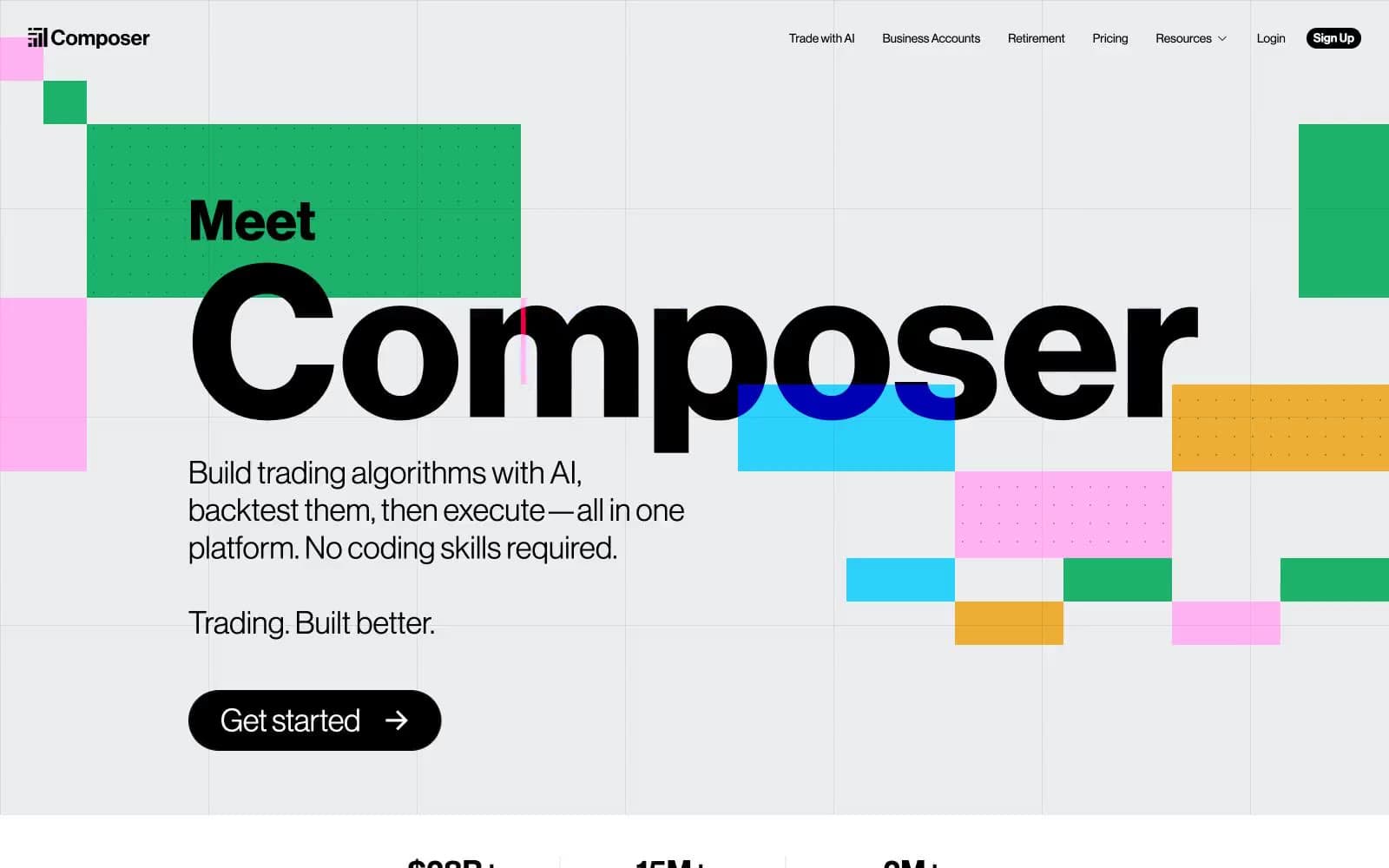
Composer. Bauhaus confetti on concrete.
- Finance
- Light theme
- 25 colors
- 2 typefaces
Composer speaks in the language of an editorial trading manifesto: a light ash canvas scattered with Bauhaus confetti — vivid blue, green, pink, and yellow rectangles that read as information shapes, not decoration. The Neue Haas Grotesk Display type stretches to 244px, letting headlines dominate like magazine covers while Inter handles the quiet, compact UI chrome below. The system is confident and maximalist for marketing surfaces but contracts to a clean, functional dashboard for product work — sharp 2px icon edges and pill-shaped 9999px buttons coexist without contradiction, because both serve clarity over softness. Color is deployed as functional punctuation: black text on near-white surfaces, hairline gray borders everywhere, and saturated chromatic blocks that mark emphasis, group information, and create visual rhythm across an otherwise monochrome grid.
Composer design system

Brand5
Brand blue — decorative color blocks, icon fills, secondary borders, and the blue-tinted shadow that gives elevation its on-brand cast
Green wash for highlight backgrounds, decorative bands, and soft emphasis behind content
Vivid pink — decorative strokes, confetti blocks, and gradient underline washes
Pink action color for filled buttons, selected navigation states, and focused conversion moments.
Yellow accent — confetti blocks, gradient underlines, and warm decorative surfaces
Accent8
Orange accent — decorative fills, strokes, and secondary button surfaces
Deep green — heading text color, card backgrounds, and muted button surfaces that need an earthy chromatic weight
Warm orange — button backgrounds and body accent fills, slightly softer than Ember Orange
Purple accent — rare chromatic punctuation for buttons and decorative fills
Dark blue border — used for emphasis borders that need more weight than Signal Blue
Lighter blue border — paired with Deep Iris in decorative border compositions
Red action color for filled buttons, selected navigation states, and focused conversion moments. Use as a supporting accent, not as a status color
Dark text/footer — near-black with a green undertone, used for footer backgrounds and deep heading text
Neutrals12
Primary text and filled CTA — all body and heading text, plus filled button backgrounds
Dark surface — footer background and inverted dark blocks, near-black with a slight teal undertone
Dark card surface and stroke — deep neutral for inverted cards and decorative strokes
Muted text and icon fill — secondary text color, icon fills, and decorative strokes
Tertiary border and shadow — mid-gray for low-emphasis borders and shadow accents
Icon border — medium gray for icon outlines that recede behind content
Secondary border — slightly darker than Concrete for borders that need more weight
Border and shadow base — mid-gray borders and shadow midtones
Background wash — light gray fill for inactive states and subtle surface differentiation
Hairline border — the dominant neutral border color, appearing on virtually every element
Subtle background — off-white fill for sections that need separation from Paper without a visible border
Card and nav surface — opaque white for cards, navigation bar, and button text
Try a pairing
Pick any two colors from the palette to check whether text stays readable on top.
Aa
Paper on Signal Blue
4.76 : 1 contrast
- Body textPasses AA 4.5
- Large textPasses AA 3
- StrictFails AAA 7
More DESIGN.md files. Same web, different personalities.
Mollie
Finance
a16z speedrun
Finance
Acctual
Finance
Airtree
Finance
Ambrook
Finance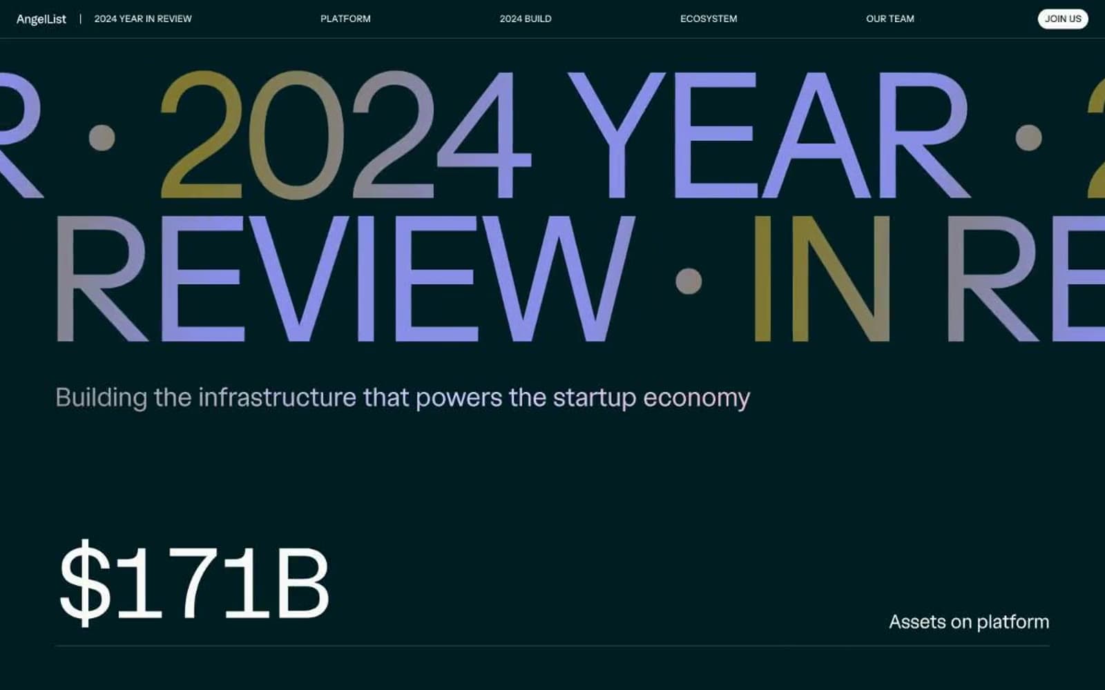
Angellist 2024
Finance
Apron
Finance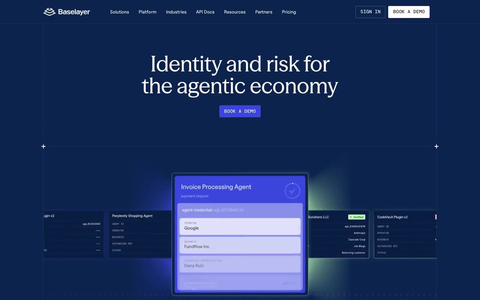
Baselayer
Finance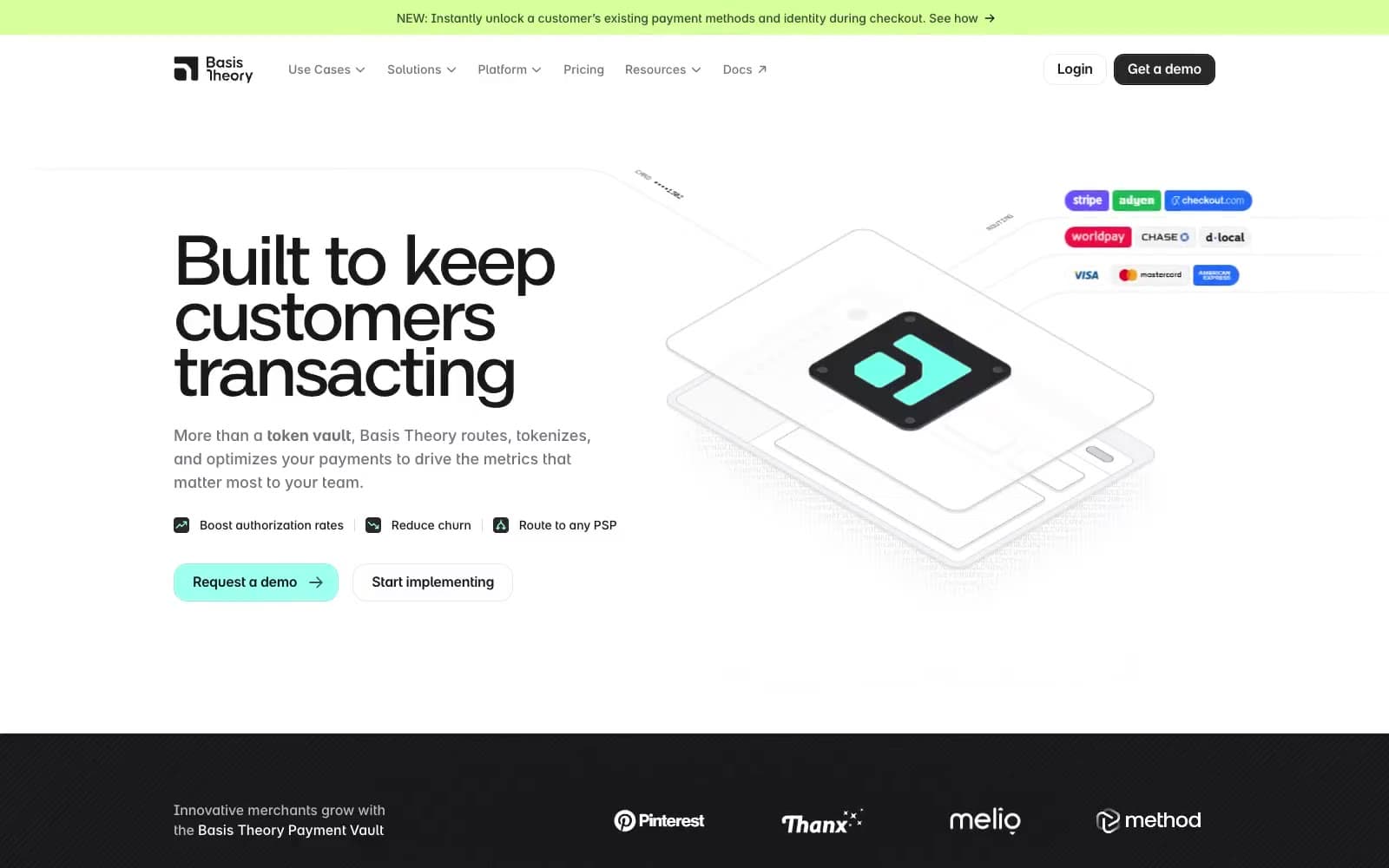
Basis Theory
Finance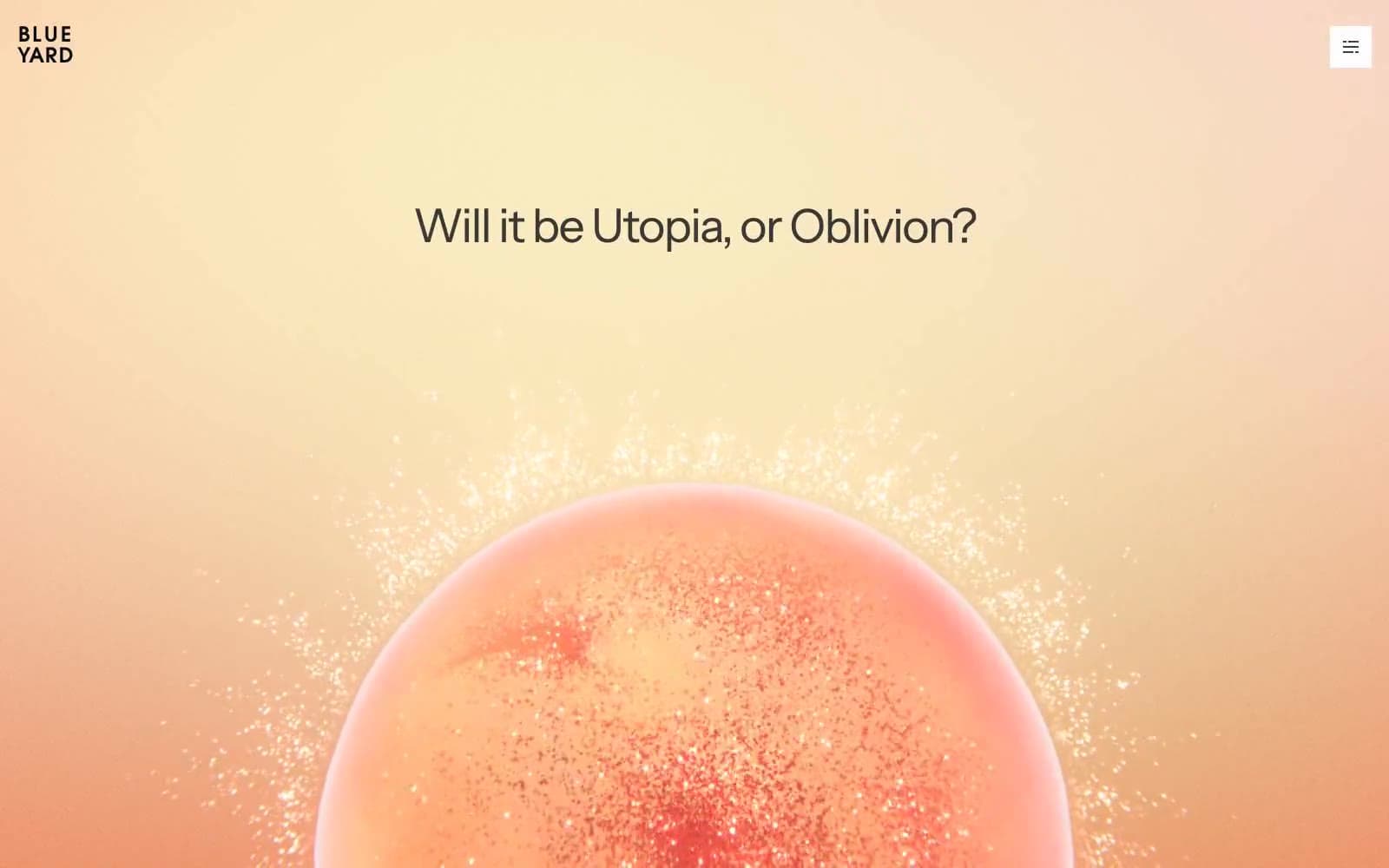
BlueYard Capital
Finance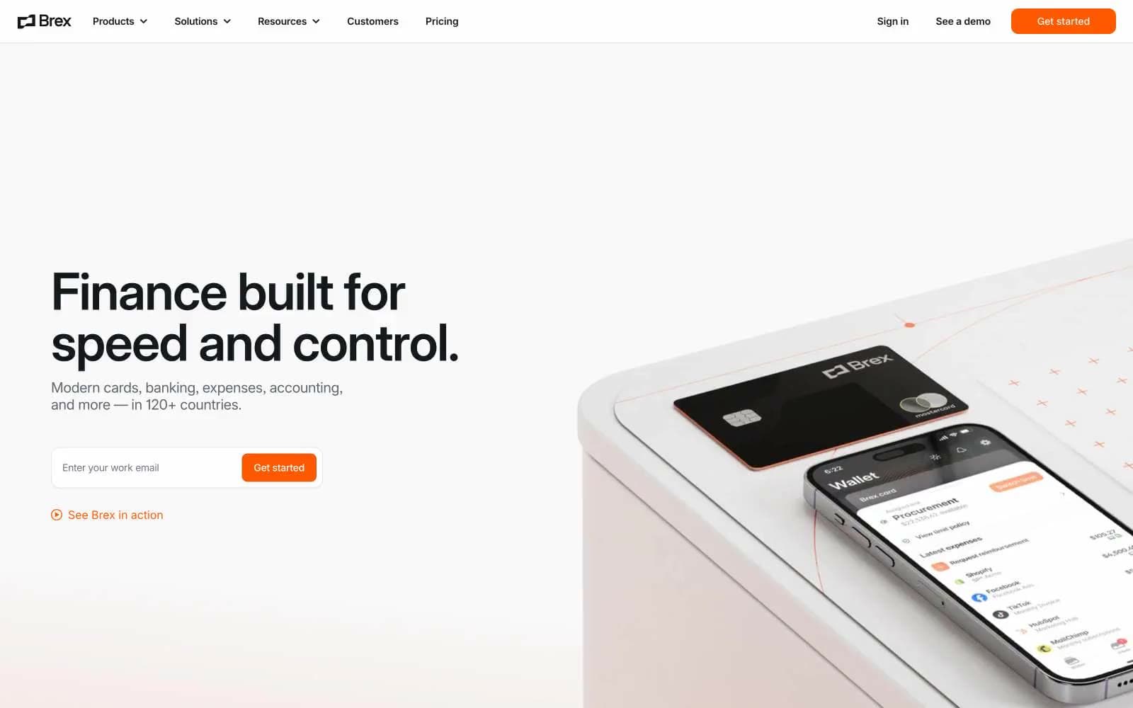
Brex
Finance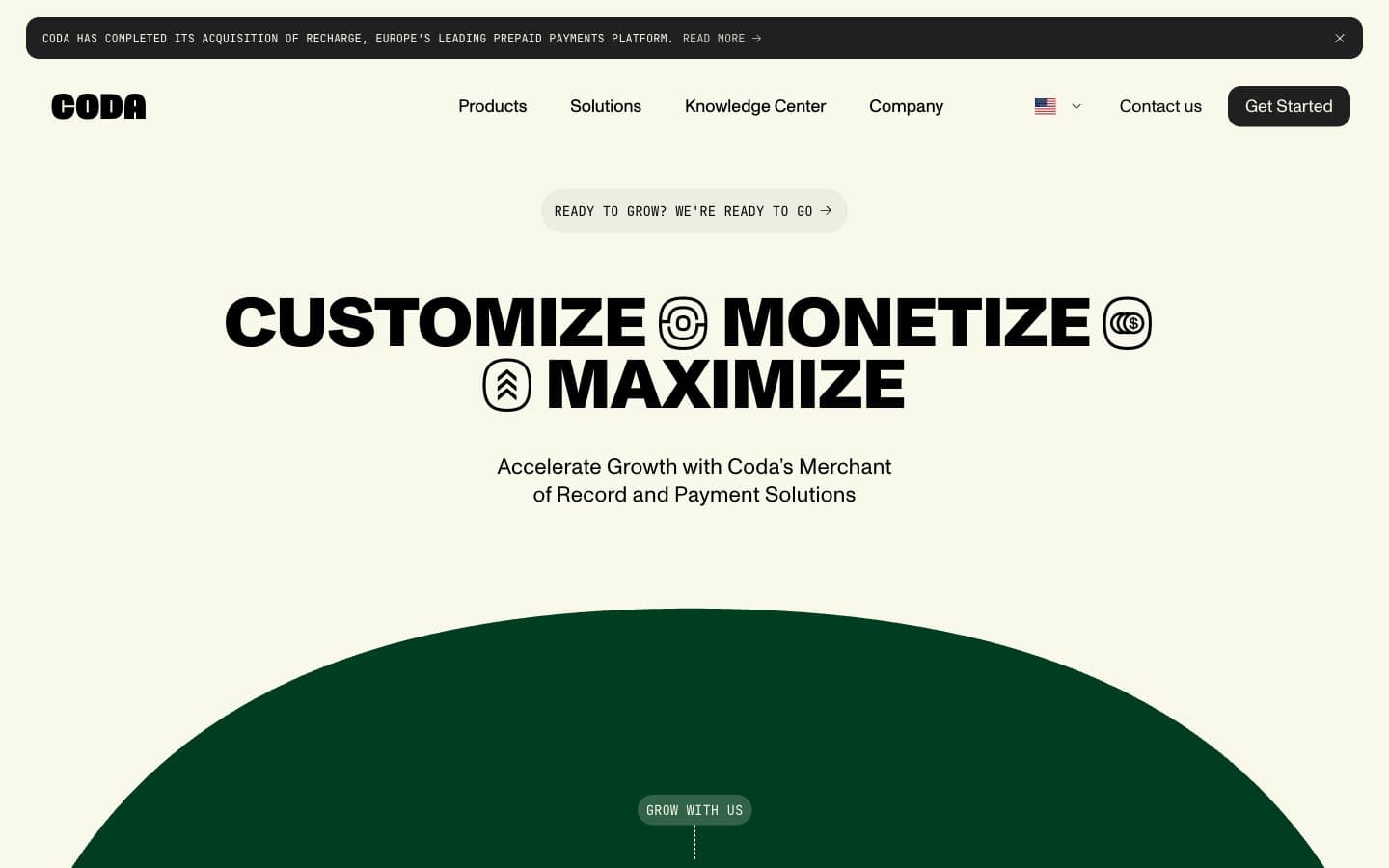
Coda
Finance


