
Column. Deep navy ledger under cool dawn.
- Finance
- Light theme
- 21 colors
- 4 typefaces
Column uses a deep-navy institutional language on a near-white canvas: the page reads as a trustworthy banking product surface first, a developer playground second. Brand color is not a single hue but a coordinated pair — indigo navy #111a4a for serious structure, seafoam green #44b48b for data and code — with one warm orange (#ec652b) reserved for high-signal accent surfaces like the Brex card. Typography is dominated by SuisseIntl, a geometric grotesque used across the full weight range from 300 (links) through 600 (display), which gives the system a refined, editorial register most fintechs lack. Cards float on generous white surfaces with subtle multi-layer shadows; most UI chrome is flat, with depth appearing only where a card needs to feel like a physical object (transaction widgets, product mockups). Code and financial data live in monospace, tinted seafoam — a visual signal that this is a bank built by engineers, for engineers.
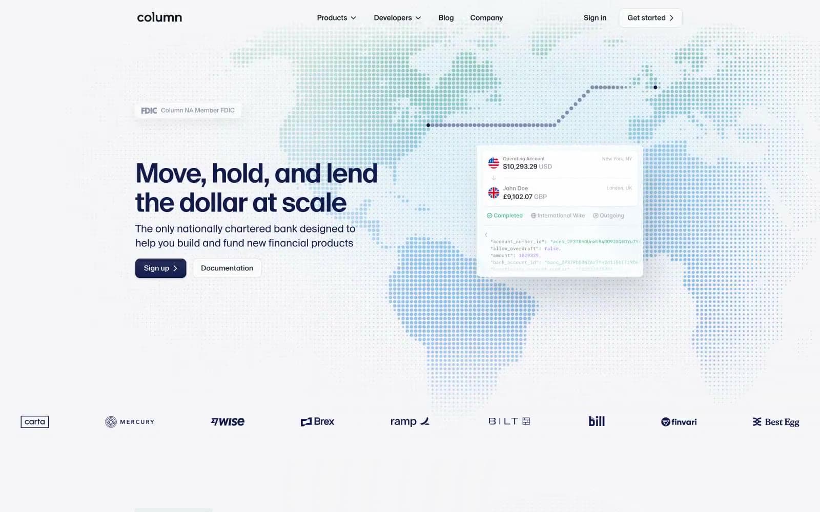
Column design system

Brand5
Primary brand color — filled CTAs, navigation active states, heading text, logo wordmark. The deep violet-tinted navy carries institutional weight without going pure black; pairs with white text for the site's most confident button
Code and data text — the signature color for JSON keys, identifiers, and financial values in code snippets. Also used for chart data points and growth visualizations
Darker seafoam for strokes, chart lines, and icon accents in data contexts. Anchors the seafoam scale on darker backgrounds
Highlighted code text — string values, URLs, API endpoints in code blocks. The lightest seafoam, reads as green-tinted monospace
Decorative stroke and chart accent — deep teal used in SVG illustrations and data visualizations alongside the seafoam scale
Accent5
Accent CTA fill and featured card background — one of the few saturated warm colors in the system. Appears on the Brex highlight card and select buttons to draw the eye without feeling decorative
Soft accent surface — lighter companion to Signal Orange, used as card backgrounds where warmth is needed at lower intensity
Soft accent surface and stroke — appears as background washes behind data widgets and as decorative chart strokes
Violet wash for highlight backgrounds, decorative bands, and soft emphasis behind content. Do not promote it to the primary CTA color
Decorative fill — medium blue used in illustration and SVG contexts
Neutrals11
Maximum contrast text, dark fills in illustrations. Used sparingly — Indigo Navy or Slate Ink carry most text work
Dark surface and emphasis text — product card backgrounds, high-contrast body copy. Near-gray with a cool blue-green undertone; works as the dark-mode substrate when a section needs to invert
Deep icon strokes and nav elements. Near-black with a blue undertone that matches the indigo navy family
Nav icons, dark icon strokes — slightly bluer than pure black, used in icon contexts where Slate Ink would be too warm
Secondary heading and body text — slightly warmer than Midnight Ink, used where pure black feels too harsh against the light canvas
Body and link text — the dominant muted text color (245 occurrences in body). Neutral gray-blue that reads as quiet, never washed out
Icon strokes, tertiary borders, placeholder text. Mid-gray that separates without competing with text
Lightest body text — captions, disclaimers, fine print. Stays legible on white but recedes visually
Card borders, input borders, divider lines. The structural hairline color — appears wherever two surfaces need to separate without shadow
Page background — the dominant canvas color. Near-white with a barely-perceptible cool tint that keeps the page from feeling sterile
Card surfaces, nav background, button fills, secondary text. The top layer of the surface stack
Try a pairing
Pick any two colors from the palette to check whether text stays readable on top.
Aa
Pure White on Indigo Navy
16.53 : 1 contrast
- Body textPasses AA 4.5
- Large textPasses AA 3
- StrictPasses AAA 7
More DESIGN.md files. Same web, different personalities.
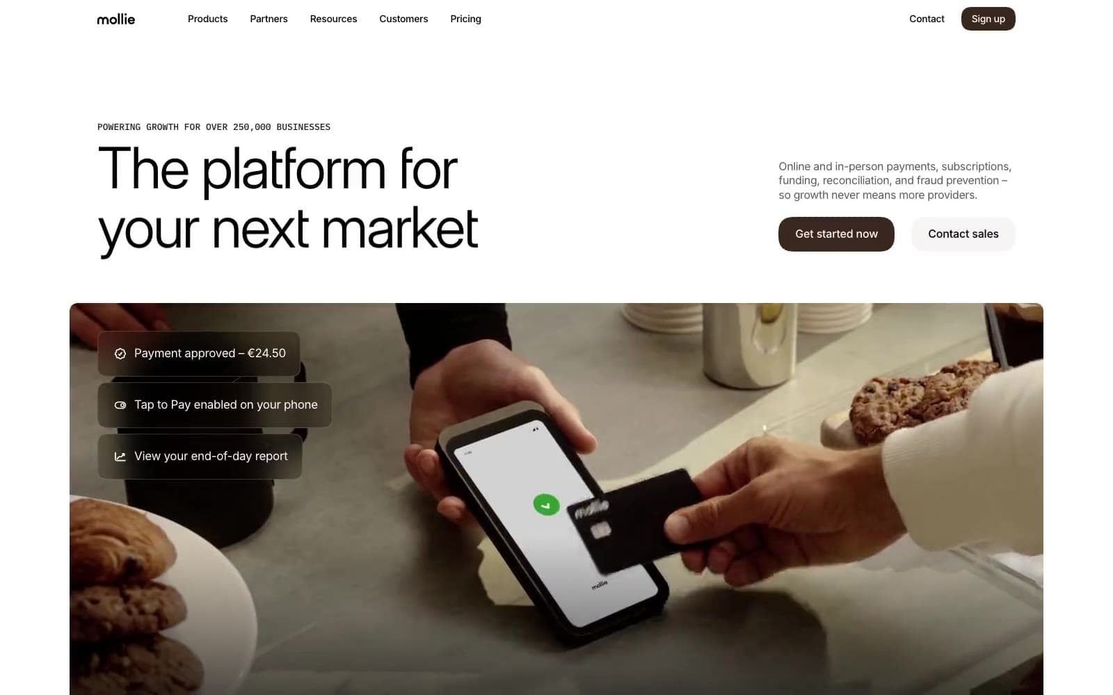
Mollie
Finance
a16z speedrun
Finance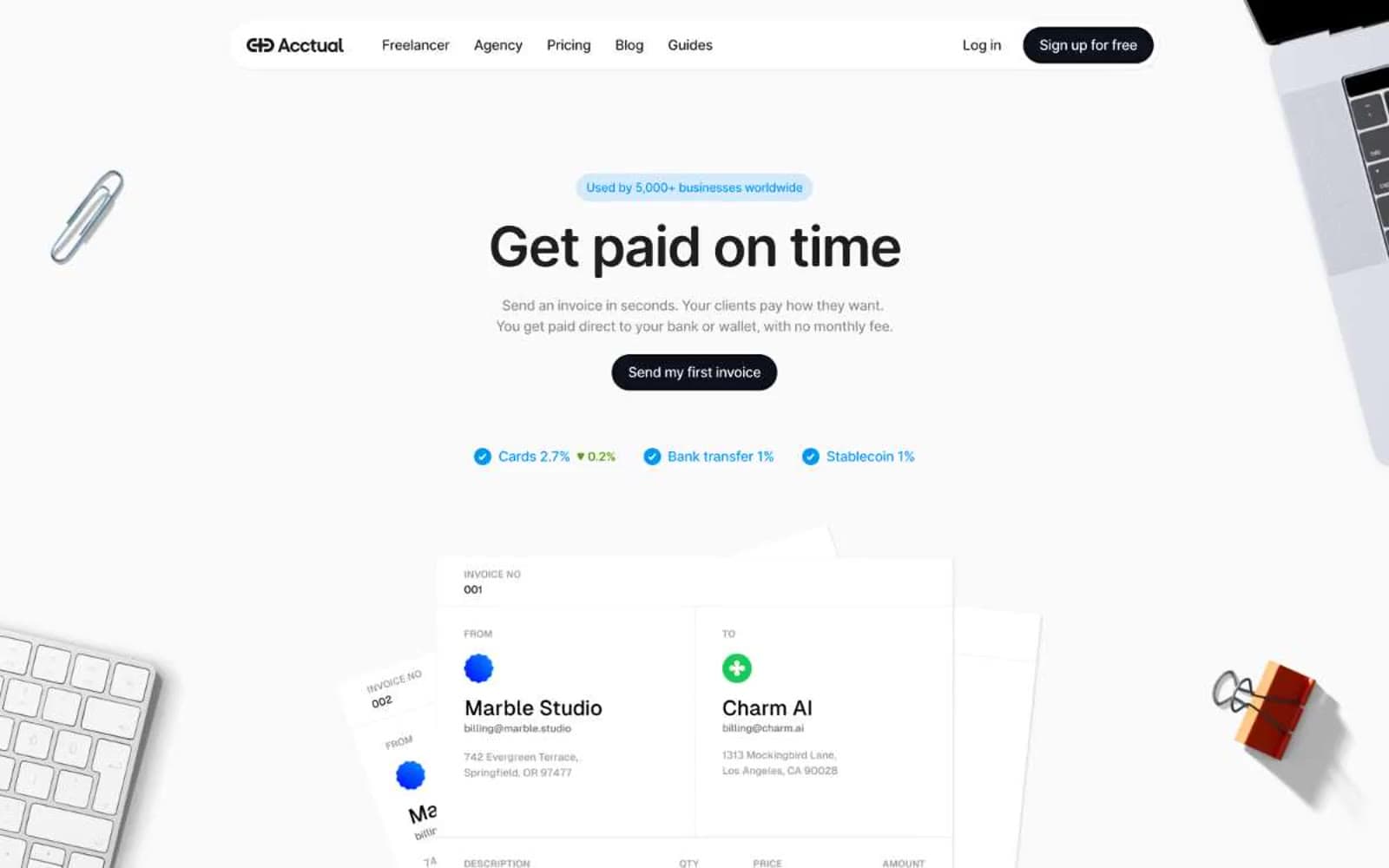
Acctual
Finance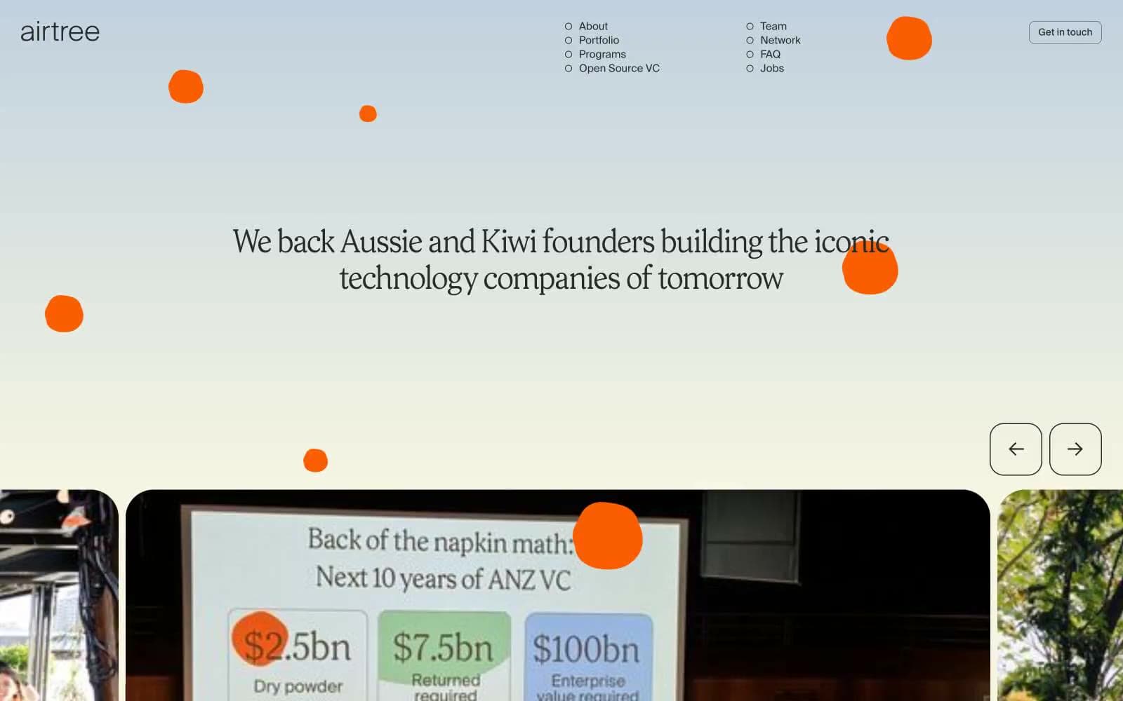
Airtree
Finance
Ambrook
Finance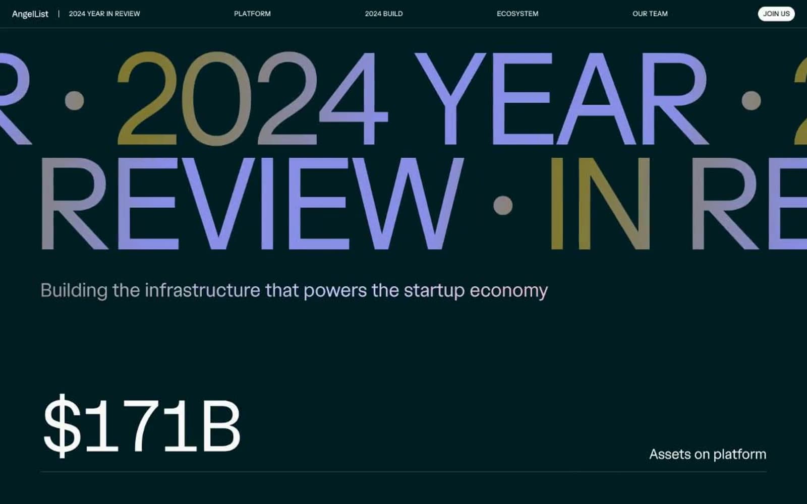
Angellist 2024
Finance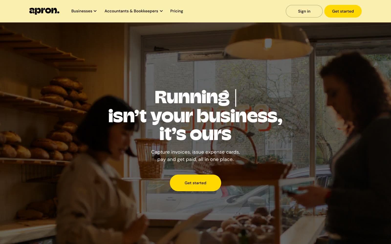
Apron
Finance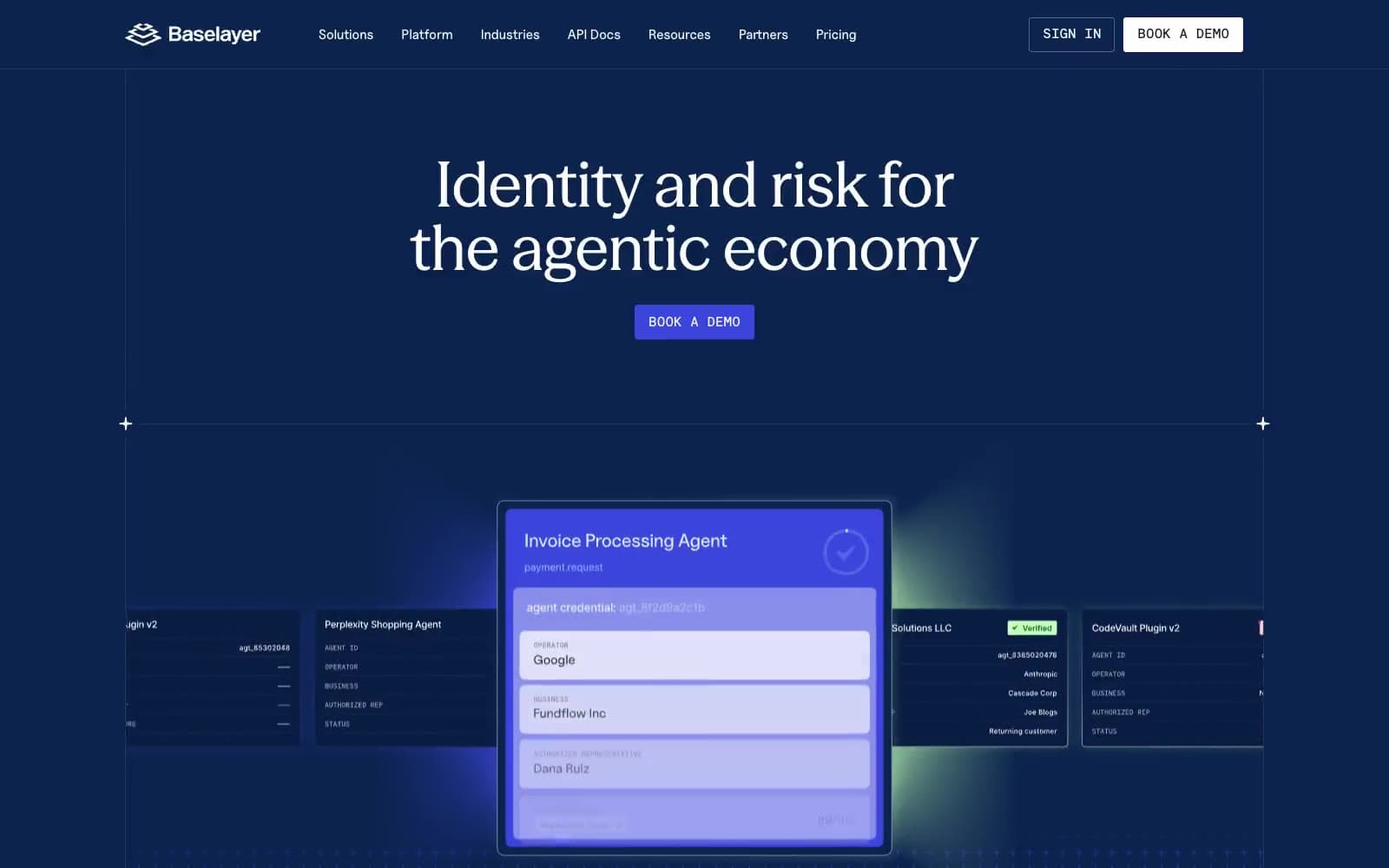
Baselayer
Finance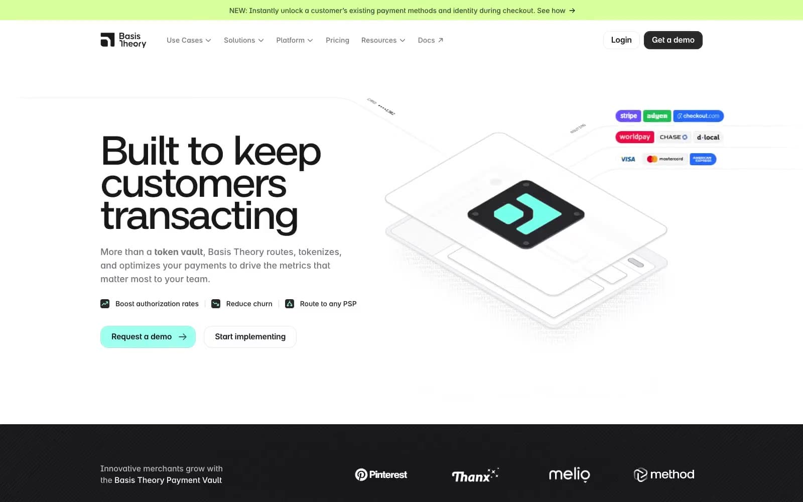
Basis Theory
Finance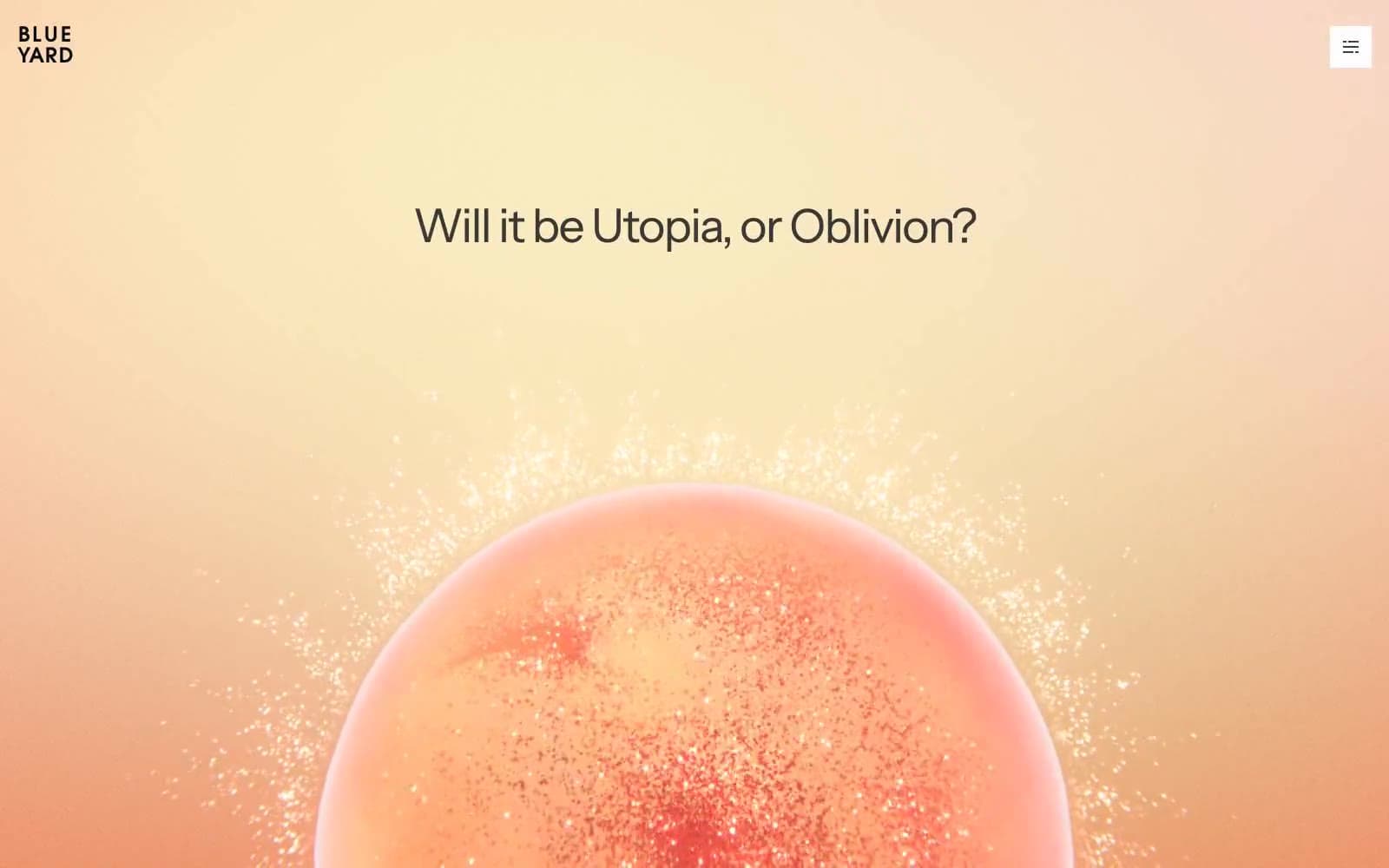
BlueYard Capital
Finance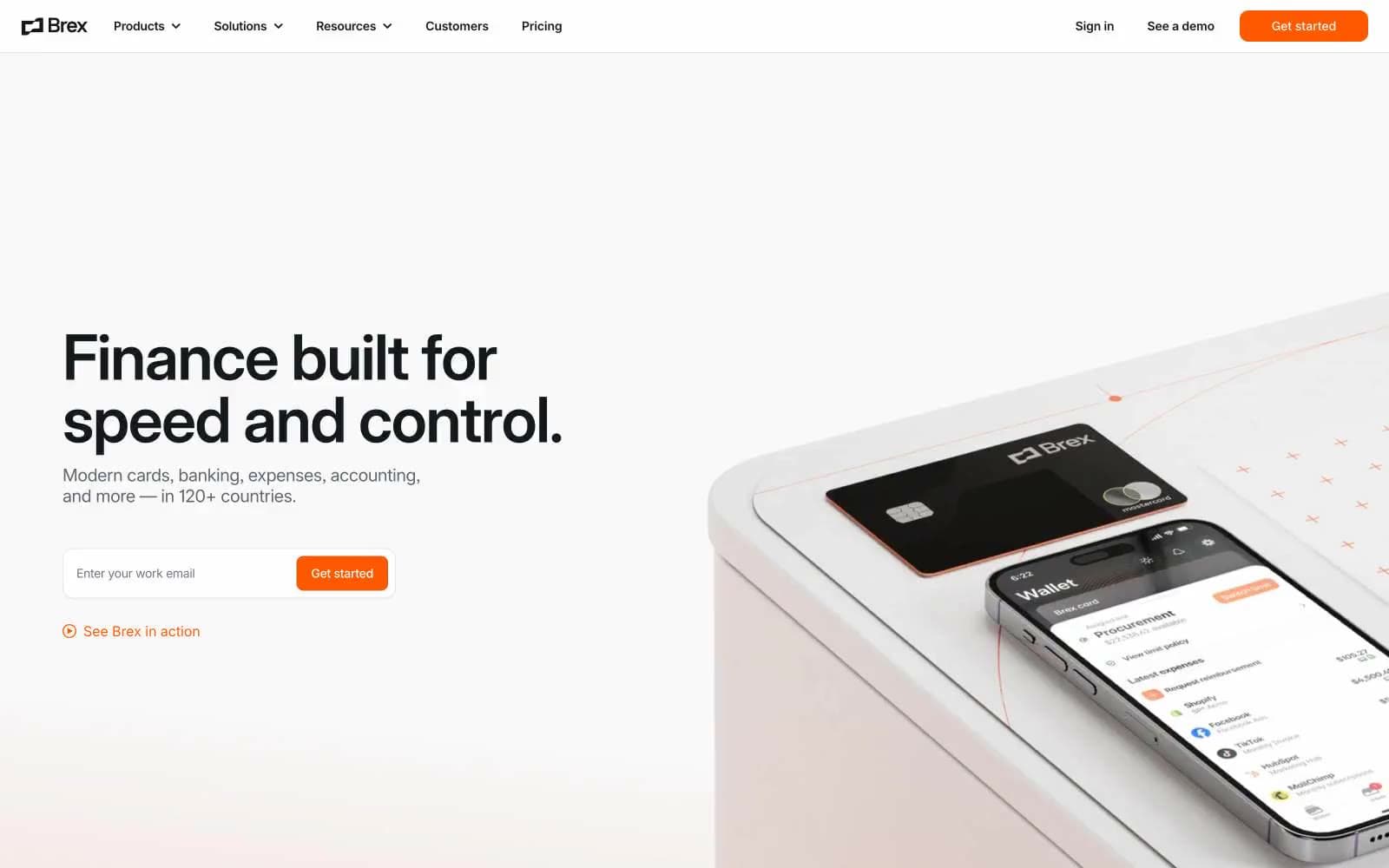
Brex
Finance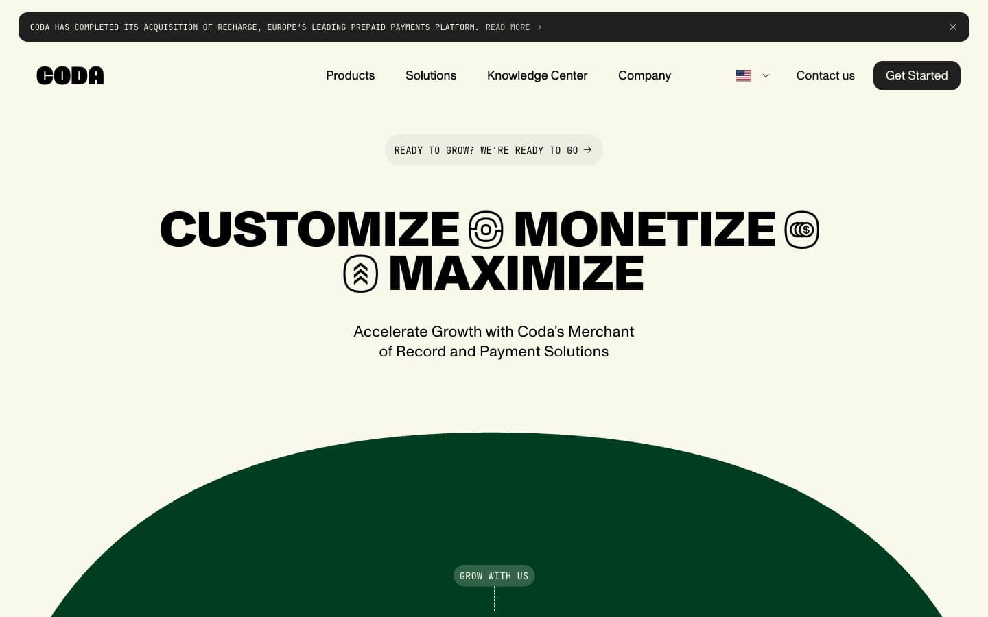
Coda
Finance


