
Co2. Climate atlas in winter light.
- Brand
- Light theme
- 15 colors
- 3 typefaces
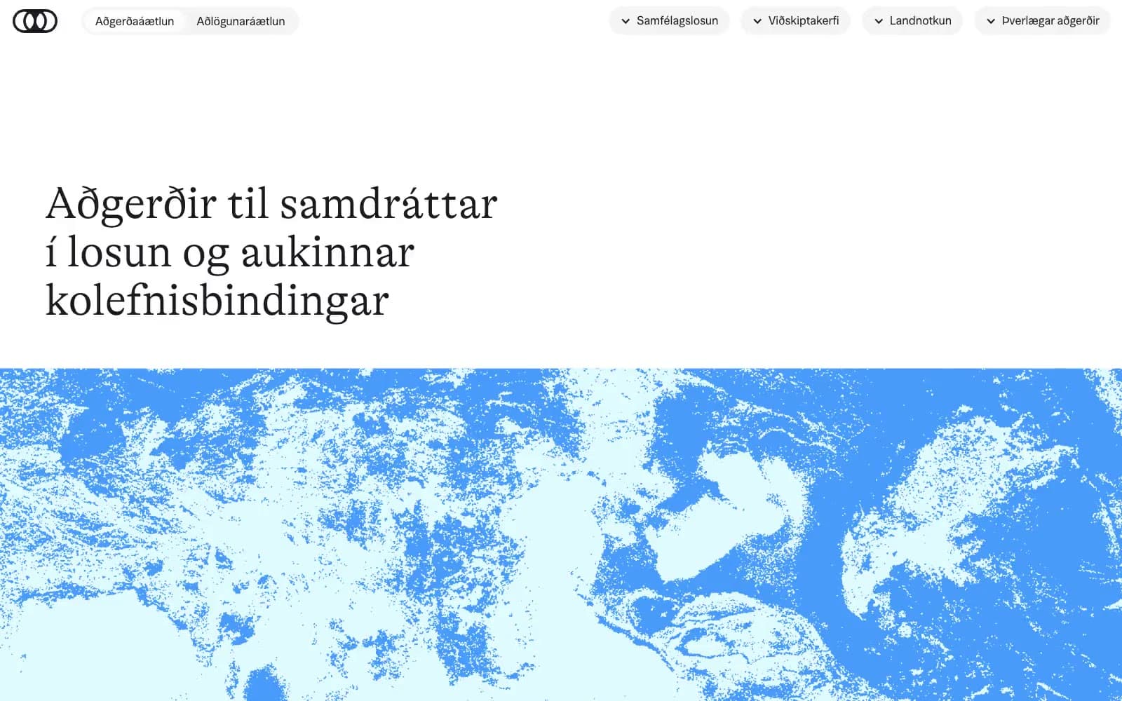
Co2.is frames public climate-policy information as a quiet editorial archive: expansive white space, hairline rules, and low-contrast pill navigation leave room for oversized, whisper-weight serif statements. A near-black editorial ink carries all reading and controls, while pale cyan and mint blocks mark filters and responsible bodies rather than turning the interface into a brightly branded dashboard. Saturated blue, teal, violet, orange, and yellow appear as a compact classification language for climate systems, with a high-contrast blue-and-white environmental image providing the hero’s only large visual interruption.
Co2 design system

Brand1
Text links, selection highlight, and blue environmental-image treatment
Accent5
Land-use system labels and coded graphic blocks
Community-emissions system labels and coded graphic blocks
Emissions-trading system labels and coded graphic blocks
Supporting palette color for small decorative accents when the core palette needs contrast. Do not promote it to the primary CTA color
Feature-card surface for a single high-attention content grouping
Neutrals9
Headlines, body text, navigation, icons, dark card surfaces, and 1px control outlines
Dark informational cards with white text
Secondary text on dark cards
1px dividers, list separators, and understated outlined-control borders
Gray action color for filled buttons, selected navigation states, and focused conversion moments
Pale cyan category chips and highlighted institution controls — an icy marker within the otherwise paper-white document
Light neutral action fill for buttons on dark surfaces
Alternate section backgrounds and rounded quiet panels
Page canvas, hero surfaces, light cards
Try a pairing
Pick any two colors from the palette to check whether text stays readable on top.
Aa
Editorial Ink on Climate Blue
5.87 : 1 contrast
- Body textPasses AA 4.5
- Large textPasses AA 3
- StrictFails AAA 7
More DESIGN.md files. Same web, different personalities.

Airbnb
Brand
Aker
Brand
Alison Roman
Brand
Alpine Bio
Brand
Alveos One
Brand
Amrit Palace
Brand
André Cândido
Brand
Anna Jóna
Brand
Apollo
Brand
Apple
Brand
Arva
Brand
Ashton Bespoke
Brand


