
Chester's Garden. Flimsy art-zine on drafting paper.
- Brand
- Light theme
- 11 colors
- 3 typefaces
Chester's Garden is a personal digital garden rendered as a quiet, editorial broadsheet on soft gray paper. The visual language is deliberately unfussy: a near-white canvas layered onto a cool gray substrate, serif display type at whisper-weight 300 that feels typeset rather than designed, and a masonry grid where cards of varying heights lock together like magazine columns. Body text is compact Inter with selectively bolded words inside flowing sentences, echoing how a reader underlines a phrase in a book. Pastel tag pills (mint, butter yellow, sage) and one rust-orange link color provide the only chromatic moments — accents behave like highlighter marks, not like a brand identity. Everything else is restrained: hairline borders, tiny radii, no gradients, no decorative elevation, and images sit in their own muted card frames.
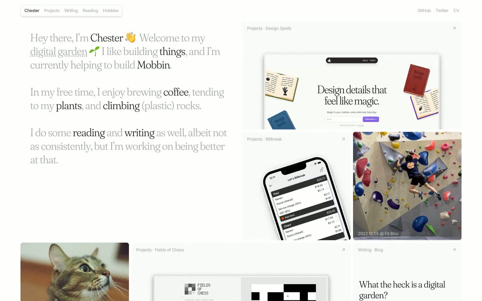
Chester's Garden design system

Brand2
Occasional inline emphasis — the only warm chromatic voice in the palette, used sparingly to single out one word or phrase inside a body sentence
Occasional inline emphasis — the cool counterpart to Rust Underline, used for the same hand-underline-in-a-book purpose
Accent3
Pill-tag background (FILTER, READ) — the first chromatic accent tier, like a fluorescent marker on the page
Pill-tag background (NOW BREWING) — second accent tier, warmer counterpart to the mint
Pill-tag background (READ variants) — third accent tier, softer green for less emphatic tags
Neutrals6
Primary body text, nav logo, image letterbox bars — maximum contrast, used for sentences that need to carry the page
Headline and link text — almost black but not quite, so Fraunces serifs feel printed rather than digital
Secondary body text, supporting metadata lines under headings
Tertiary text, icon strokes, placeholder labels — fades to the background and only earns attention when scanned for
Page background, card borders, hairline dividers — the cool, slightly blue-gray substrate that every surface sits on or against
Card and content-tile surface — reads as warm white against the cool Paper Gray substrate, giving each block a subtle lift without any shadow
Try a pairing
Pick any two colors from the palette to check whether text stays readable on top.
Aa
Bone White on Rust Underline
8.98 : 1 contrast
- Body textPasses AA 4.5
- Large textPasses AA 3
- StrictPasses AAA 7
More DESIGN.md files. Same web, different personalities.

Airbnb
Brand
Aker
Brand
Alison Roman
Brand
Alpine Bio
Brand
Alveos One
Brand
Amrit Palace
Brand
André Cândido
Brand
Anna Jóna
Brand
Apollo
Brand
Apple
Brand
Arva
Brand
Ashton Bespoke
Brand


