
CHELSEA. The roster plays, the chrome disappears.
- Studio
- Dark theme
- 6 colors
- 1 typeface
Chelsea is a talent roster presented as a black-box cinema: full-bleed cinematic photography sits directly on pure black, with a single vivid blue (#4490ff) as the only chromatic voice. The interface is deliberately skeletal — a thin top bar, a tiny floating blue dot, and a name list rendered in the accent color — letting the roster's work carry all visual weight. Typography is one family (Neue Haas Unica Pro) in two weights, set with tight 1.0–1.15 line-heights so the type reads like a film credit rather than a website. Everything that can be invisible is invisible: no borders on the canvas, no shadows, no card containers, no section backgrounds — the only surface transition is the sudden black-to-photography cut. Buttons and links are pill-shaped (9999px radius) and extremely compact, reinforcing the sense that this is a viewing room, not a product dashboard.
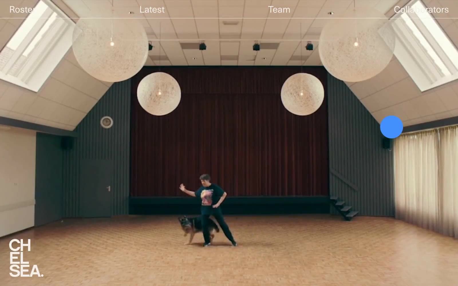
CHELSEA design system

Brand1
Primary action, interactive links, roster name listings, focal dot indicator, highlighted borders — the only chromatic voice in an otherwise monochrome system
Neutrals5
Page canvas, all section backgrounds, negative space — the floor everything sits on
Headings, heavy borders, structural borders on dark surfaces — near-black with a slight cool cast for separation from the pure black canvas
Light-mode surfaces, neutral borders on cards or panels, secondary dividers — provides a paper-like counterpoint when a section lifts off the black canvas
Warm off-white for text and subtle borders — softer than pure white, evoking film stock and gallery walls against the black canvas
Maximum-contrast text and dividers when absolute clarity is needed over photography or dark media
Try a pairing
Pick any two colors from the palette to check whether text stays readable on top.
Aa
Void Black on Spotlight Blue
6.68 : 1 contrast
- Body textPasses AA 4.5
- Large textPasses AA 3
- StrictFails AAA 7
More DESIGN.md files. Same web, different personalities.

Basement Studio
Studio
Production Portugal
Studio
Active Theory
Studio
Adnaut
Studio
Agence K72
Studio
Akash Tyagi
Studio
Analogue
Studio
Athletics
Studio
BAM Photographers
Studio
Bareis + Nicolaus
Studio
Becklyn
Studio
Branding
Studio


