
Cassette. Neon cassette on black velvet.
- Studio
- Dark theme
- 6 colors
- 2 typefaces
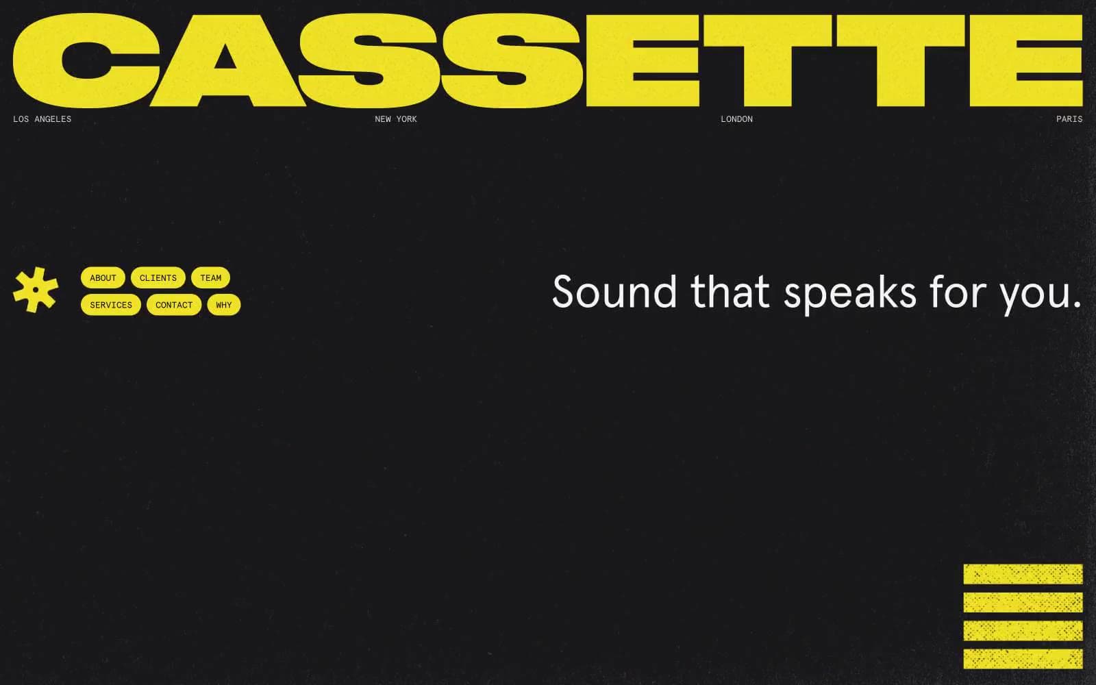
Cassette is a music curation agency site that reads like a single-color risograph print: near-black canvas, one electric yellow doing all the work, and a mono/sans typography pair that feels like liner notes and stage signage. The visual system is deliberately austere — no gradients, no shadows, no decorative secondary hues — so the yellow wordmark, pill buttons, and equalizer bars hit with amplifier-level intensity against the dark ground. Layout is editorial and collage-driven: oversized type, asymmetric image stacks, and bordered logo grids. Components are flat, fully rounded (900px pills), and bordered rather than elevated, with a pervasive grain/noise texture that gives even flat color a tactile, photocopied quality.
Cassette design system

Brand1
Primary action buttons, wordmark, navigation pill borders, section badges, equalizer bars, brand asterisk, highlight underlines — the only chromatic color in the system, carrying 100% of brand voice and functional energy
Neutrals5
Hard borders, image outlines, logo grid dividers, text on yellow fills — the structural ink that gives the system its edges
Primary page background — a warm near-black that sits behind every screen, softer than pure black and warmer against the yellow
Subtle dividers, secondary borders, low-contrast structural lines between grid cells
Muted helper text, secondary descriptive copy, low-emphasis labels
Primary text color, body copy, headings, client logos, light surface fills — a warm off-white that reads as paper against the warm-black ground
Try a pairing
Pick any two colors from the palette to check whether text stays readable on top.
Aa
Pure Black on Hi-Vis Yellow
15.61 : 1 contrast
- Body textPasses AA 4.5
- Large textPasses AA 3
- StrictPasses AAA 7
More DESIGN.md files. Same web, different personalities.

Basement Studio
Studio
Production Portugal
Studio
Active Theory
Studio
Adnaut
Studio
Agence K72
Studio
Akash Tyagi
Studio
Analogue
Studio
Athletics
Studio
BAM Photographers
Studio
Bareis + Nicolaus
Studio
Becklyn
Studio
Branding
Studio


