
Caserne. Black gallery wall with white type whispers.
- Studio
- Dark theme
- 5 colors
- 1 typeface
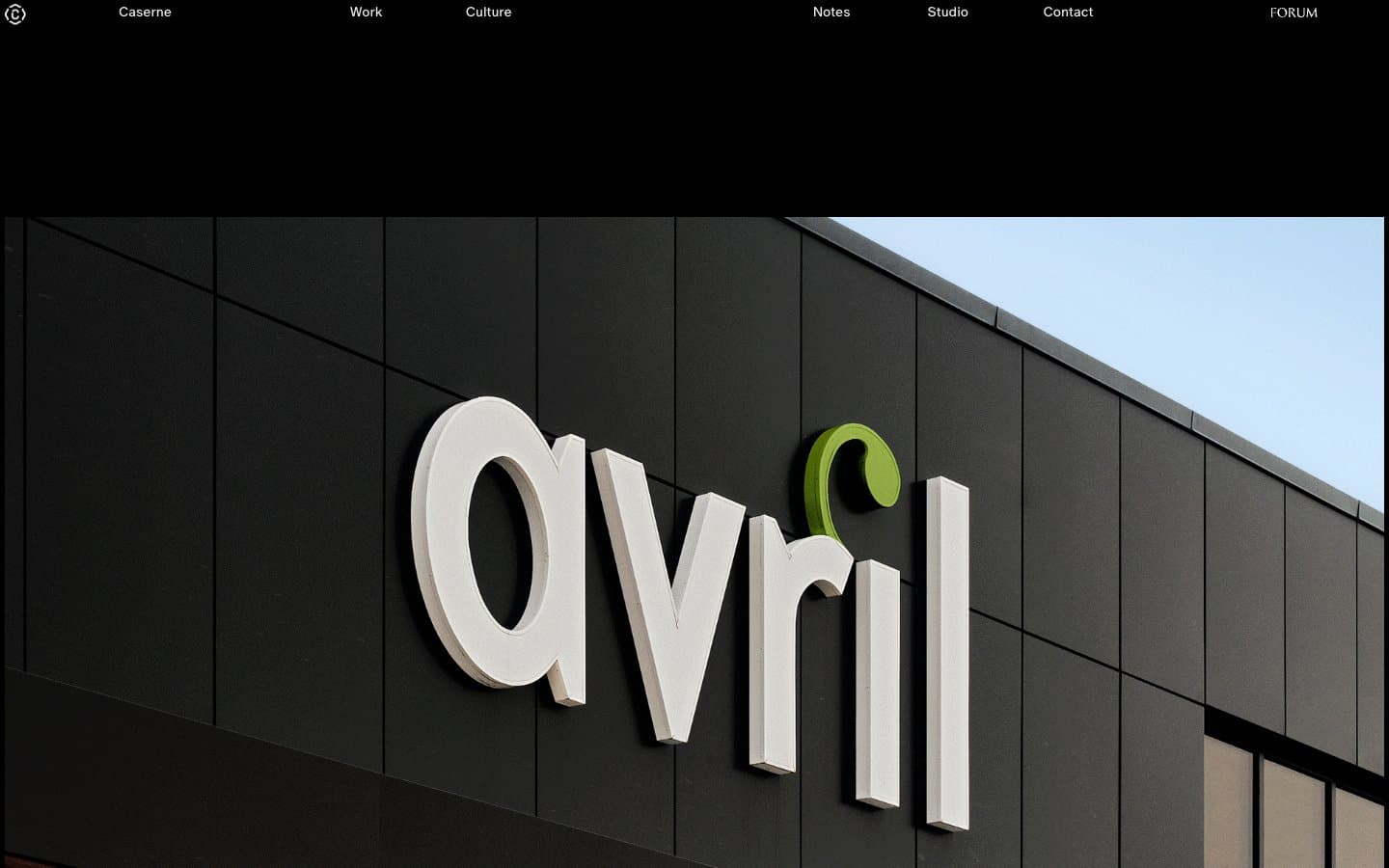
Caserne operates as a gallery-grade portfolio: a near-pure black canvas where oversized editorial photography does the heavy lifting, and the interface itself retreats into hairline borders and whisper-thin type. The visual language is gallery-grade restraint — true black dominates, type sits at 13–14px in custom ABC Oracle, and the only motion is the page scroll revealing monolithic project images. Every UI element earns its place: there is no navigation chrome, no button fills, no decorative gradient — just text, image, and a 1px line. The « » guillemets prefixing project labels are a French-Canadian editorial signature, hinting at the studio's Montreal roots and anchoring the brand in a curatorial, almost typographic sensibility.
Caserne design system

Neutrals5
Page canvas, full-bleed section backgrounds, hero containers
Muted icon strokes, separators, and secondary graphic details. Do not promote it to the primary CTA color
Muted secondary text, project descriptions, metadata captions
Hairline borders, image outlines, grid dividers, nav separators — the structural linework of the entire interface
Primary text, project labels, navigation links, icon strokes on dark surfaces
Try a pairing
Pick any two colors from the palette to check whether text stays readable on top.
Aa
Paper on Obsidian
21.00 : 1 contrast
- Body textPasses AA 4.5
- Large textPasses AA 3
- StrictPasses AAA 7
More DESIGN.md files. Same web, different personalities.

Basement Studio
Studio
Production Portugal
Studio
Active Theory
Studio
Adnaut
Studio
Agence K72
Studio
Akash Tyagi
Studio
Analogue
Studio
Athletics
Studio
BAM Photographers
Studio
Bareis + Nicolaus
Studio
Becklyn
Studio
Branding
Studio


