
Busuu. Playful passport of global connection.
- Brand
- Light theme
- 12 colors
- 1 typeface
Busuu's design system radiates warm, approachable energy through a vivid purple-to-blue gradient hero that bleeds confidence before settling into a calm, near-white workspace. The dominant interface is built on a very pale blue-tinted canvas (#f2f7fd) with white cards floating above it, and a single saturated spring-green (#11ee92) acts as the primary action accent — an unconventional choice that immediately distinguishes it from the sea of blue CTAs in edtech. Typography is custom (Nista) with a compact, bold-friendly weight stack: heavy 800 for display, 700 for headings, and a clean 400 for body, giving the system a confident, slightly geometric voice. The visual language is heavily illustrated — flat, colorful character art with circular framing devices — and the layout relies on generous padding, pill-shaped controls, and circular flag tiles to make global language learning feel tactile and inviting rather than academic.
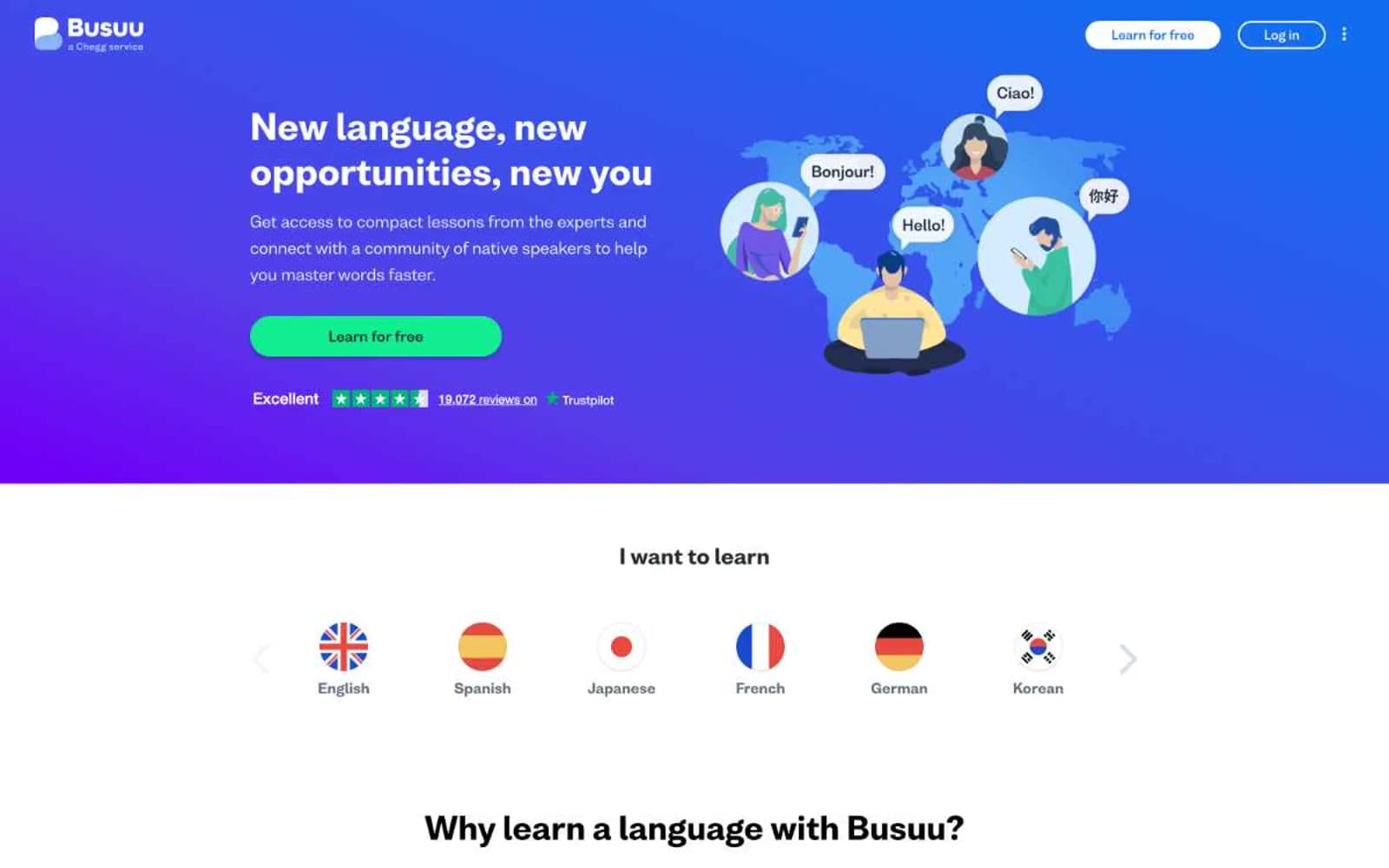
Busuu design system

Brand4
Left edge of hero gradient — anchors the purple sky of the landing banner
Brand links, nav accents, heading highlights, logo wordmark — the only blue that carries brand meaning
Green supporting accent for decorative details and low-frequency emphasis. Do not promote it to the primary CTA color
Right edge of hero gradient — transitions from deep indigo to a cleaner blue, softening the landing page mood
Accent1
Review star fill on the Trustpilot social-proof line — the only yellow in the system, used exclusively for ratings
Neutrals7
Icon strokes, decorative illustration linework, highest-contrast text — used where maximum weight is needed
Primary body text and heading color — softer than pure black, keeps long-form copy comfortable
Muted helper text, secondary body copy, metadata — readable but recedes against charcoal
Soft elevation wash and button shadow base — used in the subtle 1px shadow stack
Input borders, dividers, subtle structural lines — cool-toned to harmonize with the mist canvas
Page background — barely-blue tinted near-white, the calm base layer below the hero
Card surfaces, nav background, content panels — sits one level above the mist canvas
Try a pairing
Pick any two colors from the palette to check whether text stays readable on top.
Aa
Paper White on Deep Indigo
11.84 : 1 contrast
- Body textPasses AA 4.5
- Large textPasses AA 3
- StrictPasses AAA 7
More DESIGN.md files. Same web, different personalities.

Airbnb
Brand
Aker
Brand
Alison Roman
Brand
Alpine Bio
Brand
Alveos One
Brand
Amrit Palace
Brand
André Cândido
Brand
Anna Jóna
Brand
Apollo
Brand
Apple
Brand
Arva
Brand
Ashton Bespoke
Brand


