
Bumble. Sunlit honey editorial.
- Brand
- Light theme
- 8 colors
- 1 typeface
Bumble runs on a monochrome-plus-one-warmth system: near-black ink (#202020) carries every word, every border, every interactive surface, and one vivid honey-yellow (#ffdb5b) floods the hero and feature canvases as the brand's emotional signal. The geometry is soft and confident — 16-24px radii on cards and buttons, pill-shaped badges at 1000px, barely-there shadows at 12% opacity — so nothing feels sharp or aggressive. BumbleSans speaks in slightly opened letter-spacing (0.007-0.02em), which is unusual for a geometric sans and gives even the smallest UI copy a warm, unhurried cadence. Content is arranged in generous 24-40px padded cards over white surfaces, with full-bleed yellow bands acting as the visual punctuation between sections. The result reads like a sunlit lifestyle magazine: human photography does the heavy lifting, the brand color is never decorative noise, and the UI recedes so the people in the photos lead.
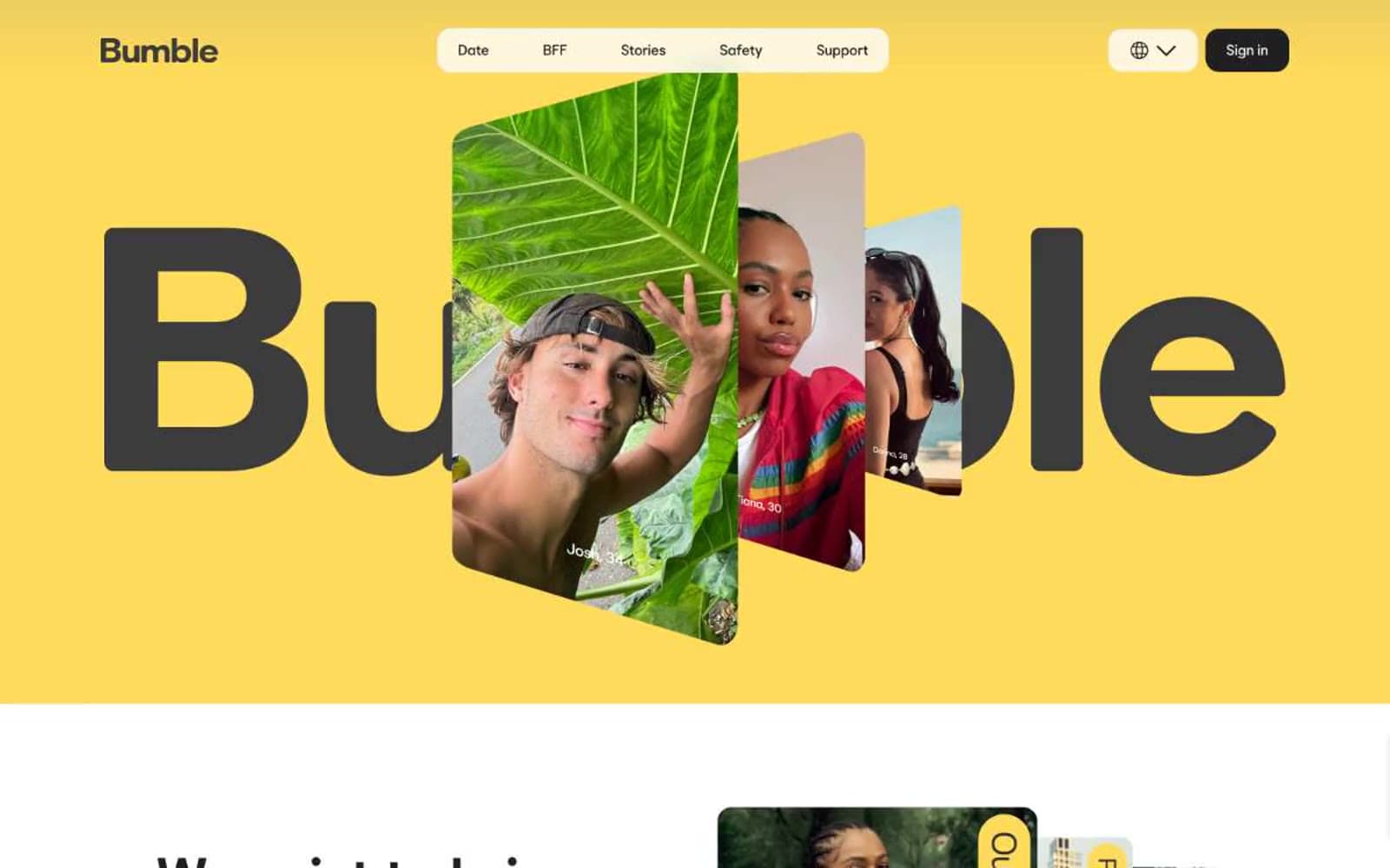
Bumble design system

Brand2
Yellow state accent for badges, validation surfaces, and short status labels.
Lighter yellow accent surface for secondary card frames and tonal variation against Honey
Neutrals6
Primary text, filled action buttons, all borders and dividers — the structural near-black that carries 2,100+ UI instances and is the de facto primary action color
Badge borders and badge text — the slightly warmer dark used inside pill-shaped tags
Secondary borders, muted icon strokes, and supplementary divider lines when Ink feels too heavy
Muted helper text, inactive nav borders, and low-emphasis UI labels
Subtle elevated card surface for sections that need to step forward from the white page without going dark
Page canvas, card surfaces, button text on dark fills, body text inverse
Try a pairing
Pick any two colors from the palette to check whether text stays readable on top.
Aa
Bumble Ink on Bumble Honey
12.05 : 1 contrast
- Body textPasses AA 4.5
- Large textPasses AA 3
- StrictPasses AAA 7
More DESIGN.md files. Same web, different personalities.
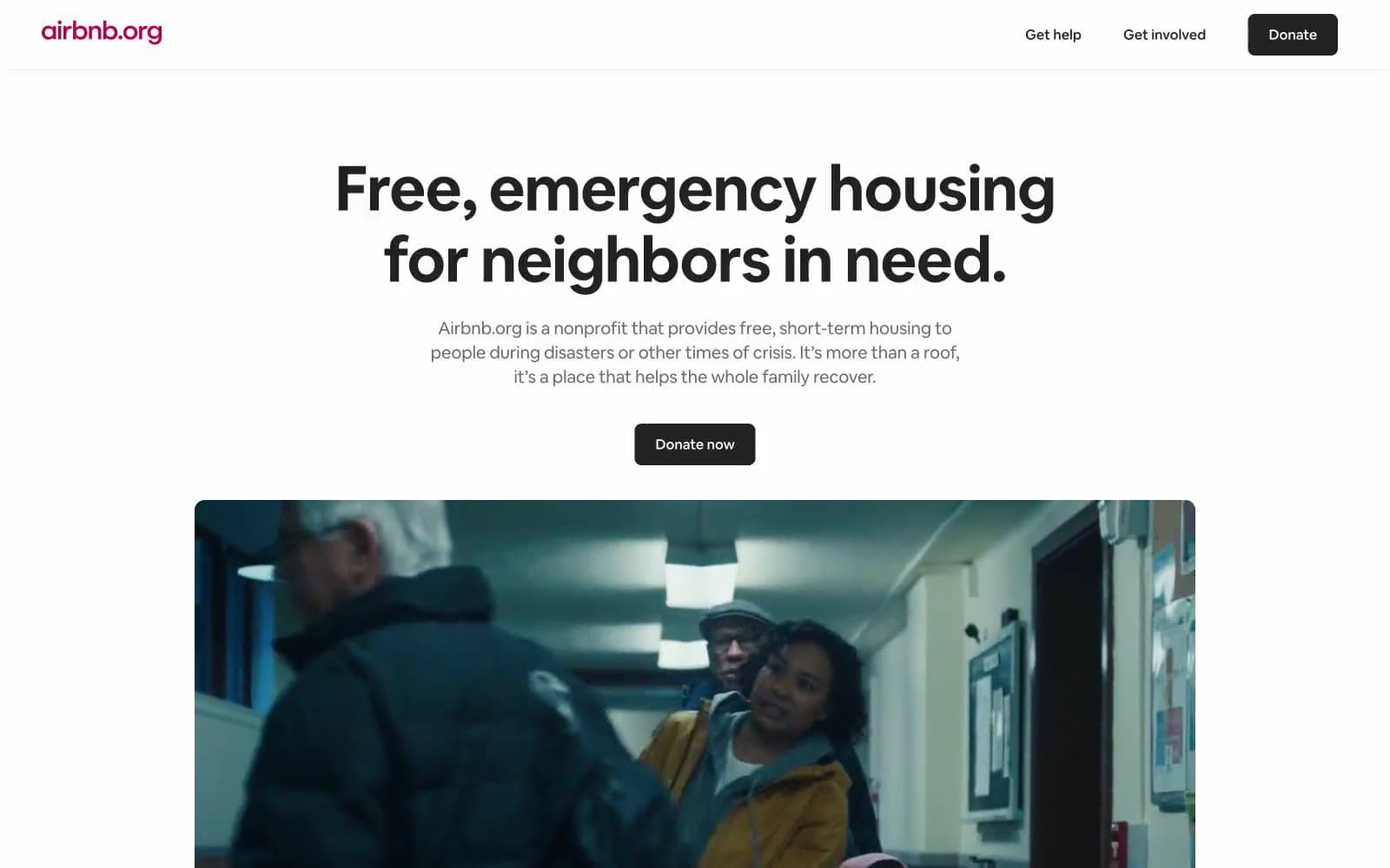
Airbnb
Brand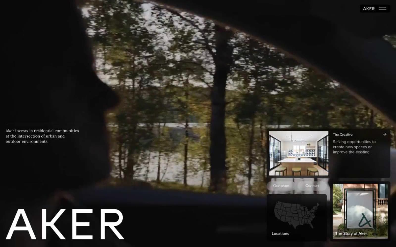
Aker
Brand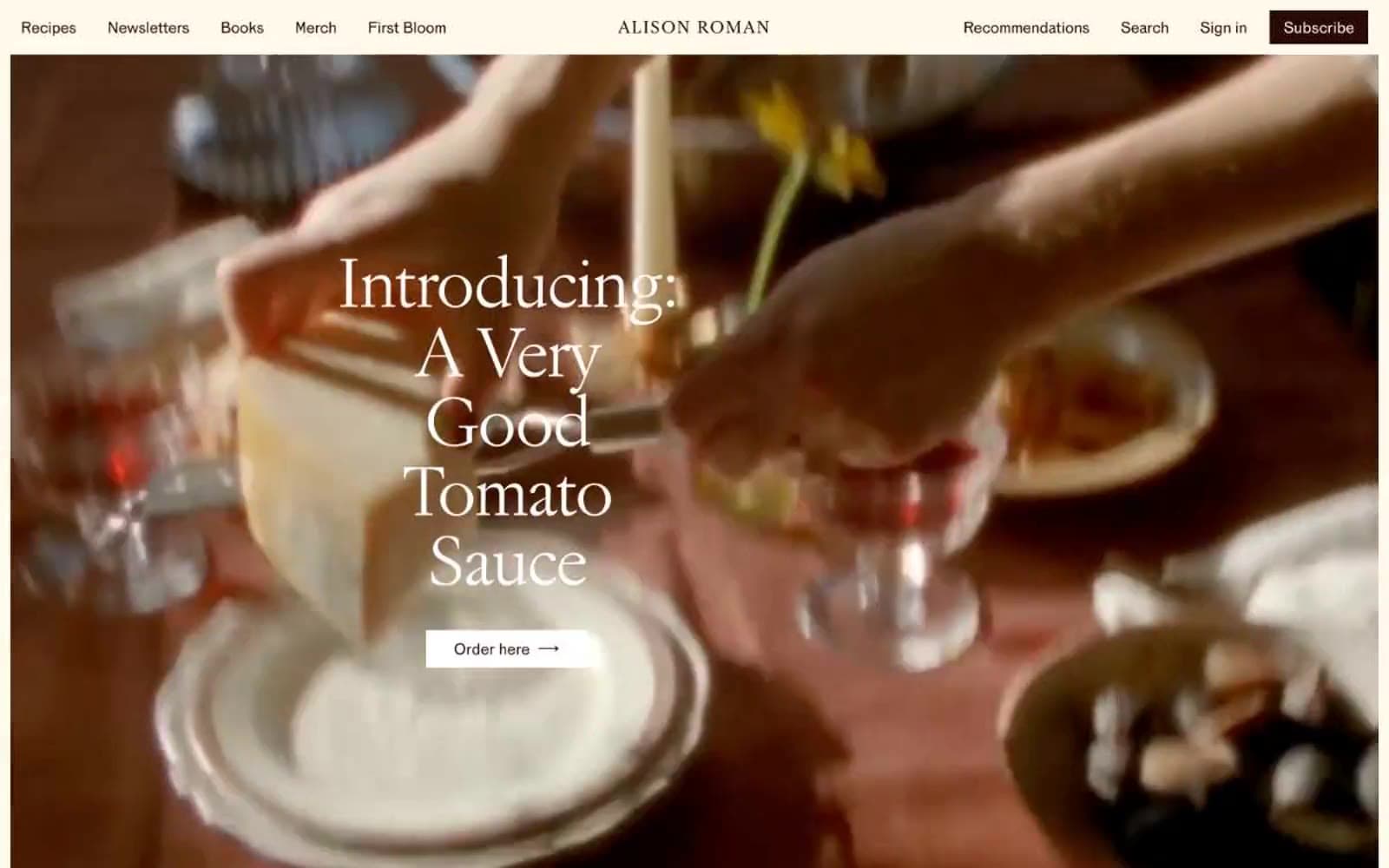
Alison Roman
Brand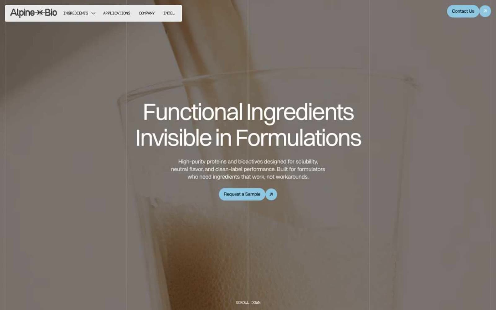
Alpine Bio
Brand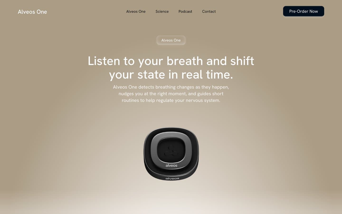
Alveos One
Brand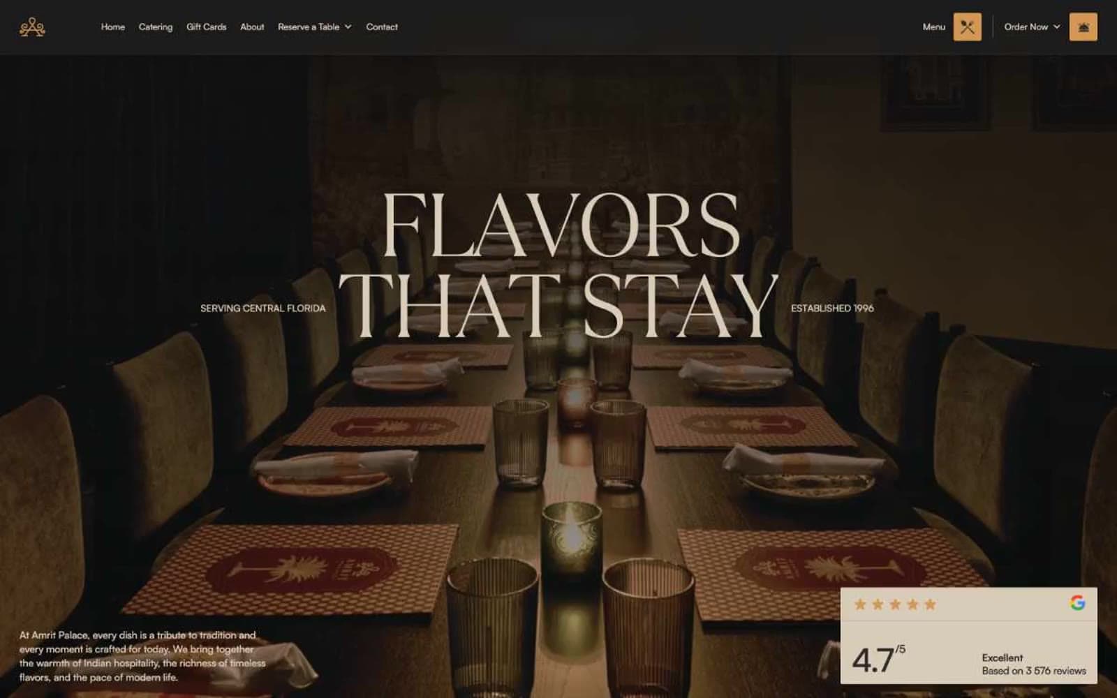
Amrit Palace
Brand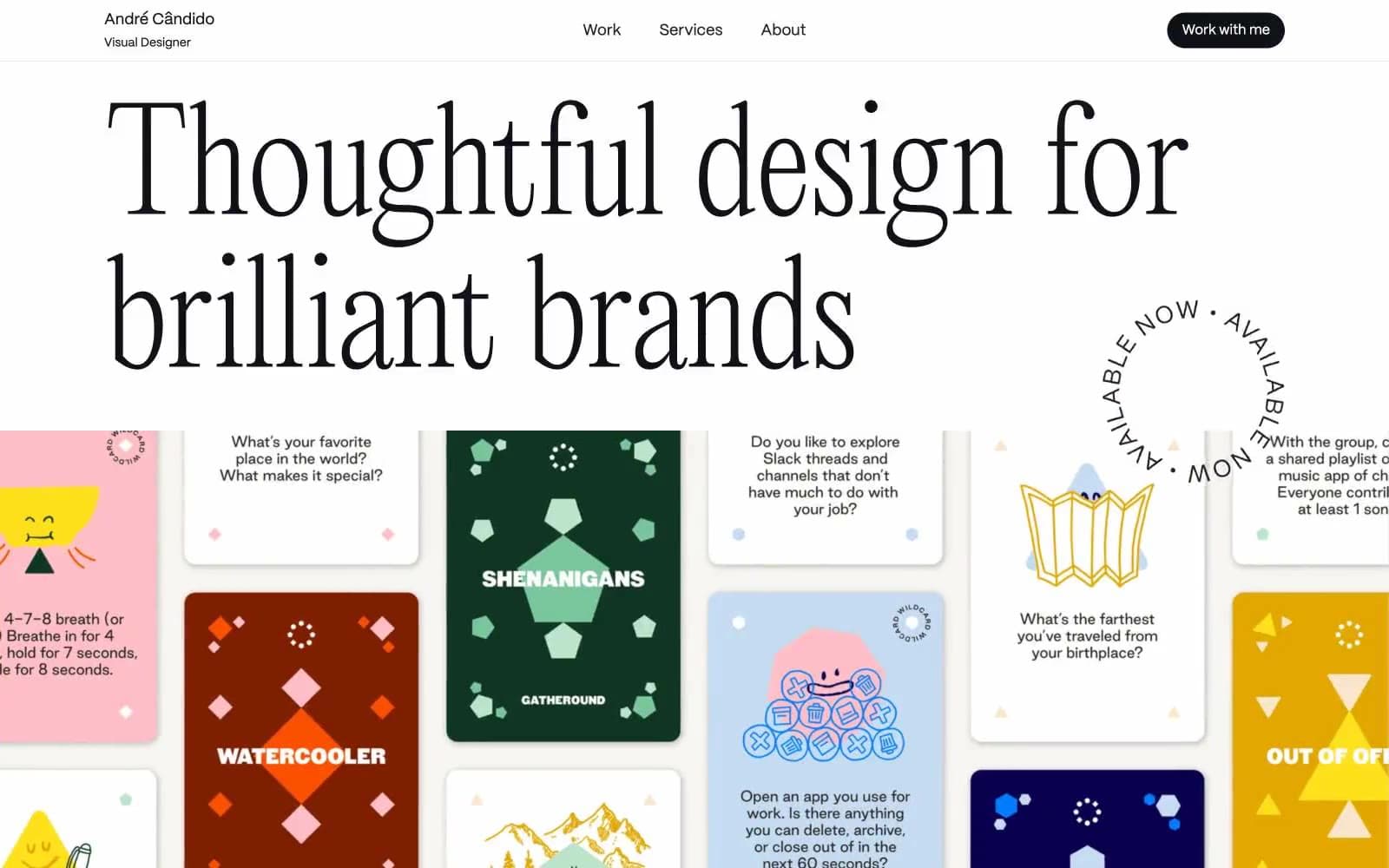
André Cândido
Brand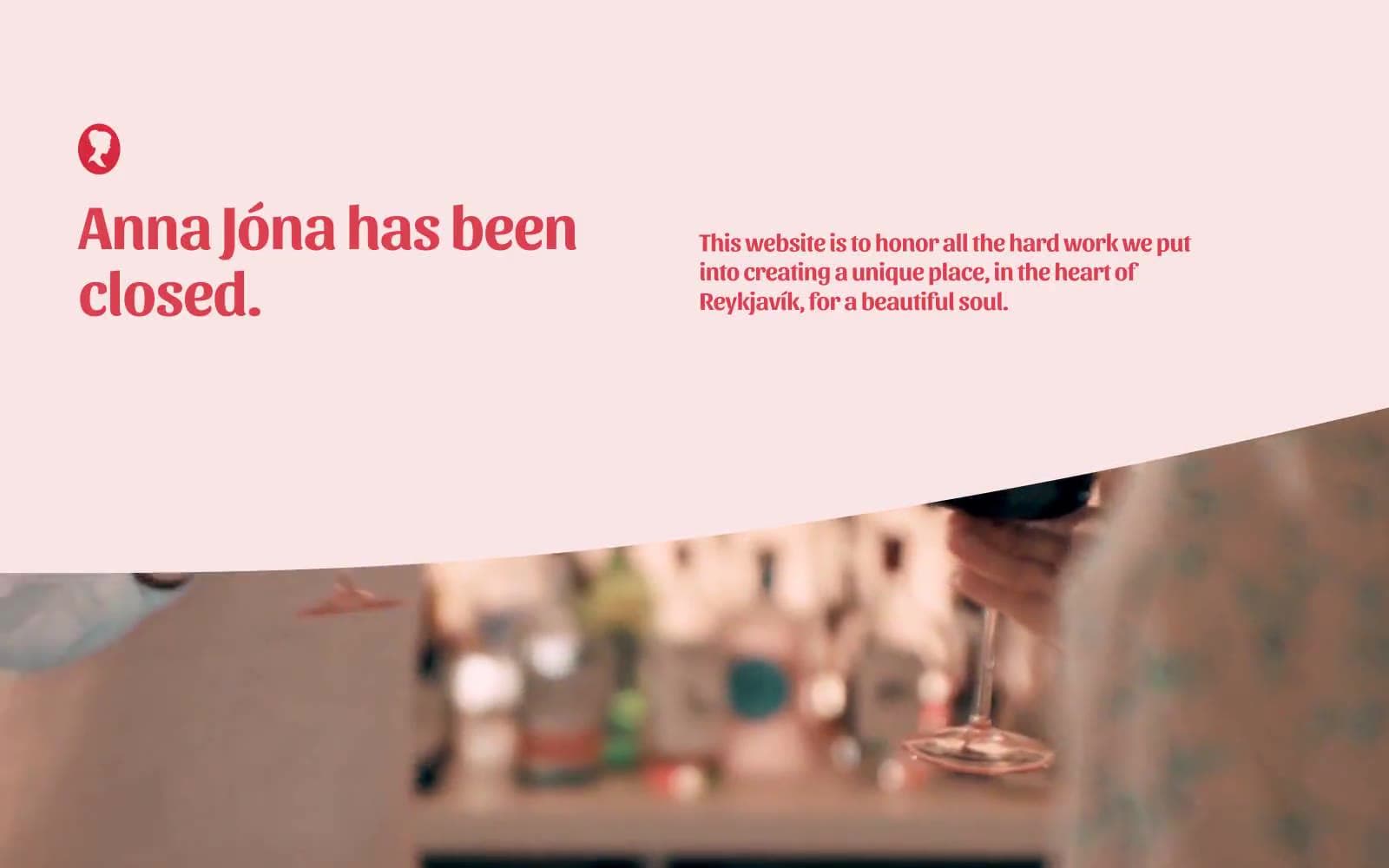
Anna Jóna
Brand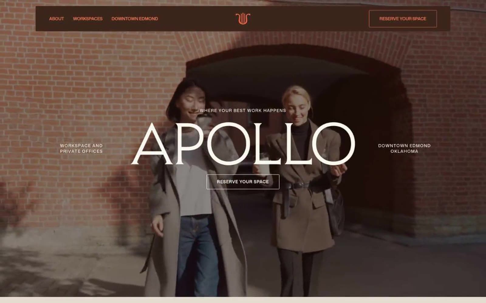
Apollo
Brand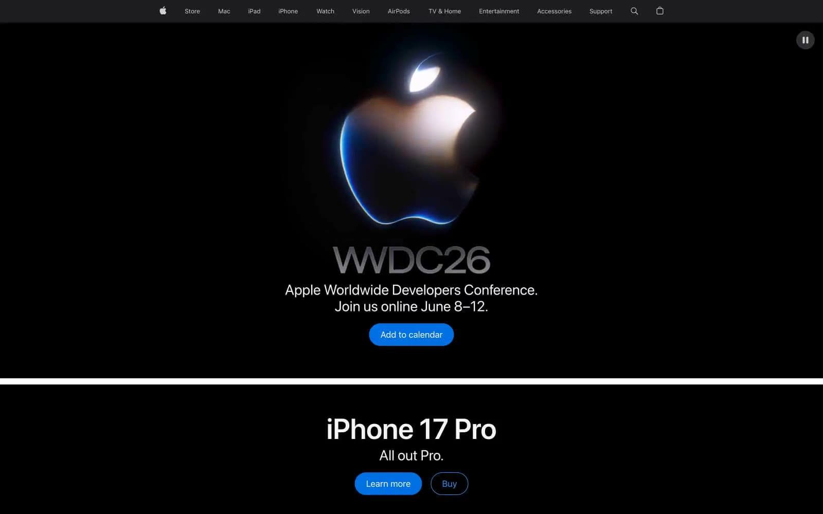
Apple
Brand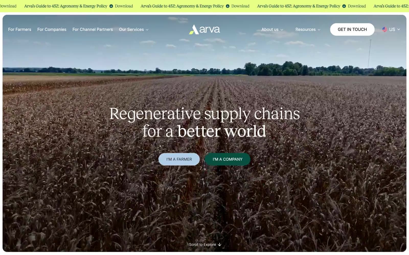
Arva
Brand
Ashton Bespoke
Brand


