
BMW.com. A typographic frame where the cars are the only color.
- Brand
- Light theme
- 4 colors
- 2 typefaces
BMW.com uses an austere automotive showcase language: the UI recedes entirely so the product photography can speak. The interface is built from just two surfaces — pure white and a charcoal near-black — connected by a whisper-light display heading at 60px that signals premium through typographic restraint rather than weight. Every structural element (navigation, footer links, language switcher) is rendered as plain text with no decorative chrome, treating the web page as a typographic frame for the vehicles rather than a software interface. The signature choice is the 300-weight display face — a deliberate anti-convention in luxury automotive branding where most competitors default to 700–900 weights.
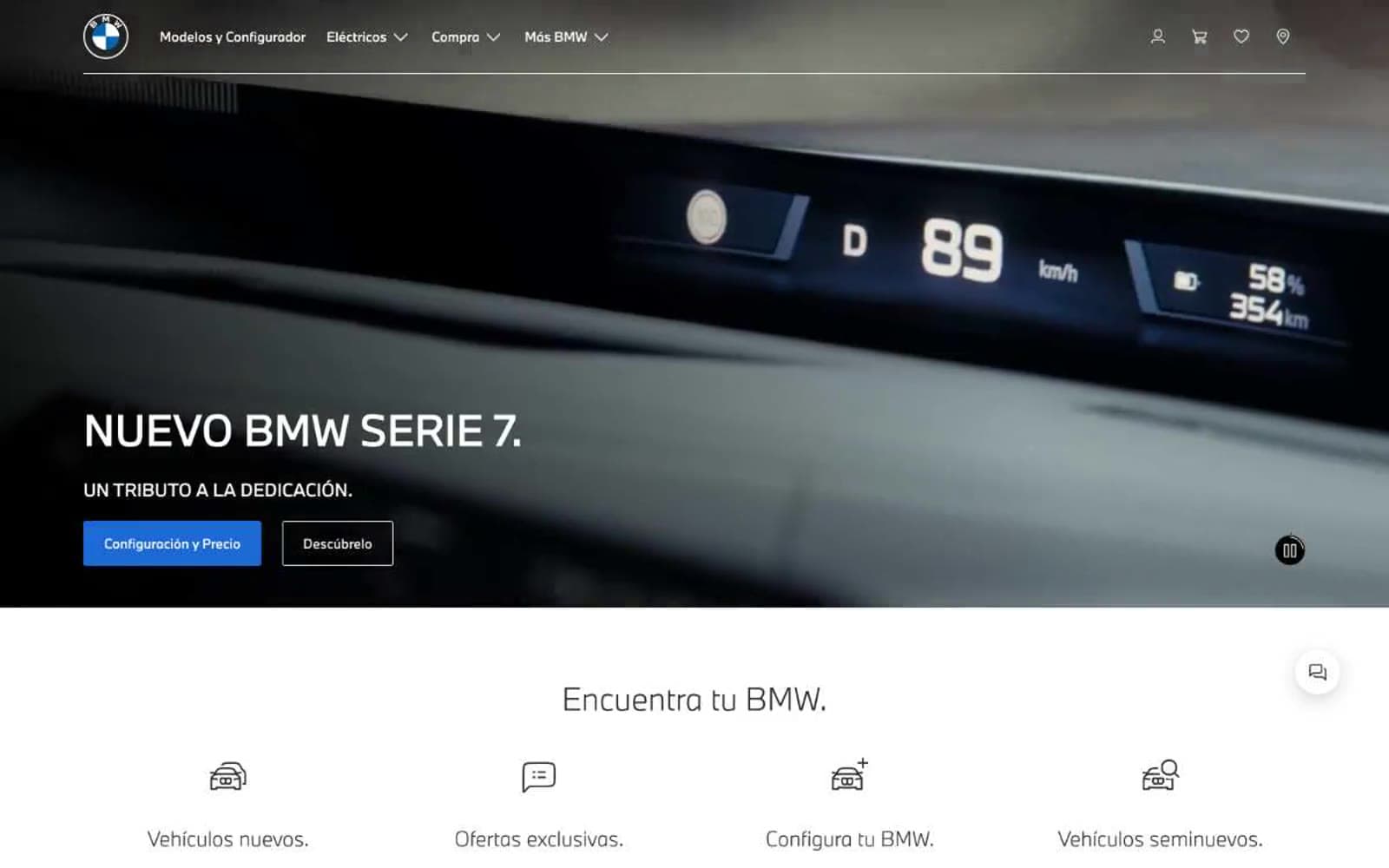
BMW.com design system

Neutrals4
Body text, footer background, heading text on light surfaces — the near-black structural anchor
Muted helper text and secondary dividers on white surfaces, secondary text on dark footer
Alternate surface band, subtle card background where a step up from pure white is needed
Page canvas, header background, inverted text on dark footer
Try a pairing
Pick any two colors from the palette to check whether text stays readable on top.
Aa
Pure White on Carbon
15.13 : 1 contrast
- Body textPasses AA 4.5
- Large textPasses AA 3
- StrictPasses AAA 7
More DESIGN.md files. Same web, different personalities.

Airbnb
Brand
Aker
Brand
Alison Roman
Brand
Alpine Bio
Brand
Alveos One
Brand
Amrit Palace
Brand
André Cândido
Brand
Anna Jóna
Brand
Apollo
Brand
Apple
Brand
Arva
Brand
Ashton Bespoke
Brand


