
Beings. Portrait gallery on warm paper.
- Brand
- Light theme
- 11 colors
- 5 typefaces
Beings combines oversized, almost poster-like black typography with sharp-edged editorial portraiture and warm skin-tone section fields. The white opening canvas is interrupted by deep brown and peach editorial panels, where compact uppercase navigation sits far quieter than the imagery and type. The system gives visual authority to representation-led photography: faces are cropped close, media blocks are large and unrounded, and thin circular linework creates a recurring gallery-layout gesture.
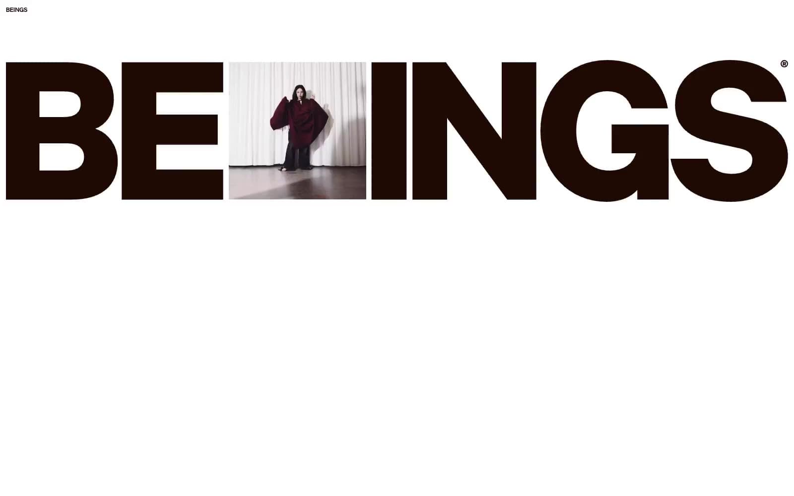
Beings design system

Brand2
Talent-section display text and supporting copy on Cocoa Ink — the muted peach makes dark editorial panels feel human rather than corporate
Deep brown feature-section surface for high-contrast editorial statements
Accent4
Pale peach participation and joining surface
Shortlist area surface and dark-on-light warm brown emphasis
Secondary pale warm surface
Profile dark-theme text and small warm highlight
Neutrals5
Primary text, navigation, outlined controls, logo treatment, and dark surface
Hairline decorative circles and subdued interface marks
Text on Shortlist Clay surfaces
Warm light surface for talent pages, partner labels, and soft text on dark sections
Primary page canvas, header background, and bright media surround
Try a pairing
Pick any two colors from the palette to check whether text stays readable on top.
Aa
Cocoa Ink on Talent Peach
12.75 : 1 contrast
- Body textPasses AA 4.5
- Large textPasses AA 3
- StrictPasses AAA 7
More DESIGN.md files. Same web, different personalities.

Airbnb
Brand
Aker
Brand
Alison Roman
Brand
Alpine Bio
Brand
Alveos One
Brand
Amrit Palace
Brand
André Cândido
Brand
Anna Jóna
Brand
Apollo
Brand
Apple
Brand
Arva
Brand
Ashton Bespoke
Brand


