
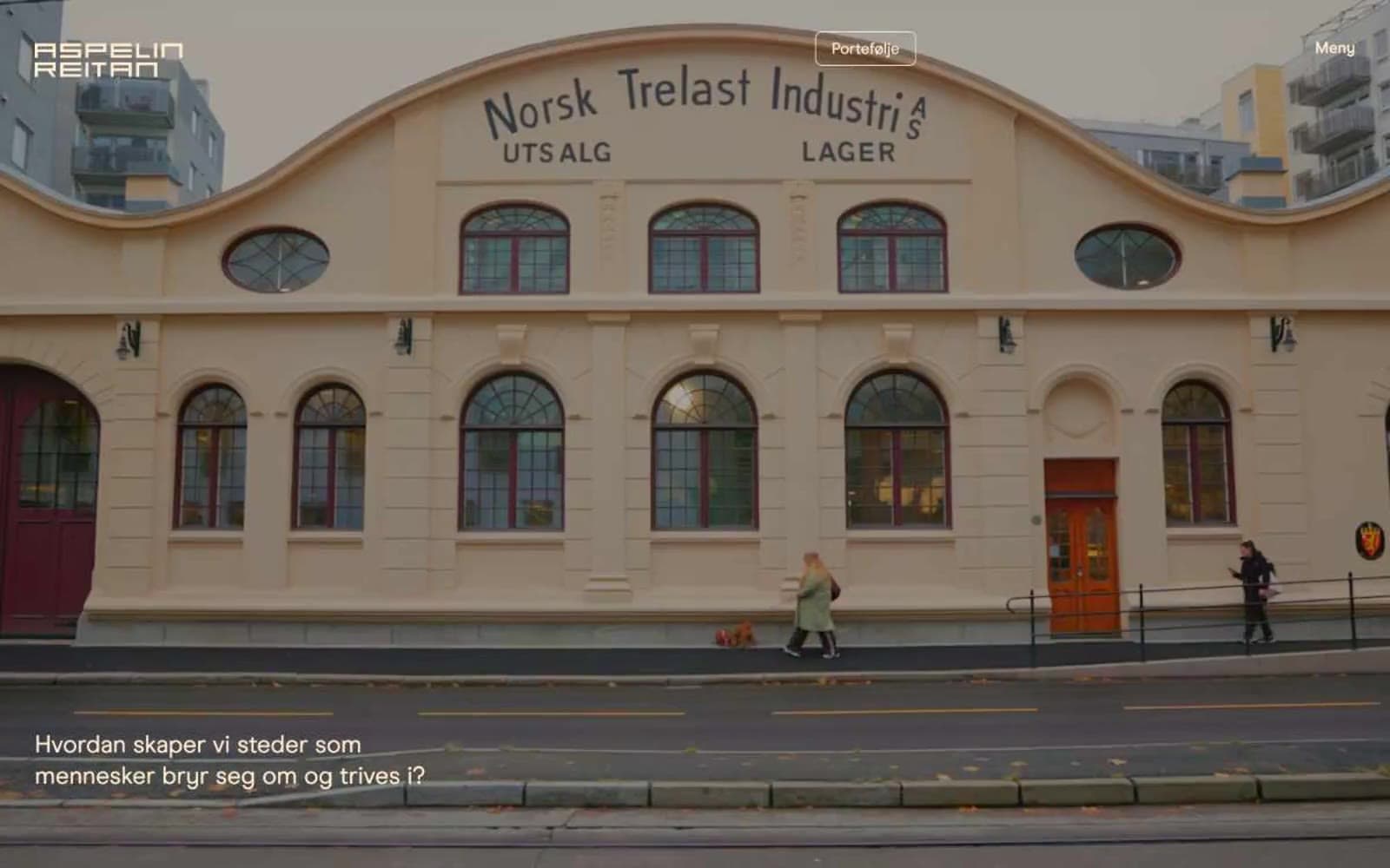
Aspelin Reitan. The page reads like a portfolio of built places pinned to a warm cream wall, with a single line of white type floating over each full-bleed image.
- Brand
- Light theme
- 7 colors
- 1 typeface
Aspelin Reitan treats the website as a curated architectural gallery: warm cream canvases, full-bleed dark photography as section anchors, and a single custom sans-serif that stays small and editorial. The interface is deliberately quiet — no filled CTAs, no bright accent colors, no shadow stacks — letting the buildings and interiors carry the brand voice. Warmth is structural, not decorative: cream parchment for surfaces, deep walnut for dark sections, amber for the few interactive moments. Every UI element is a hairline outline or a small caption; the photograph does the heavy lifting.
Aspelin Reitan design system

Accent2
Navigation borders, active state accents, warning/attention states, and the single chromatic punctuation in an otherwise warm-neutral system
Link borders and heading underlines on dark sections — a desaturated brass for typographic detail without breaking the monochrome feel
Neutrals5
Structural borders, section dividers, image edge treatments — used as a hairline, never as a fill
Dark canvas behind full-bleed photographs, footer backgrounds, and dark editorial sections — the deep brown that makes white type glow warm
Secondary dark surface and border on dark sections — a half-step lighter than Walnut for subtle layering on dark
Gray accent for outlined action borders, linked labels, and lightweight interactive emphasis.
Lighter cream for elevated surfaces and secondary text on dark — a half-step above Parchment for subtle layering
Try a pairing
Pick any two colors from the palette to check whether text stays readable on top.
Aa
Obsidian on Amber Glow
16.43 : 1 contrast
- Body textPasses AA 4.5
- Large textPasses AA 3
- StrictPasses AAA 7
More DESIGN.md files. Same web, different personalities.

Airbnb
Brand
Aker
Brand
Alison Roman
Brand
Alpine Bio
Brand
Alveos One
Brand
Amrit Palace
Brand
André Cândido
Brand
Anna Jóna
Brand
Apollo
Brand
Apple
Brand
Arva
Brand
Ashton Bespoke
Brand


