Wope. Violet horizon interface.
- SaaS
- Dark theme
- 14 colors
- 2 typefaces
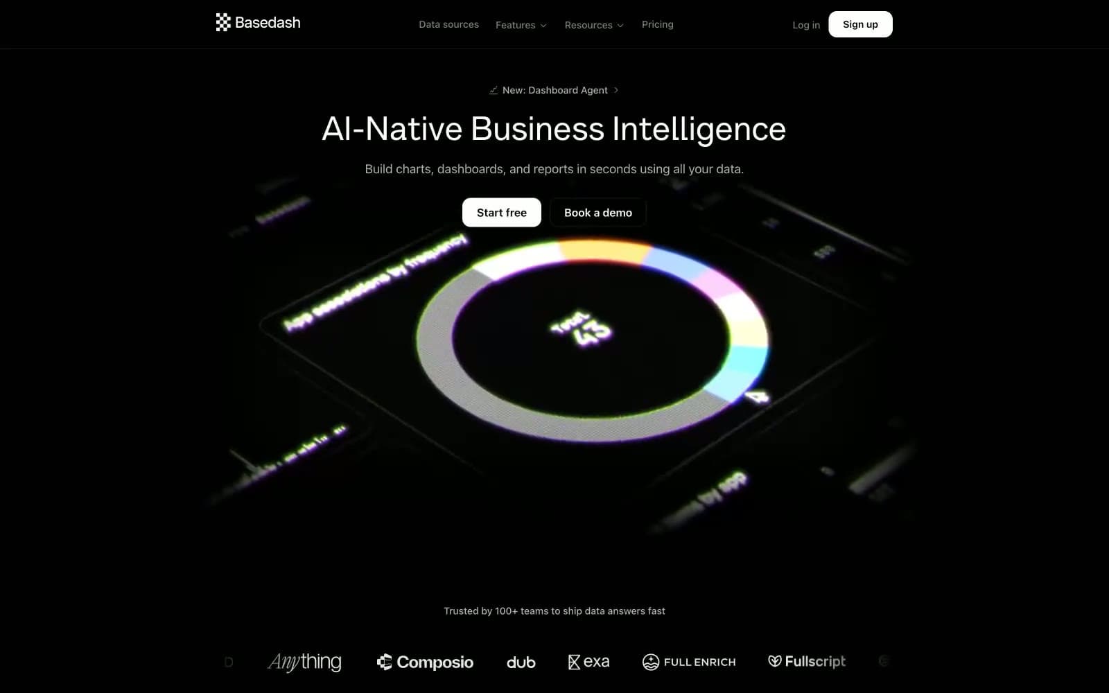
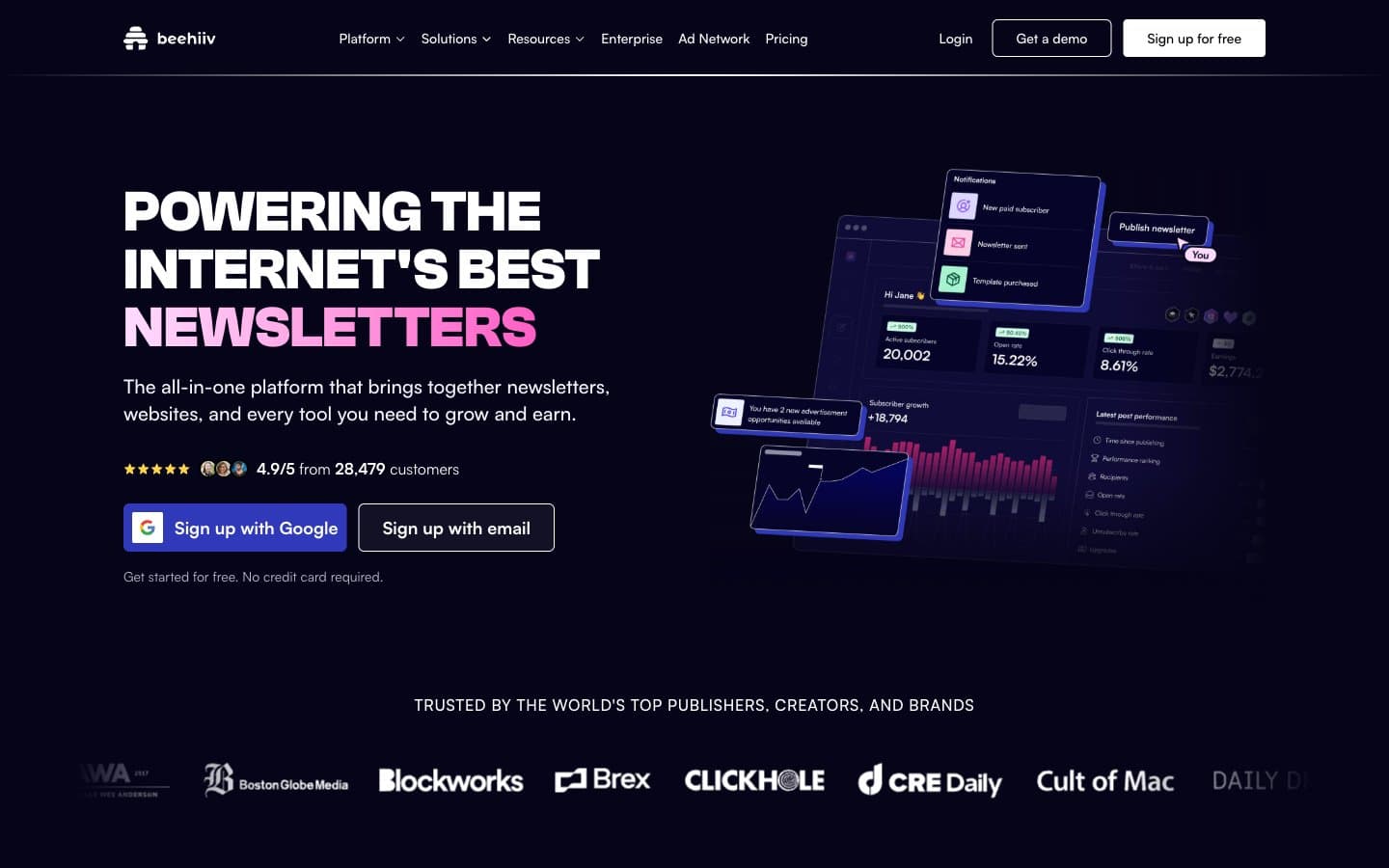
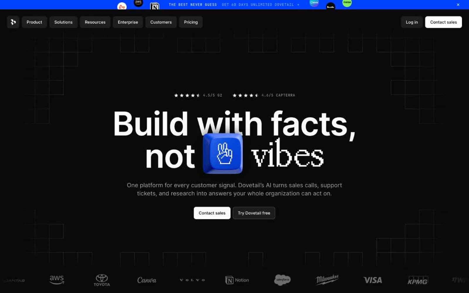
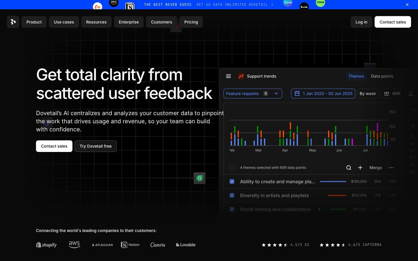
Wope - violet horizon interface. The page feels like a control deck lit from beneath by ultraviolet light: a nearly black-violet canvas, pale gray body copy, and concentrated purple glow under the product UI. The signature move is contrast by illumination rather than by layering — surfaces stay close to #0a0118 and depth comes from translucent white borders, blur, and radiant gradients instead of heavy shadow. Rebond Grotesque appears only where the brand wants scale and impact, while Inter V handles everything else with tight negative tracking in larger sizes and occasional wide-tracked utility text. Buttons, badges, and small controls are all full pills at 999px radius, set against mostly 16px cards, so soft controls float inside a more architectural content frame.

Wope design system

Brand1
Primary accent, active links, luminous highlights — saturated violet against the black-violet canvas creates the site’s underlit glow
Accent4
Gradient flare, line effects, ambient glow edges — used as the cooler top note inside purple light blooms
Gradient midpoint and visual hotspot — the brighter violet that makes hero illumination feel energized instead of flat
Hero light field, illuminated dividers, ambient section glow
Brighter line and halo treatments where the glow should read crisp instead of misty
Neutrals9
Page background, dark card surfaces, footer and section canvas
Inverse text on light treatments, occasional dark text on pale surfaces
Section overlays and bottom fades that darken content without breaking the purple atmosphere
Inactive icons, subtle separators, tertiary interface details
Body copy, navigation links, supporting labels, low-emphasis UI text
Secondary heading tone, brighter muted copy over Night Violet
Primary headings, buttons, borders, icons, input text, dominant foreground
Tinted fills for ghost pills, badge backgrounds, translucent overlays
Hairline borders on pills and glass panels
Try a pairing
Pick any two colors from the palette to check whether text stays readable on top.
Aa
Soft Quartz on Ultraviolet Core
5.51 : 1 contrast
- Body textPasses AA 4.5
- Large textPasses AA 3
- StrictFails AAA 7