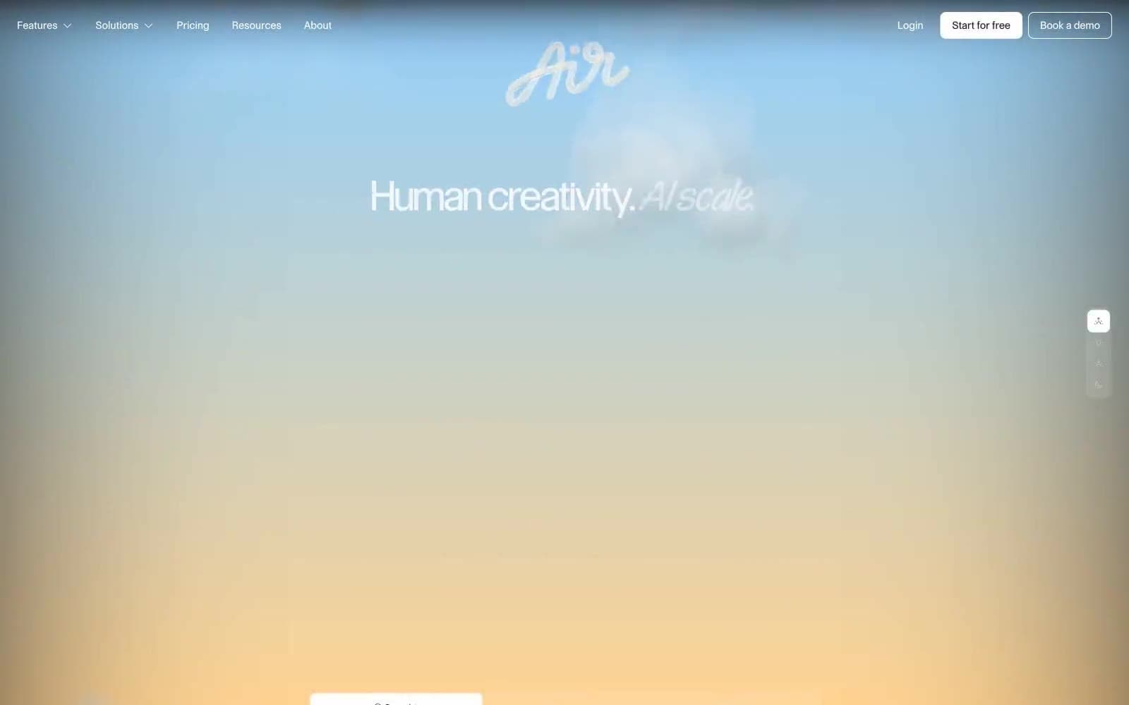
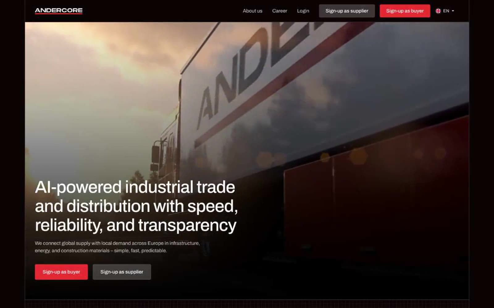
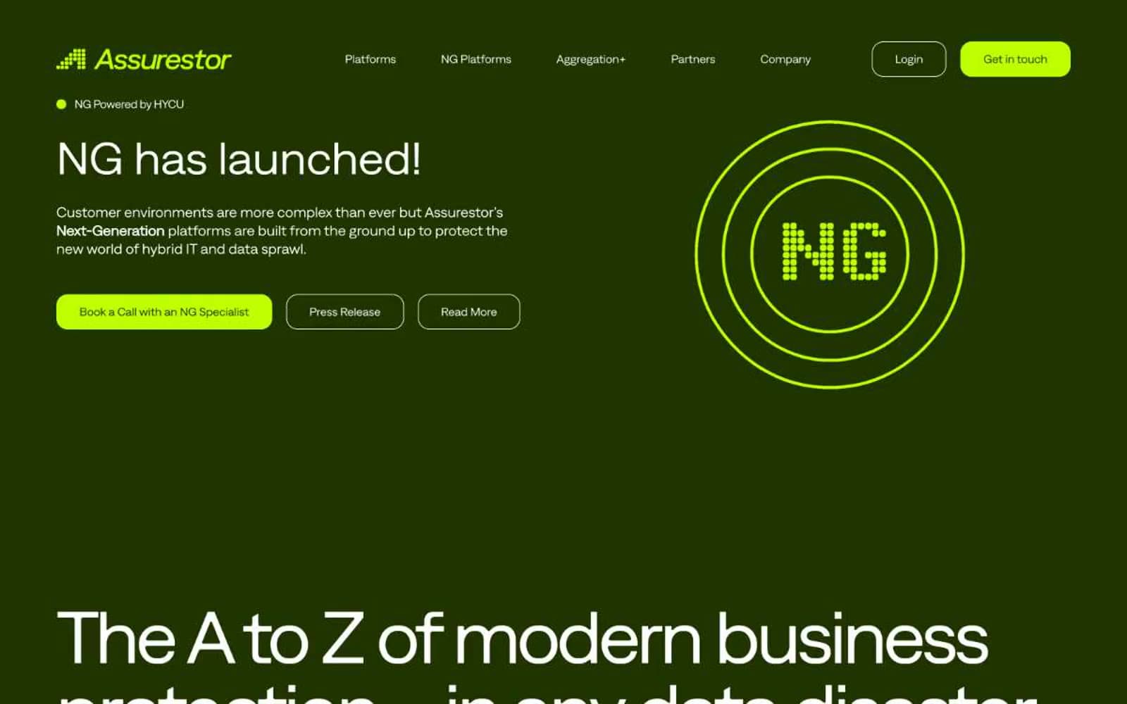
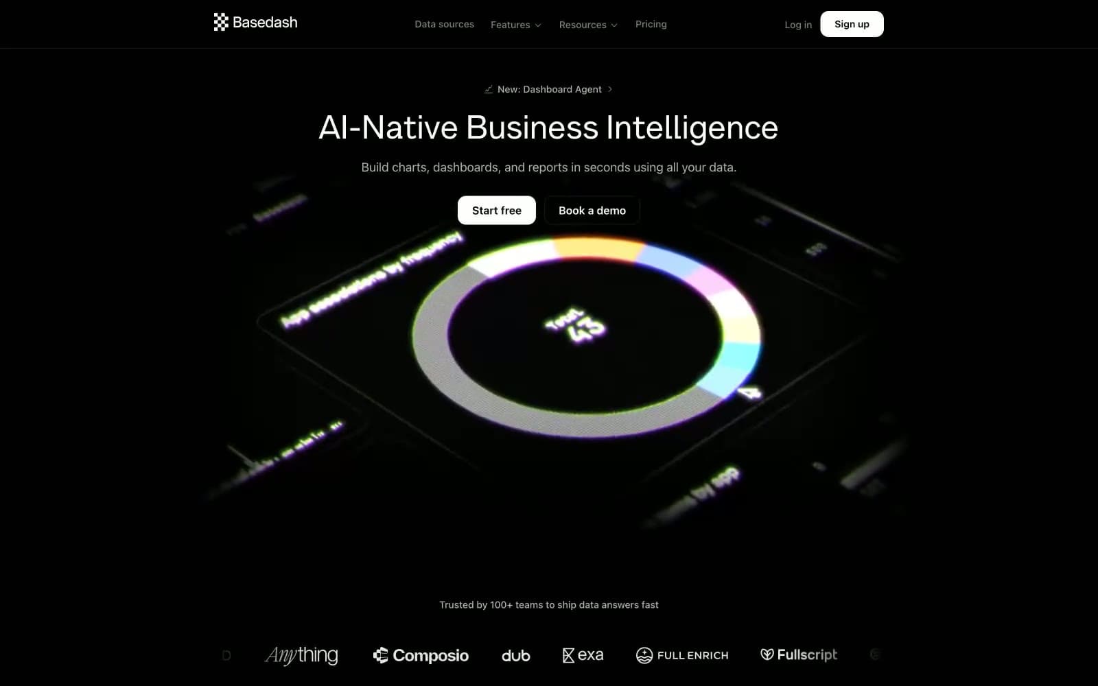
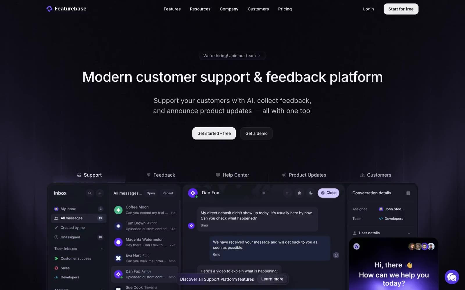
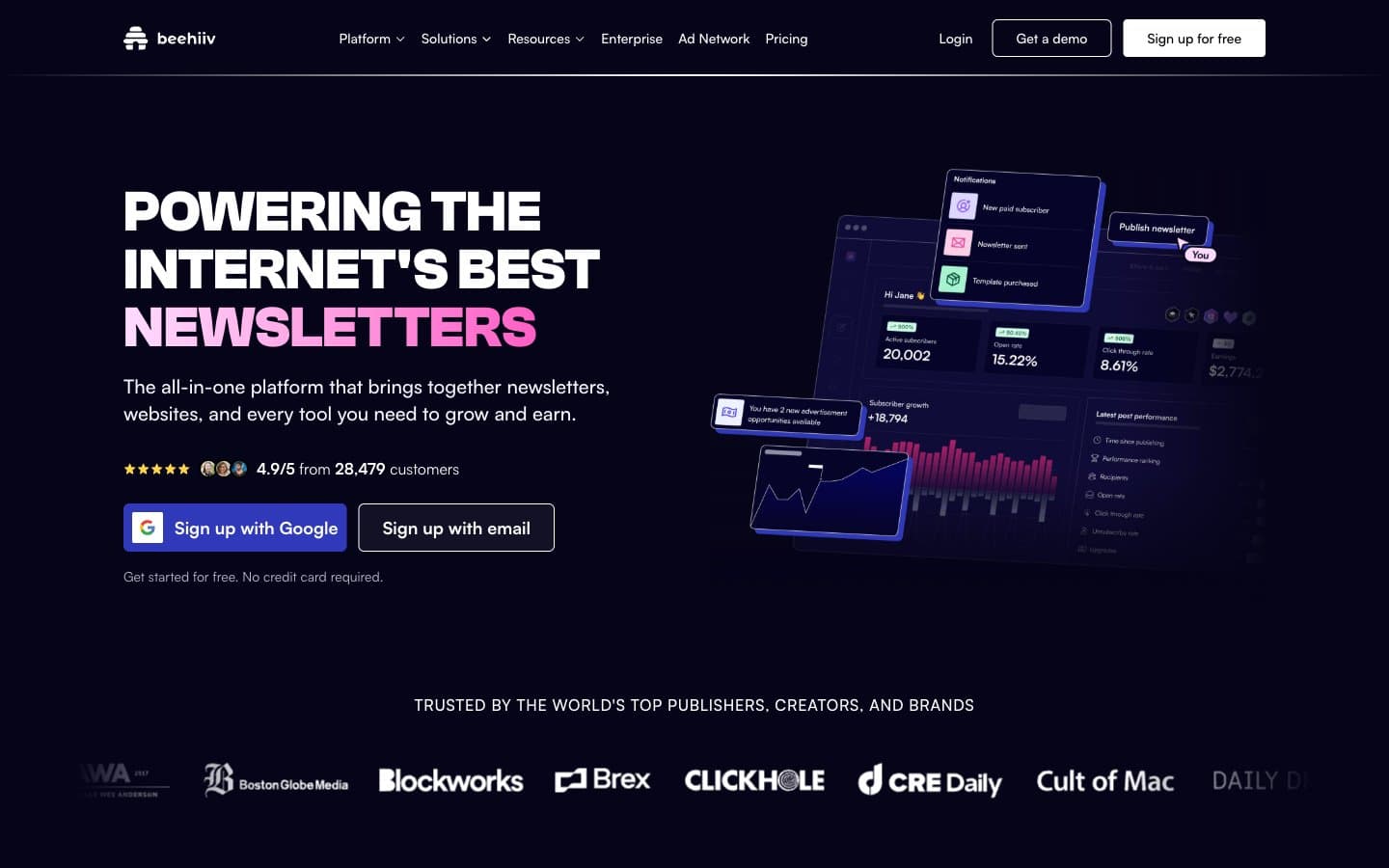
beehiiv. Midnight observatory with neon plasma.
- SaaS
- Dark theme
- 14 colors
- 2 typefaces
beehiiv uses a midnight-canvas language: near-black surfaces with subtle violet undertones, tight geometric display type in Clash Grotesk, and a signature electric-indigo-to-hot-magenta gradient that injects energy into an otherwise restrained layout. The page behaves like a product launch site — dark always, with content cards floating on the dark canvas using thin violet borders and faint glows rather than heavy shadows. Satoshi carries all interface text with comfortable spacing, while Clash Grotesk delivers the headline voice at 60-72px with zero letter-spacing for confident geometric authority. Accent color appears sparingly: as a gradient on hero text, as a full-bleed highlight on one testimonial card, and as small chromatic icons — never as large filled buttons. Components are flat and precise, relying on border-weight and inner glow rather than elevation.
beehiiv design system

Brand2
Brand accent — highlight testimonial card, gradient origin, decorative icon strokes; Signature gradient on hero text, highlight overlays, and brand energy
Brand accent — gradient terminus, star icons, playful tag fills
Accent2
Medium pink — decorative chip backgrounds, gradient midtones
Soft pink wash — subtle accent surfaces, decorative tags
Neutrals10
Page background, deepest surface — the void that everything floats on
Card and panel surfaces — one step lifted from the canvas; Atmospheric gradient overlay — blends canvas into indigo accent
Hover states, inset surface, tooltip backgrounds
Elevated surfaces, active nav backgrounds, deeper card variants
Muted borders, subdued dividers between sections
Hairline borders with violet glow, decorative dividers
Secondary text, icon strokes, subdued labels
Body text on dark surfaces, link text, standard icons
Light supporting surface for subtle backgrounds and section separation. Do not promote it to the primary CTA color
Light supporting surface for subtle backgrounds and section separation. Do not promote it to the primary CTA color
Try a pairing
Pick any two colors from the palette to check whether text stays readable on top.
Aa
Abyss Ink on Hot Magenta
7.36 : 1 contrast
- Body textPasses AA 4.5
- Large textPasses AA 3
- StrictPasses AAA 7