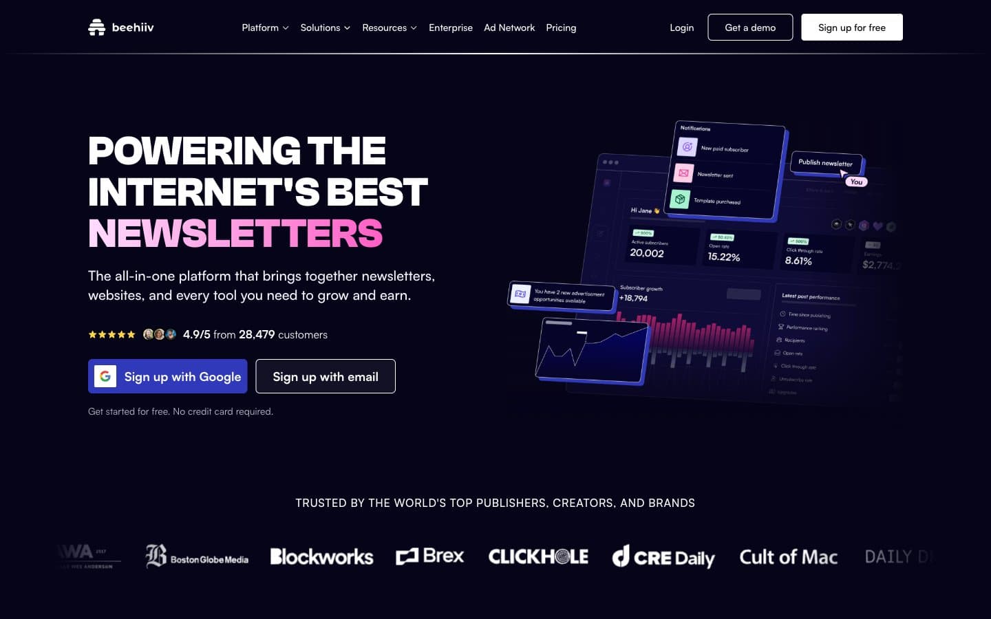
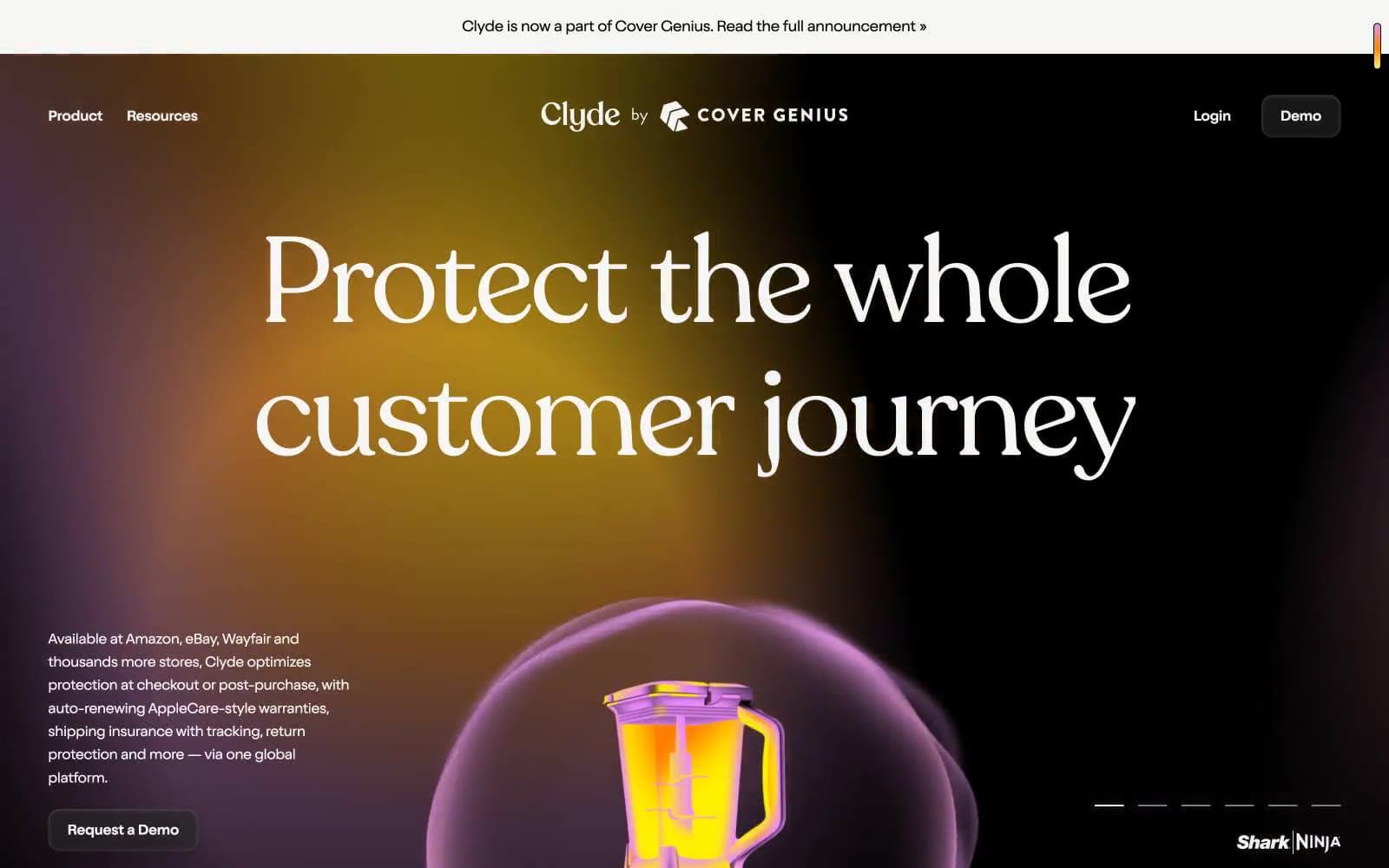
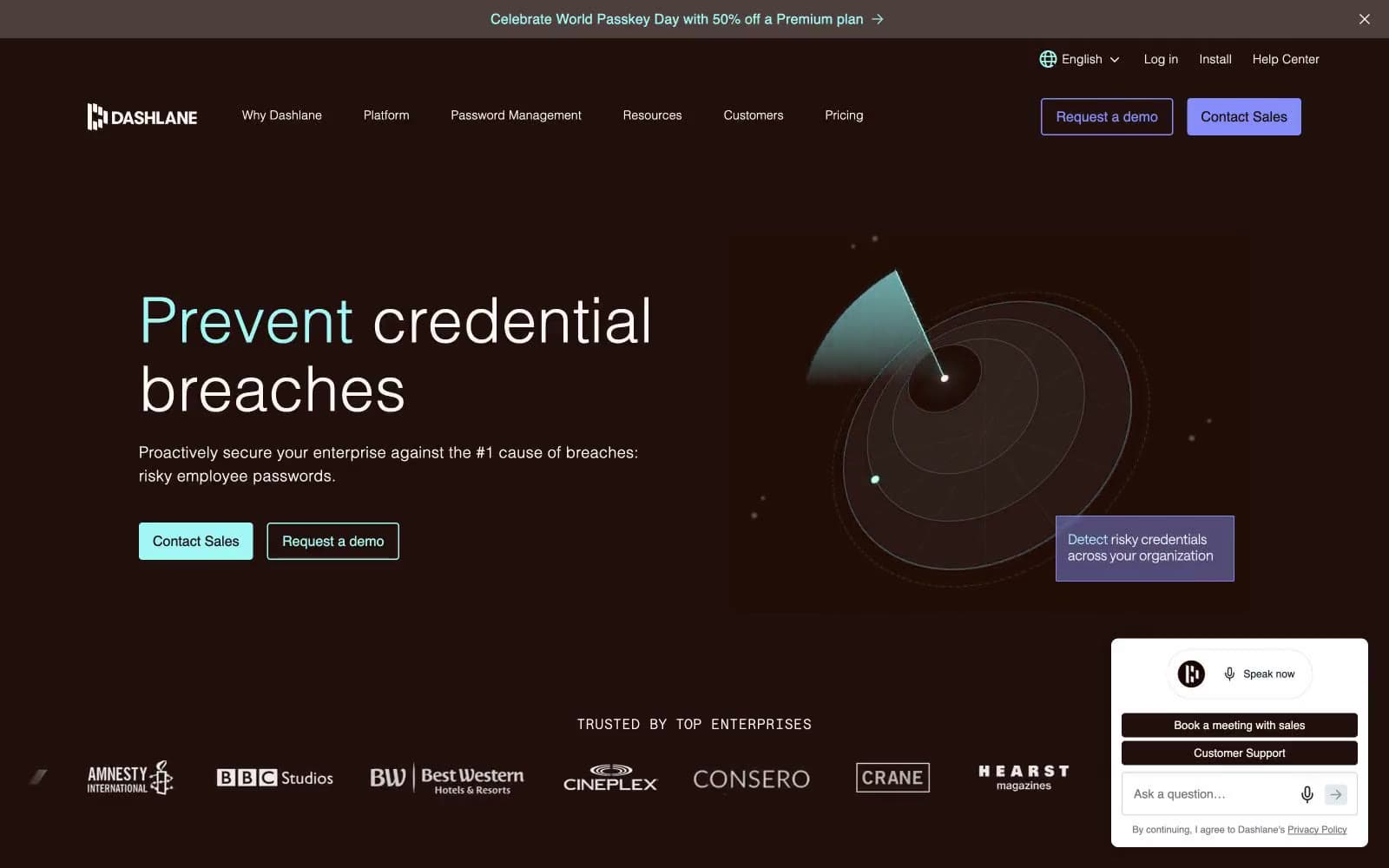
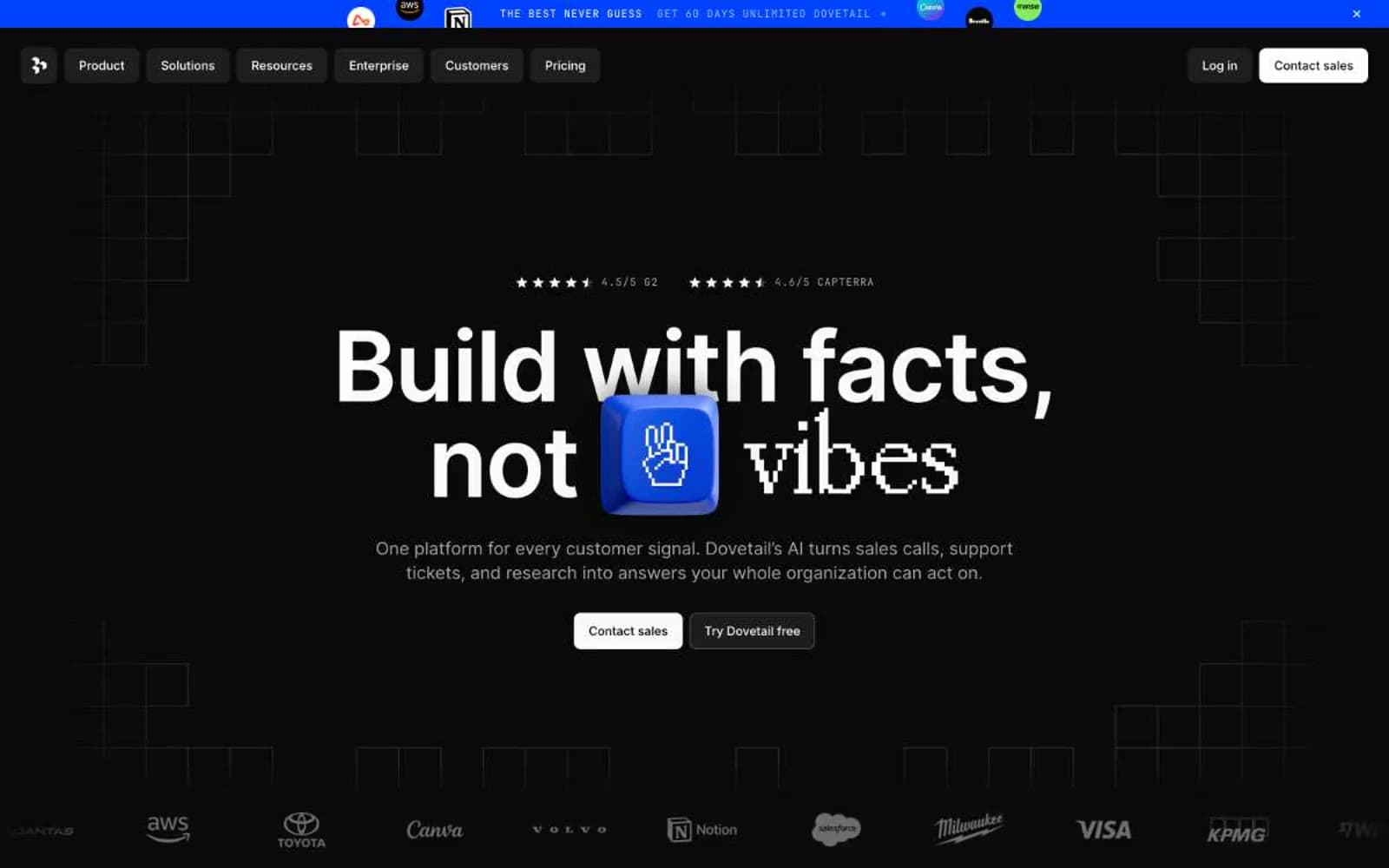
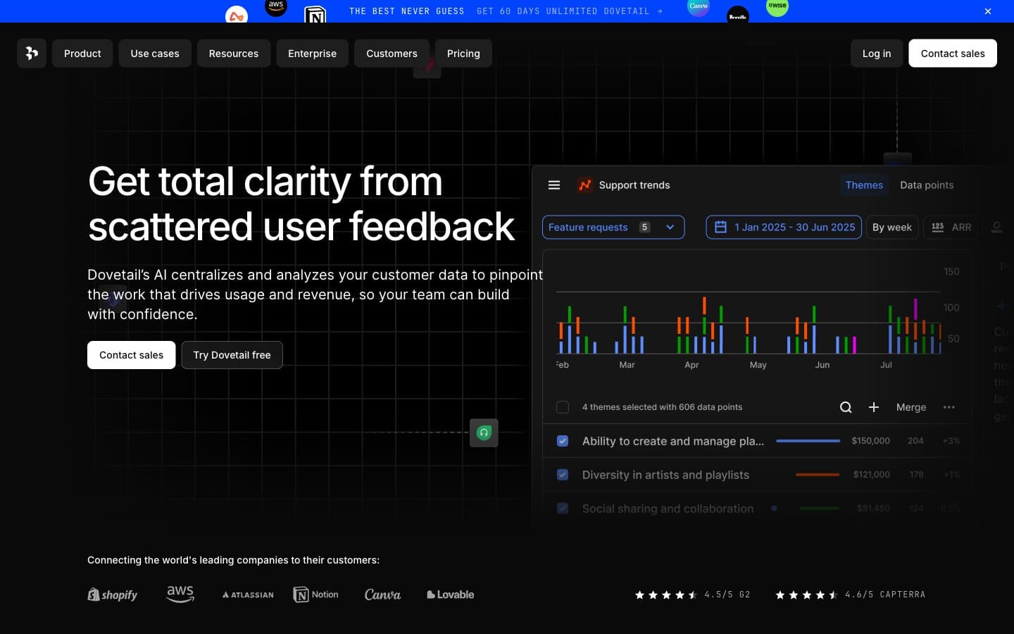
Circle. Aurora-lit mission control in deep midnight.
- SaaS
- Dark theme
- 19 colors
- 1 typeface
Circle's design system is a deep-space stage: a near-black indigo canvas radiates soft aurora gradients toward the center, and a single bright product screenshot floats on that darkness like a window into daylight. The product surface inside is crisp white and information-dense, while the marketing surface around it is theatrical — gradient CTAs, pill-shaped everything, and pastel-tinted accent cards that feel like constellation markers. Typography is a single family (Inter) pushed from whisper-tight tracking at 64px down to relaxed spacing at 10px, giving headlines a dense, confident weight that fills the dark space. The visual rhythm alternates between the cosmic dark page and floating white product panels; this contrast — not color variety — is the signature.

Circle design system

Brand4
Supporting palette color for small decorative accents when the core palette needs contrast. Do not promote it to the primary CTA color
Supporting palette color for small decorative accents when the core palette needs contrast. Do not promote it to the primary CTA color
Secondary brand fill — vivid blue-violet used for solid accent surfaces and card backgrounds in feature blocks
Deep purple background fill for video thumbnail cards and feature panels, anchoring darker sections of the page
Accent6
Pastel rose-tinted surface for soft accent cards and pill buttons — the warmest of the pastel constellation
Pastel lavender surface for accent cards and ghost buttons — the signature pastel that bridges the aurora's pink and purple ends
Pastel cream-yellow surface for warm accent cards and highlight buttons
Pastel blue-white surface for cool accent cards and secondary CTA buttons
Pastel mint surface for accent cards and quiet informational buttons
Blue supporting accent for decorative details and low-frequency emphasis. Use as a supporting accent, not as a status color
Neutrals9
Primary text color inside product panels and on white surfaces — near-black, slightly softer than #000
Page canvas — the cosmic-dark background that radiates the aurora gradient. All marketing copy and product panels float on this surface
Outer page background where the aurora gradient fades to black, framing the central glow
Secondary text, icon strokes on dark canvas, and dark-mode body copy
Tertiary text and body copy on white surfaces
Muted violet used for subtle borders and outlines on the dark canvas — a low-contrast structural line
Muted helper text, secondary nav labels, and inactive tab text
Borders, dividers, table separators, and subtle structural lines — the dominant border color across all components
Product panel surfaces, input fields, card fills inside the embedded product screenshots, and the top navigation bar
Try a pairing
Pick any two colors from the palette to check whether text stays readable on top.
Aa
Product White on Plasma Violet
9.52 : 1 contrast
- Body textPasses AA 4.5
- Large textPasses AA 3
- StrictPasses AAA 7