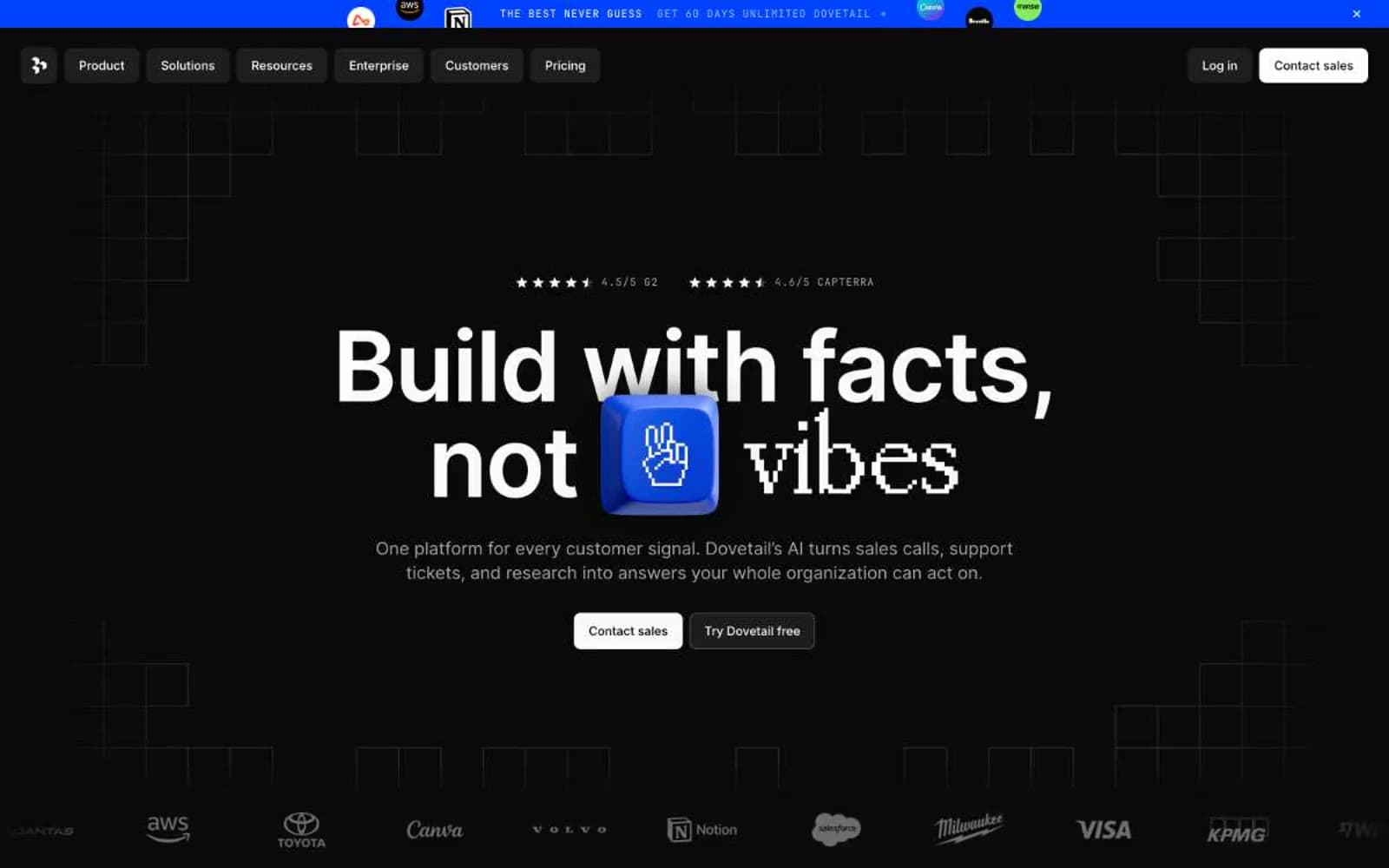
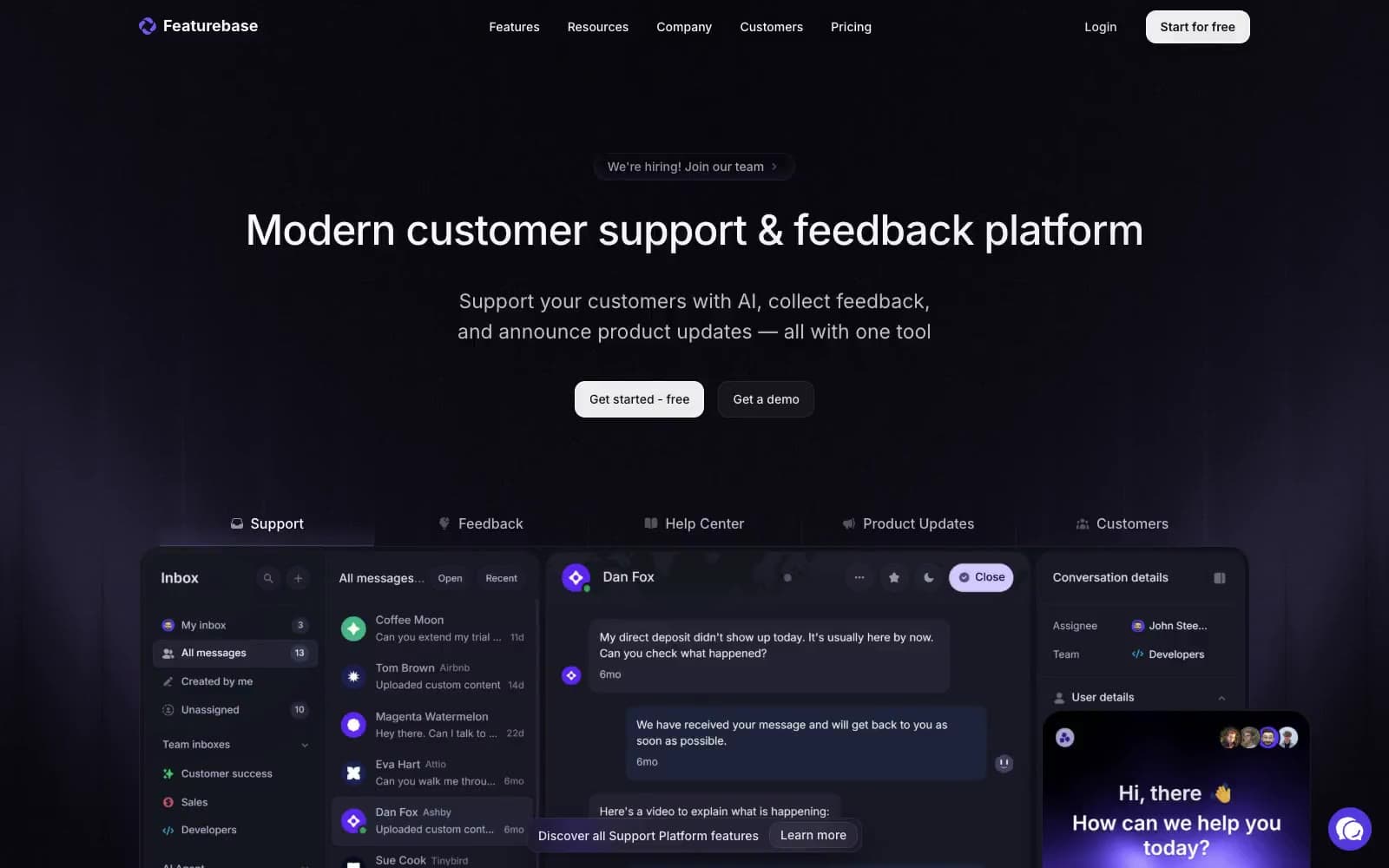
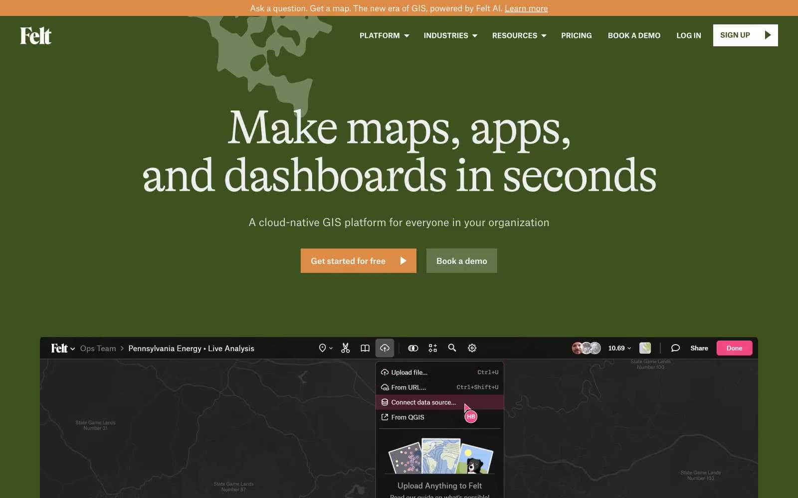
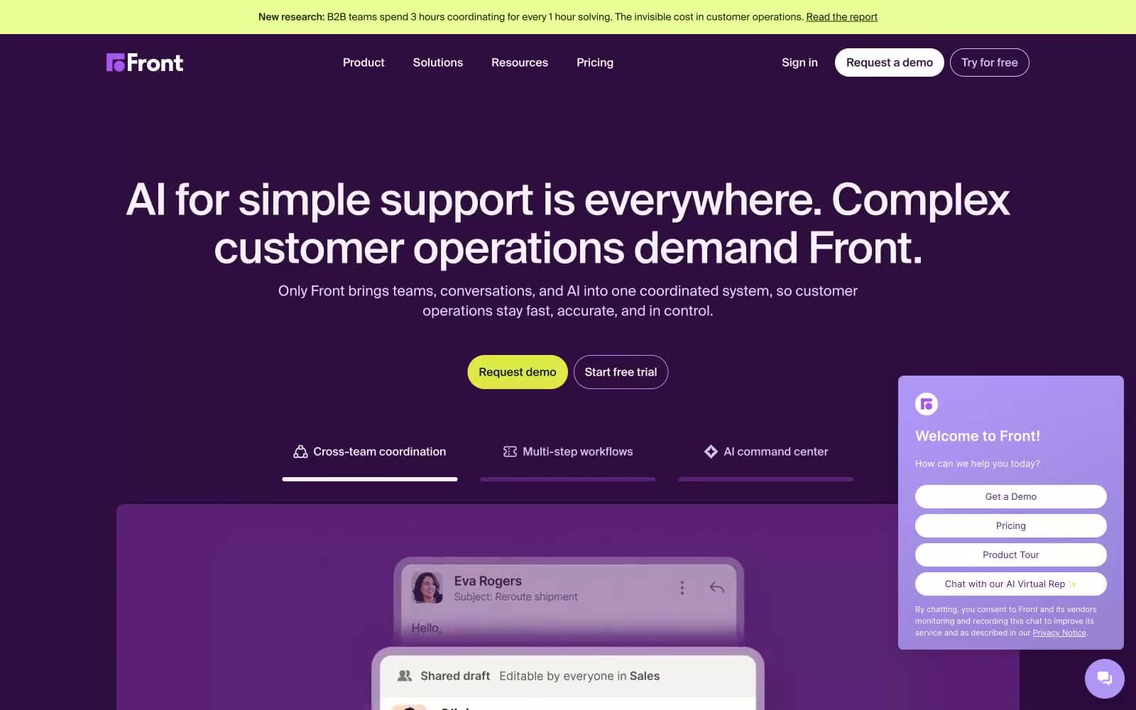
Dovetail. Blueprint control room at midnight.
- SaaS
- Dark theme
- 10 colors
- 2 typefaces
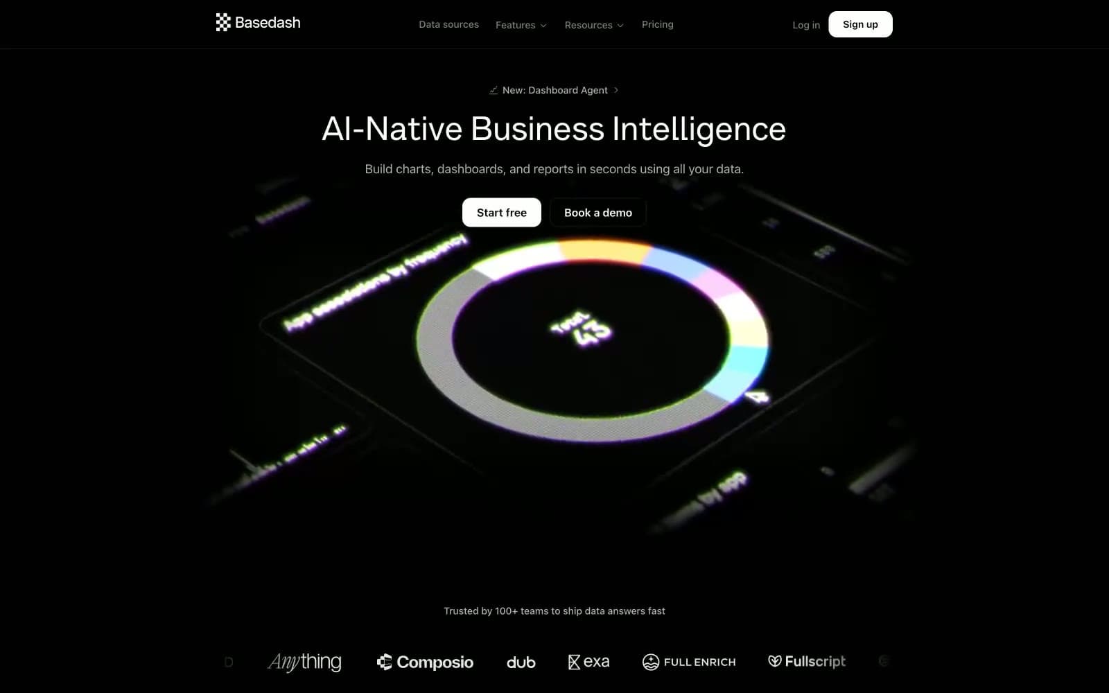
Dovetail's design language is a dark command center: near-black canvas, subtle grid wireframes, and cool gray type that recedes so charts and data can lead. A single vivid cornflower blue (#6798ff) acts as the system's only chromatic accent — it appears on the announcement bar, feature icons, and active highlights, never as decorative noise. Typography is Inter at every layer with progressively tighter tracking as sizes grow (from -0.012em at 14px to -0.036em at 64px), giving headlines a compressed, engineered quality rather than a marketing gloss. Components are weightless: 8px radii, hairline borders at #1e1e1 or #313131, zero shadows, and flat surfaces that stack through tone rather than elevation. The overall rhythm is compact, technical, and instrument-like — a tool room, not a pitch deck.
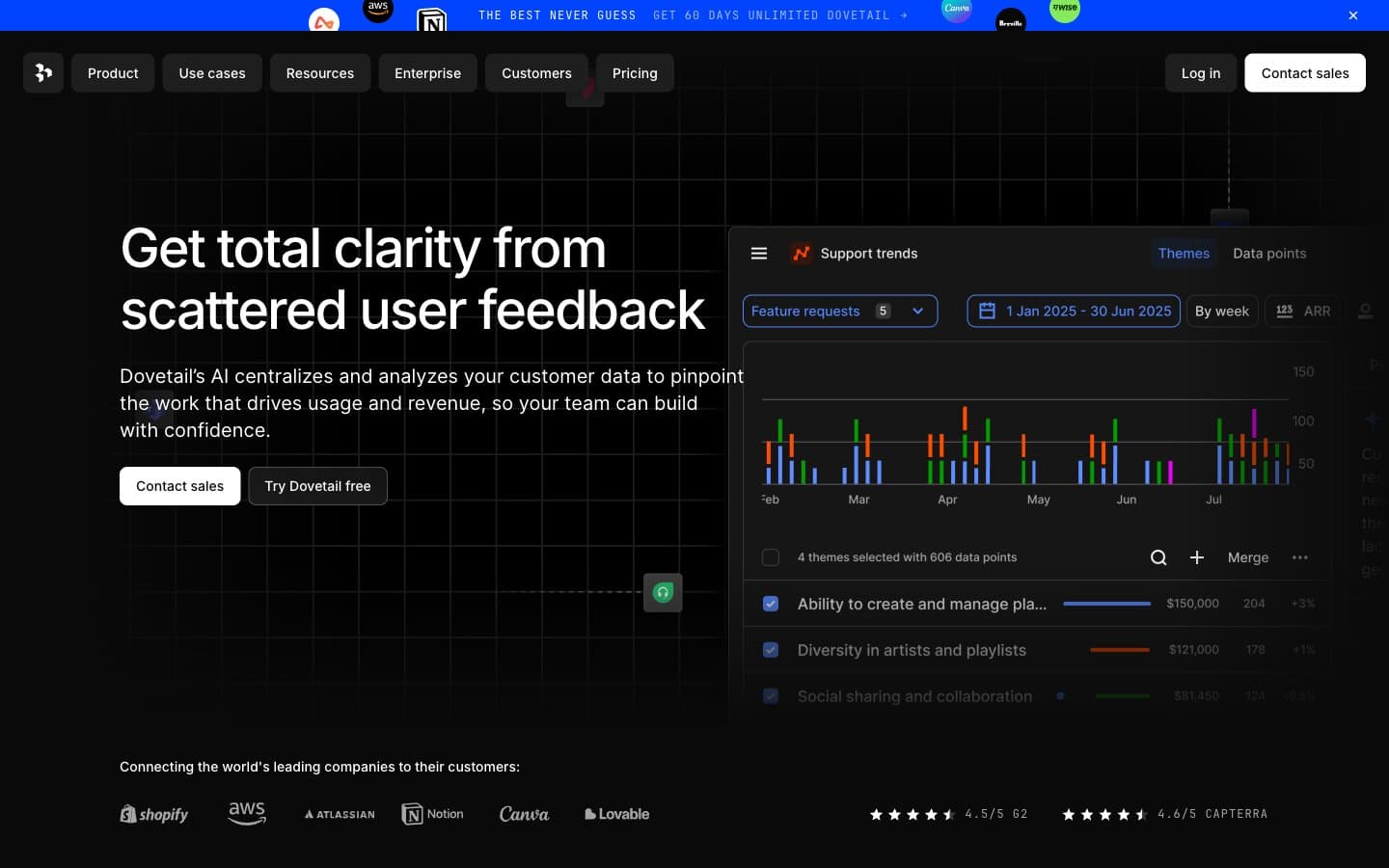
Dovetail design system

Accent1
Accent for announcement bar, feature icons, active states, and data highlight strokes
Neutrals9
Pure black used in SVG illustration fills and contrast anchors
Primary page background — the dark canvas that everything sits on
Alternate surface level for nested cards and section backgrounds
Card surfaces, button backgrounds, and key borders that delineate panels
Hairline borders on image frames and subtle dividers
Mid-tone borders on outline buttons and input frames
Disabled or de-emphasized button text
Secondary body text, borders on muted elements, icon strokes
Primary text, primary filled button background, icon fills, nav links
Try a pairing
Pick any two colors from the palette to check whether text stays readable on top.
Aa
Onyx on Blue Cornflower
7.51 : 1 contrast
- Body textPasses AA 4.5
- Large textPasses AA 3
- StrictPasses AAA 7