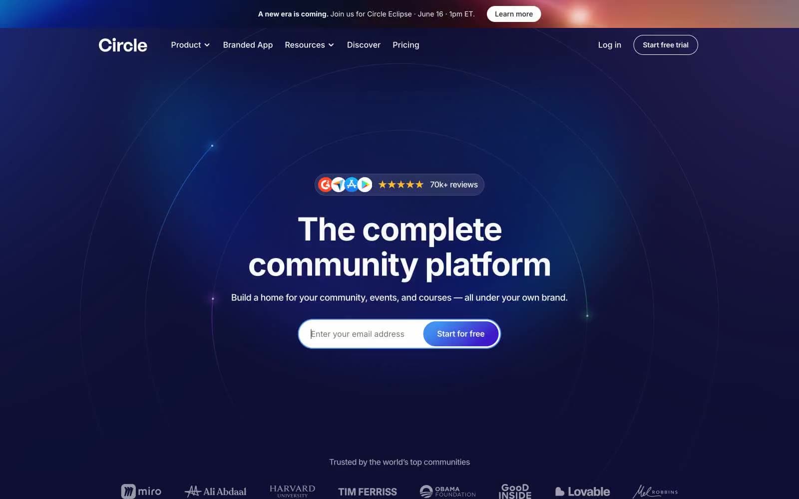
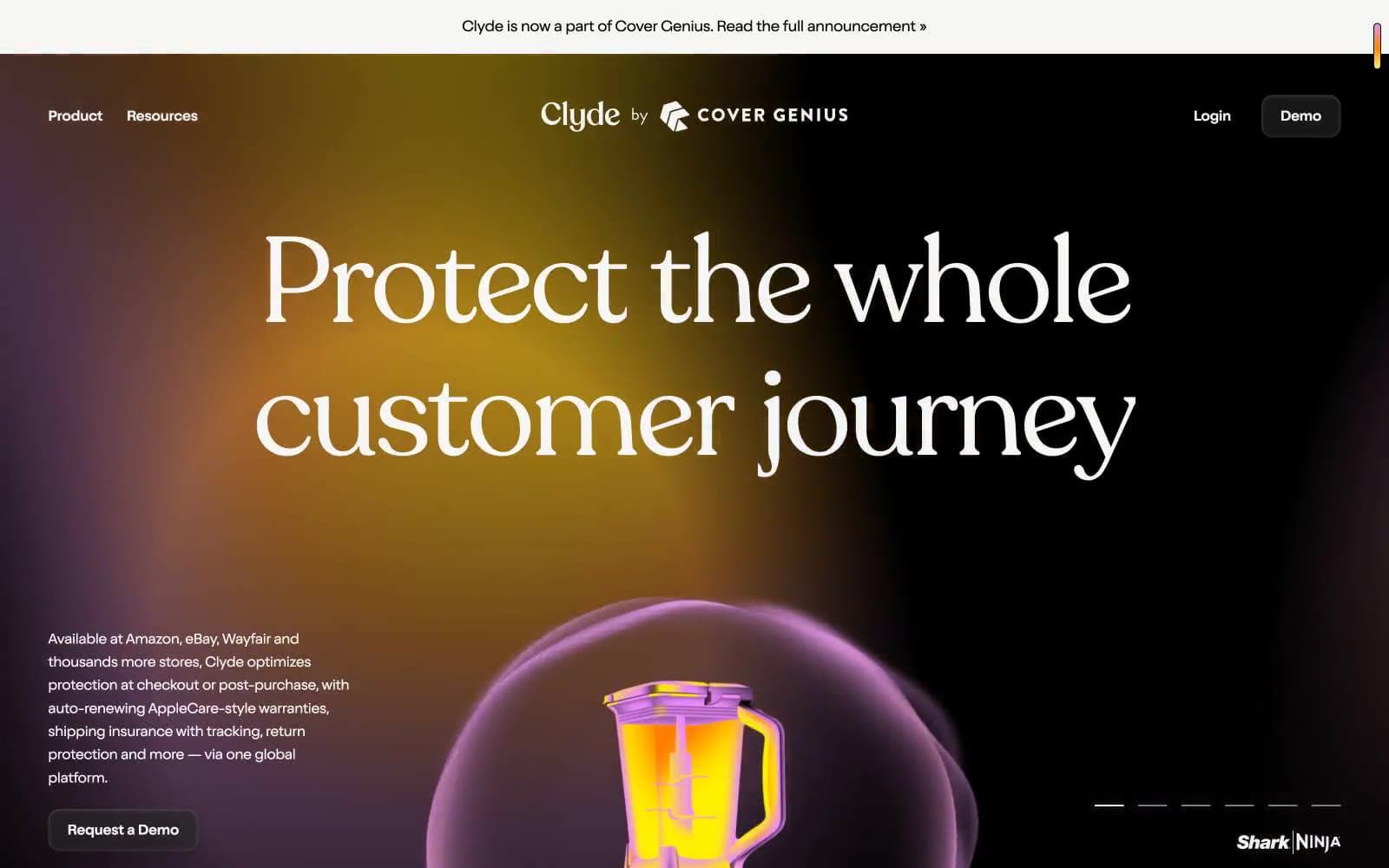
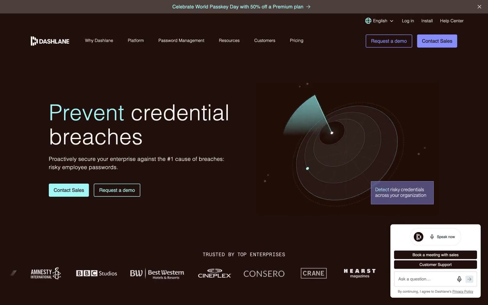
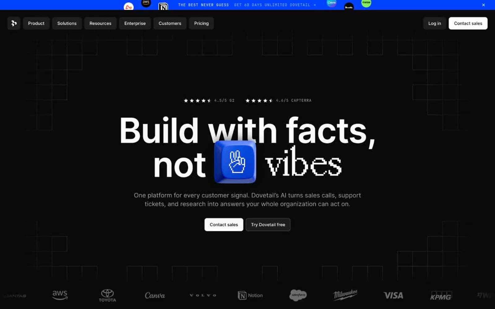
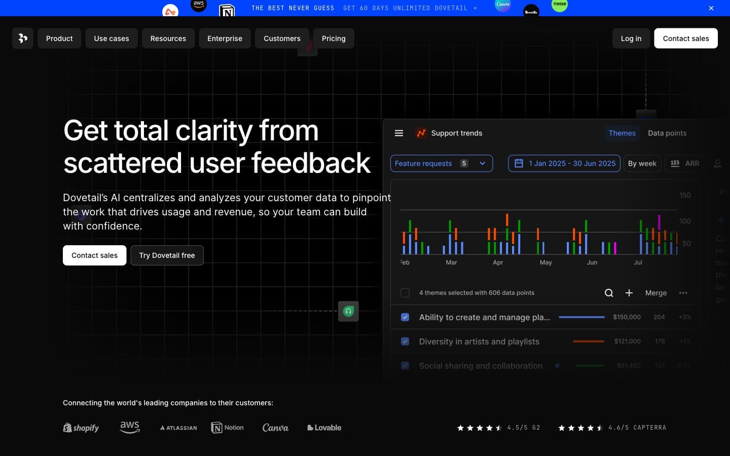
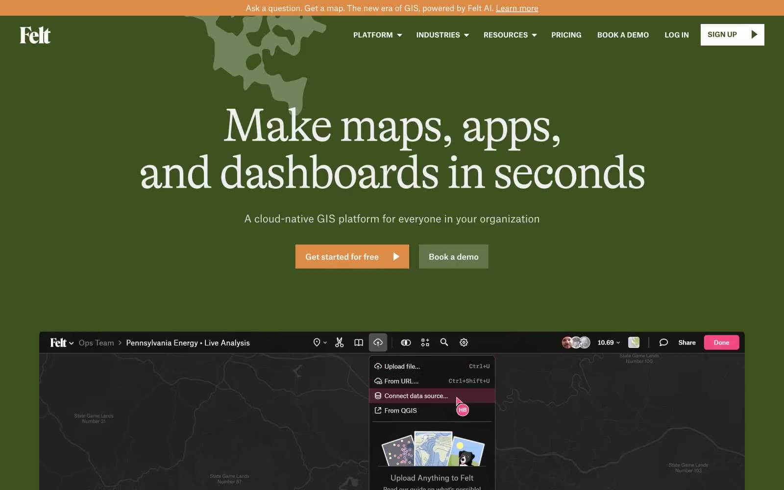
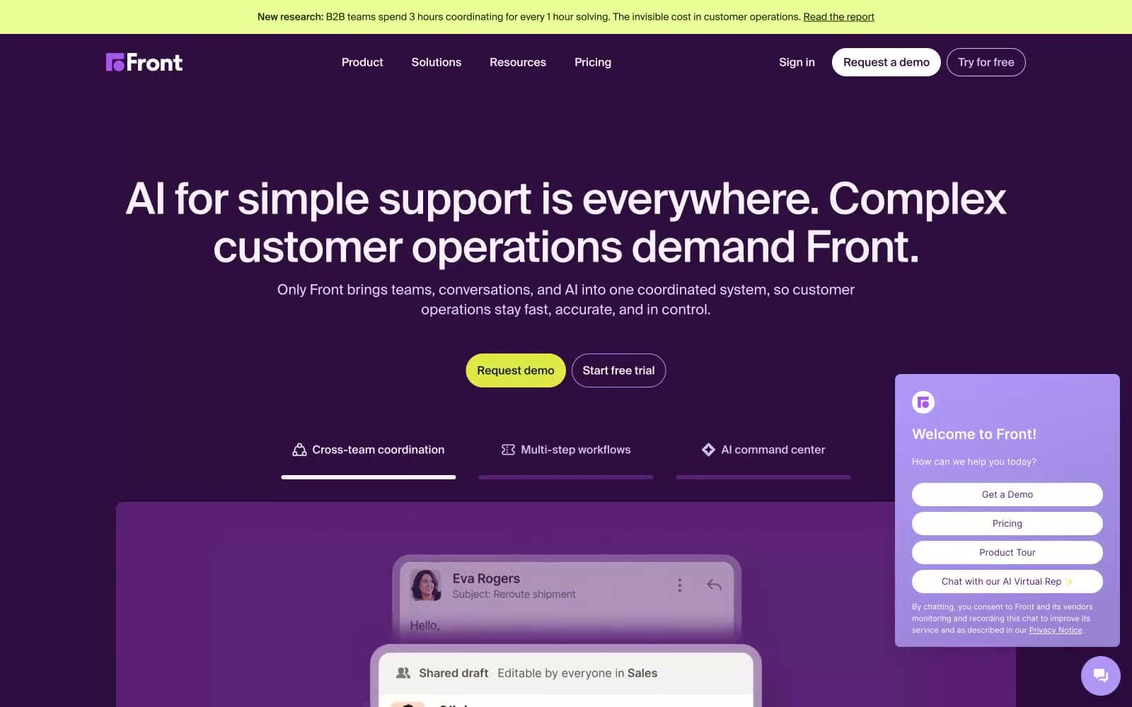
Featurebase. Violet-lit support console.
- SaaS
- Dark theme
- 12 colors
- 1 typeface
Featurebase is a near-black product stage where dense support-software screenshots sit beneath restrained white typography. The interface uses flat charcoal surface layers, hairline blue-gray borders, and white filled conversion controls; saturated violet is reserved for logo marks, product-state icons, and the glow framing demos. Inter at medium weights keeps navigation and controls compact, while 48px and 36px headings use slight negative tracking to make the page feel composed rather than oversized.
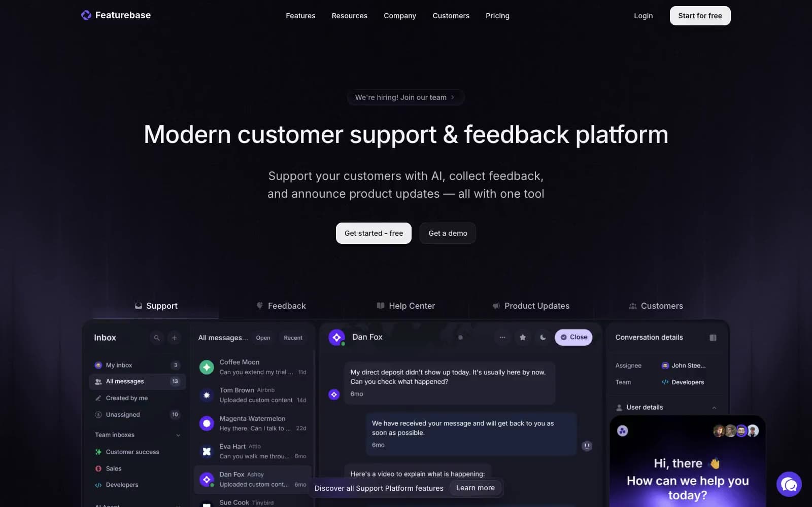
Featurebase design system

Brand1
Brand symbol, selected product icons, and violet light sources — a narrowly deployed signal against the black canvas
Accent2
Soft demo-edge illumination and decorative feature-section washes
Subtle upward background haze behind contained product visuals
Neutrals9
Page backgrounds and uninterrupted full-bleed section canvas
Inset page regions, dark filled controls, and low-level card surfaces
Product-demo panels, card fills, dark text on white controls, and structural borders
Raised dark controls and secondary panel layers
Fine borders around dark demo panes, tabs, and outlined controls
Metadata, subdued icons, and tertiary product-interface text
Muted body copy, inactive tabs, secondary links, and product-interface labels
Lead paragraphs and lower-emphasis navigation text
High-emphasis headings, icons, filled action surfaces, and logo marks
Try a pairing
Pick any two colors from the palette to check whether text stays readable on top.
Aa
Void Canvas on Signal Violet
4.63 : 1 contrast
- Body textPasses AA 4.5
- Large textPasses AA 3
- StrictFails AAA 7