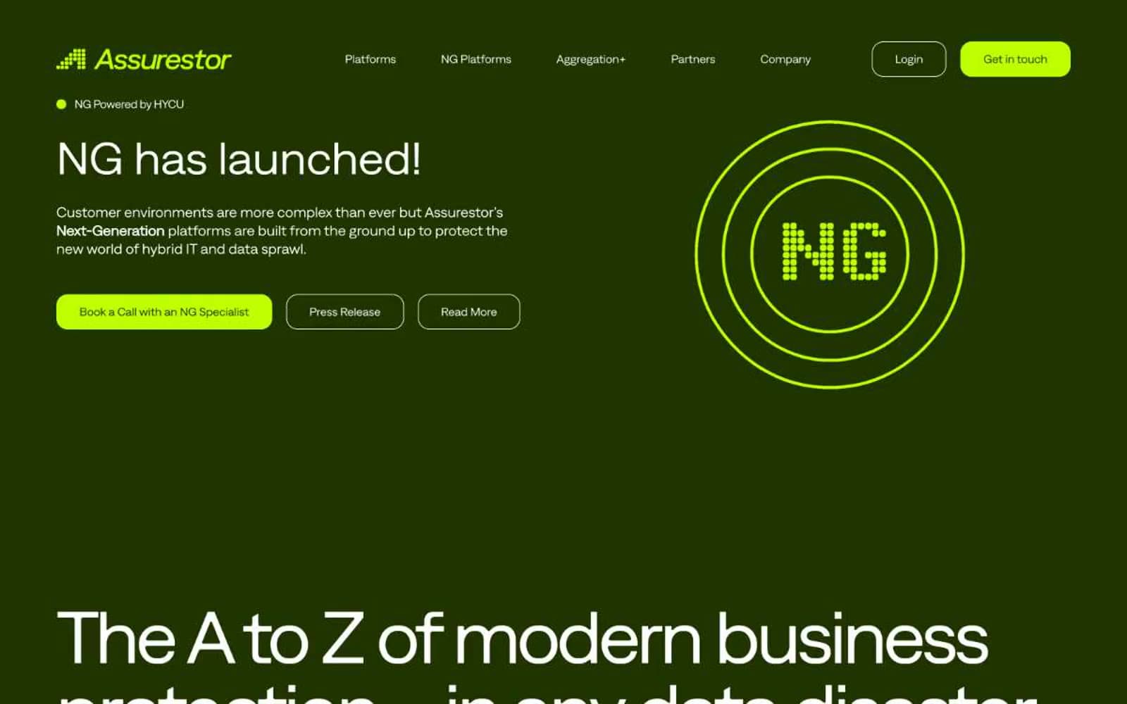
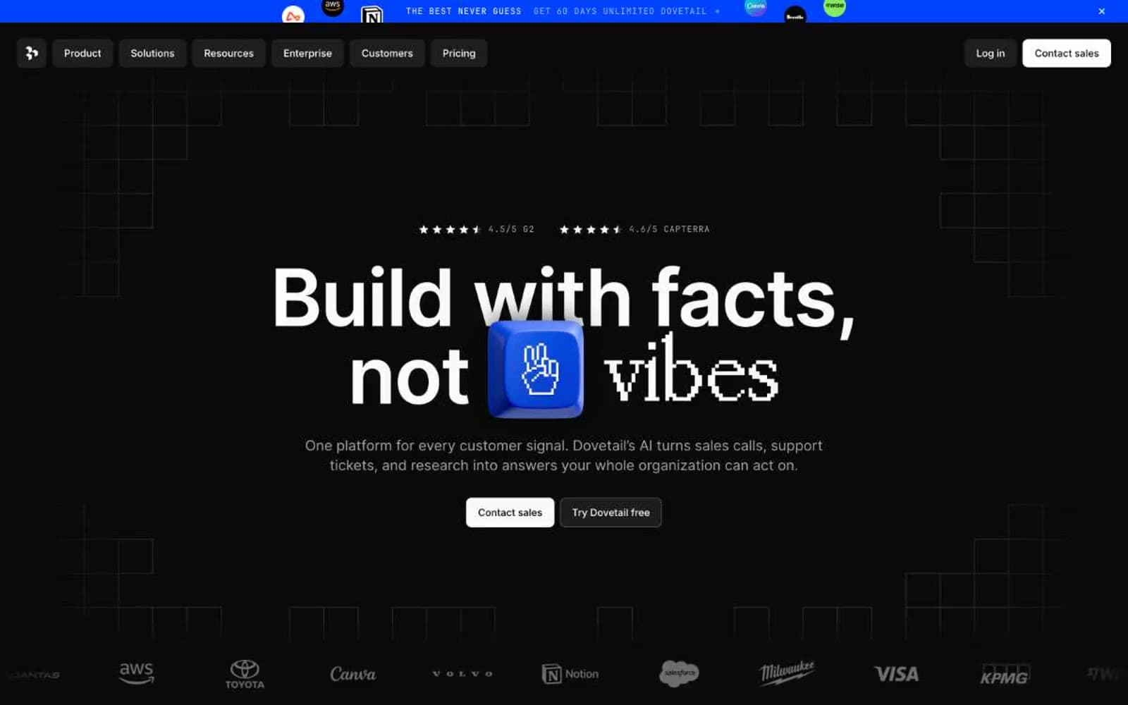
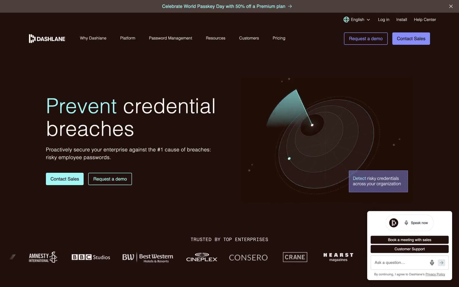
Dashlane. Midnight vault with mint keyholes.
- SaaS
- Dark theme
- 11 colors
- 2 typefaces
Dashlane is a dark, warm-toned security interface — a near-black cocoa canvas (#200f0a) with subtle plum depth, where mint (#a2f6f5) pierces the surface like a keyhole glow and violet (#858df9) plays the second voice. The system is built on one custom sans (Saans) that uses weight 300 for headlines and 500 for UI — a deliberate two-weight conversation that lets massive statistics whisper rather than shout. Surfaces sit on a warm scale from cocoa to deep aubergine, separated by hairline borders in muted beige (#e3ccc0) rather than cold grays. Components are pill-shaped for actions and 8px-rounded for cards; buttons feel like physical keys (9999px), never rectangles. The overall mood is 'midnight vault with a single lit doorway' — confident, restrained, with color appearing as small functional punctuation against an otherwise matte dark workspace.
Dashlane design system

Brand1
Teal action color for filled buttons, selected navigation states, and focused conversion moments.
Accent3
Outlined action borders, secondary highlights, icon accents — vivid violet for the second action voice and decorative strokes
Deeper violet for secondary borders and surface accents when iris needs to recede
Soft violet for inactive nav borders and gentle icon tints — the muted sibling of iris
Neutrals7
Page background, primary text on light surfaces — the warm near-black base; it has subtle brown warmth that distinguishes it from pure black and pairs with mint without vibrating
Card surfaces, elevated panels — slightly cooler and lighter than the page, reading as a card lifted off cocoa
Accent surface for nested cards or highlighted zones — a warmer brown for the third elevation step
Muted helper text, link underlines in resting state — desaturated warm gray for non-prominent metadata
Hairline borders on cards and nav, subtle dividers — beige linework that defines edges without harshness
Secondary borders, image outlines, utility rules — neutral gray for the most abundant structural lines
Primary body and heading text on dark surfaces, icon fills — soft off-white that reads as paper against cocoa
Try a pairing
Pick any two colors from the palette to check whether text stays readable on top.
Aa
Cocoa Black on Mint Keyhole
15.02 : 1 contrast
- Body textPasses AA 4.5
- Large textPasses AA 3
- StrictPasses AAA 7