Tatem. A hushed dark workspace washed in a single soft blue-to-charcoal gradient, with one warm sunburst as the only color punctuation.
- SaaS
- Dark theme
- 8 colors
- 1 typeface
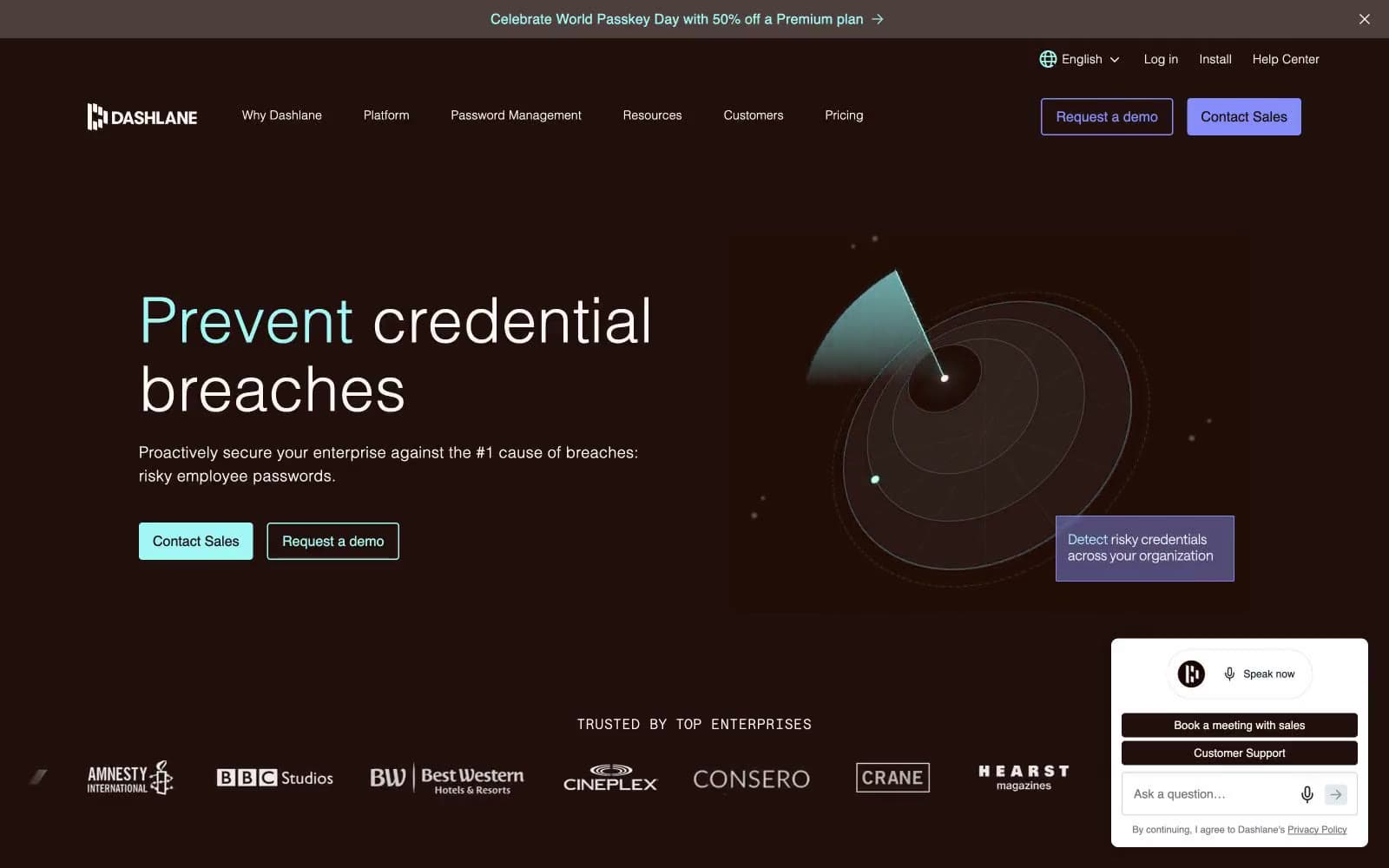
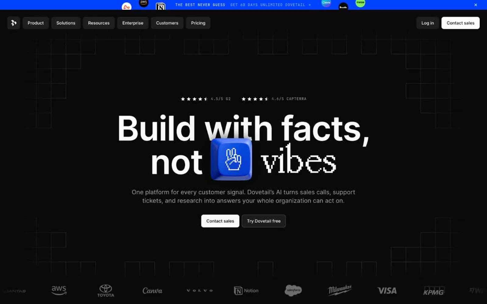
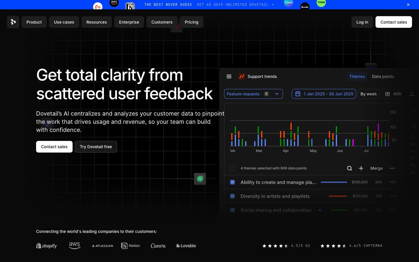
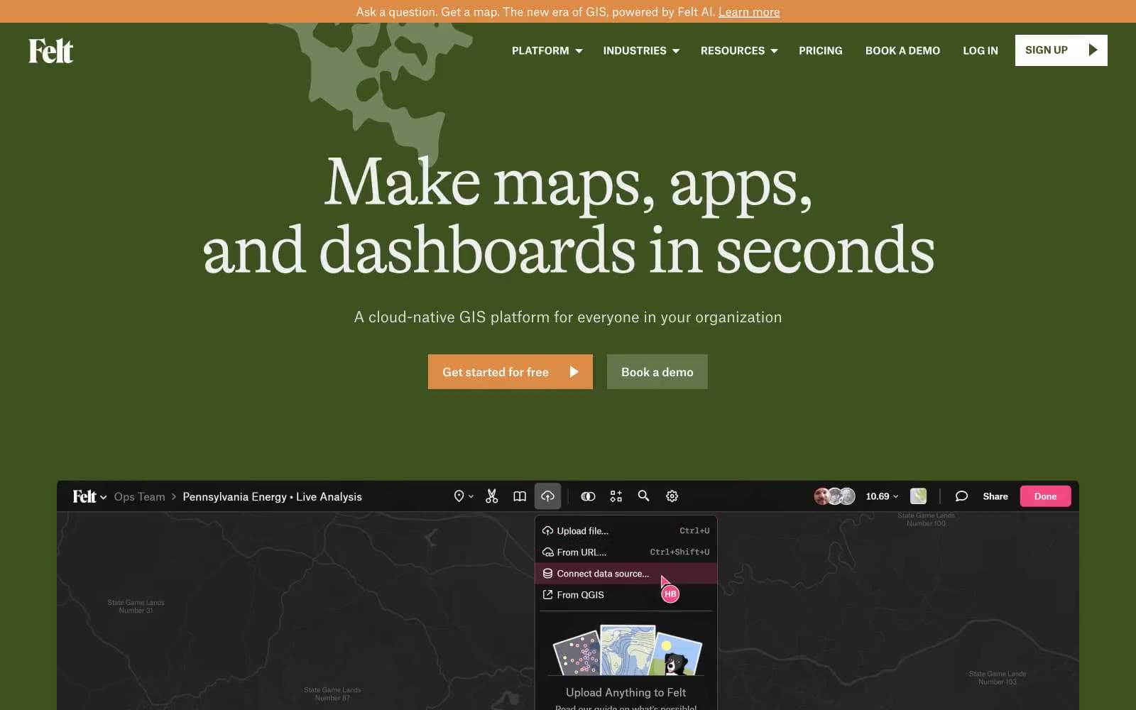
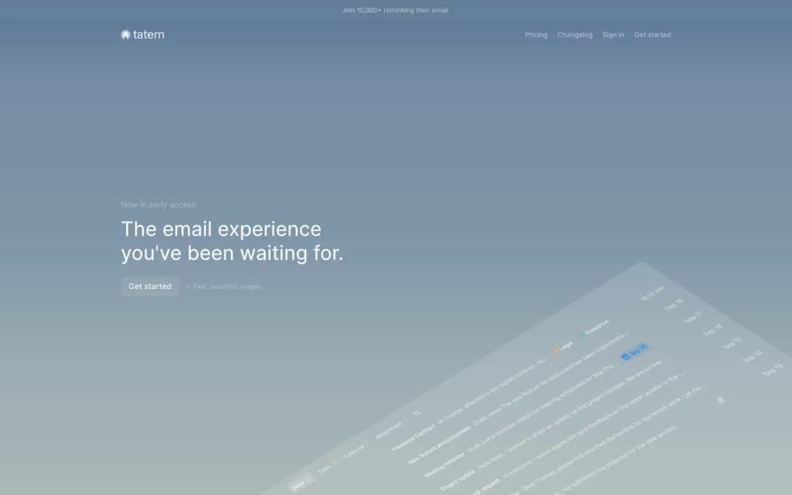
Tatem operates in a hushed, dark twilight palette where nearly the entire interface is rendered in neutral grays and near-black surfaces, creating a calm, focused environment for an email client. The hero breaks the monochrome with a single soft blue-gray gradient that fades to black, framing a large left-aligned headline and a gently rotated app preview. Typography is exclusively Inter at weight 400, relying on size and letter-spacing to establish hierarchy rather than weight contrast. Components stay flat and minimal: ghost buttons with thin borders, 6px-radius cards, keyboard shortcut chips, and inbox rows that use spacing and subtle gray separators rather than borders or shadows. The visual signature is restraint — one warm sunburst icon is the only chromatic punctuation, and the rest of the system communicates through negative space, neutral gradients, and whisper-quiet text colors.
Tatem design system

Brand2
Hero gradient anchor — the start of the soft blue-to-gray wash that defines the first viewport and makes the brand feel atmospheric rather than corporate
Gradient terminus — the pale gray-green endpoint of the hero wash that dissolves the page into the dark sections below
Neutrals6
Base canvas, section background, primary surface — the dominant dark that anchors all content sections
Mid-tone surface, card backgrounds, chip fills, subtle dividers
Tertiary text, icon strokes, inactive nav items, secondary button text
Muted body text, sub-labels, metadata
Secondary headings, emphasis text on dark surfaces
Primary text, logo mark, ghost button borders on dark — the highest-contrast color, used sparingly for headlines and active labels
Try a pairing
Pick any two colors from the palette to check whether text stays readable on top.
Aa
White on Obsidian
11.20 : 1 contrast
- Body textPasses AA 4.5
- Large textPasses AA 3
- StrictPasses AAA 7