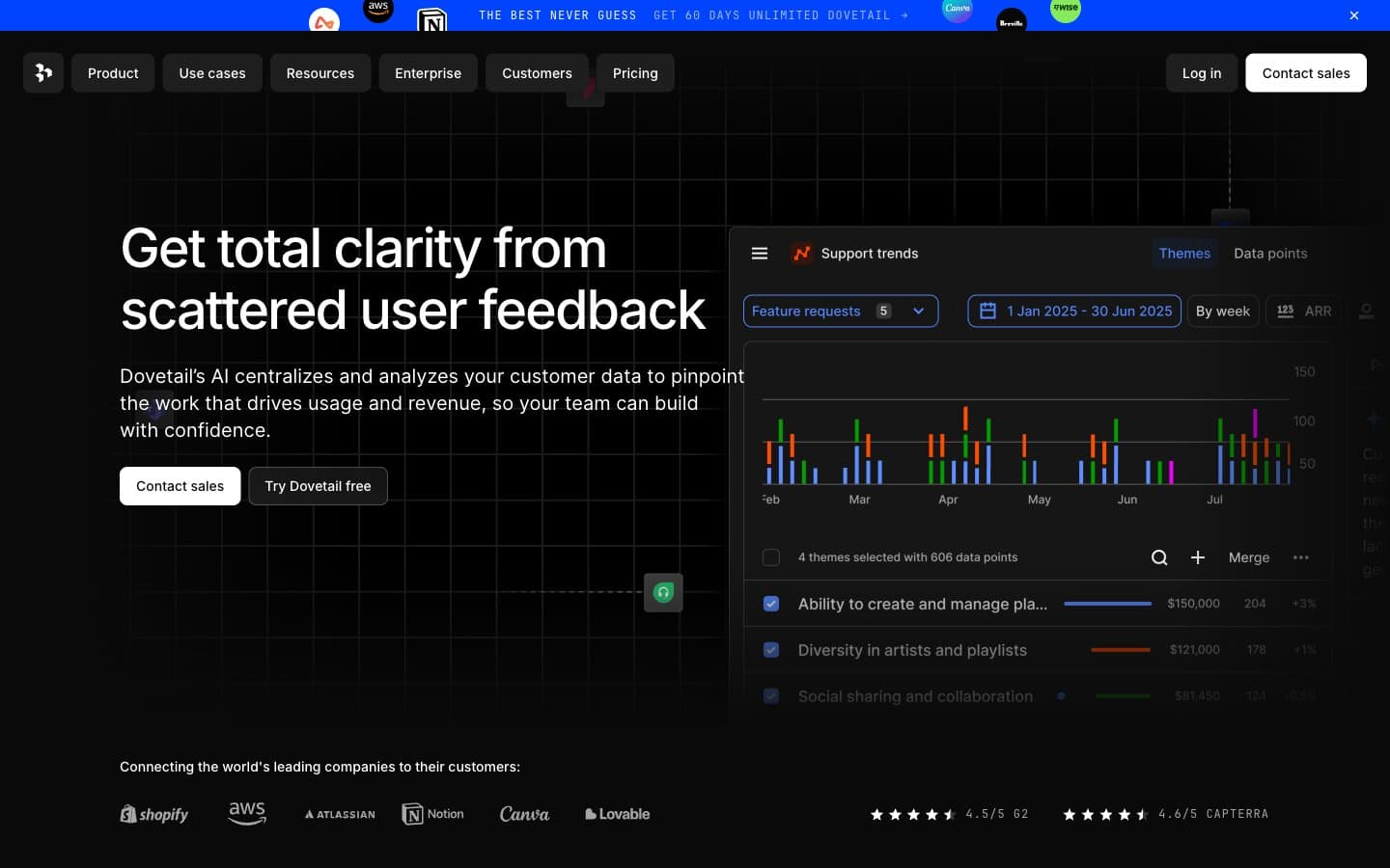
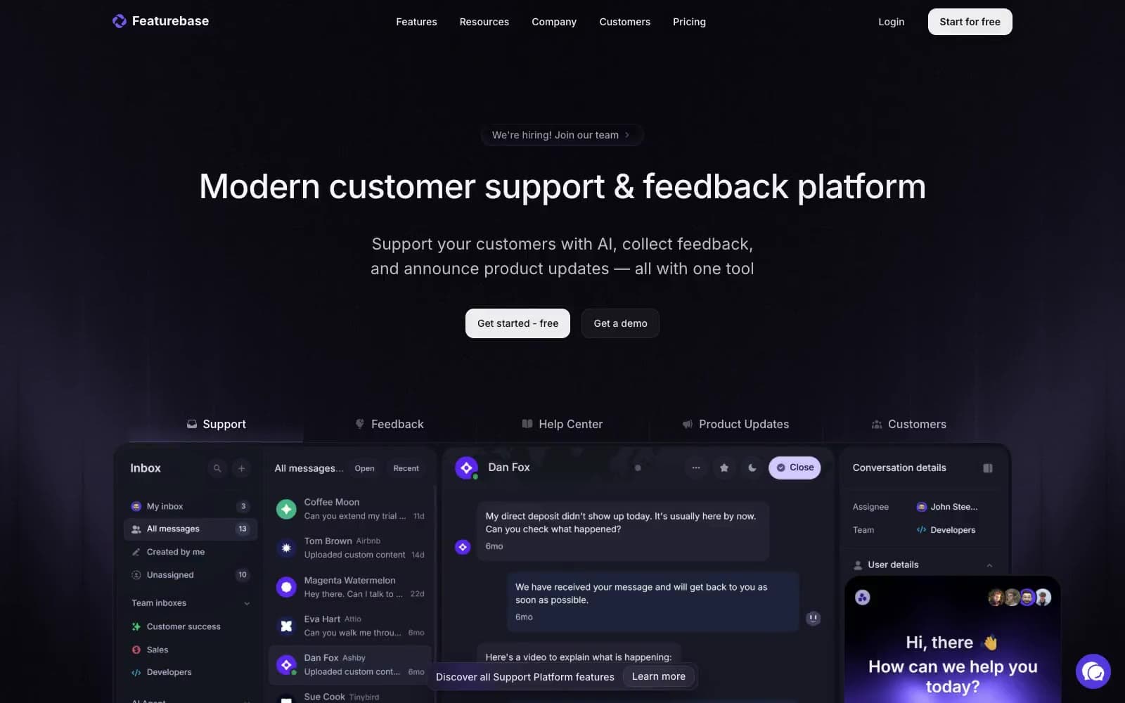
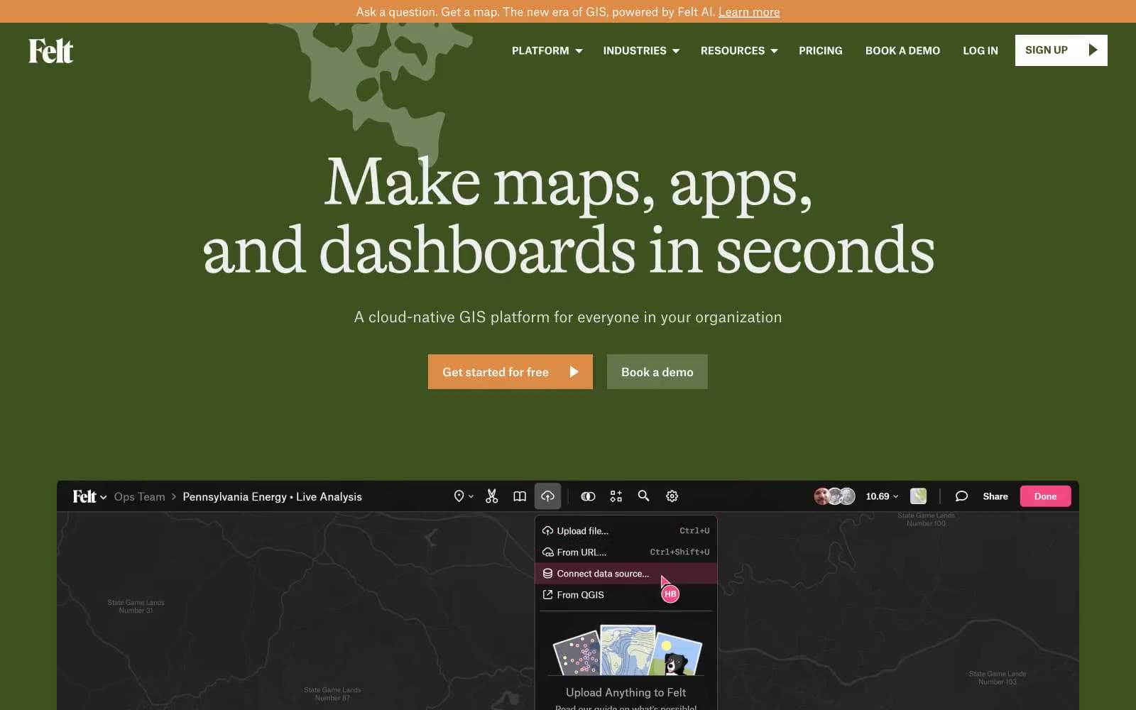
Tapbots. A midnight spacecraft hangar where a single violet frequency cuts through the void.
- SaaS
- Dark theme
- 21 colors
- 1 typeface
Tapbots Ivory is a cosmic product showcase rendered in violet dusk: a near-black canvas hosts floating 3D mascots and illuminated spacecraft, with a single saturated violet threading through every interactive element. The interface is deliberately flat — no drop shadows, no card elevations, no gradients on UI surfaces — letting the 3D hero illustrations carry all visual weight while the UI itself stays quiet and spacious. Typography is exclusively the Apple system stack, which signals the product's iOS-first heritage and avoids any web-font loading delay. The layout is a single centered column that breathes generously between sections, with content maxing out well before the viewport edges. Color is used surgically: violet for links, icons, and emphasis; green and red as functional punctuation for feature headings.

Tapbots design system

Brand8
Primary brand violet — the signature color saturating hero backgrounds, app icons, and brand surfaces
Violet supporting accent for decorative details and low-frequency emphasis. Do not promote it to the primary CTA color
Mid-violet for feature headings and emphasis — sits between Signal Violet and Glow Violet in the scale
Dark violet for pressed link states and deep accent contexts
Violet supporting accent for decorative details and low-frequency emphasis. Do not promote it to the primary CTA color
Soft violet for muted text and subtle border accents where full saturation would shout
Cool violet tint for body text and light border treatment — the coolest end of the violet range
Signature hero and brand gradient — blue to magenta sweep used on logo, feature icons, and brand surfaces
Accent2
Accent green for select feature headings — functional punctuation that breaks the violet monotony
Notification badges, unread indicators, and attention-grabbing icon accents
Neutrals11
Deepest canvas — the void behind everything, visible at the absolute darkest page edges
Subtle surface lift for embedded app screenshots and elevated content blocks
Primary page background — the dominant surface where all content lives
List and card surface — the faintest step up from canvas for grouped content
Deepest text level — placeholder, disabled, very-low-emphasis body
Supporting neutral for secondary UI, dividers, and muted labels. Do not promote it to the primary CTA color
Tertiary text — captions, metadata, timestamps
Muted body text and supporting copy
Secondary text and icon fills at reduced opacity contexts
Heading color at reduced emphasis — sub-section titles, subdued headers
Primary text, headings, icons — maximum contrast against the dark canvas
Try a pairing
Pick any two colors from the palette to check whether text stays readable on top.
Aa
Pure White on Signal Violet
6.37 : 1 contrast
- Body textPasses AA 4.5
- Large textPasses AA 3
- StrictFails AAA 7