REKKI. Mission control dashboard in a darkroom.
- SaaS
- Dark theme
- 10 colors
- 5 typefaces
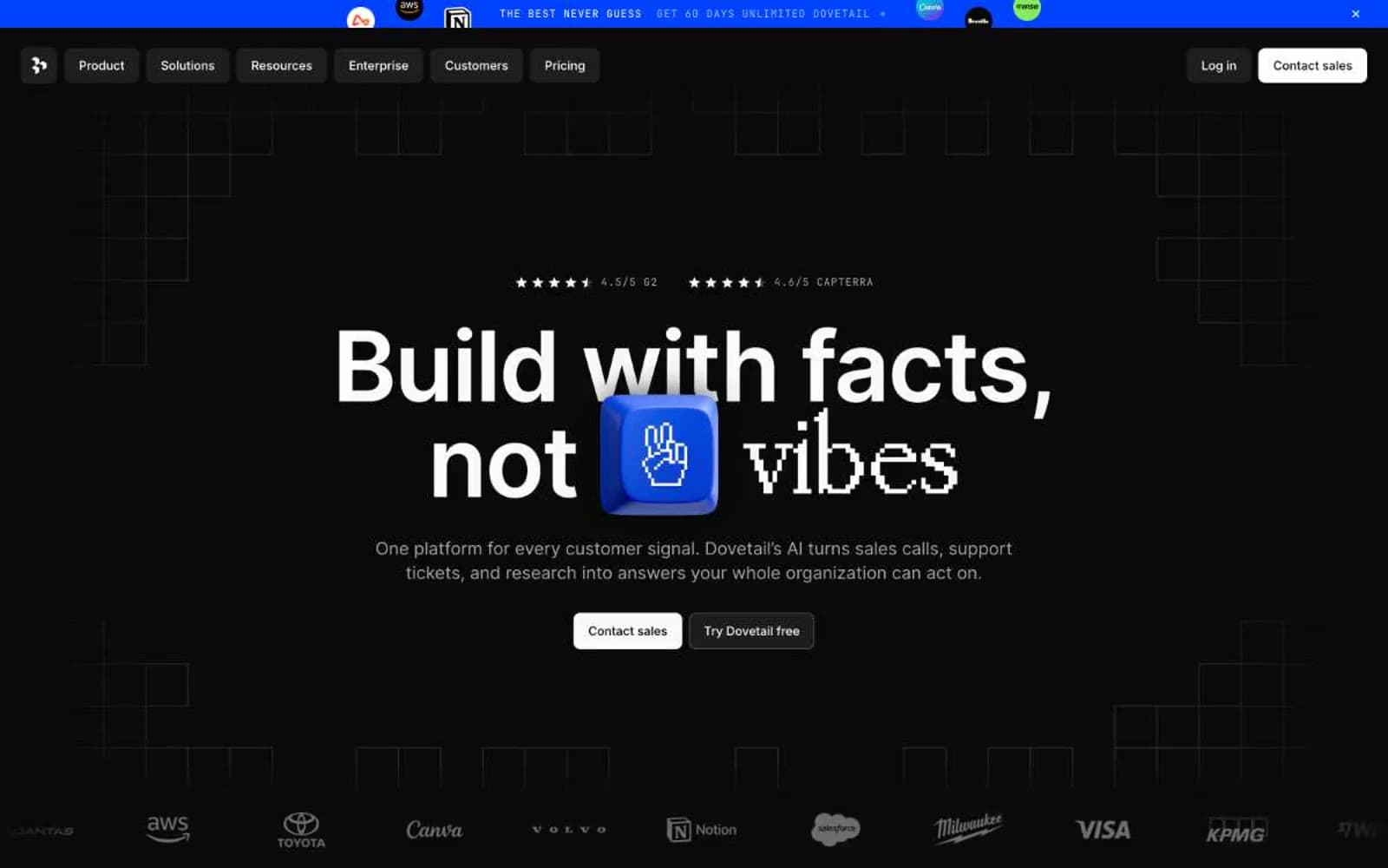
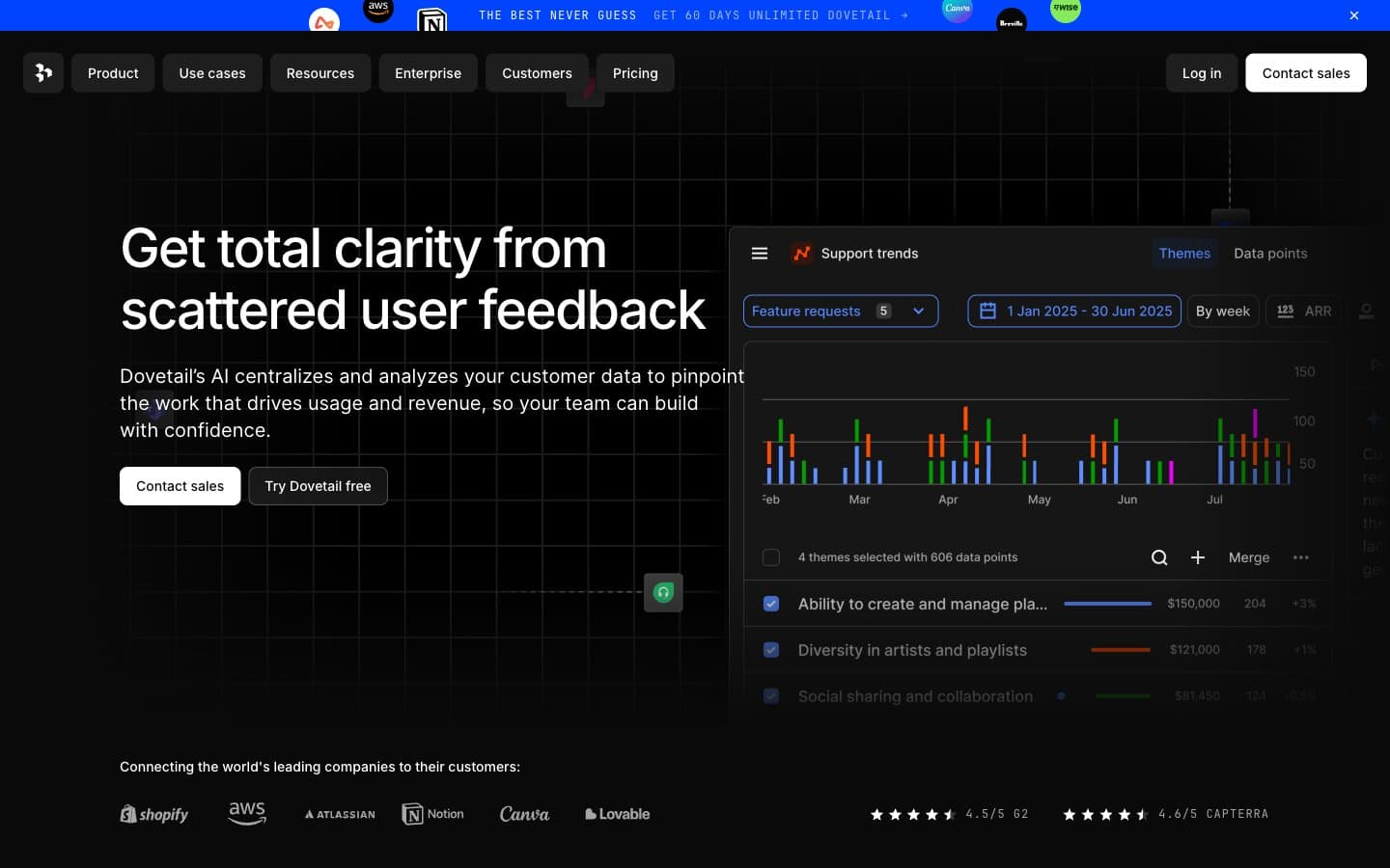
REKKI is a midnight enterprise control room: a pitch-black canvas hosting dense product interfaces that glow from within. The visual system is nearly monochromatic — no semantic color clutter, no decorative gradients — letting one electric blue do all the emotional heavy lifting on CTAs, active states, and brand punctuation. Typography is custom and characterful: Diatype REKKI brings quiet authority with tight negative tracking on display sizes, while OCD-GARRI handles the utilitarian UI labels. Components sit on the canvas like instrument panels — dark, lightly elevated by near-invisible inset white borders rather than drop shadows, with pill-shaped interactive elements that feel like physical switches.

REKKI design system

Brand1
Primary CTA fill, active nav indicator, brand accent dots, link highlights — the single chromatic voice in an otherwise silent monochrome system
Neutrals9
Page canvas, dominant background, hairline divider color, icon fill — the floor of the entire system
Card surface base, deep panel backgrounds — first step above the page canvas
Elevated card surfaces, section backgrounds, border fills — the mid-surface layer
Input field backgrounds, form controls, tertiary surfaces
Highest card elevation, modal surfaces, hover-state surfaces — the ceiling of the surface stack
Body text, muted labels, secondary borders, link underlines — the workhorse neutral for non-heading text
Link text, subdued navigation labels
Icon strokes, tertiary button borders, low-priority text
Light neutral action fill for buttons on dark surfaces.
Try a pairing
Pick any two colors from the palette to check whether text stays readable on top.
Aa
Paper on Signal Blue
5.42 : 1 contrast
- Body textPasses AA 4.5
- Large textPasses AA 3
- StrictFails AAA 7