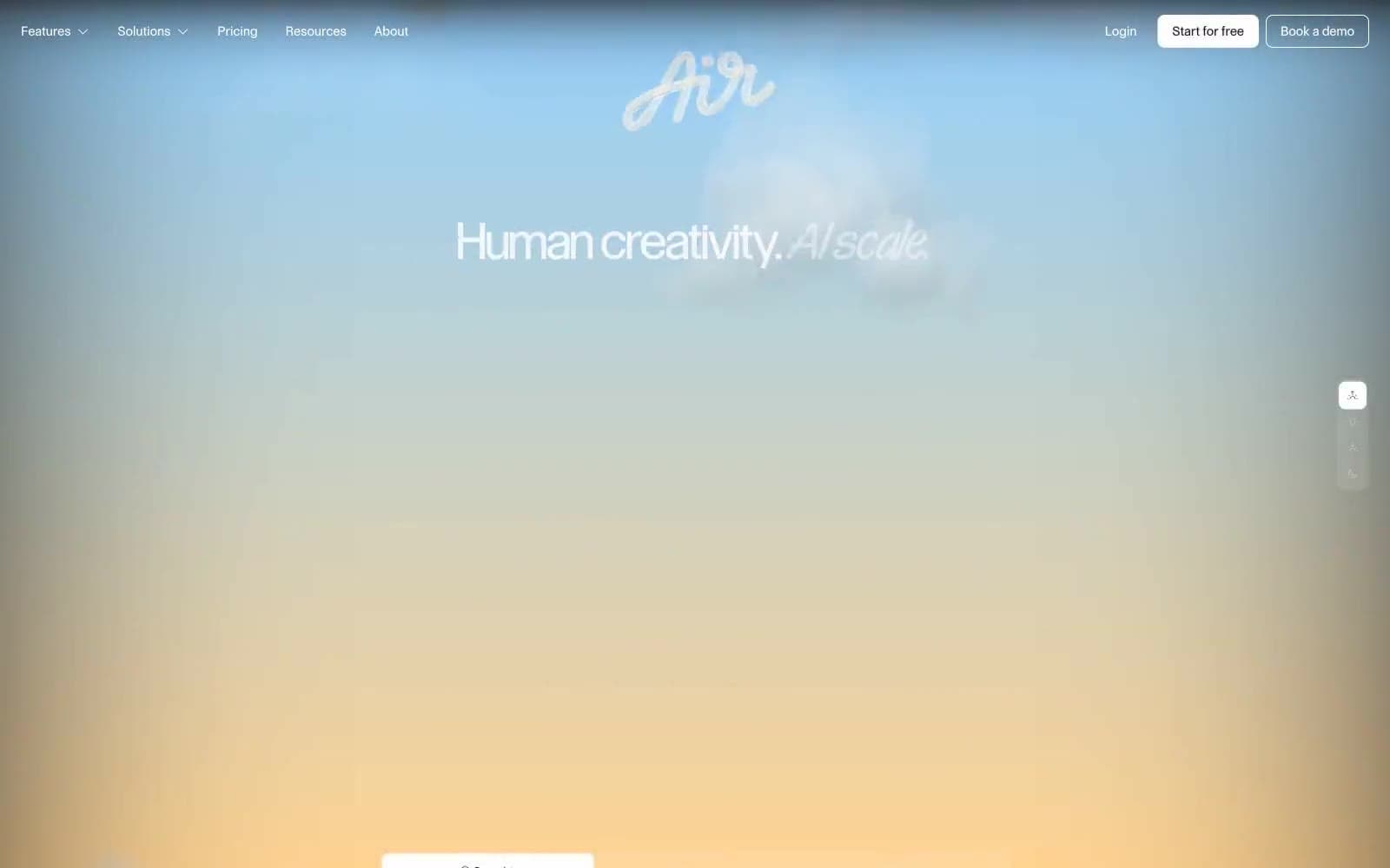
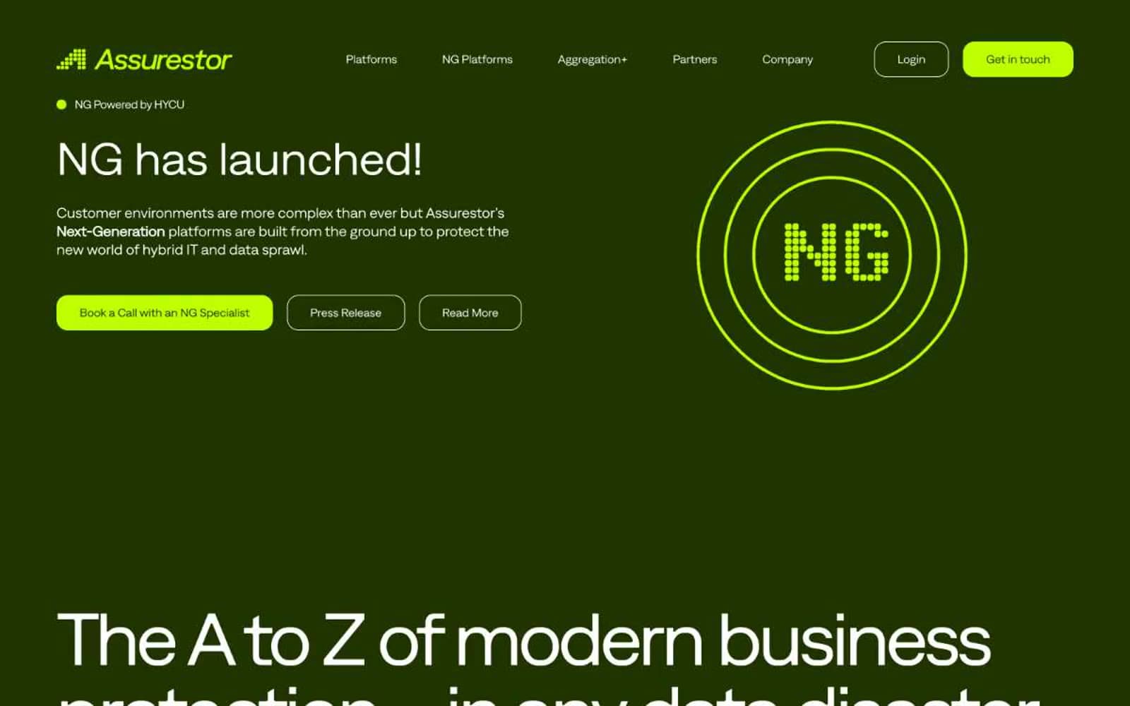
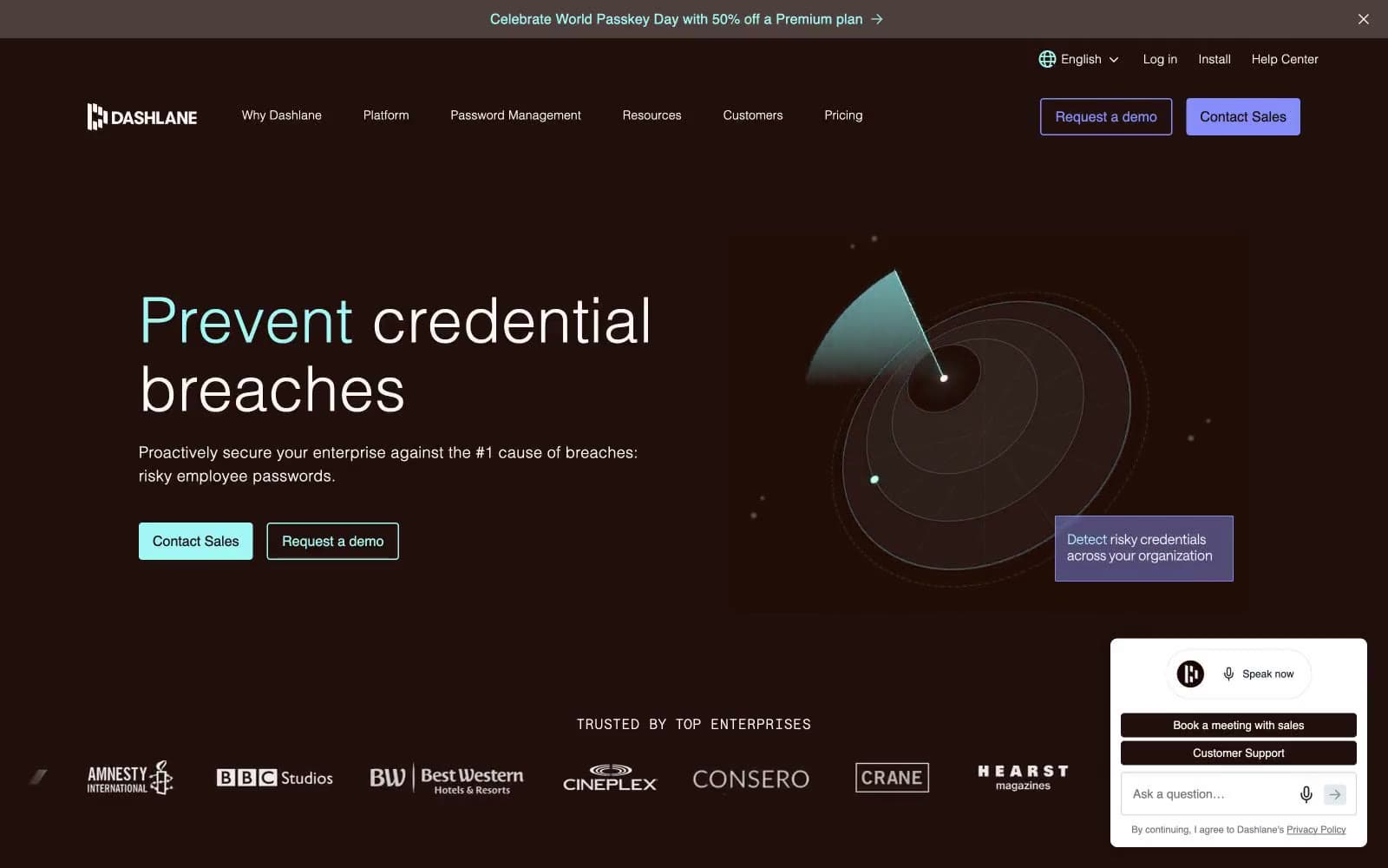
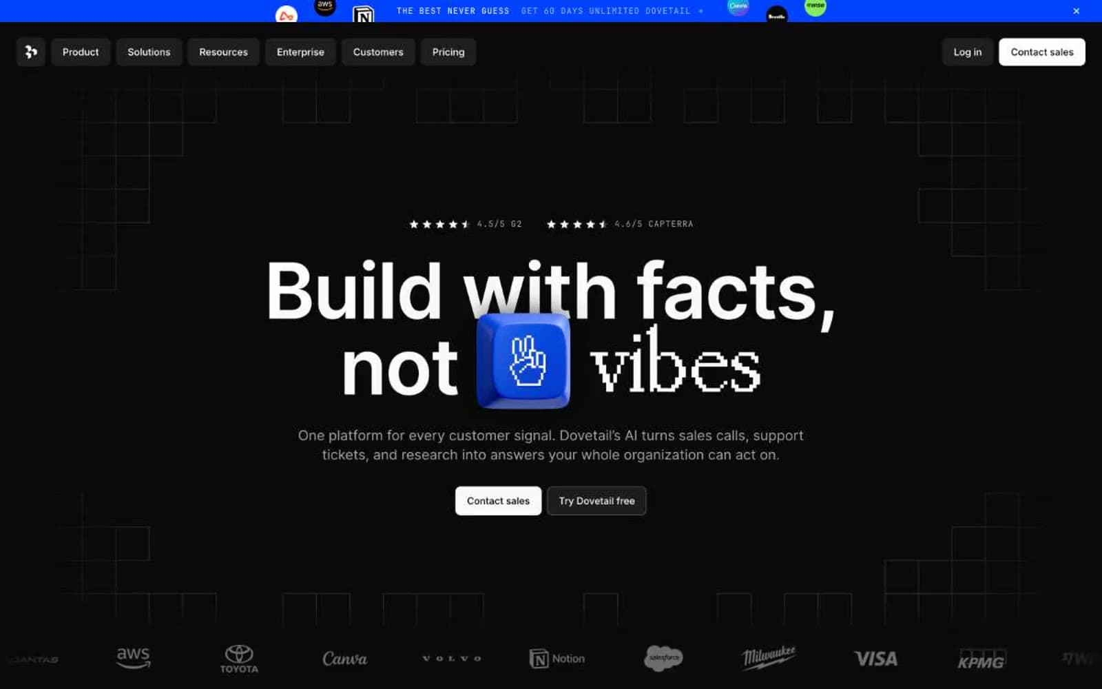
Ordinal. A near-black room where a single neon green switch glows as the only thing that matters.
- SaaS
- Dark theme
- 10 colors
- 2 typefaces
Ordinal is a near-monochrome dark canvas interrupted by a single luminous mint accent — the interface behaves like a dimmed control room where one neon switch is always lit. Almost the entire UI lives in #151316 with white type, gray hairlines, and quiet 5px corners, while #8ef5b5 is reserved as punctuation: primary action fills, eyebrow labels, active states, and logo glows. The product screenshot is the hero — no decorative imagery, no gradients, no illustrations — letting the calendar UI itself become the visual. Typography is Inter in only two weights (400, 500) paired with a custom monospace eyebrow face, all text sits tight with negative tracking, and the result reads as a calm, professional tool that earns its single color through restraint rather than scarcity.

Ordinal design system

Brand1
The single chromatic accent — filled primary CTAs, eyebrow pill labels, active nav indicator, logo glow, and green-text logo tints. Against #151316 the contrast is 14:1, making it legible as both text and fill
Accent1
Muted teal used for gradient stops and subtle secondary accents — never appears alone, always paired as a background fade or shadow; Gradient overlay creating soft elevation behind product screenshot and logo wall
Neutrals8
Page background, hero canvas, footer — near-black with a faint violet undertone that keeps the dark from feeling flat or sterile
Primary text on light feature sections and nav borders in light mode
Card and panel surface above the void canvas — subtle lift achieved through one tonal step rather than shadow
Mid-weight borders and subtle UI separators — slightly darker than Mist for structural rules
Muted body text, hairline dividers, inactive icon strokes, and low-emphasis borders on dark backgrounds
Light-mode body borders and secondary text on warm light sections
Hairline borders, dividers, input outlines, and card edges on light surfaces.
Primary text and icon color on dark surfaces; borders on dark UI; inverted text on light feature cards
Try a pairing
Pick any two colors from the palette to check whether text stays readable on top.
Aa
Void Canvas on Mint Filament
13.97 : 1 contrast
- Body textPasses AA 4.5
- Large textPasses AA 3
- StrictPasses AAA 7