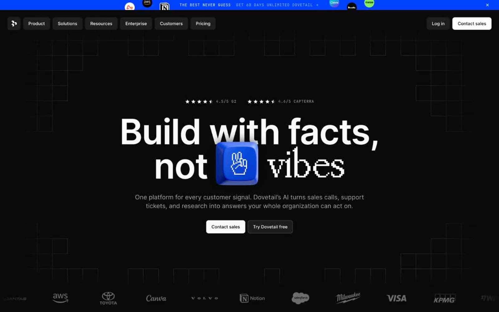
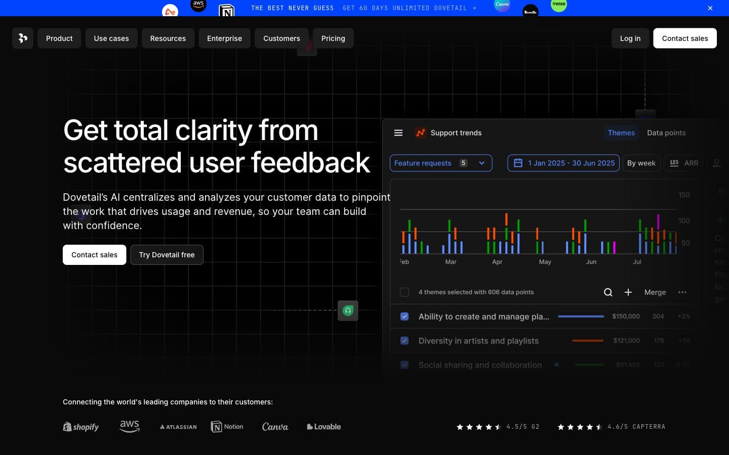
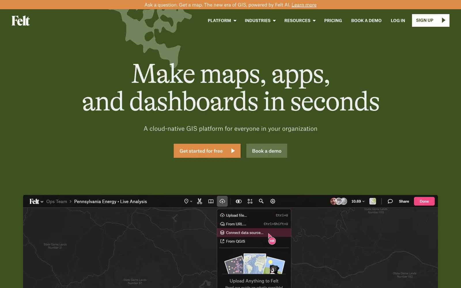
Mesh. Bronze ink on midnight paper.
- SaaS
- Dark theme
- 13 colors
- 4 typefaces
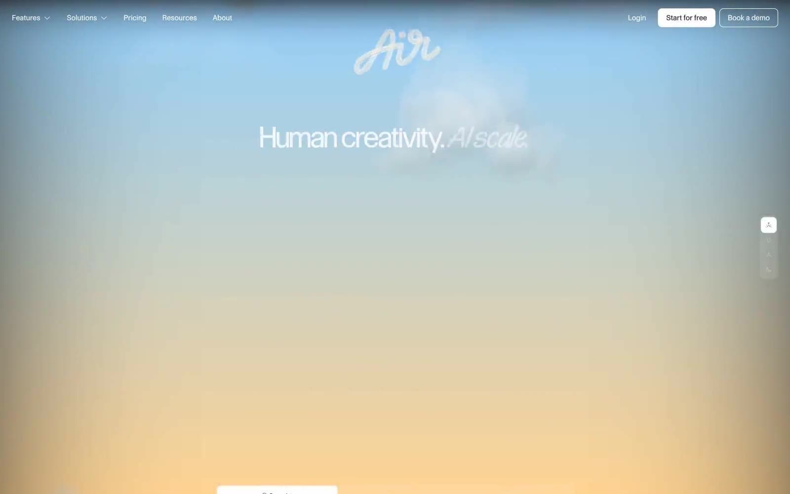
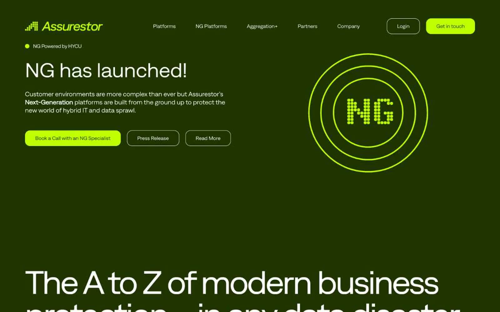
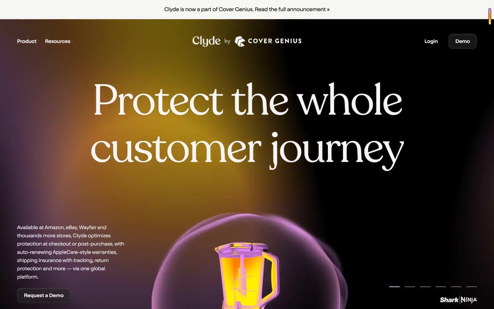
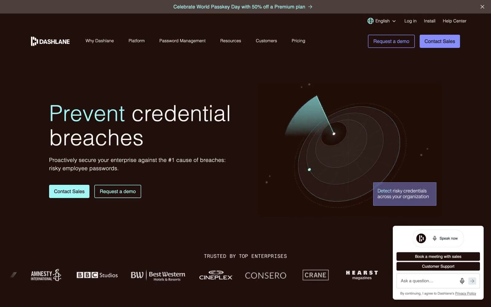
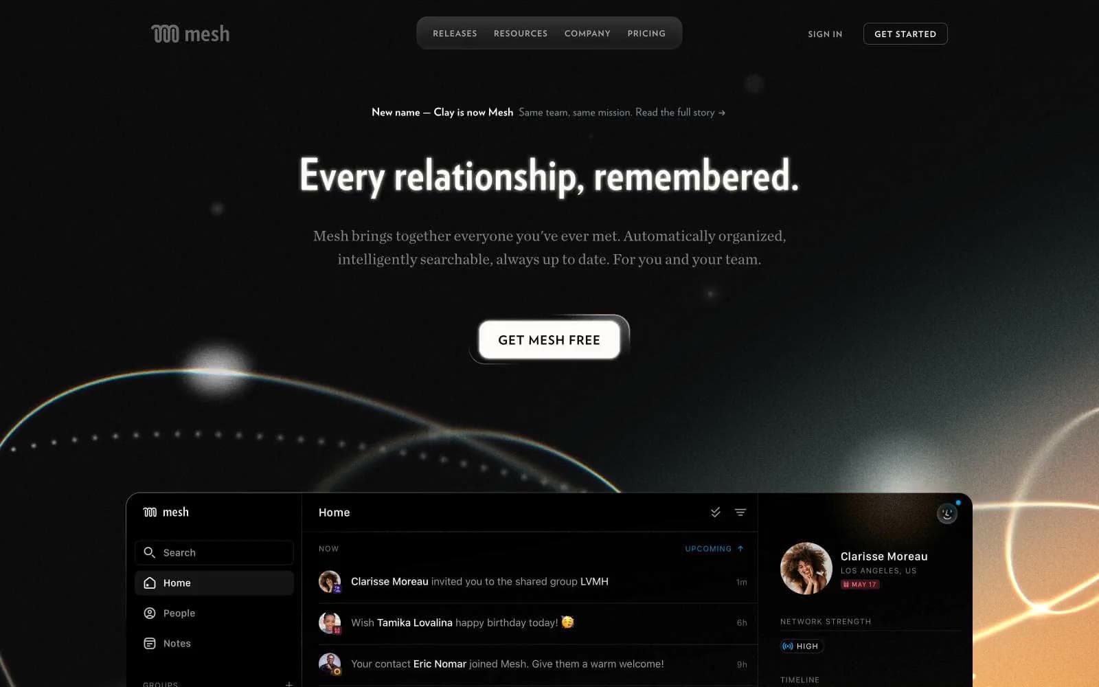
Mesh presents a nocturnal editorial workspace: near-black canvas, warm amber glow bleeding up from the lower viewport, and crisp white type that reads like a magazine spread rather than a SaaS dashboard. The voice is confident but quiet — compact, information-dense, with text doing the heavy lifting and color reserved as semantic punctuation. Warm copper (#f2b98b) is the only chromatic accent, and it arrives as outlines and rules rather than fills, so actions feel invited rather than pushed. The interface borrows from print typography: wide-tracked uppercase labels (0.1–0.17em), condensed display faces for hero headlines, and generous line-height on body copy. Surfaces are flat, borders are hairline, and the lone shadow is subtle — depth comes from layering and glow, not drop shadows.
Mesh design system

Brand2
Outlined action border, link underline, decorative icon accent — warm copper against matte black, the only chromatic punctuation in the system
Lighter amber accent for secondary decorative rules and gradient highlights
Accent1
Gradient start color — the warm horizon glow that bleeds into the lower viewport
Neutrals10
Body text on light surfaces, icon fills, deep contrast anchor
Page background, hero base, footer — the dominant near-black field that holds everything else
Elevated surfaces, icon strokes, secondary button borders — one step lighter than the canvas to create depth without elevation
Secondary text, inactive link borders, de-emphasized chrome
Heading and body muted variant — the slightly warmer counterpart to Cool Steel
Body helper text, icon outlines, subtle annotation
Hairline borders, dividers, list separators, muted structural lines — the most-used neutral border color
Body borders, very subtle structural separators
Light surface variant, gradient terminus — a soft warm white paired with Obsidian for AAA contrast
Neutral form states, badge text, and quiet UI feedback where color should stay understated. Do not promote it to the primary CTA color
Try a pairing
Pick any two colors from the palette to check whether text stays readable on top.
Aa
Onyx on Bronze Glow
12.09 : 1 contrast
- Body textPasses AA 4.5
- Large textPasses AA 3
- StrictPasses AAA 7