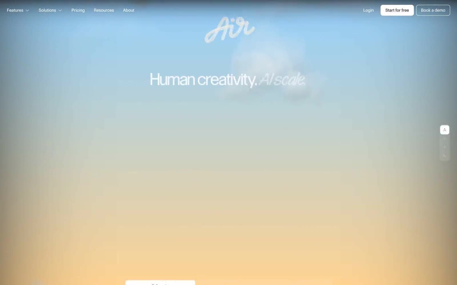
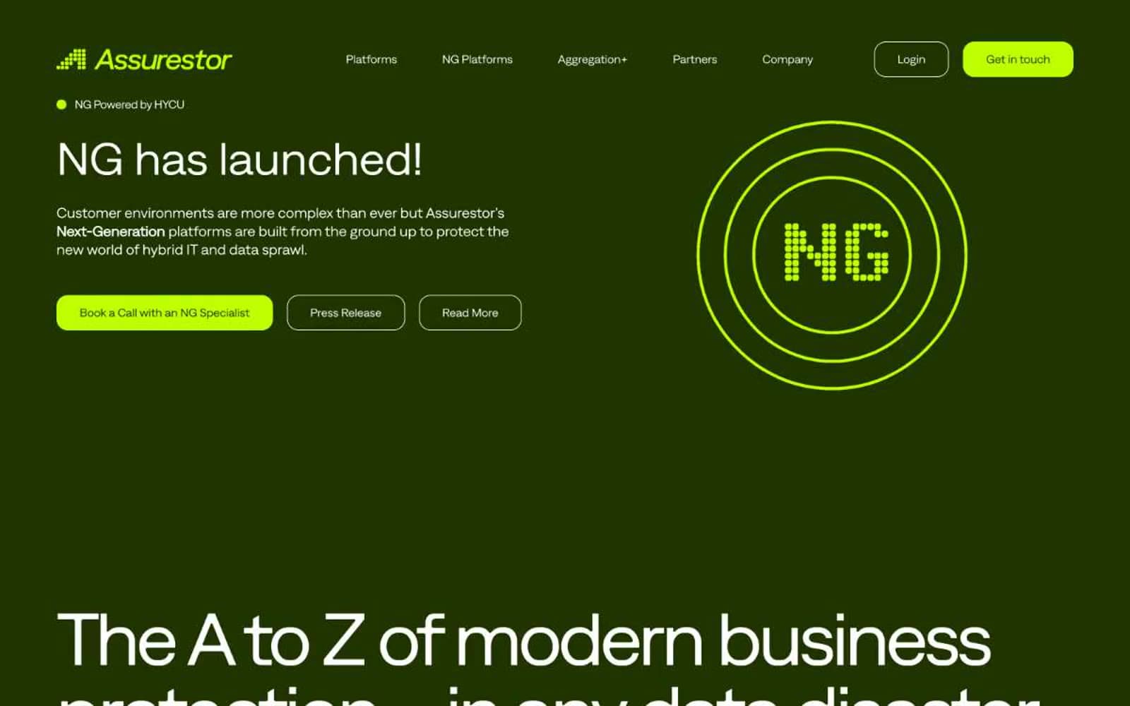
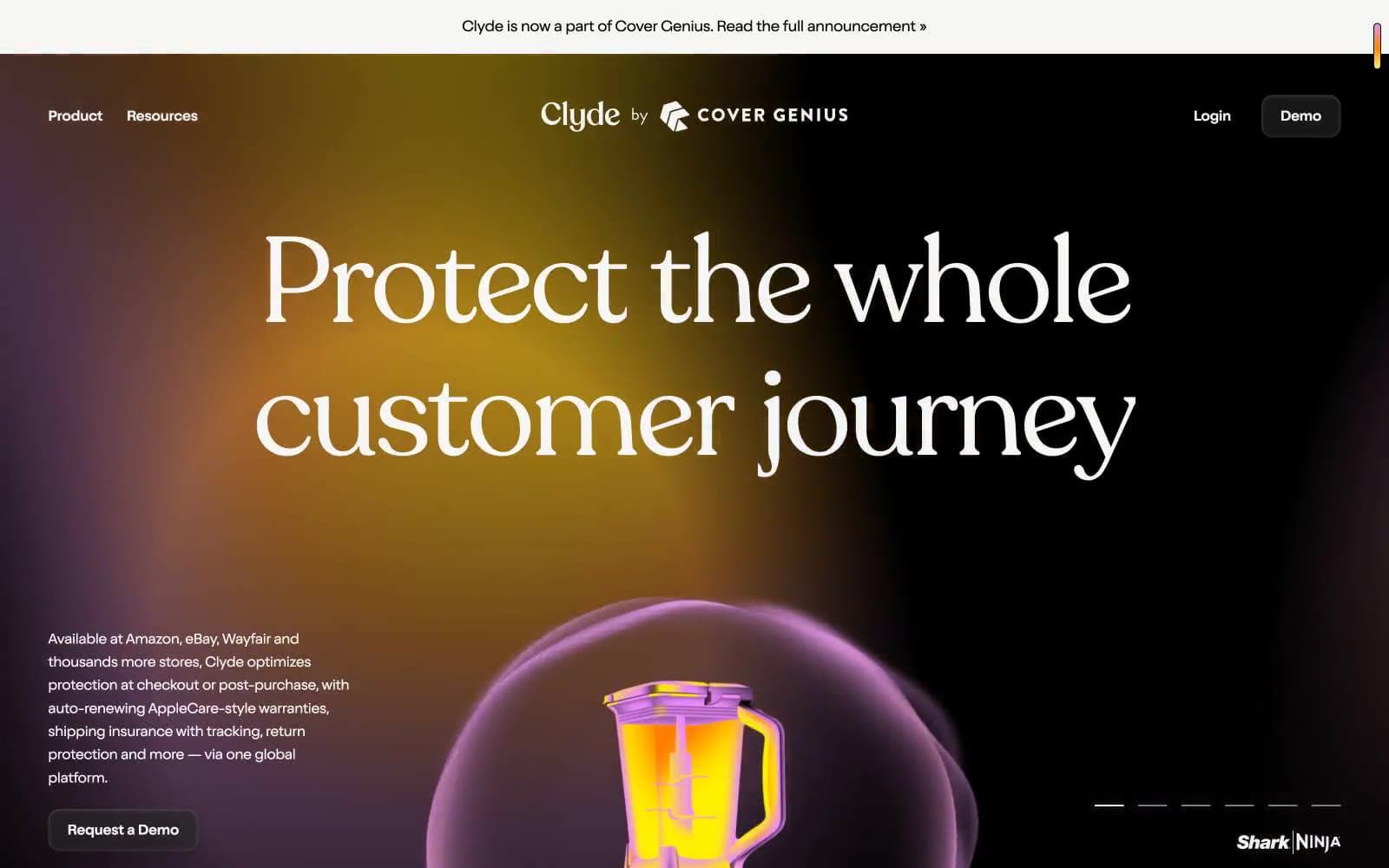
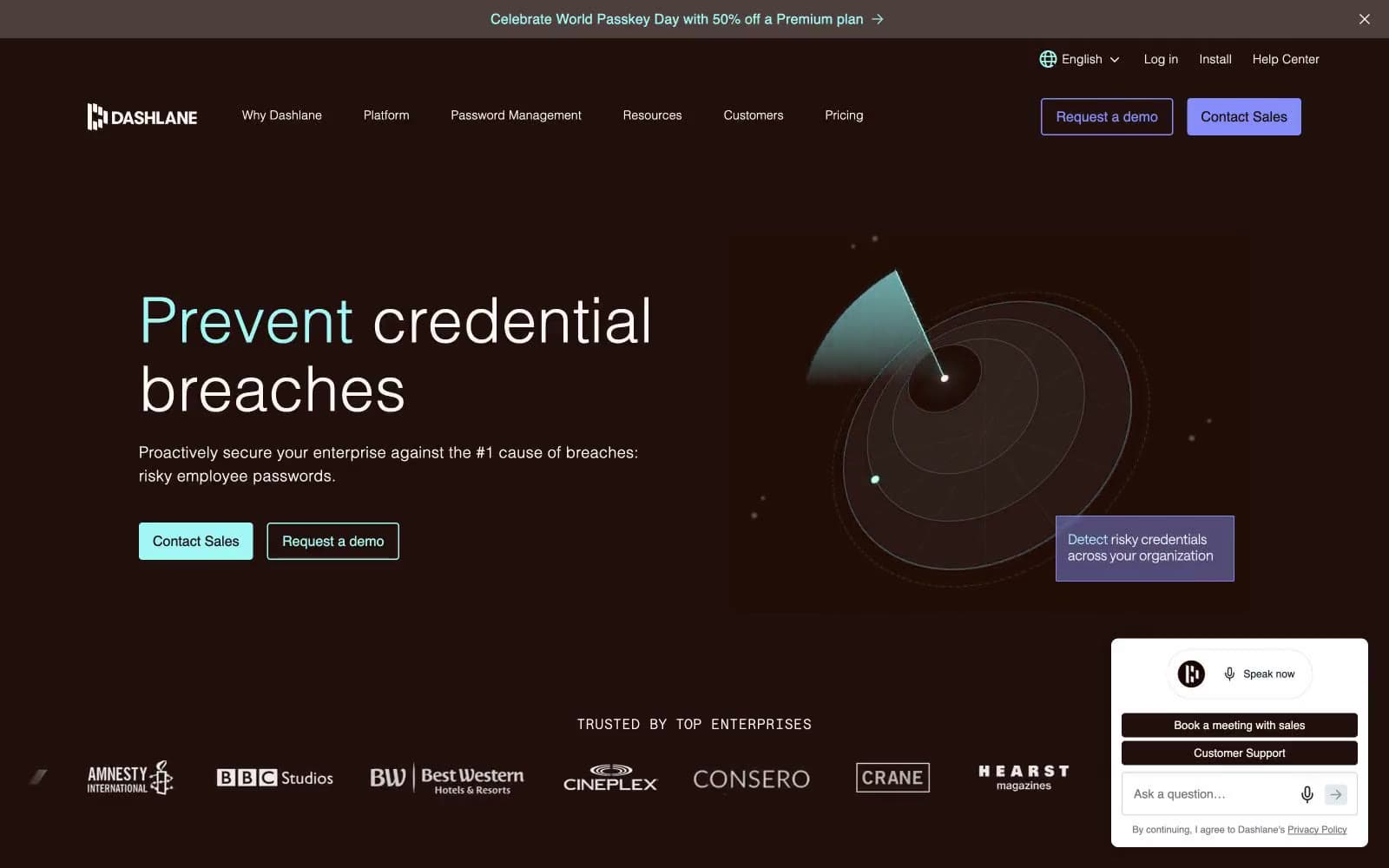
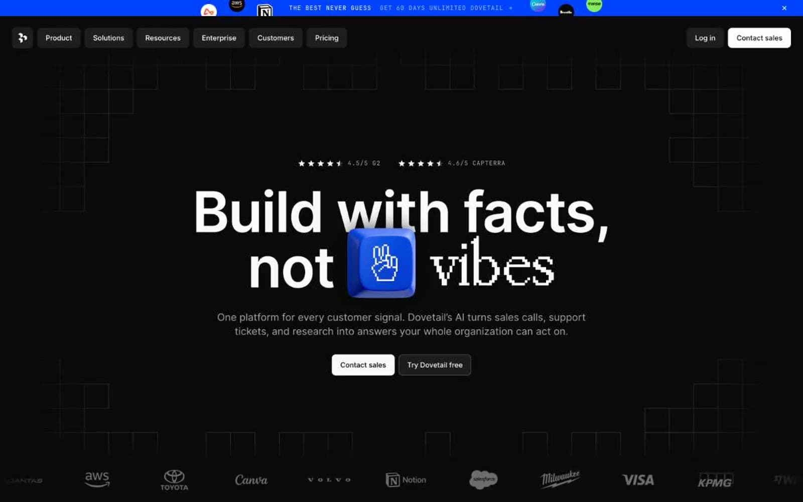
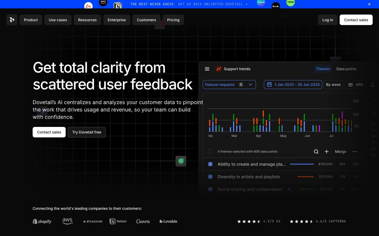
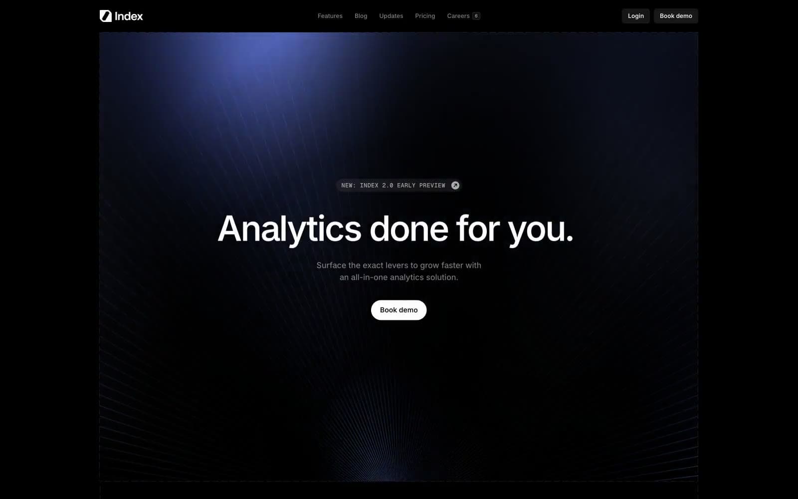
Index. The entire interface is a wireframe drawing, with one periwinkle annotation pen.
- SaaS
- Dark theme
- 7 colors
- 2 typefaces
Index operates as a technical wireframe drawn in negative space: a near-black canvas wrapped in dashed containment lines, a single muted periwinkle accent (#7089ba) used as quiet annotation, and display type set at maximum weight (Raveo 1000) that anchors every section. The visual logic is "blueprint on a light table" — components are not decorated but outlined, so the interface reads as a schematic rather than a finished product. Surfaces stay matte and flat; elevation is implied by hairline dashed borders and a slight surface lift from #1c1c1c to #808080, never by shadow. The only moment of softness is the hero's radial light wash, which acts like a focused desk lamp on a drafting table. Color is rationed — achromatic 99% of the time, with the violet-blue reserved for small chromatic punctuation (data connection nodes, icon fills, subtle washes). Typography does the emotional heavy lifting: weight 1000 display lines dominate, set tight (-0.04em) and large (70px) so they feel architectural rather than editorial.
Index design system

Accent1
Decorative icon fills, data-node accents, subtle highlight washes on feature illustrations, checkmark accents — the only chromatic mark in the system, rationed to annotation roles
Neutrals6
Page background, all structural borders, primary text on light surfaces — the absolute black that makes the dashed containment lines read as ink on paper
Elevated surface — card backgrounds, section fills, the canvas where the hero spotlight lands; lifted one step from Void but barely
Tertiary borders and disabled outlines, dividers in dense lists
Body text secondary, metadata labels, muted borders, checkbox/divider lines on dark
Helper text, caption-level metadata, tertiary text on dark surfaces
Primary text, logo mark, active nav text, button borders, eyebrow chips — the one bright stroke against the void
Try a pairing
Pick any two colors from the palette to check whether text stays readable on top.
Aa
Void on Periwinkle Annotation
5.98 : 1 contrast
- Body textPasses AA 4.5
- Large textPasses AA 3
- StrictFails AAA 7