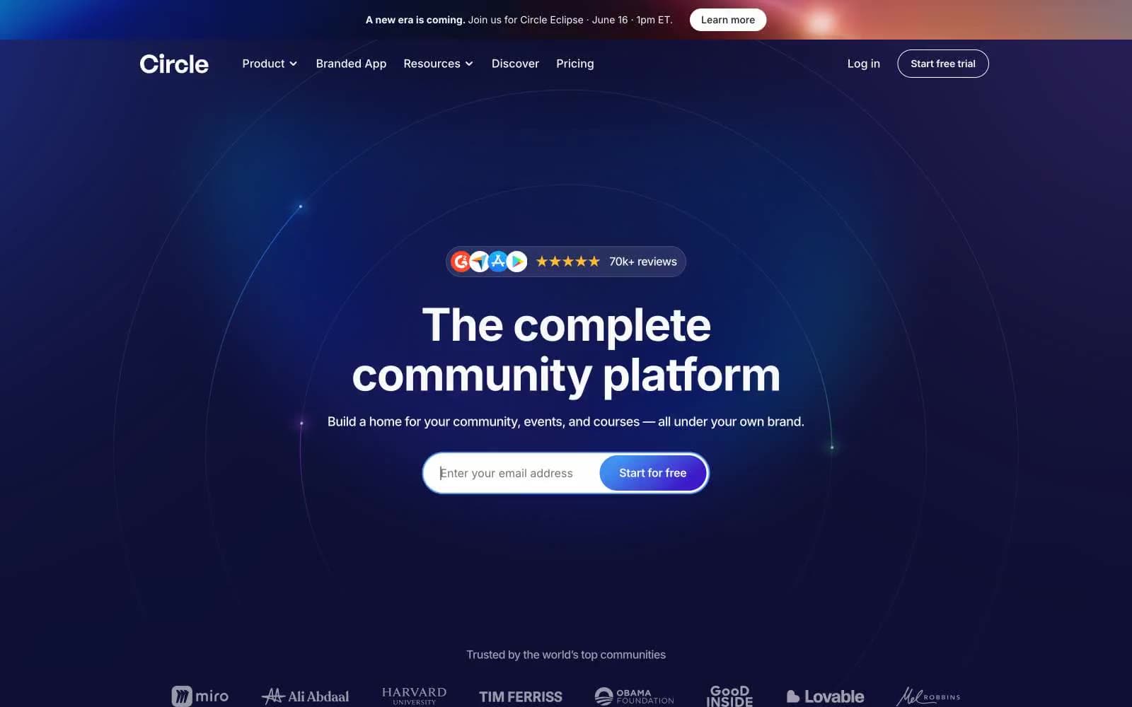
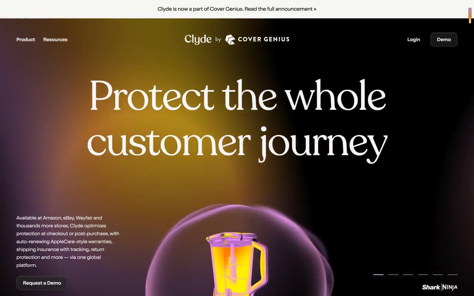
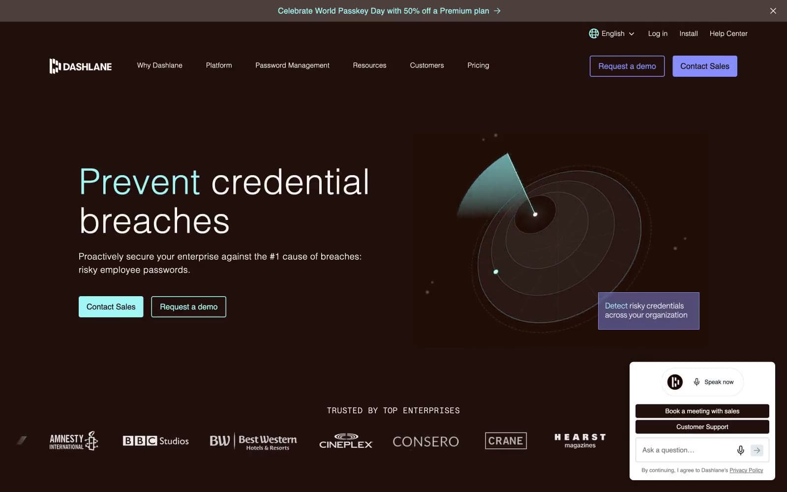
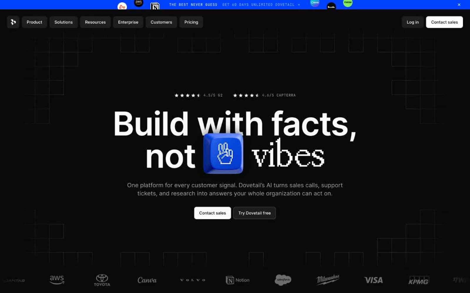
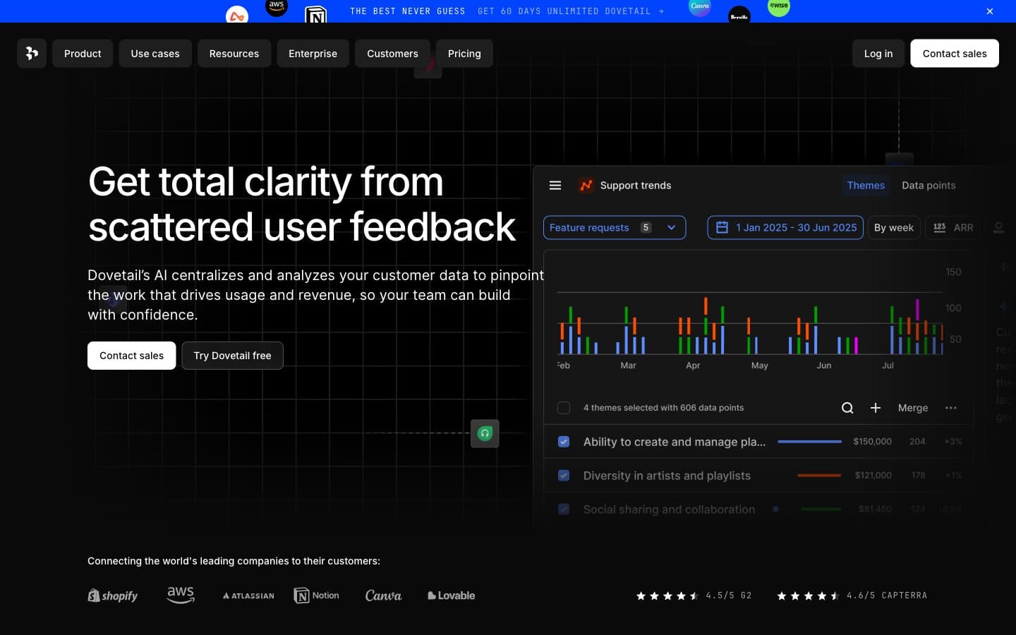
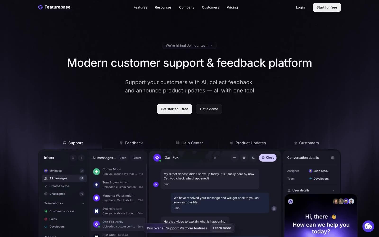
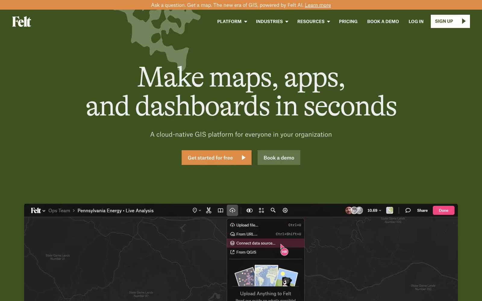
IFTTT. Editorial darkroom with neon service tiles.
- SaaS
- Dark theme
- 18 colors
- 1 typeface
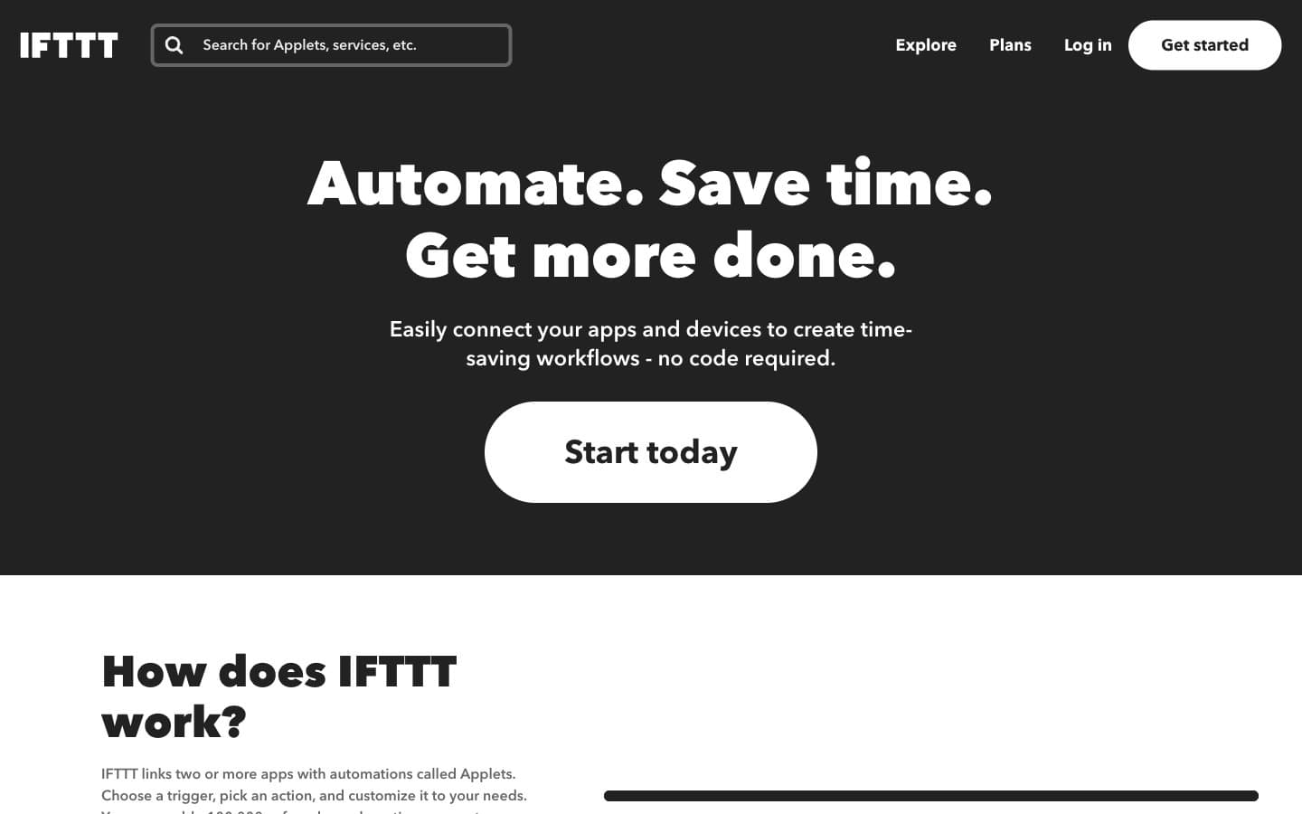
IFTTT reads as a dark editorial canvas punctuated by full-bleed brand-colored service tiles — the architecture is almost monochrome (#222222 canvas, white text, hairline borders) and then service tiles detonate in their native brand colors (Spotify green, YouTube red, Google blue). The visual system trusts geometric Avenir Next at confident sizes: 68px italic display heads with positive tracking, mid-weight body, and one-weight family across the whole stack. Primary action language is the pill: 100px radius, white fill, black text — repeated in inverse for the nav. Cards are flat, borderless, and color-as-surface rather than colored borders. The hero is a single dark band with centered display text and a solitary pill — no decoration, no gradient, no illustration.
IFTTT design system

Brand2
Brand accent — primary highlights, featured service tiles, active indicators
Green action color for filled buttons, selected navigation states, and focused conversion moments
Accent10
Brand accent — Google service tiles, link emphasis, interactive hover on dark
Brand accent — secondary blue for service tile variants, subtle elevated surfaces
Red action color for filled buttons, selected navigation states, and focused conversion moments
Green action color for filled buttons, selected navigation states, and focused conversion moments
Brand accent — RSS Feed tile, warm decorative accent
Brand accent — YouTube tile, high-saturation red service representation
Brand accent — Slack tile, purple-pink service representation
Brand accent — secondary green for Android Device-adjacent tiles
Red action color for filled buttons, selected navigation states, and focused conversion moments
Brand accent — Instagram tile, vivid pink-red service representation
Neutrals6
Page background, dark section bands, card surfaces on dark — the structural ground for 90% of the interface
Hairline dividers, card borders on dark surfaces, subtle structural lines
Secondary text, helper copy, muted metadata on light backgrounds
Tertiary text, icon fills, disabled states, low-emphasis borders
Light-mode section dividers, ghost button borders, soft borders on white surfaces
Primary text on dark, light section backgrounds, pill button fill, card backgrounds in light sections
Try a pairing
Pick any two colors from the palette to check whether text stays readable on top.
Aa
Canvas Charcoal on IFTTT Signal Blue
5.30 : 1 contrast
- Body textPasses AA 4.5
- Large textPasses AA 3
- StrictFails AAA 7