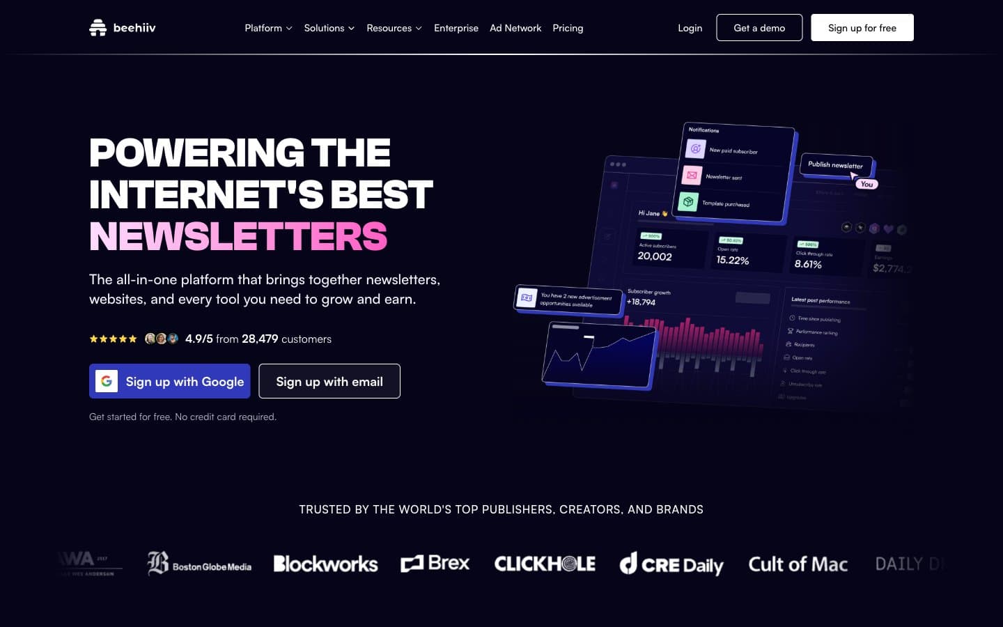
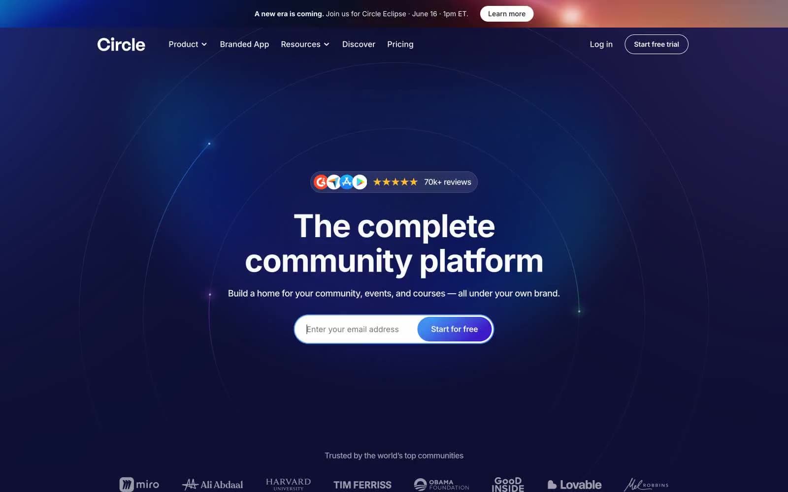
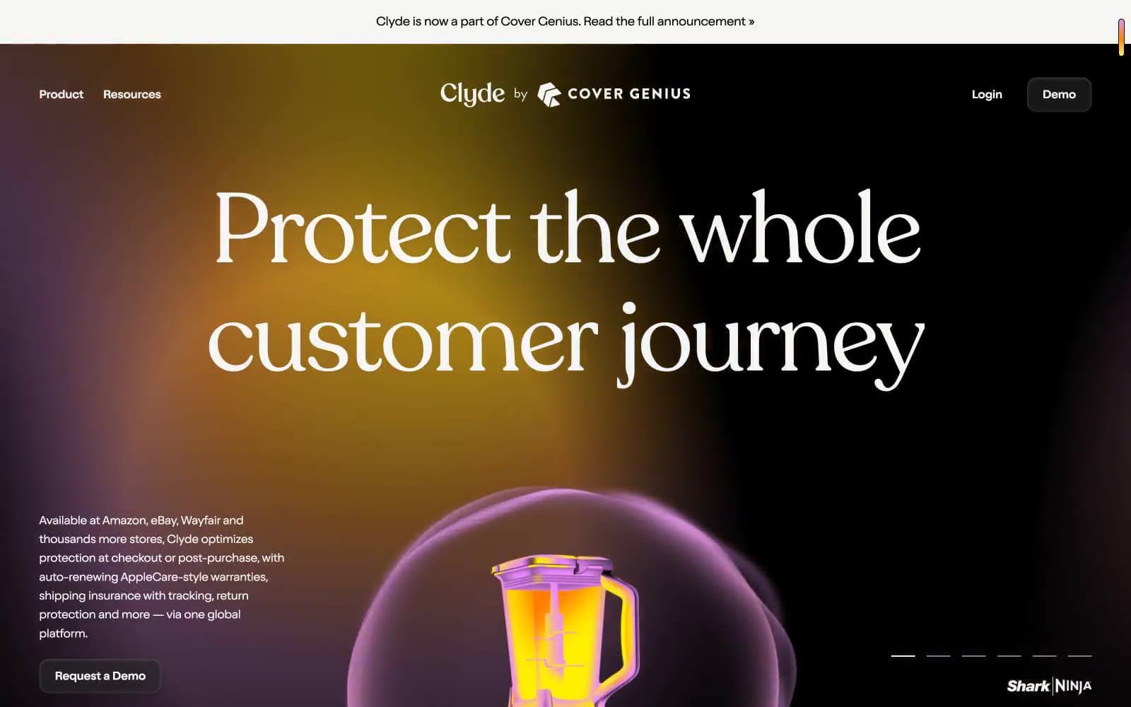
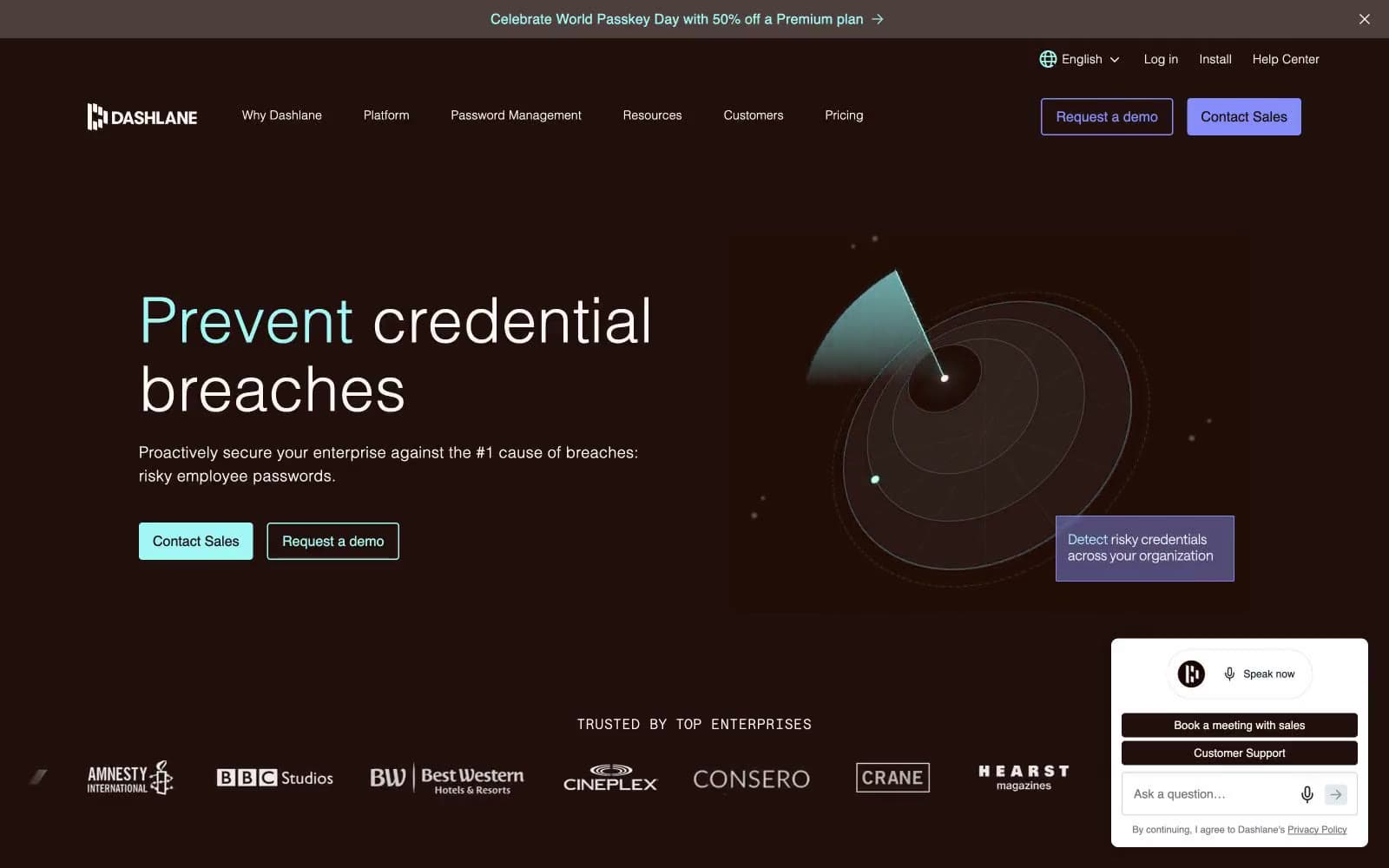
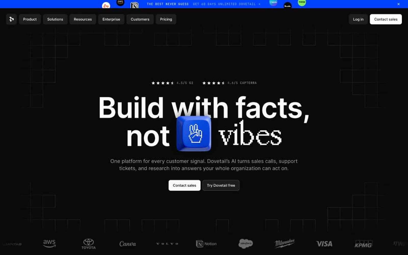
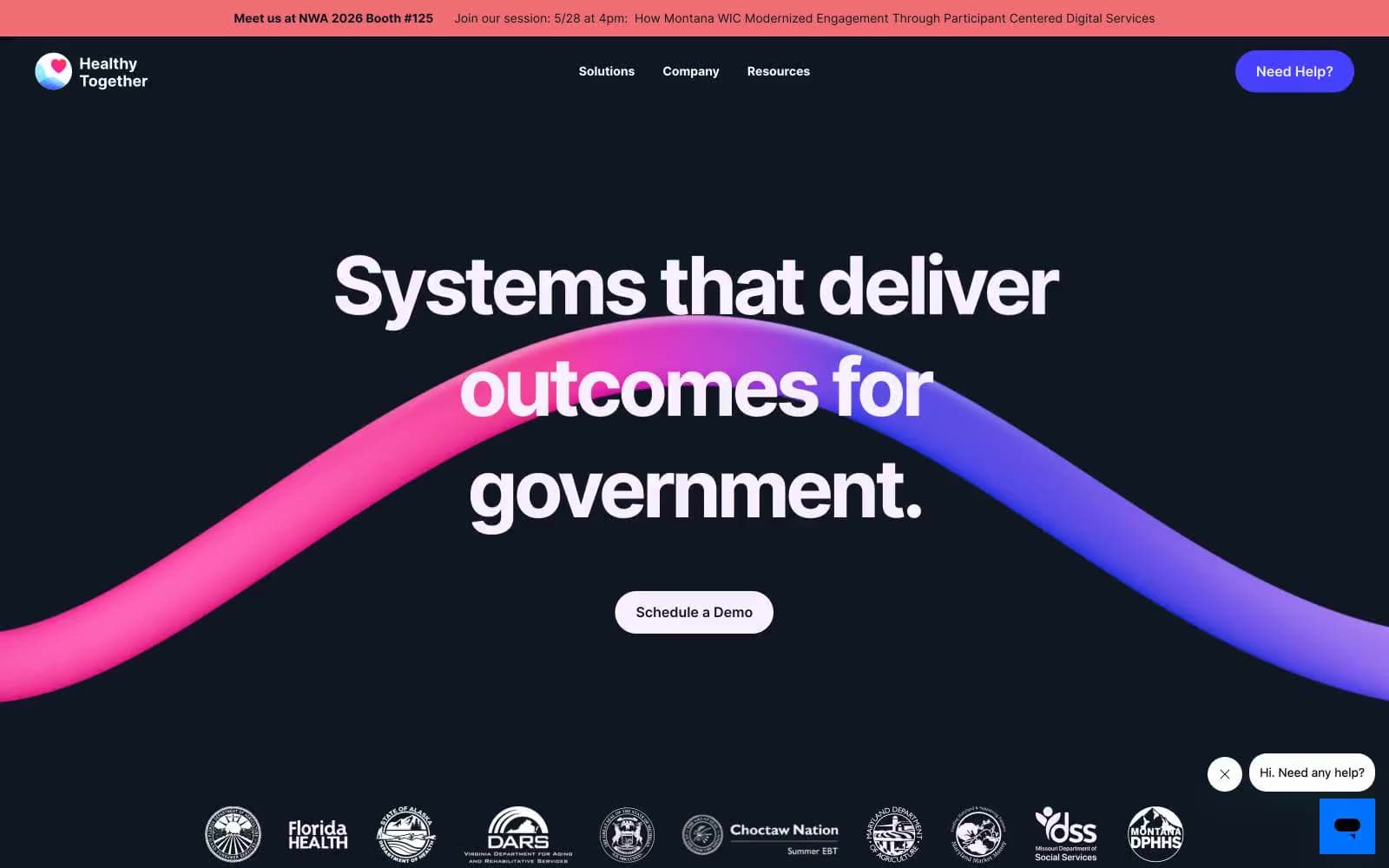
Healthy Together. Midnight navy with a violet brushstroke ribbon.
- SaaS
- Dark theme
- 8 colors
- 1 typeface
Healthy Together operates as a dark-anchored government-tech platform: deep midnight-navy canvases host oversized confident headlines, broken by vivid electric-violet accent sections and pale lavender breathing room. A signature pink-to-violet ribbon sweeps through the hero like a brushstroke, giving the otherwise austere dark UI a single moment of organic energy. Cards are generously rounded (42px), buttons are fully pill-shaped, and Inter's tight tracking at massive sizes (64–92px) gives headlines a compressed, architectural weight. The visual rhythm alternates dark → vivid → soft, never plain white-on-white — every surface is a deliberate temperature.
Healthy Together design system

Brand1
Primary action buttons, vivid section backgrounds, active nav indicators, brand accent — the single chromatic moment that switches the UI on; Hero ribbon graphic, accent gradients — pink-to-violet sweep that is the only decorative motion in the system
Accent2
Soft violet tint for tag/chip backgrounds, accent surface washes, decorative fills
Endpoint of the signature ribbon gradient — warm anchor to Electric Iris's cool
Neutrals5
Primary text, hero canvas, nav bar, page-level dark backgrounds — the structural anchor of the entire system
Body text on light surfaces where Midnight Ink is too heavy — softens the hierarchy
Secondary text, helper copy, muted headings, subtle borders
Section canvas, card fills, soft highlight wash — the breathing-room surface between dark hero blocks
Card surfaces, nav dividers, button text — the clean interior surface
Try a pairing
Pick any two colors from the palette to check whether text stays readable on top.
Aa
Midnight Ink on Lilac Whisper
11.54 : 1 contrast
- Body textPasses AA 4.5
- Large textPasses AA 3
- StrictPasses AAA 7