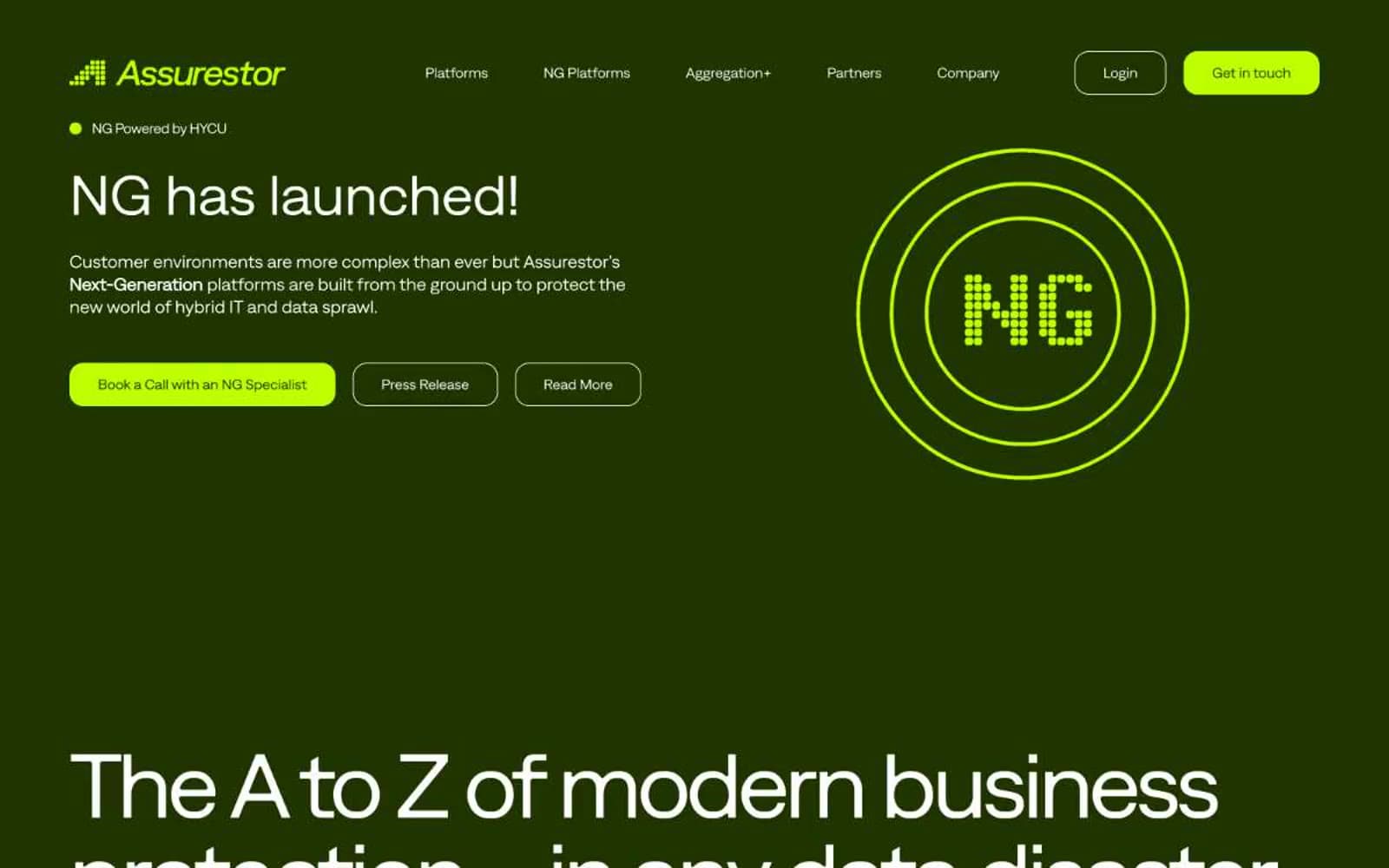
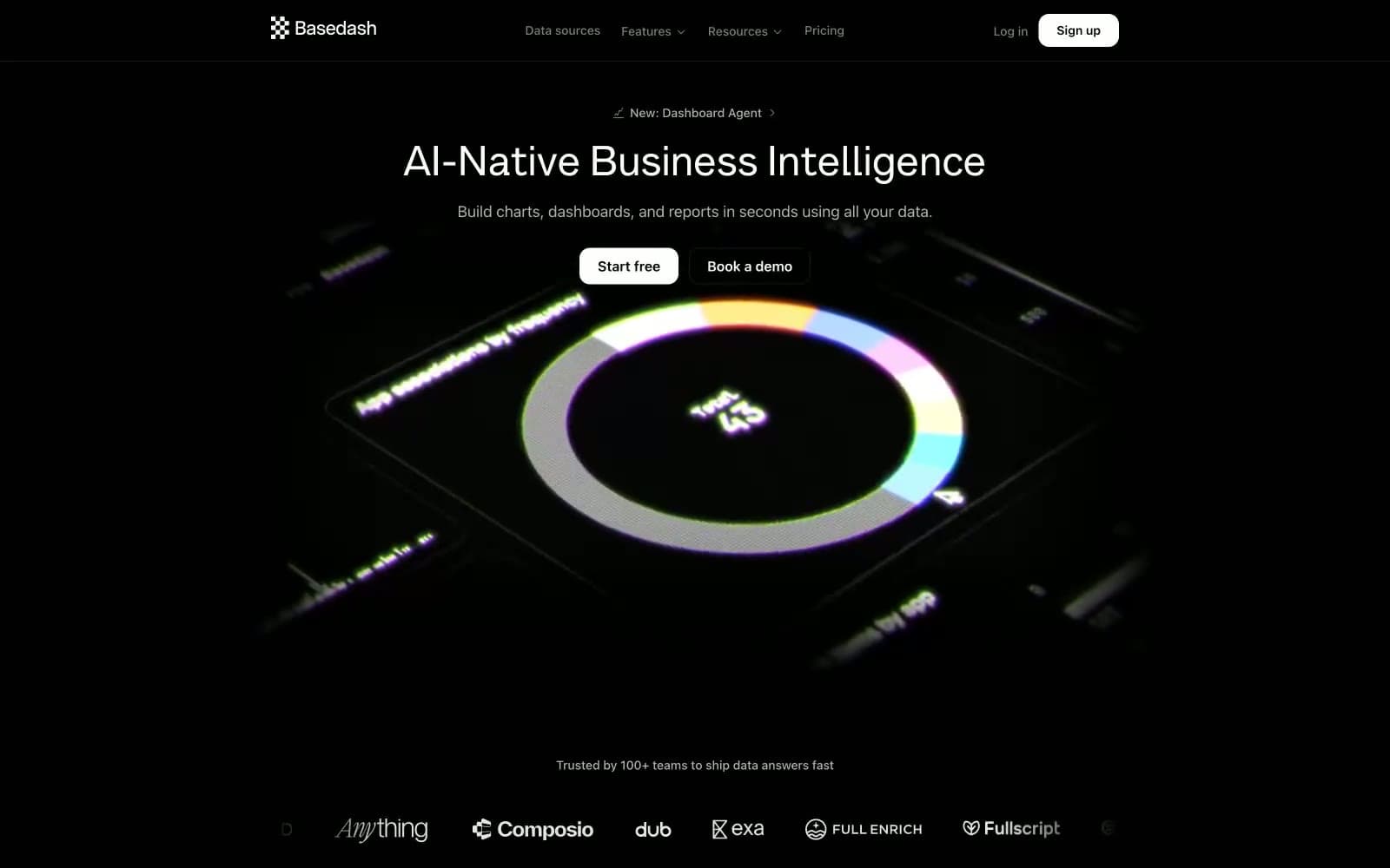
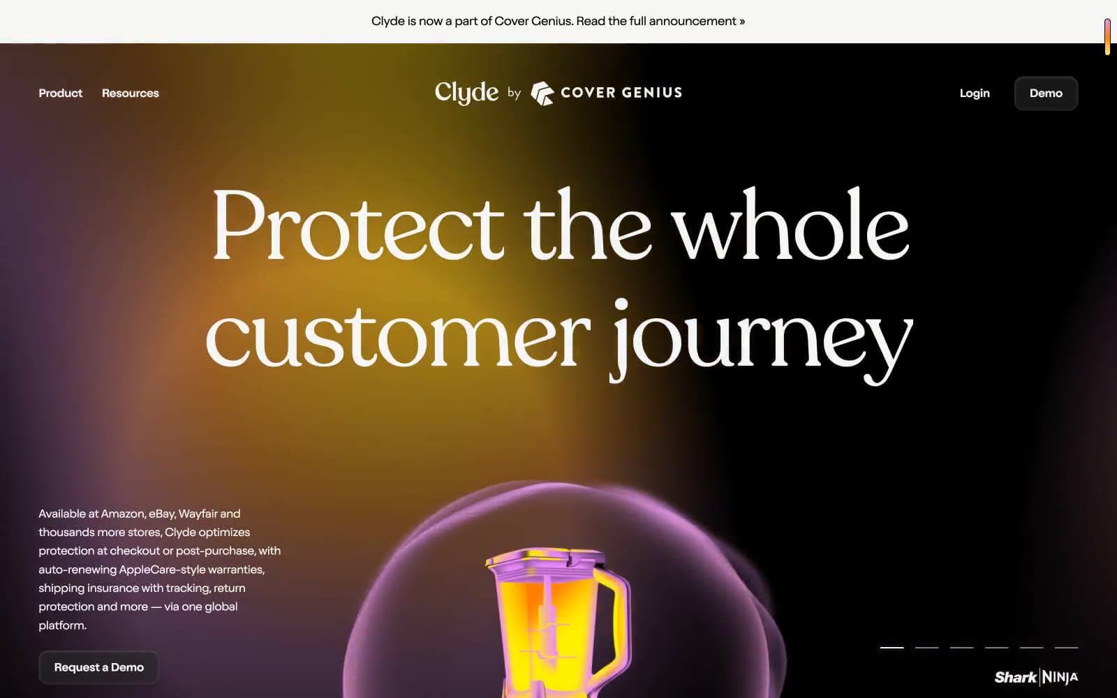
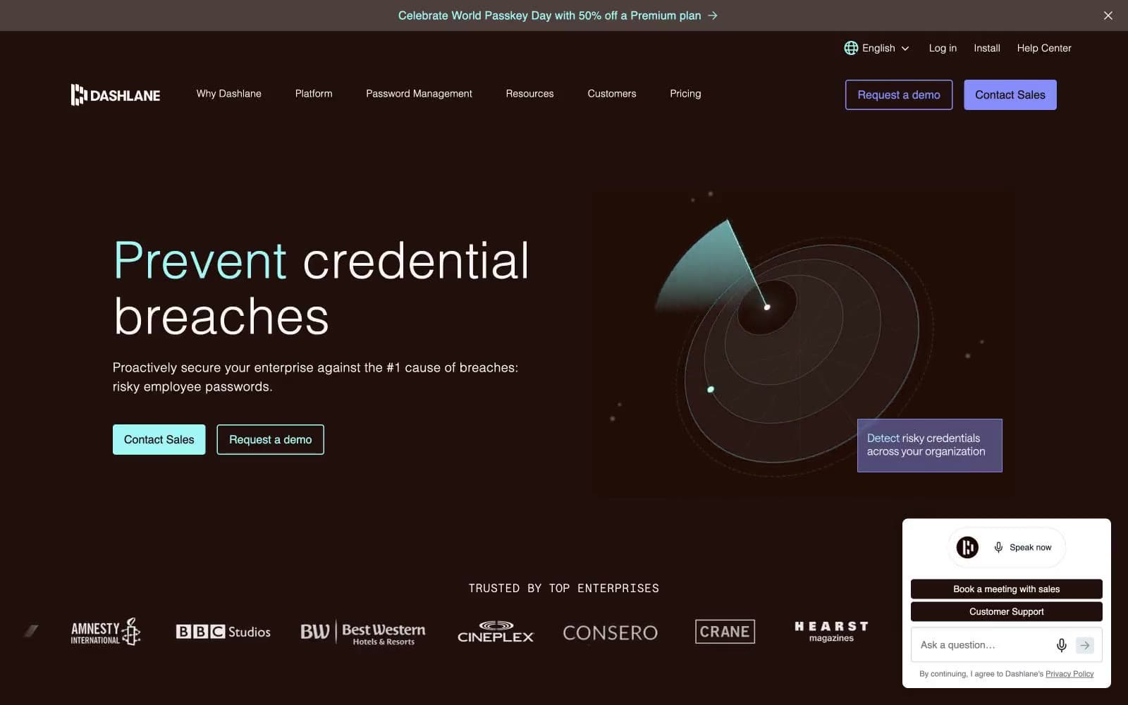
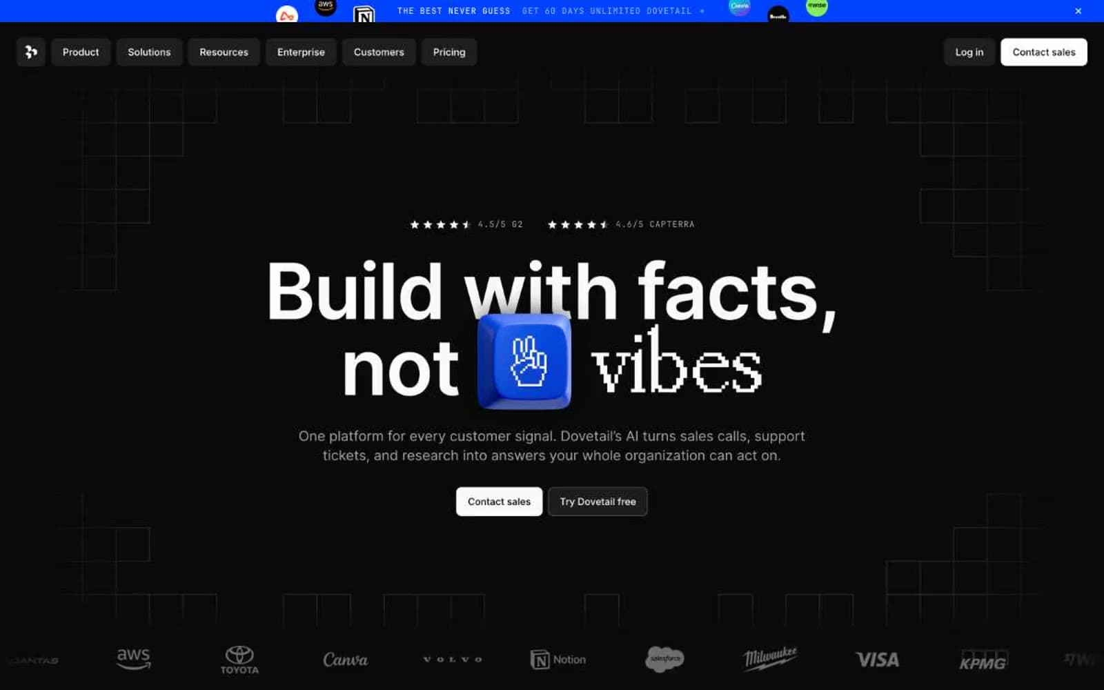
Front. Midnight plum control room, one lime spark.
- SaaS
- Dark theme
- 15 colors
- 2 typefaces
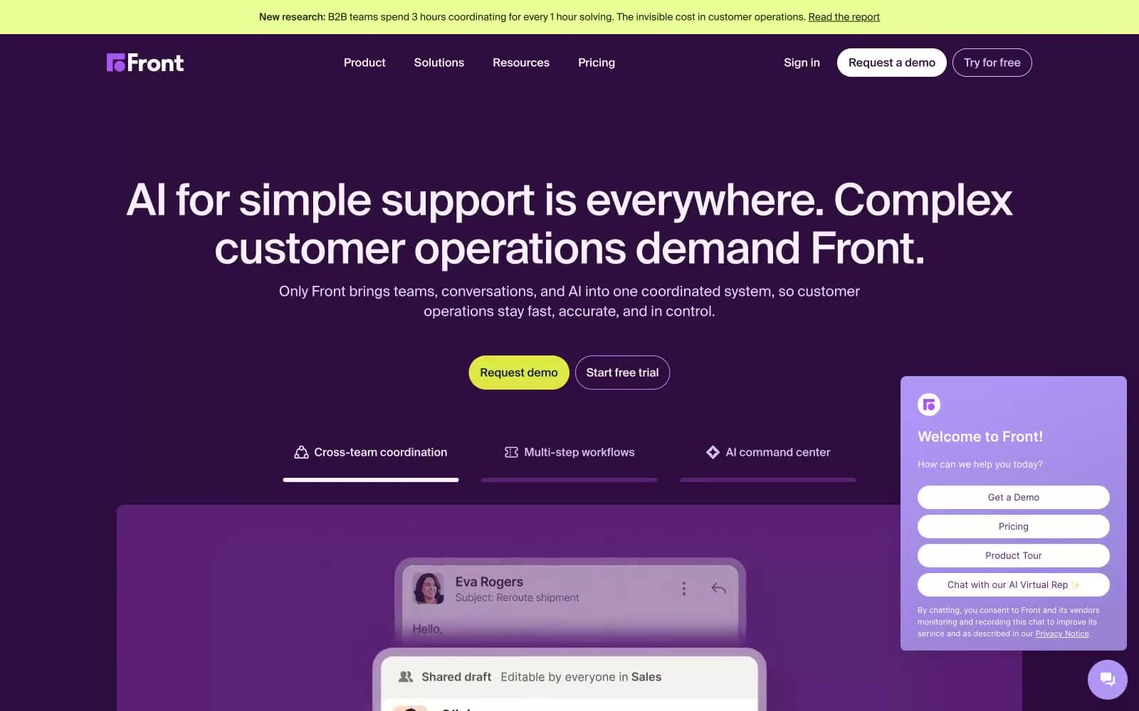
Front operates in a deep-plum command-center language: a single saturated purple (#300c41) carries the page, lighter lavender cards float above it, and one electric lime accent punches through the darkness as the only warm color. Typography is neo-grotesque and tightly tracked, with display sizes at weight 500 pulling inward at -0.02em so headlines feel machined rather than drawn. Surfaces are flat — no drop shadows, only a hairline 1px inset ring in pale lilac (#d0c6f0) to define interactive edges. The overall rhythm is confident and dense: rounded pill controls (40-64px radius), compact 8/16/24px spacing, and dark-on-dark layering that makes the lime CTA feel switched on.
Front design system

Brand2
Page canvas, hero backgrounds, nav background — the single dominant surface color that gives Front its unmistakable identity
Pink supporting accent for decorative details and low-frequency emphasis. Do not promote it to the primary CTA color
Accent3
Green supporting accent for decorative details and low-frequency emphasis. Do not promote it to the primary CTA color
Violet supporting accent for decorative details and low-frequency emphasis. Do not promote it to the primary CTA color
Decorative borders, accent strokes on illustrations, gradient terminus in the chat widget
Neutrals10
Rare dark text accent on the lime button and light surfaces with maximum contrast
Violet supporting accent for decorative details and low-frequency emphasis. Do not promote it to the primary CTA color
Primary body and heading text on light surfaces — near-black with a faint warm cast
Secondary text, helper copy, metadata labels
Tertiary text, placeholder copy, disabled labels
Supporting neutral for secondary UI, dividers, and muted labels. Do not promote it to the primary CTA color
Inset focus ring color, soft hover wash, tinted shadow on elevated cards
Borders on light surfaces, table dividers, inactive outlines
Light supporting surface for subtle backgrounds and section separation. Do not promote it to the primary CTA color
Light supporting surface for subtle backgrounds and section separation. Do not promote it to the primary CTA color
Try a pairing
Pick any two colors from the palette to check whether text stays readable on top.
Aa
Frost on Aubergine
15.21 : 1 contrast
- Body textPasses AA 4.5
- Large textPasses AA 3
- StrictPasses AAA 7